Table of Contents >> Show >> Hide
- Why sea salt paint colors work so well
- How to style a sea salt palette like a grown-up coastal dream
- 13 sea salt paint colors to try
- 1. Frothy Surf by Behr
- 2. Sea Glass by Benjamin Moore
- 3. Salt by Farrow & Ball
- 4. Sea Salt by Sherwin-Williams
- 5. Breezeway by Behr
- 6. Pink Sea Salt by Behr
- 7. Salty Sea by Valspar
- 8. Seaside Fog by Valspar
- 9. Salty Breeze by Glidden
- 10. Misty Coast by Behr
- 11. Sea Sprite by Glidden
- 12. Sea Salt by Benjamin Moore
- 13. Seaspray by Glidden
- Which sea salt paint color is right for your room?
- Common mistakes to avoid
- The lived-in experience of sea salt colors at home
- Final thoughts
If your idea of paradise involves open windows, sun-washed wood, and a room that feels like it just exhaled, sea salt paint colors deserve a serious look. These shades live in that delicious middle ground between blue, green, gray, and barely-there neutral. They are soft without being sleepy, coastal without screaming “there is definitely a decorative anchor in here,” and calming in a way that works for real life, not just a staged beach house with exactly one tasteful shell on the coffee table.
What makes sea salt tones so appealing is their flexibility. In bright natural light, they can read airy and breezy. In dimmer rooms, they often lean moodier, grayer, or more cocooning. That shift is not a bug; it is the magic trick. Designers and major paint brands keep returning to these shades because they create a serene backdrop while still offering more personality than plain white walls.
Below, you will find 13 sea salt paint colors that capture the relaxed spirit of the coast, from misty blue-greens to soft mineral pinks and crisp whites. Some are classic wall colors, some are better for trim, cabinetry, or bathrooms, and all of them can help turn an ordinary room into a dreamy coastal escape.
Why sea salt paint colors work so well
Sea salt-inspired paint colors succeed because they borrow from the coastline without copying it too literally. Think sea glass, fog, weathered driftwood, sandy dunes, pale algae, shell white, and sky just before sunset. That mix creates colors that feel natural, easy on the eyes, and surprisingly versatile.
Most sea salt shades also have what designers love to call a “chameleon” quality. They shift depending on the direction of the light, the time of day, and what is sitting next to them. A blue-green may look almost silver in one room and softly sage in another. That is exactly why sampling matters. Paint this family of colors on more than one wall, check them morning and night, and do not judge them under one lonely overhead bulb that makes every room look like an interrogation scene.
How to style a sea salt palette like a grown-up coastal dream
The easiest way to make these shades sing is to pair them with materials that feel honest and relaxed. Crisp white trim sharpens cooler sea salt colors. Creamier whites soften warmer versions. Light oak, rattan, wicker, linen, jute, cotton, marble, polished chrome, aged brass, and matte black all work beautifully, depending on whether you want your room to lean classic, cottagey, modern, or quietly luxurious.
For accent colors, think driftwood gray, sandy beige, cloud white, navy, and occasional blush or coral. If you want the room to stay peaceful, keep the contrast low. If you want more energy, add a darker blue, a richer green, or black details for definition.
13 sea salt paint colors to try
1. Frothy Surf by Behr
Frothy Surf is the gentlest possible entry into the coastal world. It is an off-white with a whisper of sea green, which makes it perfect for anyone who wants color that barely announces itself. On the wall, it feels fresh and clean, but not sterile. It is lovely in a home office, guest room, or bathroom where you want the mood to stay light and uncluttered.
Use it with bright white trim for a crisp look, or pair it with pale wood and woven textures for a softer coastal finish. This is the shade for people who say, “I do want color, but I also want plausible deniability.”
2. Sea Glass by Benjamin Moore
Sea Glass brings more character to the party. It has that polished-by-the-tide feel: cool, mellow, slightly nostalgic, and just moody enough to add depth without making a room feel dark. It works especially well in bedrooms, reading nooks, dining rooms, or any space where you want a cozy, collected atmosphere.
Layer it with vintage brass, warm woods, creamy upholstery, and textured fabrics. If you love coastal style but want it to feel refined rather than beach-rental obvious, Sea Glass is a strong contender.
3. Salt by Farrow & Ball
Not every sea salt paint color has to be green or blue. Salt is a bright, crisp white with a fresh, salty-air quality that makes a room feel open and quietly polished. It is ideal if you want the coastal vibe to come through the atmosphere, not through an obvious wash of color.
This shade looks gorgeous with linen upholstery, plaster textures, pale oak floors, and black or bronze accents. In kitchens and bathrooms, it gives you that clean, sunlit look that feels sophisticated rather than stark.
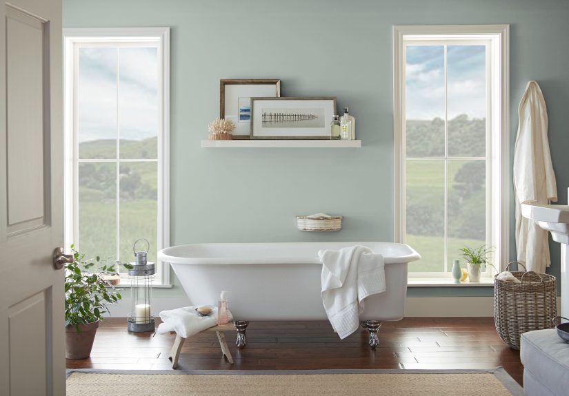
4. Sea Salt by Sherwin-Williams
This is the celebrity shade in the category, and for good reason. Sherwin-Williams Sea Salt is a cool, muted green with blue undertones that somehow manages to feel like a spa day, a beach weekend, and a very smart design decision all at once. It is famously adaptable and can read green, blue, or gray depending on the light.
It is especially beautiful in bathrooms, bedrooms, laundry rooms, and quiet living areas. Pair it with crisp white trim, polished chrome, marble, soft towels, and natural textures for a look that feels timeless and airy.
5. Breezeway by Behr
Breezeway has the sea-glass look down cold. It is brighter and more cheerful than some of the grayer sea salt tones, which makes it ideal if you want a little more lift and visibility on the wall. It can wake up a kitchen, powder room, mudroom, or casual family space without feeling loud.
Because it has that fresh, uplifting quality, Breezeway looks best when you keep the rest of the palette clean: white trim, open shelving, wicker baskets, simple ceramics, and plenty of natural light.
6. Pink Sea Salt by Behr
Here is the wildcard, and honestly, it earns its place. Pink Sea Salt proves that a dreamy coastal palette does not have to stop at blue and green. This muted mineral pink feels sun-faded rather than sugary, which makes it surprisingly easy to live with. It is pretty in bedrooms, bathrooms, and offices that need warmth without heaviness.
Try it with driftwood tones, creamy whites, muted brass, and soft gray-green accents. If your version of the coast includes sunset skies and rosy shells, this color makes perfect sense.
7. Salty Sea by Valspar
Salty Sea goes deeper and earthier than the floaty blue-greens. It is a muted green with a grounded quality that works beautifully on paneling, cabinetry, or walls where you want color to feel calm but intentional. It brings a tonal, layered look to interiors and plays well with lighter greens and soft whites.
This one is a strong pick for a coastal kitchen, a mudroom with beadboard, or a dining area that needs more substance than a pale pastel can provide.
8. Seaside Fog by Valspar
Seaside Fog sits in that sweet spot between soft green and washed-out mist. It feels gentle, tranquil, and subtly energizing, which is a rare combination. That makes it a smart choice for bathrooms and bedrooms, where you want calm but not flatness.
Use it with bamboo shades, antique brass, white tile, and leafy plants. It is a great example of how coastal color can feel fresh and restorative without leaning overly theme-y.
9. Salty Breeze by Glidden
Salty Breeze is a pale gray-mint green that behaves almost like a neutral. It has a soft yellow undertone, so it can feel a touch warmer than some of the blue-based sea salt hues. That makes it useful in rooms that need brightness without turning chilly.
It works well on full-room walls, and it also makes sense outdoors or in sunrooms. Pair it with darker sage notes, warm woods, black accents, and reflective materials like glass or mirrors to keep the space balanced.
10. Misty Coast by Behr
Misty Coast shifts the conversation toward glacial gray with a hint of blue. If you love the coast but do not want obvious green, this color is a fantastic compromise. It feels cool, tailored, and classic, especially in living rooms, hallways, and bedrooms with elegant finishes.
Style it with navy pillows, black marble, brushed nickel, or soft blue textiles. It is the coastal equivalent of wearing a cashmere sweater instead of a tropical-print shirt.
11. Sea Sprite by Glidden
Sea Sprite is a seafoam aqua-green with a little more personality and color presence. It can feel historic, cheerful, and timeless depending on how you use it. This makes it a fun option for a dining room, entryway, or primary bedroom that needs more than a whisper of color.
Pair it with off-white trim, lighter woods, a sculptural light fixture, and simple upholstery. It has enough energy to stand on its own while still keeping the room relaxed.
12. Sea Salt by Benjamin Moore
Benjamin Moore’s Sea Salt takes a different path from the Sherwin-Williams favorite. This version is a nuanced neutral that can swing warm beige in bright light and cooler gray when the room dims. That flexibility makes it excellent for homeowners who love coastal style but want a more grounded, less obviously blue-green result.
It works beautifully in living rooms, bedrooms, and open-plan spaces where you want continuity. Add white linen, warm woods, woven rugs, and a few ocean-inspired accents, and the room feels coastal without looking costume-y.
13. Seaspray by Glidden
Seaspray is the brightest, breeziest blue of the bunch. It is a light tropical turquoise aqua with real vacation energy, but because it is softened enough for interiors, it still feels livable. Use it when you want the room to feel playful, uplifting, and unmistakably airy.
It shines in bedrooms, kids’ rooms, bathrooms, and sunlit spaces. White furniture, silver accents, picture-frame molding, and plush textures help it feel polished rather than too sugary.
Which sea salt paint color is right for your room?
If you want a near-neutral, start with Frothy Surf, Salt, or Benjamin Moore Sea Salt. If you want a classic blue-green that shifts beautifully, Sherwin-Williams Sea Salt remains the benchmark. If you want a brighter sea-glass look, Breezeway is a winner. If you prefer something earthy and grounded, try Salty Sea. For a soft gray coastal mood, Misty Coast makes excellent sense. And if your heart wants more color, Sea Sprite and Seaspray are ready to stop pretending they are shy.
Room function matters, too. Bedrooms and bathrooms often benefit from the softer, cooler shades because they enhance relaxation. Kitchens and mudrooms can handle slightly stronger tones or greener undertones. Living rooms usually do best with colors that shift gracefully across changing daylight, since these spaces are used at all hours.
Common mistakes to avoid
The first mistake is choosing from a tiny paint chip and expecting loyalty from the wall. Sea salt shades are notoriously light-sensitive, so sampling is essential. The second mistake is pairing a cool blue-green wall with the wrong white trim. A crisp, cool white can make a cooler sea salt color look fresh and modern, while a creamy white can soften warmer or beige-leaning versions. The third mistake is piling on too many obvious beach motifs. One woven basket: charming. A basket, a net, a driftwood sign, and three decorative starfish: a cry for help.
Let the paint do some of the storytelling. Then support it with texture, material, and contrast instead of themed clutter.
The lived-in experience of sea salt colors at home
One of the most appealing things about sea salt paint colors is how they change the emotional temperature of a room without demanding constant attention. You do not walk into a room painted in a good sea salt shade and think, “Wow, color!” You usually think, “Why does it feel so nice in here?” That is the real power of this palette. It creates mood first and shows off second.
In everyday life, these colors tend to feel best in the hours when homes are actually being used. Morning light brings out their airy side. A breakfast nook painted in a sea-glass green can feel fresh and optimistic without being too bright before coffee. In the afternoon, especially in sunny rooms, many of these shades soften into a clearer blue-green or pale mineral tone that makes white trim, linen curtains, and wood furniture look even better. By evening, the same walls often settle into a quieter gray or muted sage, which makes the room feel more intimate and restful.
That day-to-night shift is especially satisfying in bedrooms and bathrooms. A color like Sherwin-Williams Sea Salt or Seaside Fog can feel clean and almost spa-like in the morning, then cocooning and calm after sunset. In a bedroom, that means the room never feels too cold or too flat. In a bathroom, it adds the kind of low-key luxury that makes an ordinary shower feel slightly more expensive than it really is.
These shades also tend to be forgiving in homes that are not professionally styled every five minutes. Real houses have backpacks, dog bowls, remote controls, laundry baskets, and the occasional mysterious pile of mail. Sea salt colors work with that reality because they are soft enough to reduce visual stress. They do not fight for attention, and they do not make every object in the room look louder. Instead, they create a gentle backdrop that helps a space feel more organized, even when life is doing its usual messy little dance.
Another strong point is their compatibility with collected interiors. Maybe you have oak floors, a white sofa, a brass lamp, a jute rug, and a navy throw. A sea salt shade can connect all of those pieces without making the room feel forced. It bridges warm and cool elements better than many other paint families, which is one reason designers keep coming back to it.
And perhaps that is the best way to describe the experience of living with these colors: they feel easy. Not boring, not bland, not forgettable. Easy in the most luxurious sense. Easy to decorate around. Easy to wake up to. Easy to come home to. Easy to love for longer than one trend cycle. When a color can make a room feel like a deep breath, a long weekend, and a cleaner house than you actually have, it is doing excellent work.
Final thoughts
The best sea salt paint colors capture what people love about coastal style in the first place: lightness, softness, ease, and a connection to nature. Whether you choose a crisp salty white, a classic spa-like blue-green, a sandy neutral, or a misty seafoam tone, the goal is not to make your home look like a beach set. It is to make it feel restful, open, and gently transported.
If you want the safest bet, start with Sherwin-Williams Sea Salt, Benjamin Moore Sea Salt, or Behr Breezeway. If you want something slightly different, Sea Glass, Salty Sea, Misty Coast, and Pink Sea Salt each offer their own version of the coastal dream. Sample generously, watch the color in changing light, and let the room tell you which tide to ride.