Table of Contents >> Show >> Hide
- Table of Contents
- Design Rules That Make DIY Wall Art Look Expensive
- Quick Hanging + Layout Tips (So Your Wall Doesn’t Become a Pin Cushion)
- 15 DIY Wall Art Projects for Stylish Looks on a Budget
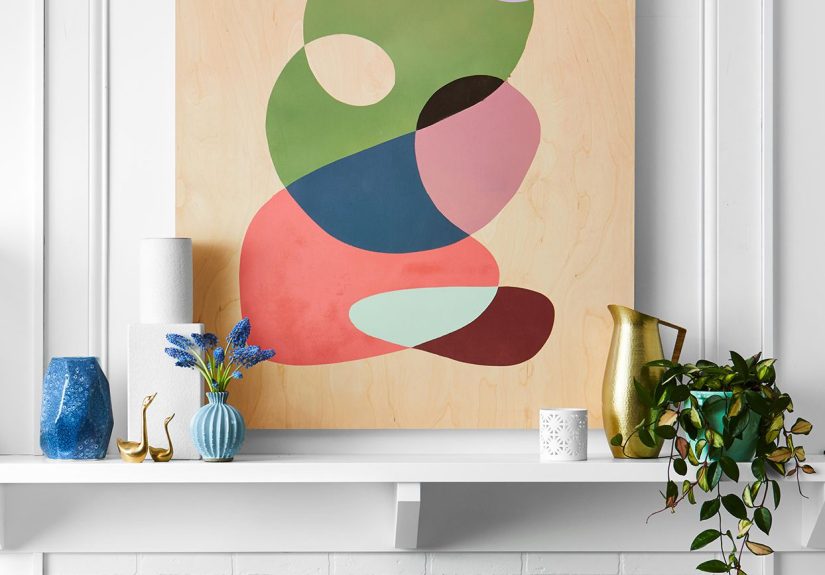
- 1) Oversized Abstract Canvas That Looks “Gallery” (Not “Grocery List”)
- 2) Thrifted Frame Makeover with Crisp Stripes
- 3) Printable Art + Thrift Frames = Instant Gallery Wall
- 4) The Clean “Grid Wall” for Minimalists Who Still Like Personality
- 5) Framed Fabric Panels (Because Wallpaper Isn’t the Only Pattern Party)
- 6) Embroidery Hoop Textile Trio
- 7) Pressed Botanical “Specimens” in Floating Frames
- 8) Mirror Gallery Wall (Art That Also Helps You Check Spinach)
- 9) Hanging Plate Wall (Instant Charm, Zero Painting Required)
- 10) Peel-and-Stick Wallpaper “Framed Panel” (Rental-Friendly Wow)
- 11) Painted Arch (or Color-Block Shape) That Acts Like a Headboard
- 12) Mini Wood Slat “Art Panel” for Texture on a Budget
- 13) Yarn or Woven Wall Hanging (Cozy Without Buying “Boho” for $200)
- 14) Sculptural Paper Art (3D Butterflies, Florals, or Geometric Shapes)
- 15) Shadow Box Collection (AKA “My Weird Little Treasures, But Make It Chic”)
- Extra: Real-World DIY Wall Art Lessons (About of Helpful Chaos)
- Conclusion
Your walls are basically the biggest “please decorate me” surfaces in your home. And yet, wall art can feel weirdly expensivelike the moment you put something in a frame, it suddenly costs the same as a small used car. The good news: you don’t need a gallery budget to get a gallery vibe.
This guide shares 15 DIY wall art projects that look stylish (not “I made this during a sugar crash”), stay budget-friendly, and work in real homesapartments, rentals, starter houses, and the “I swear I’ll paint later” spaces. You’ll also get hanging tips that prevent the classic DIY tragedy: 14 tiny nail holes arranged in the shape of regret.
Design Rules That Make DIY Wall Art Look Expensive
1) Go bigger than feels polite
Small art is cute… until it’s floating alone on a big wall like a postage stamp in the middle of a billboard. Oversized art looks intentional, and “intentional” is the secret ingredient behind most high-end interiors. If you’re on a budget, scale is your best friend.
2) Repeat one thing on purpose
A single color repeated across frames, a consistent mat size, or even matching spacing between pieces can make thrifted finds look curated instead of chaotic. Repetition reads as “designer,” even if your “studio” is your kitchen table.
3) Give your art some breathing room
White space (mats, margins, simple frames) makes almost any image look more premium. If your project is bold, keep the frame simple. If your frame is ornate, keep the art calmer. Balance is the glow-up.
4) Add texture, not clutter
Texture is the shortcut to cozy: woven wall hangings, wood slats, pressed botanicals, fabric panels, sculptural paper. Textures look rich, even when they’re cheapbecause your wall starts doing something besides being flat and silently judgmental.
Quick Hanging + Layout Tips (So Your Wall Doesn’t Become a Pin Cushion)
Before you start any project, decide how you’ll hang it. A few simple rules save time, drywall, and your mood:
- Use painter’s tape or paper templates to mock up placement before committing.
- Eye-level cheat code: hang the center of the piece around 57 inches from the floor for most rooms.
- Spacing: aim for consistent gapsaround 2 inches between frames is a clean rule of thumb.
- Above furniture: keep the bottom of frames roughly 7–10 inches above the top of a sofa/console.
- Hardware matters: studs are best; use proper anchors if there’s no stud where you need it.
- Renters: Command-style strips, picture ledges, or leaning frames can look intentional and avoid holes.
- Bonus hack: if you struggle to mark where the nail goes, people use a tiny dab of white toothpaste to transfer the spot.
Now, onto the fun part: making your walls look like you have your life together (even if your laundry basket says otherwise).
15 DIY Wall Art Projects for Stylish Looks on a Budget
1) Oversized Abstract Canvas That Looks “Gallery” (Not “Grocery List”)
Best for: living rooms, over a bed, blank walls that need a statement.
Big abstract art is expensive because it’s bignot because it’s complicated. You can recreate the vibe with a blank canvas (or a thrifted canvas you paint over) and a limited palette.
- Budget move: pick 2–4 colors that already appear in your room (pillows, rug, curtains).
- How to do it: tape off simple shapes, paint broad strokes, or try watery gradients for an elevated look.
- Pro tip: step back every few minutes. Abstract art improves dramatically when viewed from “across-the-room distance.”
2) Thrifted Frame Makeover with Crisp Stripes
Best for: turning “meh” frames into “where did you buy that?” frames.
Thrift frames are plentiful, but the finish can scream “1997.” Painter’s tape + spray paint turns them into modern, punchy accents. Stripes feel custom and playful without requiring actual artistic skill.
- What you’ll do: spray one base color, let it dry fully, tape stripes, spray a second color, peel tape.
- Make it look luxe: choose two shades in the same family (e.g., brick + burgundy) for a tonal “lacquer” vibe.
- Heads-up: super ornate frames can cause paint bleedsimpler edges = cleaner stripes.
3) Printable Art + Thrift Frames = Instant Gallery Wall
Best for: anyone who wants a “collection” fast and cheap.
The fastest budget wall decor combo is: thrifted frames + high-quality prints. You can print photography, typography, vintage illustrations, or even your own phone photos (yes, your camera roll has potential).
- How to make it cohesive: stick to one theme (botanicals, black-and-white photos, line drawings, travel spots).
- Upgrade trick: use a consistent mat color to unify mismatched frames.
- Layout tip: mix sizes, but repeat a few “anchor” sizes to avoid a scattered look.
4) The Clean “Grid Wall” for Minimalists Who Still Like Personality
Best for: hallways, offices, dining rooms, anyone craving calm symmetry.
A grid wall uses identical frames, evenly spaced, arranged like a tidy matrix. It’s the organized cousin of the classic gallery wall. It looks polished, timeless, and surprisingly easy to update.
- What to hang: family photos, botanicals, or a series (diptych/triptych sets look extra “designed”).
- Make it modern: simple frames + consistent spacing = crisp, quiet impact.
- Plan first: arrange on the floor so the grid feels balanced before you touch a hammer.
5) Framed Fabric Panels (Because Wallpaper Isn’t the Only Pattern Party)
Best for: renters, boho spaces, and anyone with leftover fabric they refuse to throw away.
Fabric art is secretly brilliant: it adds color + texture, and it’s easy to swap seasonally. Use scarves, vintage linens, quilt blocks, or interesting remnants.
- How to do it: wrap fabric around foam board, staple/tape the back, then frame it (or hang it as-is).
- Design win: large-scale prints read like murals; small repeats feel classic.
- Upgrade: add a mat for instant “gallery” energy.
6) Embroidery Hoop Textile Trio
Best for: bedrooms, nurseries, cozy corners, and quick wins.
Stretch a pretty fabric or lace inside embroidery hoops and hang them as a grouped set. It’s charming, lightweight, and budget-friendly.
- Style tip: use three hoops in different sizes for a balanced cluster.
- Make it current: choose neutral linen, bold stripes, or a modern floral.
- Bonus: zero glass means it’s kid-friendly and less “oops, shattered.”
7) Pressed Botanical “Specimens” in Floating Frames
Best for: kitchens, bathrooms, entryways, and anyone who likes the “collected” look.
Pressed leaves and flowers feel vintage and elevatedlike you own a charming old greenhouse and also know what “archival” means. (You can learn the word later; the art still works.)
- How to do it: press botanicals in a heavy book, then mount on cardstock and frame.
- Protect it: keep out of harsh sunlight to reduce fading.
- Make a set: repeat one plant type across 3–6 frames for a gallery-worthy series.
8) Mirror Gallery Wall (Art That Also Helps You Check Spinach)
Best for: small rooms that need light, dim hallways, foyers.
A cluster of mirrors acts like wall art and makes spaces feel brighter and bigger. Mix shapes, keep frame tones cohesive, and let reflection do the heavy lifting.
- Budget tip: thrift mirrors or mix a few inexpensive ones with one “statement” mirror.
- Placement: put them where they bounce light (across from a window is chef’s kiss).
- Design note: this works especially well above a sofa or console table.
9) Hanging Plate Wall (Instant Charm, Zero Painting Required)
Best for: kitchens, dining rooms, cottage/farmhouse vibes, maximalists.
Decorative plates give you pattern and color fast. They don’t even have to matchdifferent sizes and edges can look curated when the palette is consistent.
- How to do it: use plate hangers or wall-safe hooks designed for plates.
- Make it cohesive: pick a theme (blue-and-white, botanicals, earthy neutrals).
- Layout tip: start with the largest plate in the center, then build outward.
10) Peel-and-Stick Wallpaper “Framed Panel” (Rental-Friendly Wow)
Best for: renters, commitment-phobes, and people who want pattern without the full wallpaper marathon.
Peel-and-stick wallpaper is designed to go on walls, but it also works beautifully as “art” when applied to a removable surface. You get the look of a bold accent without permanently changing the room.
- How to do it: apply wallpaper to foam board or thin plywood, trim cleanly, then frame or mount.
- Professional touch: use a level and smooth out bubbles with a plastic smoother or credit card.
- Extra idea: try textured panels that mimic brick/stone for a dimensional look.
11) Painted Arch (or Color-Block Shape) That Acts Like a Headboard
Best for: bedrooms, reading nooks, “I want a statement” moments.
Paint a big arch, circle, or rectangle behind furniture to create the illusion of architectural detail. It’s part mural, part wall art, and 100% cheaper than buying a giant print.
- How to do it: outline with painter’s tape and a pencil; paint two coats for crisp edges.
- Design move: choose a color a shade darker than your wall for a subtle, high-end effect.
- Fun twist: add a thin contrasting border line for a graphic finish.
12) Mini Wood Slat “Art Panel” for Texture on a Budget
Best for: modern spaces, Scandinavian vibes, walls that feel flat.
Slat walls are gorgeous, but you don’t need to commit to a full wall. Build a smaller slat panel and hang it like art. Paint the background board dark for depth, then attach slim wood strips with consistent spacing.
- How to do it: cut thin slats, attach to a backing board, stain or paint, then hang with sturdy hardware.
- Make it look designer: keep spacing consistent and edges clean.
- Where it shines: behind a sofa, in an entry, or as a textured backdrop above a desk.
13) Yarn or Woven Wall Hanging (Cozy Without Buying “Boho” for $200)
Best for: bedrooms, nurseries, and anyone who wants soft texture.
Yarn wall art can be as simple as wrapped strands on a dowel or as detailed as a woven piece. Either way, texture makes a room feel finished.
- Beginner version: knot yarn in varied lengths, trim into a clean shape (triangle, arc, fringe).
- Color tip: neutrals look elevated; one accent color keeps it modern.
- Cat warning: hang it high if you live with a fluffy creature who believes yarn is a personal challenge.
14) Sculptural Paper Art (3D Butterflies, Florals, or Geometric Shapes)
Best for: feature walls, kids’ rooms, creative studios, low-cost drama.
Paper art is lightweight, affordable, and shockingly impactful when repeated. Think butterflies in a gradient, folded geometric shapes, or layered paper flowers in a shadow box frame.
- How to do it: cut shapes, fold for dimension, arrange in a pattern, and mount in a frame or directly on the wall.
- Make it modern: stick to one color (all white, all black, or one bold shade).
- Extra polish: use consistent spacing like you’re building a “pattern,” not random confetti.
15) Shadow Box Collection (AKA “My Weird Little Treasures, But Make It Chic”)
Best for: kitchens, entryways, offices, anyone who collects anything.
Shadow boxes turn everyday objects into art: vintage keys, postcards, small tools, shells, matchbooks, mini sculptures. Grouping a collection makes it feel intentionaland it tells a story better than generic prints ever will.
- How to do it: pick a theme, arrange items before attaching, then secure with adhesive or small mounts.
- Design tip: line items up by size or color for that “museum display” energy.
- Bonus: it’s a conversation starter that doesn’t require you to explain what the art “means.”
Extra: Real-World DIY Wall Art Lessons (About of Helpful Chaos)
DIY wall art is one of the fastest ways to make a home feel personalbut it’s also where people tend to learn design lessons in the most dramatic way possible. Here are the “experience-based” truths that show up again and again when folks tackle budget-friendly wall decor at home.
Lesson #1: The wall is bigger than your confidence. The most common mistake isn’t bad tasteit’s undersizing. Many people start with a small canvas because it feels safer. But small art on a large wall reads as unfinished. If you’re nervous, go bigger with something simple: a large color-block, a bold wallpaper panel, or a set of three matching frames. The bigger the piece, the more “intentional” it looksand the less anyone notices tiny imperfections.
Lesson #2: Consistency beats perfection. A gallery wall doesn’t need every frame to match, but it does need at least one consistent thread: spacing, color palette, mat color, or frame finish. If the frames are all different, keep the art cohesive. If the art is eclectic, unify the frames. This is why grid walls look so polished: the structure does the work, even if the images are personal and casual.
Lesson #3: Prep is the glow-up nobody wants to do. People skip drying time, forget to clean surfaces, or paint over glossy thrift-store frames without a planthen wonder why the finish looks “sticky” or chips. The unsexy steps (cleaning, lightly sanding shiny surfaces, letting paint cure fully) are what make DIY projects look store-bought. If you only do one “adult” thing during crafting, let it be: wait for the paint to dry before taping stripes or stacking frames.
Lesson #4: Hanging is half the art. Even stunning DIY pieces can look awkward if they’re hung too high, spaced randomly, or tilted slightly like a confused baseball cap. People who love their finished walls usually plan first: painter’s tape outlines, paper templates, or laying everything on the floor to test the arrangement. Also, measure from the center of the art rather than the top edgeeye-level placement looks calm and “right” in most rooms.
Lesson #5: Texture saves “simple” projects from looking cheap. Flat prints are great, but when a room feels bland, texture is the fix. A woven hanging, slat panel, framed fabric, pressed botanicals, or even a mirror cluster adds depth without adding clutter. Texture also hides small mistakesnobody’s counting brush strokes when the wall is doing something interesting.
Lesson #6: Your best materials might already be in your house. Old scarves become framed fabric panels. Kids’ drawings become a rotating gallery. Postcards become a shadow box story. A stack of thrift frames becomes a grid wall. Budget DIY wall art gets dramatically easier when you treat “stuff you already own” as your supply closetand your walls as a place to display memories, not just decoration.
Conclusion
Stylish DIY wall art doesn’t require a design degree or a dramatic budgetit requires smart scale, a little structure, and the willingness to try. Pick one project that fits your space today, then build from there. Your walls will look more finished, your room will feel more like you, and you’ll get the deeply satisfying experience of saying, “Yeah, I made that,” without immediately whispering, “Please don’t look too closely.”