Table of Contents >> Show >> Hide
- What “Earthy” Actually Means (So Your Room Doesn’t Look Like Dirt)
- Quick Rules That Make Any Palette Look Intentional
- 27 Earthy Color Palettes for a Beautiful Home
- 1) Desert Sand + Cream + Cognac + Charcoal
- 2) Oatmeal + Warm Greige + Olive + Brass
- 3) Linen White + Sandstone + Camel + Black
- 4) Warm Taupe + Mushroom + Clay + Off-White
- 5) Stone Gray + Warm White + Driftwood + Iron
- 6) Cream + Butterscotch + Tobacco Brown + Deep Teal
- 7) Sage + Warm White + Natural Oak + Soft Black
- 8) Eucalyptus + Stone + Linen + Aged Brass
- 9) Olive + Cream + Rust + Walnut
- 10) Moss + Putty + Off-White + Bronze
- 11) Forest Green + Warm Beige + Cognac + Ivory
- 12) Soft Mint-Sage + Cream + Light Oak + Clay Pink
- 13) Terracotta + Warm White + Sand + Olive
- 14) Clay + Cream + Charcoal + Light Wood
- 15) Sunbaked Peach + Taupe + Olive + Matte Black
- 16) Rust + Camel + Bone + Deep Green
- 17) Brick Red + Warm White + Walnut + Brass
- 18) Burnt Sienna + Cream + Denim Blue + Dark Brown
- 19) Cocoa + Warm Beige + Ivory + Copper
- 20) Espresso + Sand + Sage + Antique Brass
- 21) Slate + Mushroom + Warm White + Terracotta
- 22) Deep Olive + Cocoa + Bone + Ocher
- 23) Ink Black + Warm White + Natural Wood + Clay
- 24) Sea Glass Blue + Sand + Warm White + Driftwood
- 25) Dusty Blue + Clay + Cream + Brass
- 26) Stormy Blue-Gray + Warm Greige + Walnut + Linen
- 27) Sage + Soft Blue + Warm White + Terracotta
- How to Make Earthy Palettes Look Expensive (Even If Your Sofa Was on Sale)
- of Real-World Experience (A.K.A. What Happens After You Actually Live With These Colors)
- Conclusion
If your home’s current “color story” is basically Builder Beige + Random Throw Pillow, you’re not alone. The good news: earthy color palettes are the easiest way to make a space feel calm, intentional, and quietly expensivewithout having to sell a kidney for a designer.
Earthy palettes pull from nature: sunbaked sand, clay, stone, bark, moss, and those moody sky moments right before it rains. They’re grounded, flexible, and surprisingly forgivingmeaning they’ll still look good when you inevitably spill coffee, add a plant, or change your mind about the rug (again).
Below are 27 earthy color palettes you can use in any room, plus practical rules that keep “earthy” from turning into “muddy.”
What “Earthy” Actually Means (So Your Room Doesn’t Look Like Dirt)
Earth tones aren’t just browns. They include muted greens, warm neutrals, clay reds, ochres, and soft, nature-inspired bluescolors that feel slightly toned down, like they’ve been filtered through sunlight, dust, or stone. The vibe is cozy, lived-in, and connected to the outdoorsmore “quiet hike” than “neon nightclub.”
Quick Rules That Make Any Palette Look Intentional
Use the 60–30–10 Rule (Yes, It Works for Homes Too)
Pick a dominant color (60%) for big areas like walls or large rugs, a secondary color (30%) for upholstery/curtains/cabinetry, and an accent (10%) for smaller momentspillows, art, lampshades, and that one dramatic vase you impulse-bought.
Respect Undertones (Because Beige Can Secretly Be Pink)
Two colors can be “neutral” and still clash if one leans warm (yellow/red/orange) and the other leans cool (green/blue/purple). Compare paint samples side-by-side to spot undertones, and try to keep undertones consistent within the same sightline (like an open living/dining area).
Light Matters: Room Direction + LRV
North-facing rooms often read cooler and darker, so warmer hues or higher-LRV colors can help. South-facing rooms get stronger light, which can make warm colors feel even warmer (sometimes too warm). LRV (Light Reflectance Value) is a 0–100 scale that describes how much light a color reflectshigher LRV generally looks brighter in the same room.
Texture Does Half the Work
Earthy palettes shine when they’re paired with natural materials: oak, walnut, linen, jute, stone, leather, terracotta, rattan, brushed brass, and matte black. Even a “simple” palette looks layered when textures change.
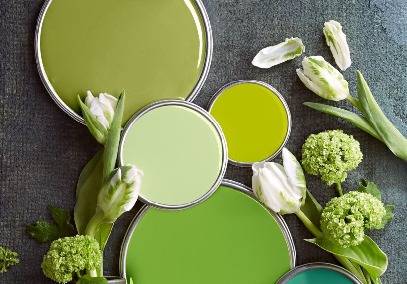
27 Earthy Color Palettes for a Beautiful Home
How to read these: Each palette lists 4–5 colors you can split into 60–30–10 (plus neutrals). Use the “Try it” idea to picture it in a real room.
1) Desert Sand + Cream + Cognac + Charcoal
- Desert sand (soft beige)
- Creamy white
- Cognac leather
- Charcoal gray
Try it: Beige walls, cream trim, a cognac chair, and charcoal accents in hardware and frames.
2) Oatmeal + Warm Greige + Olive + Brass
- Oatmeal
- Warm greige
- Muted olive
- Brushed brass
Try it: Greige walls, oatmeal sofa, olive pillows, brass lighting for a “soft-but-grown-up” living room.
3) Linen White + Sandstone + Camel + Black
- Linen white
- Sandstone tan
- Camel
- Matte black
Try it: A bright neutral base with camel textiles and crisp black accents to keep it modern.
4) Warm Taupe + Mushroom + Clay + Off-White
- Warm taupe
- Mushroom
- Soft clay
- Off-white
Try it: Bedroom walls in taupe, mushroom bedding, clay throw, off-white curtainscozy with zero drama.
5) Stone Gray + Warm White + Driftwood + Iron
- Stone gray
- Warm white
- Driftwood brown
- Iron (deep gray/black)
Try it: Great for open plans with lots of wood flooringstone walls, warm white trim, iron fixtures.
6) Cream + Butterscotch + Tobacco Brown + Deep Teal
- Cream
- Butterscotch (muted gold)
- Tobacco brown
- Deep teal
Try it: Cream walls, tobacco furniture, butterscotch accents, teal art for a “collected” look.
7) Sage + Warm White + Natural Oak + Soft Black
- Sage green
- Warm white
- Natural oak
- Soft black
Try it: Kitchen cabinets in sage, warm white walls, oak shelves, black pullsfresh without feeling trendy.
8) Eucalyptus + Stone + Linen + Aged Brass
- Eucalyptus green
- Stone beige
- Linen
- Aged brass
Try it: Perfect for bathroomsgreen vanity, stone tile, linen towels, brass mirror.
9) Olive + Cream + Rust + Walnut
- Olive
- Cream
- Rust
- Walnut brown
Try it: Olive accent wall, cream sofa, rust pillows, walnut coffee tablewarm and grounded.
10) Moss + Putty + Off-White + Bronze
- Moss green
- Putty (gray-beige)
- Off-white
- Bronze
Try it: A calm office palette that looks “serious” without being boring.
11) Forest Green + Warm Beige + Cognac + Ivory
- Forest green
- Warm beige
- Cognac
- Ivory
Try it: Dining room: forest walls, ivory ceiling, beige rug, cognac chairs. Instant mood.
12) Soft Mint-Sage + Cream + Light Oak + Clay Pink
- Mint-sage
- Cream
- Light oak
- Clay pink
Try it: Nursery or guest room that feels soothing but not “baby-ish.”
13) Terracotta + Warm White + Sand + Olive
- Terracotta
- Warm white
- Sand
- Olive
Try it: Terracotta art and textiles are an easy way to try this palette without committing to full walls.
14) Clay + Cream + Charcoal + Light Wood
- Clay (muted orange-red)
- Cream
- Charcoal
- Light wood
Try it: Clay as the accent (10%) keeps it warm, while charcoal prevents “too sweet.”
15) Sunbaked Peach + Taupe + Olive + Matte Black
- Sunbaked peach
- Taupe
- Olive
- Matte black
Try it: Entryway or powder roomsmall spaces can handle bolder earth tones beautifully.
16) Rust + Camel + Bone + Deep Green
- Rust
- Camel
- Bone white
- Deep green
Try it: Southwestern-inspired without going full “theme.” Add woven textures and you’re done.
17) Brick Red + Warm White + Walnut + Brass
- Brick red
- Warm white
- Walnut
- Brass
Try it: Great for libraries/reading nooksbrick feels cozy when balanced with warm white and wood.
18) Burnt Sienna + Cream + Denim Blue + Dark Brown
- Burnt sienna
- Cream
- Denim blue
- Dark brown
Try it: Denim blue makes warm reds look intentional, not accidental.
19) Cocoa + Warm Beige + Ivory + Copper
- Cocoa brown
- Warm beige
- Ivory
- Copper
Try it: Living room: cocoa accent wall, beige sofa, ivory rug, copper lamps for warmth that glows at night.
20) Espresso + Sand + Sage + Antique Brass
- Espresso
- Sand
- Sage
- Antique brass
Try it: Ideal if you have dark wood floorsespresso ties everything together instead of fighting it.
21) Slate + Mushroom + Warm White + Terracotta
- Slate gray
- Mushroom
- Warm white
- Terracotta
Try it: A modern, moody palette where terracotta acts like a small “spark” rather than the whole fire.
22) Deep Olive + Cocoa + Bone + Ocher
- Deep olive
- Cocoa
- Bone
- Ocher
Try it: Add ocher in art or a single chairjust enough to keep the room from going too serious.
23) Ink Black + Warm White + Natural Wood + Clay
- Ink black
- Warm white
- Natural wood
- Clay
Try it: If you love contrast but want warmth, clay is the perfect “softener.”
24) Sea Glass Blue + Sand + Warm White + Driftwood
- Sea glass blue
- Sand
- Warm white
- Driftwood
Try it: Coastal without the nautical clichésmore “beach walk,” less “anchor decor.”
25) Dusty Blue + Clay + Cream + Brass
- Dusty blue
- Clay
- Cream
- Brass
Try it: Blue and clay are natural opposites that make each other pop in a calm, mature way.
26) Stormy Blue-Gray + Warm Greige + Walnut + Linen
- Stormy blue-gray
- Warm greige
- Walnut
- Linen
Try it: Bedrooms love this paletteserene, cozy, and forgiving in low light.
27) Sage + Soft Blue + Warm White + Terracotta
- Sage
- Soft, watery blue
- Warm white
- Terracotta
Try it: This is an easy whole-home paletterepeat sage/white everywhere, then rotate blue and terracotta by room.
How to Make Earthy Palettes Look Expensive (Even If Your Sofa Was on Sale)
- Start with what can’t change: floors, countertops, tile, and big furniture. Match your palette to those undertones first.
- Sample like a pro: test large swatches on multiple walls and check morning, afternoon, and nighttime lighting.
- Repeat colors three times: a color looks “intentional” when it shows up in at least three places (pillow, art, and a vase, for example).
- Keep saturation consistent: earthy works best when most colors are slightly muted, with one deeper accent for contrast.
- Use plants as a “free” color: greenery automatically ties earthy palettes together and adds life.
of Real-World Experience (A.K.A. What Happens After You Actually Live With These Colors)
The first time you commit to an earthy palette, you learn a humbling truth: paint chips are liars. Not malicious liarsmore like that friend who says, “I’m five minutes away,” while still in the shower. On the chip, a warm greige looks perfectly balanced. On your wall at 7 p.m., it might suddenly reveal a secret hobby of looking faintly purple. That’s not you being picky. That’s lighting doing what lighting does: changing everything like it’s auditioning for a drama series.
Once you get past the sampling phase (and the brief moment where your hallway resembles a modern art installation of rectangles), earthy colors start to earn their keep. Warm neutrals are the peacekeepers of a home: they don’t pick fights with wood tones, they don’t freak out when you bring in a patterned rug, and they let your furniture be the star without demanding applause. Even better, they tend to make rooms feel softerlike the visual equivalent of putting on a sweatshirt you’ve owned since forever but refuses to fall apart.
Greens are where the “beautiful home” part really kicks in. A sage or olive in the right spot can make a room feel designed, even if the only other upgrades were “I replaced one lightbulb” and “I moved the plant to where it can’t die as fast.” The funny part is that green behaves like a neutral when it’s mutedespecially in spaces with natural texturesso it feels bold and safe at the same time. It’s the introvert’s version of a statement color.
Terracotta and clay tones come with a small warning label: they’re addictive. You start with one rust pillow, and suddenly you’re considering a clay accent wall, then a terracotta lamp, and then you’re googling “how to hide a fifth throw blanket from my family.” But these colors have a magic trick: they glow. In warm evening light, they make a room feel welcoming and lived-inlike you meant to host friends, even if you’re actually eating cereal for dinner while standing over the sink.
My biggest real-life takeaway? Earthy palettes are less about “perfect” and more about “cohesive.” When the undertones match, when the textures feel natural, and when you repeat a few key shades across rooms, your home starts to feel like it has a point of view. Not a loud one. More like a calm, confident one that says, “Yes, I own coasters. No, I don’t panic when trends change.”
Conclusion
Earthy color palettes work because nature already did the hard design work for us. Choose a grounded base, respect undertones and light, then layer in texture and small accents. Whether you go full desert neutrals or lean into greens and clay, your home will feel warmer, calmer, and more pulled togetherwithout needing a total renovation.