Table of Contents >> Show >> Hide
- How to Use Warm Color Palettes Without Overheating the Vibe
- 31 Warm Color Palettes, Room by Room
- Living Room
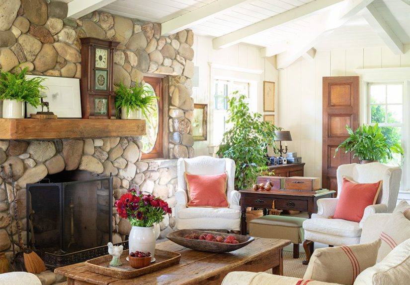
- 1. Cream + Camel + Cinnamon
- 2. Greige + Terracotta + Walnut
- 3. Soft Peach + Ivory + Burnished Gold
- 4. Mushroom Taupe + Rust + Warm White
- Kitchen
- 5. Buttercream + Sage-Tan + Copper
- 6. Warm White + Honey Oak + Clay
- 7. Apricot Beige + Espresso + Brass
- Dining Room
- 8. Cinnamon Red + Taupe + Antique Gold
- 9. Camel + Olive + Cream
- 10. Dusty Peach + Mocha + Linen
- Primary Bedroom
- 11. Warm White + Sand + Caramel
- 12. Blush Beige + Cocoa + Brass
- 13. Clay Pink + Oatmeal + Chestnut
- Guest Bedroom
- 14. Creamy White + Taupe + Terracotta
- 15. Pale Honey + Mushroom + Warm Gray
- Nursery
- 16. Peach Cream + Biscuit + Soft Olive
- 17. Butter Beige + Dusty Rose + Warm White
- Kids’ Room
- 18. Apricot + Cinnamon + Cream
- 19. Golden Tan + Teal Accent + Ivory
- Home Office
- 20. Toasted Beige + Walnut + Rust
- 21. Warm Greige + Cognac + Cream
- Bathroom
- 22. Ivory + Sandstone + Brushed Brass
- 23. Pale Clay + Cream + Walnut
- Powder Room
- 24. Rust + Pink Beige + Blackened Bronze
- 25. Mocha + Cream + Aged Brass
- Laundry Room
- 26. Butter Yellow + White + Natural Wood
- Mudroom
- 27. Saddle Brown + Greige + Cream
- Entryway
- 28. Warm White + Tan + Terracotta
- Hallway
- 29. Oatmeal + Camel + Soft Bronze
- Family Room or Den
- 30. Deep Taupe + Rust + Camel
- Sunroom or Reading Nook
- 31. Cream + Honey + Soft Olive
- Tips for Choosing the Right Warm Palette for Your Home
- Real-Life Experience: Living With Warm Color Palettes
- Conclusion
If your home has ever felt a little too cold, a little too gray, or a little too “Why does this room look like a waiting area for a dentist who hates joy?” then warm color palettes may be your new best friend. Warm colors have a talent for making spaces feel welcoming, grounded, and lived-in in the best possible way. They can turn a stark room into a cozy retreat, a bland kitchen into the heart of the house, and a forgettable hallway into a graceful connector that actually deserves a second glance.
The beauty of a warm palette is that it is not limited to loud reds or pumpkin-orange drama. Warm color schemes can be subtle, elegant, and surprisingly flexible. Think creamy whites, sandy beige, caramel, clay, mushroom taupe, muted peach, cinnamon, rust, honey, and soft olive. These shades work across decorating styles, too. A modern home can feel softer with warm greige and tan. A farmhouse kitchen can glow in buttercream and terracotta. A traditional dining room can look downright regal in auburn and antique gold.
In this guide, you will find 31 warm color palettes for every room in the house, along with practical ways to use them. Some are rich and dramatic. Some are light and airy. All of them are designed to help you build a home that feels comfortable, inviting, and full of personality. Consider this your shortcut to a warmer home, minus the guesswork and the swatch-induced identity crisis.
How to Use Warm Color Palettes Without Overheating the Vibe
Before diving into the room-by-room inspiration, keep a few smart design principles in mind. First, warm does not mean dark. A room can feel warm with soft cream, pale peach, or light camel just as easily as it can with brick red or deep rust. Second, always pay attention to undertones. A beige with pink undertones will feel very different from a beige with yellow undertones. Third, think about balance. The classic 60-30-10 decorating rule still works beautifully: use one dominant color for most of the room, a secondary color for support, and a smaller accent color for contrast and personality.
Texture also matters. Warm paint colors look even richer when paired with wood, linen, rattan, leather, brushed brass, woven rugs, and matte ceramics. In other words, if you want your room to look like it gives great hugs, color and texture should work together.
31 Warm Color Palettes, Room by Room
Living Room
1. Cream + Camel + Cinnamon
This palette gives a living room instant softness. Cream walls keep the space bright, camel upholstery adds quiet richness, and cinnamon accents bring depth without making the room feel heavy. It works especially well with oak furniture and natural-fiber rugs.
2. Greige + Terracotta + Walnut
For a living room that feels modern but not sterile, start with warm greige, then layer in terracotta pillows, pottery, or artwork. Walnut wood tones ground everything beautifully. This is the palette for people who like minimalism but would also like it to have a pulse.
3. Soft Peach + Ivory + Burnished Gold
Soft peach can brighten dim living spaces without shouting for attention. Paired with ivory and burnished gold, it feels cheerful, flattering, and surprisingly sophisticated. Add boucle or velvet textures for extra coziness.
4. Mushroom Taupe + Rust + Warm White
This combination feels tailored, calm, and a little luxe. Mushroom taupe walls create a warm neutral backdrop, while rust accents add movement and personality. Warm white trim prevents the palette from becoming too muddy.
Kitchen
5. Buttercream + Sage-Tan + Copper
If you want a kitchen that feels sunny without turning into a lemon advertisement, buttercream is a smart choice. Pair it with muted green-tan cabinetry or accents and warm copper details for a palette that feels fresh, homey, and timeless.
6. Warm White + Honey Oak + Clay
This palette is ideal for kitchens with natural wood cabinets or open shelving. Warm white walls let the honey oak glow, while clay accessories or a backsplash add earthy warmth. It is calm, welcoming, and very easy to live with.
7. Apricot Beige + Espresso + Brass
Apricot beige softens a kitchen and flatters stone countertops. Espresso details add contrast, while brass hardware brings warmth and polish. The overall effect is elegant but not fussy.
Dining Room
8. Cinnamon Red + Taupe + Antique Gold
Dining rooms can handle a little drama, and this palette knows it. Cinnamon red creates intimacy, taupe balances the intensity, and antique gold lighting or frames add a refined finish. This is dinner-party energy in color form.
9. Camel + Olive + Cream
Camel walls or upholstery make a dining room feel grounded and sophisticated. Olive adds an earthy accent, while cream keeps things from getting too serious. It is warm, relaxed, and excellent with wood tables.
10. Dusty Peach + Mocha + Linen
If you want a softer take on warm color palettes, dusty peach is a winner. Mocha adds depth, linen tones keep things light, and the result feels romantic without becoming sugary.
Primary Bedroom
11. Warm White + Sand + Caramel
This is the definition of easy comfort. Warm white walls, sand bedding, and caramel leather or wood accents create a bedroom that feels restful and grown-up. It is quiet, layered, and far from boring.
12. Blush Beige + Cocoa + Brass
Blush beige adds subtle warmth and makes skin tones look fantastic, which is always appreciated in a bedroom. Cocoa anchors the palette, and brass lighting gives it a soft glow. Elegant, cozy, and low effort in the best way.
13. Clay Pink + Oatmeal + Chestnut
Clay pink is warmer and more grounded than a typical pastel. With oatmeal textiles and chestnut wood, it becomes a restful palette that feels stylish instead of trendy. Add woven textures for even more warmth.
Guest Bedroom
14. Creamy White + Taupe + Terracotta
This guest room palette feels welcoming from the moment someone drops their suitcase. Creamy white keeps things airy, taupe adds softness, and terracotta gives the room character. Guests may start checking local real estate.
15. Pale Honey + Mushroom + Warm Gray
Pale honey adds gentle color without overwhelming a smaller room. Mushroom tones bring sophistication, and warm gray keeps the look polished. It is perfect for a guest room that needs to feel flexible and calm.
Nursery
16. Peach Cream + Biscuit + Soft Olive
This palette is sweet without becoming candy-coated. Peach cream feels gentle, biscuit adds softness, and soft olive introduces a natural accent that grows well with the room over time.
17. Butter Beige + Dusty Rose + Warm White
Butter beige is one of the best nursery neutrals because it feels sunny and soothing at the same time. Dusty rose adds tenderness, while warm white keeps the palette breathable and clean.
Kids’ Room
18. Apricot + Cinnamon + Cream
This lively combination is full of personality but still feels warm and grounded. Apricot brightens the room, cinnamon adds energy, and cream keeps the whole scheme from bouncing off the walls.
19. Golden Tan + Teal Accent + Ivory
Yes, a warm palette can handle a cool accent. Golden tan and ivory create the warm base, while a small touch of teal in bedding or art gives the room fun contrast. Think playful, not chaotic.
Home Office
20. Toasted Beige + Walnut + Rust
Home offices benefit from warmth because sterile spaces often kill creativity faster than a broken coffee machine. Toasted beige keeps the room focused, walnut adds substance, and rust introduces just enough energy to stay inspired.
21. Warm Greige + Cognac + Cream
For a more polished office, warm greige offers flexibility, cognac leather brings richness, and cream lightens the mood. This palette is excellent for video calls because it looks smart without feeling stark.
Bathroom
22. Ivory + Sandstone + Brushed Brass
Bathrooms often look cleaner and more expensive in soft, warm neutrals. Ivory walls, sandstone tile or accessories, and brushed brass fixtures create a calm, spa-like environment with just enough warmth to avoid a clinical look.
23. Pale Clay + Cream + Walnut
If you want the bathroom to feel more custom, pale clay is a great alternative to plain beige. Cream keeps it soft, and walnut vanities or shelving add warmth and depth.
Powder Room
24. Rust + Pink Beige + Blackened Bronze
Powder rooms are the perfect place to be a little bold. Rust walls can look dramatic and inviting, especially with pink-beige trim or wallpaper details. Blackened bronze gives the palette an edge.
25. Mocha + Cream + Aged Brass
Mocha can make a small powder room feel cocooning rather than cramped when paired with creamy trim and warm metallics. This one feels moody, stylish, and more memorable than another forgettable gray box.
Laundry Room
26. Butter Yellow + White + Natural Wood
Laundry is never exciting, but the room can at least pretend to be cheerful. Butter yellow brings light and optimism, white keeps it fresh, and natural wood adds warmth and a casual, welcoming tone.
Mudroom
27. Saddle Brown + Greige + Cream
Mudrooms need durability and warmth. Saddle brown on benches or cabinetry hides wear well, greige on the walls softens the scheme, and cream trim keeps it from feeling heavy. It is hardworking and handsome.
Entryway
28. Warm White + Tan + Terracotta
Your entryway sets the mood for the whole house, so make it count. Warm white opens the space, tan brings stability, and terracotta in art, runners, or pottery gives guests a friendly first impression.
Hallway
29. Oatmeal + Camel + Soft Bronze
Hallways often get ignored, which is rude considering how much traffic they handle. Oatmeal walls brighten the passage, camel accents add warmth, and soft bronze lighting turns the corridor into part of the design, not an afterthought.
Family Room or Den
30. Deep Taupe + Rust + Camel
This palette is made for movie nights, board games, and the kind of sofa you disappear into for three hours by accident. Deep taupe creates intimacy, rust adds richness, and camel keeps things approachable.
Sunroom or Reading Nook
31. Cream + Honey + Soft Olive
In a bright space, cream walls let natural light bounce around, honey tones bring glow, and soft olive adds a grounded, organic finish. It feels sunny, layered, and wonderfully relaxed.
Tips for Choosing the Right Warm Palette for Your Home
When testing warm paint colors, look at them in morning light, afternoon light, and lamplight. A color that seems creamy at noon can turn yellow at sunset or pink under artificial lighting. Always test large swatches on more than one wall. Warm colors also respond strongly to nearby surfaces, so flooring, tile, cabinets, and upholstery will influence what you see.
Another smart move is to repeat one warm note throughout the home. Maybe it is terracotta in art, caramel in wood tones, or creamy off-white on trim. That repeating thread helps the whole house feel connected even when each room has its own personality. You do not want your home to feel like 11 strangers rented one floor plan together and made separate decisions in the paint aisle.
Finally, remember that the best warm color palettes are not about chasing trends. They are about creating rooms that feel good to live in. If a palette makes your house feel brighter, calmer, softer, or more welcoming, it is doing its job beautifully.
Real-Life Experience: Living With Warm Color Palettes
One of the most interesting things about warm color palettes is how differently they feel once you actually live with them. On paper, a shade like greige or sandy beige can sound safe, almost boring. In real life, though, those colors often become the quiet heroes of a home. They change with the light, flatter wood furniture, make textiles feel richer, and create a background that is easy to decorate around. A living room painted in a warm neutral usually feels finished faster because almost everything you bring into it looks intentional.
People also tend to underestimate how emotional color can be in daily life. A warm kitchen feels friendlier at 7 a.m. when you are making coffee with one eye open and the personality of a disappointed potato. A terracotta-accented dining room can make weeknight meals feel more special. A bedroom in warm white and caramel can feel more restful at night because the room does not glare back at you. These are not huge, dramatic transformations. They are small environmental upgrades that quietly improve how a home functions and feels.
Another common experience is discovering that warm palettes are more flexible than expected. Many homeowners worry that warm colors will feel too traditional, too dark, or too orange. In practice, the right warm palette can look modern, minimal, rustic, coastal, classic, or eclectic depending on the materials around it. Warm white with pale oak feels Scandinavian. Clay and walnut feel earthy and contemporary. Camel and brass can read polished and upscale. The palette sets the mood, but the styling tells the full story.
There is also a practical advantage. Warm rooms often feel more forgiving. Slight scuffs, shadows, and everyday wear tend to blend more naturally into creamy, earthy, and mid-toned surfaces than into stark white or icy gray spaces. That matters in family rooms, hallways, mudrooms, and kitchens where real life happens. Beautiful design is great, but beautiful design that survives shoes, backpacks, pets, snack crumbs, and a mysteriously sticky doorknob is even better.
Many people who switch from cooler palettes to warmer ones say the house starts to feel more personal. The space looks less like a showroom and more like a home. Photographs feel richer against the walls. Wood furniture suddenly makes sense. Lamps cast a prettier glow in the evening. Even seasonal decorating becomes easier because warm palettes play nicely with autumn tones, holiday greenery, spring florals, and summer textures.
Of course, warm color palettes still need restraint. Go too bold in every room, and the house can start to feel visually crowded. The most successful lived-in homes usually mix stronger warm shades with breathing room: warm white trim, neutral upholstery, natural textures, and thoughtful repetition. That balance keeps the home from feeling themed. You want “cozy and collected,” not “a pumpkin spice latte exploded in the foyer.”
In the end, the experience of living with warm color palettes is less about following strict rules and more about creating comfort. The best rooms are the ones people want to stay in a little longer. They invite conversation, rest, and everyday routines without feeling stiff or overdesigned. Warm palettes do that beautifully. They soften hard edges, flatter real life, and make a house feel like it is genuinely happy you came home.
Conclusion
Warm color palettes work because they make rooms feel human. They add comfort, character, and an easy sense of welcome that suits nearly every style of home. Whether you lean toward creamy neutrals, earthy terracottas, buttery yellows, or rich caramel browns, there is a warm palette that can bring out the best in every room. Start with the mood you want, test colors in real light, layer in texture, and let your home get a little warmer, softer, and much more inviting.