Table of Contents >> Show >> Hide
- How to Pick a Living Room Color Scheme That Actually Works
- 33 Beautiful Living Room Color Schemes
- 1) Warm White + Natural Oak + Black
- 2) Cream + Camel + Soft Charcoal
- 3) Greige + Crisp White + Brass
- 4) Beige + Sage + Warm Wood
- 5) Soft Taupe + Dusty Rose + Deep Brown
- 6) Buttercream + Linen + Walnut
- 7) Blue-Gray + White + Sand
- 8) Navy + Ivory + Cognac
- 9) Forest Green + Cream + Antique Gold
- 10) Olive + Clay + Off-White
- 11) Chocolate Brown + Cream + Pale Blue
- 12) Charcoal + Warm White + Rust
- 13) Black + Cream + Natural Jute
- 14) Stone Gray + White + Eucalyptus Green
- 15) Soft Black (Near-Black) + Beige + Brass
- 16) Terracotta + Cream + Dark Wood
- 17) Peach + Warm White + Olive
- 18) Blush + Oatmeal + Black
- 19) Dusty Lavender + Warm Gray + Cream
- 20) Sky Blue + White + Light Wood
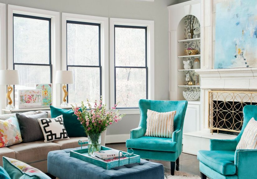
- 21) Teal + Cream + Walnut
- 22) Aqua + Gray + Navy
- 23) Indigo + Tan + White
- 24) Mustard + Navy + Cream
- 25) Sunny Yellow + Soft White + Warm Gray
- 26) Mocha Brown + Cream + Soft Black
- 27) Oxblood + Blush + Antique Brass
- 28) Plum + Taupe + Warm White
- 29) Coral + Sand + White
- 30) Charcoal Blue + Warm White + Wood
- 31) Graphite + Soft White + Emerald
- 32) Cloudy White + Silver + Pale Greige
- 33) Chartreuse Accent + Neutral Base + Dark Wood
- Make Any Color Scheme Look Designer-Approved
- Common Color Mistakes (and How to Avoid Them)
- Real-Life Experiences With Living Room Color Schemes (500+ Words)
- Conclusion
Choosing a living room color scheme is a little like picking a personality for your house.
Do you want “calm and collected,” “warm and welcoming,” or “I host game night and I’m not afraid of drama”?
The good news: you don’t need to be born with an interior designer gene (or a secret Pinterest board named
“Vibes Only”) to land on a palette that looks pulled together and feels great to live with.
Below are 33 beautiful living room color schemeseach with a clear mood, a practical way to use the colors
(walls, upholstery, accents), and styling tips so it doesn’t turn into “oops, why does my couch look purple now?”
energy. You’ll also find guidance on balancing a palette, dealing with tricky lighting, and making any scheme
look more expensive than it has any right to.
How to Pick a Living Room Color Scheme That Actually Works
Start with the room you have, not the room you wish you had
Natural light is the ultimate co-designer. North-facing rooms tend to lean cooler; south-facing rooms often
amplify warmth. That means the same “greige” can read cozy in one home and slightly gloomy in another.
Before committing, sample paint on multiple walls and check it morning, afternoon, and eveningbecause
living rooms love to shape-shift like they’re auditioning for a magic show.
Use a simple ratio so the palette feels balanced
A classic guideline is the 60-30-10 approach: roughly 60% main color (often walls), 30% secondary color
(large furniture/rugs), and 10% accent color (pillows, art, accessories). It’s flexible, not a law, but it keeps
a scheme from feeling either chaotic or painfully flat.
Decide on a vibe: airy, grounded, moody, or playful
If you want “airy,” lean into warm whites, soft neutrals, and light woods. If you want “grounded,” bring in
earthy tones like taupe, clay, olive, or chocolate. If you want “moody,” go deeper with navy, forest green,
charcoal, or oxbloodand add warm lighting and texture so it feels cozy, not cave-like.
Undertones matter more than the color name
“White” can be creamy, crisp, or slightly gray. “Blue” can lean teal, periwinkle, or slate. To avoid clashing,
match undertones: warm with warm (creamy whites, camel, terracotta) or cool with cool (blue-grays, crisp
whites, charcoal). If you mix, do it intentionally with a bridge color (like greige or natural wood).
33 Beautiful Living Room Color Schemes
Each scheme below includes: Core colors (your main players), Best for (where it shines),
and a Quick styling move (the small thing that makes it feel designed).
1) Warm White + Natural Oak + Black
Core colors: warm white, honey oak, matte black.
Best for: bright, timeless living rooms that still feel lived-in.
Quick styling move: add black in at least three places (frame, lamp, hardware) so it looks intentional.
2) Cream + Camel + Soft Charcoal
Core colors: cream, camel leather, soft charcoal.
Best for: “quiet luxury” without trying too hard.
Quick styling move: layer texturesbouclé, linen, and a nubby rugto keep neutrals from feeling bland.
3) Greige + Crisp White + Brass
Core colors: greige, crisp white trim, brushed brass.
Best for: transitional spaces that need polish and warmth.
Quick styling move: choose one metal finish (brass) and repeat it across lighting and small decor.
4) Beige + Sage + Warm Wood
Core colors: beige, sage green, walnut or oak.
Best for: relaxed, nature-forward living rooms.
Quick styling move: add one darker green accent (olive pillow, botanical art) for depth.
5) Soft Taupe + Dusty Rose + Deep Brown
Core colors: soft taupe, dusty rose, deep espresso brown.
Best for: warm, flattering rooms (great for skin tones and photos).
Quick styling move: keep rose mostly in textiles; let taupe do the heavy lifting on walls.
6) Buttercream + Linen + Walnut
Core colors: buttercream, natural linen, walnut wood.
Best for: cozy spaces that still feel light.
Quick styling move: add a vintage-style rug with muted reds for a “collected” look.
7) Blue-Gray + White + Sand
Core colors: blue-gray, white, sandy beige.
Best for: calm living rooms that avoid stark coldness.
Quick styling move: add warm woods or woven textures so the blue-gray reads soothing, not chilly.
8) Navy + Ivory + Cognac
Core colors: navy, ivory, cognac leather.
Best for: classic, high-contrast spaces with instant sophistication.
Quick styling move: use ivory curtains and a light rug to balance navy walls or a navy feature wall.
9) Forest Green + Cream + Antique Gold
Core colors: forest green, cream, antique gold.
Best for: moody rooms that still feel elegant and welcoming.
Quick styling move: hang art with warmer tones (ochre, rust) so green feels richer.
10) Olive + Clay + Off-White
Core colors: olive, clay/terracotta, off-white.
Best for: earthy palettes with a modern edge.
Quick styling move: add black accents sparingly (one lamp, one frame) to sharpen the look.
11) Chocolate Brown + Cream + Pale Blue
Core colors: chocolate brown, cream, pale blue.
Best for: a cozy “hug” of a living room that doesn’t feel heavy.
Quick styling move: let pale blue appear in glassware or art for an airy, light-reflecting effect.
12) Charcoal + Warm White + Rust
Core colors: charcoal, warm white, rust/copper.
Best for: modern spaces that want warmth without losing mood.
Quick styling move: choose a rust velvet pillow or chairit adds warmth fast and looks luxe.
13) Black + Cream + Natural Jute
Core colors: black, cream, jute/tan.
Best for: graphic, high-contrast minimalism with softness.
Quick styling move: use natural fiber rugs and baskets so the black reads chic, not severe.
14) Stone Gray + White + Eucalyptus Green
Core colors: stone gray, white, eucalyptus green.
Best for: subtle color that still feels fresh.
Quick styling move: introduce green through plants and one patterned pillow (not fifteen).
15) Soft Black (Near-Black) + Beige + Brass
Core colors: soft black, beige, brass.
Best for: dramatic spaces that feel warm instead of stark.
Quick styling move: choose warm bulbs and layered lampslighting is non-negotiable with dark walls.
16) Terracotta + Cream + Dark Wood
Core colors: terracotta, cream, dark wood.
Best for: Mediterranean or desert-inspired warmth.
Quick styling move: add a cream boucle chair for texture contrast against clay tones.
17) Peach + Warm White + Olive
Core colors: peach, warm white, olive.
Best for: friendly, sunny rooms (peach is basically happiness you can paint).
Quick styling move: keep peach on walls or a single statement piece; let olive anchor the palette.
18) Blush + Oatmeal + Black
Core colors: blush, oatmeal, black.
Best for: modern romantic without looking like a cupcake shop.
Quick styling move: use black as the “grown-up” elementthin frames, metal legs, or a bold coffee table.
19) Dusty Lavender + Warm Gray + Cream
Core colors: dusty lavender, warm gray, cream.
Best for: creative homes that want color but not chaos.
Quick styling move: pick a rug with lavender undertones so it feels integrated.
20) Sky Blue + White + Light Wood
Core colors: sky blue, white, light oak.
Best for: coastal or airy spaces that need brightness.
Quick styling move: add one deeper blue accent (navy throw) to keep sky blue from feeling too sweet.
21) Teal + Cream + Walnut
Core colors: teal, cream, walnut.
Best for: bold-but-warm living rooms.
Quick styling move: pair teal with warm metals (brass) so it feels inviting, not icy.
22) Aqua + Gray + Navy
Core colors: aqua, gray, navy.
Best for: cool palettes with depth and structure.
Quick styling move: keep aqua to accents or one wall; let navy do the grounding.
23) Indigo + Tan + White
Core colors: indigo, tan, white.
Best for: a modern take on classic Americana.
Quick styling move: add subtle pattern (stripe, small geometric) to keep it lively.
24) Mustard + Navy + Cream
Core colors: mustard, navy, cream.
Best for: energetic, personality-filled spaces.
Quick styling move: use mustard in controlled doses (one chair or a few pillows) so it feels curated.
25) Sunny Yellow + Soft White + Warm Gray
Core colors: sunny yellow, soft white, warm gray.
Best for: lifting a dim living room without going neon.
Quick styling move: add natural textures (rattan, woven shade) to keep yellow from feeling too sharp.
26) Mocha Brown + Cream + Soft Black
Core colors: mocha brown, cream, soft black.
Best for: warm, modern “coffeehouse” vibes at home.
Quick styling move: choose creamy whites instead of stark whites; it makes browns feel richer.
27) Oxblood + Blush + Antique Brass
Core colors: oxblood, blush, antique brass.
Best for: dramatic, elegant rooms with a boutique-hotel feel.
Quick styling move: keep oxblood to one wall or upholstery unless the room is very bright.
28) Plum + Taupe + Warm White
Core colors: plum, taupe, warm white.
Best for: a cozy, slightly unexpected palette that still feels sophisticated.
Quick styling move: add soft lighting (shaded lamps) to bring out plum’s richness.
29) Coral + Sand + White
Core colors: coral, sand, white.
Best for: cheerful, beachy warmth without themed décor.
Quick styling move: use coral in art and textiles; keep big pieces neutral.
30) Charcoal Blue + Warm White + Wood
Core colors: charcoal blue, warm white, medium wood tones.
Best for: a modern, calming palette that feels elevated.
Quick styling move: mix wood finishes thoughtfully (similar undertone, different depth) for a designer look.
31) Graphite + Soft White + Emerald
Core colors: graphite, soft white, emerald green.
Best for: sleek rooms that still want a jewel-tone punch.
Quick styling move: introduce emerald in velvet or glassit reads rich fast.
32) Cloudy White + Silver + Pale Greige
Core colors: airy white, soft silver, pale greige.
Best for: minimalist spaces that want softness, not sterility.
Quick styling move: add warmth through wood and textiles; otherwise it can feel a bit “showroom.”
33) Chartreuse Accent + Neutral Base + Dark Wood
Core colors: chartreuse (accent), warm neutral base, dark wood.
Best for: people who want a playful statement without repainting their entire life.
Quick styling move: keep chartreuse to one hero item (chair, art, lamp) and repeat it once subtly.
Make Any Color Scheme Look Designer-Approved
Use “bridge neutrals” when mixing warm and cool
If you love a cool color (like blue-gray) but your floors are warm oak, bridge them with a neutral that sits
in the middlethink greige, oatmeal, or soft taupe. It prevents that “my walls and floors are in separate bands”
problem.
Repeat your accent color three times
Designers often repeat an accent color around a room to make it feel cohesive: one in pillows, one in art, one
in a small object. That repetition turns “random pop of color” into “wow, this is so pulled together.”
Pick one “statement” and let everything else support it
Statement can mean a bold wall color, a colorful rug, or an iconic sofanot all three at once. When your living
room has one clear star, the scheme feels intentional (and your eyes get to relax).
Don’t ignore the ceiling
A white ceiling is classic, but not your only option. Soft color overhead can make a room feel cocooned and
cozy, especially in moody palettes. If you’re nervous, go one shade lighter than your wall color and see what
happenssometimes the ceiling is the most underrated “wow” moment.
Common Color Mistakes (and How to Avoid Them)
- Going too cool in a low-light room: balance with warm whites, wood, and warm lighting.
- Choosing a bold color without enough neutrals: give the eye a place to rest (rugs, curtains, big upholstery).
- Forgetting about sheen: flat/matte hides wall flaws; satin reflects more light; choose based on traffic and texture.
- Skipping samples: paint swatches lie. Your room tells the truth.
Real-Life Experiences With Living Room Color Schemes (500+ Words)
Color looks amazing on a mood board. Living with it is a different sportmore like a long relationship where
you discover someone’s little habits (like how your “soft white” becomes “mysterious beige” at 7 p.m.).
Here are a few real-life, lived-in experiences that tend to show up when people commit to living room color
schemesplus what they learn after the honeymoon phase.
Warm whites and creams feel effortless… until you realize you’ve created a backdrop that exposes every decision.
A warm white living room is the design equivalent of a crisp button-down shirt: it always looks good, but it
makes you notice the details. Suddenly, the wrong curtain rod finish is a whole situation. The upside is huge:
warm whites let art, plants, and wood tones shine, and they’re forgiving with seasonal décor. The trick most
people learn is to add texture earlywoven rugs, linen curtains, chunky throwsso the room feels cozy instead
of blank.
Moody colors (navy, forest, charcoal) are deeply cozyif you respect lighting.
People who go dark often say the room feels like a retreat. But the same people also discover that one overhead
ceiling light can ruin the vibe like a surprise pop quiz. The fix is layered lighting: a pair of lamps, maybe a
sconce, and warm bulbs. The bonus? Dark walls make brass, wood, and art look richer. It’s the fastest way to get
that “designer home” feeling without buying designer home things.
Earth tones are the easiest “live-with-it” colors, but they need contrast.
Olive, taupe, terracotta, and chocolate brown create a grounded feeling that doesn’t feel trendy in a fragile way.
A common experience, though, is that a fully earthy palette can start to feel a little too “same note” if there’s no
contrast. People usually solve this by adding a crisp elementblack accents, a warm white trim, a light rug, or a
brighter art piece. One punchy detail makes earth tones look intentional instead of accidental.
Pastels surprise people with how grown-up they can be.
Blush, dusty lavender, pale bluemany homeowners fear these will read “kid room.” In real life, the grown-up
version of pastel is all about muting and pairing: blush with black and walnut, lavender with warm gray and cream,
pale blue with sand and natural textures. The experience most people report is that these colors are incredibly
flattering and calming day-to-day. They also photograph beautifullyif you care about that kind of thing (and if you
don’t, your camera roll will care for you).
Bold accents are the safest way to be brave.
Not everyone wants to paint a whole living room chartreuse (and honestly, your future self might appreciate that).
A real-life pattern: people dip a toe in with one bold chair, a rug, or artand then they get confident. Accents are
“editable.” If you change your mind, you’re not repainting the entire room; you’re swapping a pillow or reupholstering
one piece. It’s how many homes evolve into more personal, layered spaces over time.
The biggest takeaway from living with color is simple: the best palette isn’t the one that wins the internet.
It’s the one that makes you feel good on a normal Tuesdaywhen the coffee table is messy, the dog is asleep
in a sunbeam, and your living room looks like a place where life actually happens.
Conclusion
The best living room color schemes balance mood and function: a solid base (often a warm neutral), a secondary
color that supports your furniture and flooring, and an accent that brings personality. Whether you love airy
whites, earthy olives, bold navies, or playful pops of chartreuse, the “secret” is always the same: match undertones,
layer texture, and give the room great lighting. Do that, and your living room will look intentionallike you totally
meant for it to be this stylish all along.