Table of Contents >> Show >> Hide
- Why Cabinet Color Can Make a Small Kitchen Feel Bigger
- Before You Pick a Paint Chip: 3 Designer Rules That Matter
- The 5 Cabinet Colors Designers Use to “Expand” Small Kitchens
- 1) Warm Off-White: The “Make Everything Breathe” Neutral
- 2) Pale Yellow / Butter Yellow: The Sunbeam Trick
- 3) Mushroom / Putty / Light Greige: The “Blur the Edges” Master
- 4) Weathered Blue / Powder Blue / Gray-Blue: The Airy Recede Effect
- 5) Dusty Sage / Green-Gray: Calm, Cozy, and Surprisingly Space-Boosting
- Fast Ways to Multiply the “Bigger Kitchen” Effect (Without Changing the Color List)
- Conclusion: Pick the Color That Works With Your Light (Not Against It)
- Experiences from Real Homes: What People Notice After Painting Their Cabinets
- Experience 1: The Warm Off-White “Envelope” Makes the Room Feel Continuous
- Experience 2: Pale Yellow Feels Like You Added Morning Light
- Experience 3: Mushroom/Putty Tones Make the Kitchen Feel “Designed,” Not Just Painted
- Experience 4: Soft Blue Cabinets Change the “Temperature” of the Space
- Experience 5: Dusty Sage Makes Small Kitchens Feel Calmer (Which People Interpret as “Bigger”)
Small kitchens have a special talent: they can feel cozy in the “warm croissant” way… or cramped in the “I just opened the dishwasher into my shin again” way.
The good news is you don’t need a sledgehammer to get the first vibe. You need a smart cabinet color.
Designers consistently point to a few color families that “stretch” a tight kitchen visually by reflecting light, lowering contrast lines, and helping your eye glide around the room instead of
stopping at every edge. Think of it like spanx for your sightlinesupportive, subtle, and best used with good lighting.
Why Cabinet Color Can Make a Small Kitchen Feel Bigger
In a small kitchen, cabinets take up a huge portion of what you see. So when cabinet color is too dark, too high-contrast, or too “loud,” it can chop the space into visual chunks.
On the flip side, the right cabinet color can:
- Reflect more light (so corners don’t feel like a cave)
- Soften boundaries (fewer hard stops = more “flow”)
- Create depth (so the room feels layered, not flat)
- Reduce visual noise (so your brain stops screaming “TIGHT SPACE!”)
Before You Pick a Paint Chip: 3 Designer Rules That Matter
1) Match undertones to your fixed finishes
Countertops, floors, and backsplash tile don’t change (unless you’re doing that kind of renovation). Your cabinet color should play nice with them.
If your counters lean warm (cream, beige, gold), you’ll usually want a warm-leaning cabinet shade. If they lean cool (gray, blue, crisp white), cooler cabinet shades often look cleaner.
2) Lower contrast = bigger feel
High-contrast kitchens photograph beautifully, but in real life, strong dark/light breaks can make a small kitchen feel segmented. Softer contrastespecially between cabinets and wallshelps the
room read as one continuous volume.
3) Finish counts almost as much as color
You don’t need a mirror shine, but a satin or soft semi-gloss on cabinets can bounce light subtly and help the color do its “expand the room” magic.
Flat finishes can look chic, but they tend to absorb light and show grime faster in a high-traffic kitchen.
The 5 Cabinet Colors Designers Use to “Expand” Small Kitchens
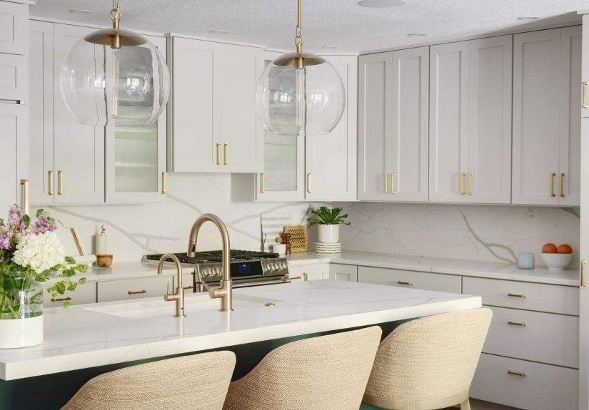
1) Warm Off-White: The “Make Everything Breathe” Neutral
If small kitchens had a universal translator, warm off-white would be it. Designers love warm whites and off-whites because they reflect light without feeling sterile.
The key is choosing a white with a gentle creamy or sandy undertonesomething that looks welcoming even under harsh overhead bulbs.
Why it makes a small kitchen feel bigger: Warm off-white acts like a light multiplier. It brightens shadowy corners and keeps sightlines open. Better yet, it doesn’t create a hard
outline around every cabinet door, which helps your eyes move more smoothly around the space.
Make it work harder: If you want the maximum “bigger kitchen” illusion, use a version of the same warm off-white on the walls (and even the ceiling). A soft, nearly monochrome envelope
reduces visual stop-and-start, which is exactly what small rooms need.
Pair it with: light oak, warm metals (brass, champagne bronze), creamy quartz, or a simple white backsplash that won’t compete.
Example shade families (for inspiration): “White Dove”-style soft whites, “Pure White”-style balanced whites, and creamy “Pointing”-style off-whites.
(Always sample in your lightingwhites can shapeshift like they’re training for a spy movie.)
2) Pale Yellow / Butter Yellow: The Sunbeam Trick
Pale yellow is the friend who shows up with coffee and a compliment. It’s warm, it’s cheerful, and in a small kitchen it can behave like tinted lightespecially when you choose a softer, cooler-leaning
yellow rather than a loud school-bus shade.
Why it makes a small kitchen feel bigger: Light yellows create a gentle glow that keeps the space from feeling boxed in. They also add warmth without the heavy visual weight that some
beiges can bring. In narrow kitchens, that “sunny wash” can make walls feel less close.
Best use cases: Galley kitchens, kitchens with limited natural light, and kitchens that feel cold because of gray floors or stainless-heavy finishes.
Pair it with: white walls, pale counters, black or dark soapstone accents for contrast, and warm wood. If you want the look to stay timeless, keep the rest of the palette simple
and let the yellow be the personalitynot the chaos.
Designer move: Use pale yellow on perimeter cabinets and reserve a slightly deeper tone for a pantry door or island. It adds dimension without shrinking the room.
3) Mushroom / Putty / Light Greige: The “Blur the Edges” Master
Mushroom and putty tones sit in that magical middle ground: not white, not beige, not gray, not brownyet somehow all of them. Designers like these taupe-leaning neutrals because they’re
low contrast and quietly sophisticated, which is a dream combo for small spaces.
Why it makes a small kitchen feel bigger: These mid-value neutrals can “melt” boundaries instead of emphasizing them.
When cabinets and walls live in a similar light range, your eye doesn’t keep hitting visual speed bumps. The room reads as layered and continuousmore volume, less box.
How to pick the right one: Look at your countertop and backsplash first.
If you have warm stone (ivory, tan, gold flecks), choose a putty with warm undertones. If you have cooler marble or concrete looks, pick a greige with a whisper of gray.
Pair it with: warm white walls, brushed nickel or aged brass hardware, and a backsplash with subtle movement (think handmade-style white tile) so the kitchen feels textured, not flat.
Pro tip: If you’re nervous it’ll look “blah,” bring in contrast with lighting and hardware, not more paint colors.
Small kitchens usually don’t need extra dramathey need fewer interruptions.
4) Weathered Blue / Powder Blue / Gray-Blue: The Airy Recede Effect
Blues can make a space feel open because cooler colors often appear to recede visually. In a small kitchen, that’s a cheat code. But the best “make it bigger” blues for cabinets aren’t super-saturated
navies (those can feel heavy). They’re softer blues with a bit of graywhat people call weathered blue, dusty blue, or powder blue.
Why it makes a small kitchen feel bigger: Soft blue brings “air” into a tight room. Pair it with white and you get gentle contrast that defines the cabinets without slicing the room into pieces.
Where it shines: Kitchens with minimal upper cabinetry (or open shelving), kitchens with lots of stainless steel, and any space that needs calm.
Blue is visually quiet, which helps reduce that cramped feeling.
Pair it with: crisp white walls, white or light quartz counters, and warm wood accents (cutting boards, stools, shelves). The wood keeps the blue from feeling chilly.
Small-kitchen bonus move: If you have a long, narrow kitchen, keep the darkest element on the floor (runner, tile) and let the upper half stay light.
That dark-to-light “graduation” can make ceilings feel higher and the room feel more balanced.
5) Dusty Sage / Green-Gray: Calm, Cozy, and Surprisingly Space-Boosting
Sage and green-gray tones are having a moment, but designers like them for more than trend value. In small kitchens, these shades can feel soft and breathableespecially when they’re muted
(think dusty, not neon).
Why it makes a small kitchen feel bigger: Muted green-grays lower visual noise. They don’t bounce light aggressively the way bright white can, but they also don’t “eat” light like deep colors.
Because they’re mid-value and desaturated, they tend to sit back visuallygiving you that receding effect without making the room feel dark.
Best pairings: warm whites, earthy wood floors, creamy counters, and matte black accents if you want a little edge.
Sage also looks great with handmade tile and natural textures, which keeps a small kitchen from feeling like a sterile shoebox.
Two-tone trick for tiny kitchens: Put sage on lower cabinets and keep uppers warm off-white. This draws the eye upward and makes the room feel tallerlike your kitchen just stood up straighter.
Shade inspiration: “Misted Green”-style pale green-grays, “Jogging Path”-style barely-green neutrals, and soft sage-blue blends like “Rushing River”-style tones.
Fast Ways to Multiply the “Bigger Kitchen” Effect (Without Changing the Color List)
- Go low-contrast: Use a wall color that’s close in tone to the cabinets so the room reads as one space.
- Use the right sheen: Satin/soft semi-gloss on cabinets reflects light and handles wipe-downs like a champ.
- Upgrade lighting: Under-cabinet lighting eliminates shadows that make kitchens feel smaller.
- Choose simpler hardware silhouettes: Chunky hardware can look busy in tight rooms; cleaner shapes feel calmer.
- Keep the backsplash light and continuous: Busy, high-contrast patterns can visually compress a small footprint.
Conclusion: Pick the Color That Works With Your Light (Not Against It)
“Ten times bigger” is dramatic, surebut the visual shift from the right cabinet color is real.
Warm off-white opens the room like a deep breath. Pale yellow adds a sunlit glow. Mushroom/putty tones blur edges and keep things flowing.
Soft blue creates airy depth. Dusty sage calms the chaos while still helping the space recede.
The best choice depends on your kitchen’s natural light, your fixed finishes, and the mood you want when you stumble in for a midnight snack.
(No judgment. The kitchen knows things. It keeps our secrets.)
Experiences from Real Homes: What People Notice After Painting Their Cabinets
These are common, repeated observations designers and homeowners share after small-kitchen cabinet paint projectsespecially in older homes, apartments, and compact layouts where every inch matters.
Consider them “field notes” you can borrow before you commit.
Experience 1: The Warm Off-White “Envelope” Makes the Room Feel Continuous
One of the most frequent reactions after a warm off-white cabinet repaint is: “Wait… did we move a wall?” Nothing structural changedyet the kitchen suddenly feels less segmented.
That’s usually because people also softened the contrast around the cabinets: a warm off-white on doors, a similar soft white on walls, and trim that doesn’t shout.
The result is an uninterrupted visual sweep. In small kitchens, that continuity matters more than any single “statement” feature.
A practical bonus shows up fast, too: warm off-whites hide everyday smudges a little better than stark, icy whites.
Homeowners often report they’re not constantly noticing fingerprints or little scuffs, which keeps the kitchen feeling calmer day-to-day.
Experience 2: Pale Yellow Feels Like You Added Morning Light
People who choose pale yellow (especially butter yellow) often describe the change as “happier” before they even say “bigger.”
In small kitchens that don’t get much sun, pale yellow acts like a mood lamp you didn’t have to plug in.
The space feels warmer, more welcoming, and less cave-likeparticularly in the late afternoon or winter months when natural light dips.
The key “experience lesson” homeowners share: keep everything else steady.
When pale yellow cabinets are paired with simple counters and a light backsplash, the kitchen feels bright and open.
When paired with multiple bold patterns, it can feel busy. In a small kitchen, calm reads as spacious.
Experience 3: Mushroom/Putty Tones Make the Kitchen Feel “Designed,” Not Just Painted
The most common surprise with mushroom/putty cabinet colors is how upscale they look once installedespecially next to stone counters.
Homeowners often say these tones feel less like “we painted to fix a problem” and more like “we planned a palette.”
That’s because putty neutrals pick up hints of surrounding materials: a warm counter, a wood floor, a brass handle.
The room feels cohesive, and cohesion makes small spaces feel larger.
Another repeated note: these shades are forgiving.
They don’t spotlight every shadow or seam, which is helpful in older kitchens where cabinet boxes and walls aren’t perfectly straight (because… houses are humble like that).
Experience 4: Soft Blue Cabinets Change the “Temperature” of the Space
Homeowners who go with a weathered blue or powder blue often notice the kitchen feels more “open” in a subtle waylike the room exhaled.
Blue tends to read as airy and clean, especially when paired with white walls. People also report the space feels less visually cluttered, even when the countertops aren’t perfectly styled.
That’s the quiet power of a cool, soft tone: it doesn’t compete with everything else.
A frequent success pattern: blue cabinets + warm wood accents.
When blue is balanced with wood stools, cutting boards, or shelves, the kitchen feels inviting rather than coldso it’s both spacious and livable.
Experience 5: Dusty Sage Makes Small Kitchens Feel Calmer (Which People Interpret as “Bigger”)
The most consistent feedback with sage and green-gray cabinets is emotional: people describe the kitchen as “less chaotic.”
That matters because your brain often translates “calm” into “spacious.” Muted green-grays don’t scream for attention, so the eye relaxes.
In compact kitchens where you can see everything at once, that softness is powerful.
Designers also note a practical advantage: sage is extremely flexible with materials.
It plays well with warm whites, wood, black accents, and many countertop stonesso homeowners don’t feel trapped if they want to update hardware or lighting later.
In other words: the kitchen feels bigger now and easier to live with later. That’s a win you can actually cook in.