
Table of Contents >> Show >> Hide
- What counts as a CTA (and why “any link” isn’t the answer)
- Rule 1: Make the action painfully obvious (clarity beats cleverness)
- Rule 2: Design for contrast, not vibes (your CTA must win the visual election)
- Rule 3: Pick one primary CTA per section (stop making users choose between twins)
- Rule 4: Make it easy to click (size, spacing, and thumb reality)
- Rule 5: Put the CTA where confidence peaks (timing beats “above the fold”)
- Rule 6: Remove fear at the point of click (microcopy is your silent closer)
- Rule 7: Treat your CTA like a product feature (test it, measure it, iterate)
- Quick swipe file: CTA patterns that keep showing up in 9-figure playbooks
- Putting it all together: a simple CTA audit you can run in 15 minutes
- Conclusion
- Experience-Based Addendum: 7 Lessons That Show Up in Real CTA Teardowns (About )
Your call-to-action (CTA) is the tiny rectangle on your page that politely asks visitors to do a thing…
and then quietly decides whether you hit your quarterly number or end up “circling back” forever.
No pressure. Just a button.
The good news: high-performing CTAs aren’t mysterious. Nine-figure brands win with repeatable patterns:
clarity, contrast, focus, trust, and relentless testing. The better news: you can steal the patterns
without stealing anything else. (Please do not steal Adobe. Their lawyers have keyboards.)
What counts as a CTA (and why “any link” isn’t the answer)
A CTA is the moment you stop describing value and ask for a commitmentbig or small. It can be a button,
a form submit, a “Start free trial” link, or even an “Add to cart” control. What makes it a CTA is that
it advances the visitor’s journey in a measurable waytrial starts, demos booked, purchases completed,
emails captured, downloads initiated.
That also means you don’t need 47 “CTAs.” You need one primary action per section, supported by the right
information and a low-friction path forward. More on that in Rule #3.
Rule 1: Make the action painfully obvious (clarity beats cleverness)
If someone has to interpret your button label, you’ve already added friction. The best CTA copy reads
like a clear next step, not a riddle. This is why many top brands stick to short, direct verbs:
“Start,” “Try,” “Buy,” “Sign up,” “Get,” “Talk to sales.”
What to do
- Lead with a verb that matches the commitment: “Start free trial,” “Book a demo,” “Get pricing,” “Add to cart.”
- Say what happens next (not the final dream outcome). “Create my account” is clearer than “Transform my business.”
- Use specificity when it reduces uncertainty: “See plans,” “Compare features,” “Download the guide.”
What to avoid
Generic CTAs like “Get started” can attract clicks, but they often fail to set expectations and can
act like a speed bump when users are looking for specific info (pricing, features, compatibility).
If you use “Get started,” make the surrounding context do the heavy lifting so users know what “started”
actually means. (Started with what? A trial? A demo? A handshake? A lifelong subscription to your newsletter?)
9-figure brand examples
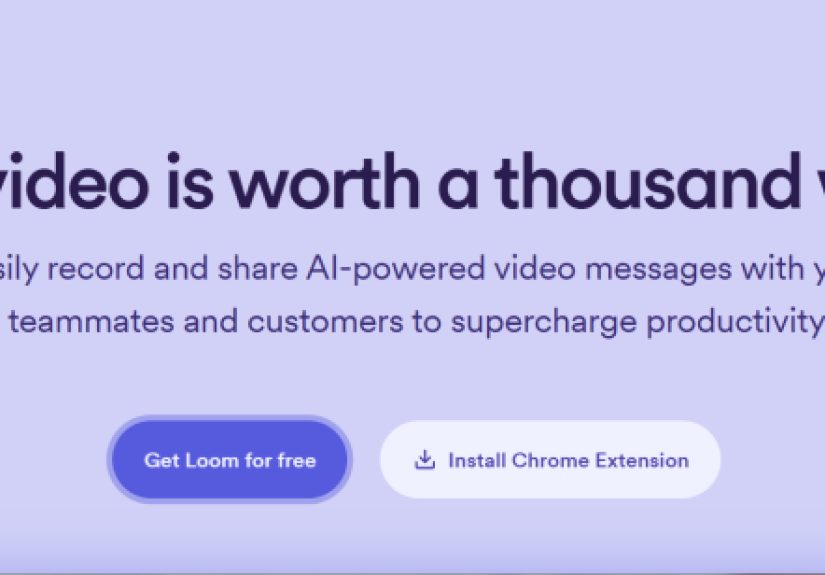
- Dropbox: uses an unambiguous offer-driven CTA like “Try Dropbox free,” paired with supporting “Learn more.”
- Adobe: leans on an expectation-setting CTA such as “Start free trial,” reinforced by what happens after the trial.
- Microsoft Teams: uses “Sign up for free,” which answers the biggest question (cost) right inside the button.
Rule 2: Design for contrast, not vibes (your CTA must win the visual election)
CTAs fail for a deeply technical reason: people don’t click what they don’t notice. Your button should be
the most visually “vote-worthy” element in its sectionclear shape, strong contrast, and enough breathing room
that it doesn’t look like a mislabeled tag.
What to do
- Use high contrast between button and background (and between button text and button fill).
- Give it whitespace so it feels like the next step, not a decoration.
- Keep the shape consistent with your UI system so users recognize it as clickable instantly.
Accessibility isn’t “extra”it’s conversion protection
A CTA that fails color contrast doesn’t just exclude people; it reduces readability for everyone on
mobile, in sunlight, on low-quality displays, or when they’re tired and squinting. Contrast standards
like WCAG’s minimums are a strong baseline for button text and adjacent microcopy.
9-figure brand examples
- Mailchimp: consistently uses clear, high-visibility “Sign Up Free” CTAs across product and plan pages, with predictable button styling.
- Netflix-style layouts: often pair a bold CTA with a simple email field, ensuring the action stands out and feels immediate.
Rule 3: Pick one primary CTA per section (stop making users choose between twins)
When everything is emphasized, nothing is. If you present two equally loud buttons, you’ve created a
mini-decision maze. And decision mazes convert exactly like you’d expect: poorly.
What to do
- Use one visually dominant primary CTA (color + weight) and make the rest secondary (outline, link style, or lower emphasis).
- Keep the goal consistent: multiple CTAs can appear on a page, but they should drive toward the same primary action when possible.
- Match the CTA to intent: top-of-funnel visitors might need “See pricing” before they’re ready for “Start free trial.”
9-figure brand examples
- Slack: commonly pairs a primary “Try for free” with a secondary “Talk to sales,” letting different buying motions self-select without competing visually.
- Shopify-style landing pages: often follow a “one page, one primary action” philosophyrepeat the same CTA rather than invent new actions.
Rule 4: Make it easy to click (size, spacing, and thumb reality)
A CTA can be persuasive and still fail because it’s physically annoying to tap. Great CTA design respects
motor control, small screens, and the fact that humans do not have styluses attached to their fingertips
(unless it’s 2007 and you’re very excited about your PDA).
Practical standards that keep you out of trouble
- Hit area: follow platform guidance like ~44×44pt minimum tappable region on iOS.
- Touch targets: on Android-style guidance, ~48×48dp is a common recommended minimum.
- Fitts’s Law: bigger and closer targets are faster to acquire and reduce error ratesespecially on mobile.
Design checklist
- Make the button tall enough that the label isn’t cramped.
- Ensure padding around it so users don’t tap a nearby link by accident.
- Keep the CTA near the content that sells it (don’t make users scroll past your pitch to find the button).
Rule 5: Put the CTA where confidence peaks (timing beats “above the fold”)
Yes, above-the-fold CTAs can workif the visitor already wants what you’re selling. But when your offer needs
explanation, the best placement is where the visitor has enough information to feel safe clicking.
Think of it like proposing marriage: technically you can do it in the first five seconds, but you shouldn’t
be shocked when they ask, “Wait, what’s your last name?”
What to do
- Use an early CTA for high-intent visitors (“Start free trial,” “Buy now”).
- Repeat the same CTA after key sections (features, proof, pricing) so users can act when they’re ready.
- Consider a persistent or sticky CTA only when it supportsnot interruptsreading.
9-figure brand examples
- Netflix-style pattern: pairs an email field with a “Get Started” action and keeps the CTA present as users scroll through benefits, making action available without forcing it.
- Dropbox: repeats “Try Dropbox free” near different value propositions (“keep versions current,” “send safely”), catching readiness moments.
Rule 6: Remove fear at the point of click (microcopy is your silent closer)
Most CTA hesitation isn’t “I hate this product.” It’s “I don’t want surprise charges,” “I’ll get spammed,”
“This will take forever,” or “I’m going to get stuck.” Your job is to reduce that fear with tiny, specific
reassurance placed right next to the CTA.
What to do
- Add a “doubt remover” line: “No credit card required,” “Cancel anytime,” “Takes 2 minutes,” “Free forever.”
- Make risk explicit when the offer is a trial or demo: what happens after, and how to stop it.
- Use social proof nearby (not 40 inches away in your footer): ratings, logos, short testimonials, usage stats.
9-figure brand examples
- Adobe trials: often reinforce the CTA with clear billing expectations (e.g., not charged until the trial ends, cancellation terms), which lowers “gotcha” anxiety.
- Zoom-style “Sign up, it’s free”: builds the reassurance directly into the CTA copy, reducing cost objections at the click moment.
Rule 7: Treat your CTA like a product feature (test it, measure it, iterate)
The fastest way to lose money is to “set and forget” the single element that literally asks for money.
The best brands treat CTA design as an optimization loop: make a hypothesis, test one change, measure a real
conversion metric, and keep what works.
What to test (without chaos)
- Copy: action clarity, benefit emphasis, first-person vs. second-person (“Start my trial” vs. “Start your trial”).
- Hierarchy: one primary CTA vs. competing CTAs; primary vs. secondary styling.
- Placement: earlier vs. after proof; repeated CTA cadence down the page.
- Friction: single-step vs. multi-step; email-first vs. click-first; form length.
- Trust: adding reassurance lines, privacy notes, badges, or testimonials near the CTA.
Measurement tips that keep you honest
- Track click-through and down-funnel conversion (CTA clicks can rise while completed signups drop).
- Define success before launching (trial starts, demos booked, purchases, qualified leads).
- Segment results (mobile vs. desktop, new vs. returning) because one CTA rarely fits everyone.
Quick swipe file: CTA patterns that keep showing up in 9-figure playbooks
- Free-first CTA: “Try for free,” “Sign up free,” “Start free trial.”
- Sales-assisted path: a secondary “Talk to sales” for enterprise buyers who need reassurance and specifics.
- Two-step CTA: email field + CTA button to reduce perceived effort and make the next step feel small.
- Benefit + action pairing: a headline that sells the outcome, plus a button that names the next step.
Putting it all together: a simple CTA audit you can run in 15 minutes
1) The Five-Second Test
Can a stranger tell what the button does in five seconds? If not, rewrite the label and tighten the supporting line above it.
2) The “One Boss” Test
Is there one clearly dominant CTA in the section? If not, pick one primary action and demote the rest.
3) The Thumb Test
On mobile, can you tap it comfortably without zooming, pinching, or accidentally opening the Privacy Policy?
Increase hit area and spacing if needed.
4) The Fear Test
What’s the most likely objection at the click momentprice, time, spam, commitment? Add one line of reassurance next to the CTA.
5) The Truth Test
Does the click deliver what the CTA promised? “Start free trial” should not land on a sales page that says “Request access.”
Make the journey consistent.
Conclusion
Great CTAs aren’t louderthey’re clearer. Nine-figure brands win by making the next step obvious, visually dominant,
easy to tap, timed to user confidence, backed by reassurance, and continuously improved through testing.
If you apply these seven rules, your CTA stops being “a button” and becomes what it was always meant to be:
the simplest possible yes.
Experience-Based Addendum: 7 Lessons That Show Up in Real CTA Teardowns (About )
If you read enough CRO case studies, teardown threads, and before/after experiments, you start noticing something:
teams rarely lose conversions because they chose the “wrong shade of blue.” They lose conversions because their CTA
is doing too many jobs at onceexplaining the offer, overcoming objections, and asking for commitmentwithout getting
great at any one of them.
One recurring pattern is the “CTA confidence gap.” The headline promises a big outcome (“Save time,” “Grow revenue,”
“Work smarter”), but the CTA is vague (“Get started”) and the next page is unclear. The visitor’s brain does the math:
“I’m about to click into uncertainty.” The fix is almost always boring and effective: rename the CTA to match the next step
(“See pricing,” “Start free trial,” “Book a demo”), then align the destination page so the click feels like progress, not a trapdoor.
Another common finding: fear is often hiding in plain sight. When trials convert poorly, it’s frequently because visitors suspect
a surprise charge or a hard-to-cancel flow. High-performing pages preempt that fear with one line of microcopy positioned where
the eye naturally pauses before clicking. That’s why “No credit card required” and “Cancel anytime” are so persistentthey don’t
persuade with hype; they persuade by removing imagined downside.
You also see a lot of “two-CTA pileups” created by good intentions. Marketing wants trials. Sales wants demos. Leadership wants
newsletter growth. The homepage becomes a crowded elevator with everyone yelling different floors. The pages that recover usually
choose a single primary CTA for the main audience (often “Try for free” or “Start free trial”), then provide a secondary CTA for the
alternative path (“Talk to sales”) that’s visible but not competing. It’s less about hiding options and more about guiding the majority
without blocking the minority.
Mobile keeps teaching the same lesson: if tapping is annoying, persuasion doesn’t matter. CTAs that “look fine” on desktop can become
fumble-prone on phones, especially when the button is small, surrounded by links, or placed too close to navigation. Increasing hit area,
adding whitespace, and repeating the CTA after proof sections often lifts performance simply because users can finally click what they want
without accidental detours.
Finally, the teams that improve fastest treat CTA work like product work. They don’t argue about copy in a vacuumthey run a clean test,
measure a meaningful conversion metric (not just clicks), and iterate. Over time, their CTAs become less clever and more truthful, less noisy
and more confident. And that’s the punchline: the best CTA “design” is a system that makes it easier for the user to say yes.