Table of Contents >> Show >> Hide
- Remodeling 101: Choose Colors in the Right Order (So You Don’t Repaint Twice)
- The Best Color Families for Urban Kitchens (And How to Use Them)
- 1) Warm Whites & Soft Off-Whites
- 2) Greige, Taupe, and “Soft Neutrals With a Backbone”
- 3) Dusty Greens: Sage, Olive, and Green-Gray
- 4) Airy Blues: Light Blue-Gray and Soft Coastal Tones
- 5) Deep Navy: City-Smart, Moody, and Surprisingly Classic
- 6) Charcoal, Soft Black, and “Not Quite Goth” Neutrals
- 7) Warm Earthy Tones: Clay, Terracotta, and Soft “Spice” Shades
- 8) Muted Mauve & Rosy Neutrals (Yes, Really)
- 9) Two-Tone Cabinets: The Cheat Code for Small Kitchens
- Color Placement Tricks That Make Urban Kitchens Look Bigger
- Lighting & Undertones: The Urban Kitchen Plot Twist
- Finishes That Survive Real Cooking (Because Kitchens Are Not Museums)
- Five Foolproof Urban Kitchen Color Recipes
- Common Mistakes (So You Don’t Pay the “Repaint Tax”)
- Conclusion: The Best Urban Kitchen Color Is the One That Works With Your Life
- Real-World Remodel Notes: 7 Urban-Kitchen Color Lessons People Learn the Hard Way
- SEO Tags
Urban kitchens are a special kind of puzzle: compact footprint, big personality, and lighting that changes its mind more often than your group chat.
The good news? Color is the easiest “remodel” lever to pullsometimes the only lever you can pull if your building thinks a “structural wall”
is a lifestyle choice. The right palette can make a galley feel wider, a studio kitchen feel intentional (not “I cook next to my couch”), and a dated
condo kitchen feel downright designer.
This guide breaks down the best kitchen color families for city homes, where to use them (walls, cabinets, island, ceiling),
and how to avoid the classic urban-kitchen trap: choosing a gorgeous shade that looks perfect online… then turning your real space into
“sad aquarium” or “hospital break room” under LED bulbs.
Remodeling 101: Choose Colors in the Right Order (So You Don’t Repaint Twice)
Before you fall in love with a paint chip, anchor your decisions to what’s hardest to change. In urban remodels, that’s often the stuff you
can’t swap easily (budget, co-op rules, elevator reservationspick your villain).
- Fixed finishes first: countertops, floor, backsplash tile, appliances (and any exposed brick or concrete you’re keeping).
- Big surfaces next: cabinets (or cabinet fronts), then walls, then ceiling.
- Accents last: island color, hardware, lighting metals, stools, textiles, art.
Why? Because a kitchen isn’t a blank canvasit’s a small ecosystem. Your countertop undertone will bully your wall color if you let it.
And in a smaller space, everything sits closer together, so mismatched undertones don’t whisper… they shout.
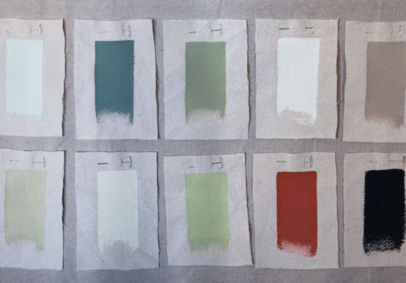
The Best Color Families for Urban Kitchens (And How to Use Them)
Below are the palettes that consistently work in city kitchensespecially where space is tight, natural light is limited, or the kitchen is visible
from the living area (aka “open concept, whether you asked for it or not”).
1) Warm Whites & Soft Off-Whites
If you want your kitchen to feel bigger, cleaner, and calmer, warm whites are the undefeated champions. The key word is warm:
creamy, soft, slightly cozy. They reflect light without feeling sterile, which matters when your “natural light” is basically a polite suggestion.
- Best for: small kitchens, north-facing kitchens, rentals you want to upgrade visually, resale-friendly remodels.
- Where to use: cabinet uppers, walls, ceilings, or all three for a seamless “expanded” look.
- Pair with: light oak, brushed nickel, stainless, warm stone, handmade-look tile, black accents for contrast.
Urban pro tip: If your kitchen is open to your living room, a warm off-white helps the whole space read as one cohesive “zone,” not a patchwork
of competing rectangles.
2) Greige, Taupe, and “Soft Neutrals With a Backbone”
Greige and taupe do the heavy lifting when you want “neutral,” but you’re tired of flat gray. These shades hide everyday mess better than bright white
(and in a kitchen, mess happenssometimes the onions win).
- Best for: condos with cool daylight, kitchens with lots of stainless, spaces where you want warmth without yellow.
- Where to use: walls, perimeter cabinets, or a soft neutral island.
- Pair with: white quartz, concrete counters, matte black hardware, warm wood shelves.
3) Dusty Greens: Sage, Olive, and Green-Gray
Greens are popular for a reason: they feel grounded, natural, and surprisingly flexible. In urban kitchens, muted greens are especially helpful
because they add personality without visually shrinking the room the way a very dark or very saturated color can.
- Best for: kitchens with warm wood, brass, or cream tile; spaces that need “calm” energy.
- Where to use: lower cabinets, an island, or walls if cabinets are neutral.
- Pair with: creamy off-whites, light oak, warm metals, veined stone, terracotta accessories.
If you’re nervous about green, start with the island or lowers. It’s the “I’m fun but I also have a 401(k)” approach to color.
4) Airy Blues: Light Blue-Gray and Soft Coastal Tones
Soft blues can make a compact kitchen feel more openlike the room took a deep breath. The trick is choosing blues with a slightly muted,
grayish base so they don’t turn cartoonish under artificial light.
- Best for: tight kitchens, white or pale counters, modern cabinets with clean lines.
- Where to use: walls, an island, or lower cabinets paired with light uppers.
- Pair with: crisp white tile, stainless steel, glass pendants, pale wood.
5) Deep Navy: City-Smart, Moody, and Surprisingly Classic
Navy reads as tailored and timelesslike your kitchen put on a blazer. It can absolutely work in an urban space if you balance it with light surfaces
(countertops, backsplash, walls) and good lighting.
- Best for: kitchens with decent lighting, high ceilings, or strong white/stone elements to keep things bright.
- Where to use: lower cabinets, an island, or a single bank of tall cabinets as a feature.
- Pair with: warm whites, brass, marble-look counters, white subway tile, oak accents.
One of the most flattering navy setups in a small kitchen is: white walls + white backsplash + navy lowers. High contrast, low chaos.
6) Charcoal, Soft Black, and “Not Quite Goth” Neutrals
Dark neutrals can make a kitchen feel luxe and architecturalespecially in modern apartments with flat-panel doors.
The secret is treating dark paint like espresso: powerful, delicious, and best balanced with milk (aka lighter finishes).
- Best for: industrial-style kitchens, spaces with lots of natural light, dramatic design lovers.
- Where to use: lower cabinets, a pantry wall, or a statement island.
- Pair with: warm off-white walls, bright backsplash tile, light counters, wood shelving, reflective metals.
City reality check: matte black looks amazing, but fingerprints are real. Choose finishes and hardware that forgive everyday life.
7) Warm Earthy Tones: Clay, Terracotta, and Soft “Spice” Shades
If your urban kitchen feels cold (hello, stainless + gray floors), earthy tones can add warmth instantly. Think subtle clay or muted terracottanot
“pumpkin spice latte wall,” unless you’re committed to the brand.
- Best for: lofts, spaces with brick, kitchens that need warmth, homes with lots of natural materials.
- Where to use: an accent wall, pantry door, or even a ceiling if you want a cozy envelope effect.
- Pair with: warm whites, olive greens, natural wood, handmade tile, aged brass.
8) Muted Mauve & Rosy Neutrals (Yes, Really)
Modern mauves and rosy neutrals are not “little kid bedroom” colors anymore. Used softly, they can act like a warm neutralespecially when your kitchen
needs to feel inviting without turning beige.
- Best for: kitchens that feel stark, spaces with cool daylight, homeowners who want something different but livable.
- Where to use: walls, a breakfast nook corner, or a single accent cabinet run.
- Pair with: warm whites, walnut tones, brushed nickel, creamy stone counters.
9) Two-Tone Cabinets: The Cheat Code for Small Kitchens
Two-tone cabinets are popular because they solve multiple problems at once: they add interest, help a small space feel taller, and let you use a darker
color without overwhelming the room.
- Classic combo: light uppers + darker lowers (draws the eye up, feels airy).
- Modern combo: neutral perimeter + bold island (lets the island be the “statement piece”).
- Warm combo: creamy uppers + natural wood lowers (soft, urban, and very livable).
Color Placement Tricks That Make Urban Kitchens Look Bigger
Go Light Where Your Eyes Land First
In many city kitchens, you see the upper cabinets and wall space before anything else. Lighter uppers, lighter walls, and a lighter backsplash can make
the space feel open even if the footprint is… let’s call it “efficient.”
Use Dark Colors Low (Like a Visual Anchor)
Dark lowers or a dark island can ground the room without closing it inespecially when counters and backsplash stay bright.
Try a “Quiet Monochrome” for Maximum Calm
Painting cabinets and walls in the same family (not necessarily the same shade) reduces visual breaks. Fewer breaks = less clutter for the eye to process,
which reads as “bigger.”
Don’t Ignore the Ceiling
If your kitchen feels choppy, a ceiling painted in a soft, warm white (or a very pale tint of the wall color) can smooth out transitions and make the room
feel taller.
Lighting & Undertones: The Urban Kitchen Plot Twist
Undertones are why two “neutral” colors can look like best friends in the store and sworn enemies in your apartment.
Urban kitchens are especially sensitive because:
- North-facing light can turn warm colors dull and cool colors extra icy.
- LED bulbs can skew green/gray or flatten warm tones if the color temperature is off.
- Reflective surfaces (stainless, glossy tile) bounce color around like a pinball machine.
The fix is boring but effective: sample the paint on multiple walls, then check it in morning, afternoon, and night lighting.
If your kitchen connects to the living room, test from the living room toobecause that’s where guests will stand while pretending not to judge your grout.
Finishes That Survive Real Cooking (Because Kitchens Are Not Museums)
Walls
A washable finish is your friend. Kitchens deal with steam, splatter, and the occasional “how did sauce get there?”
Choose a finish that can be cleaned without burnishing (that shiny rubbed spot that screams, “I scrubbed this in panic”).
Cabinets
Cabinets need tougher coatings than walls. If you’re painting existing cabinets, use products designed for cabinetry and prep thoroughly:
degrease, scuff sand, prime properly, and let everything cure fully. City life is fast; paint curing is not.
Hardware
Matte black looks sharp, brass brings warmth, and brushed metals hide fingerprints better than polished ones.
If you want an easy upgrade without a full remodel, hardware is the fastest “new kitchen” trick in the book.
Five Foolproof Urban Kitchen Color Recipes
Recipe A: Bright + Warm + Resale-Friendly
- Walls: warm off-white
- Cabinets: soft white or light greige
- Accents: matte black pulls + light wood shelves
Recipe B: Two-Tone Classic
- Uppers: warm white
- Lowers: navy or charcoal
- Backsplash: glossy white tile to reflect light
Recipe C: Calm Green City Kitchen
- Cabinets: sage or olive lowers
- Walls: creamy off-white
- Accents: aged brass + natural textures
Recipe D: Modern Loft Vibes
- Cabinets: soft black or charcoal
- Counters: bright stone or quartz
- Warmth: wood stools + warm lighting
Recipe E: Subtle but Different
- Walls: muted mauve/rosy neutral
- Cabinets: warm off-white
- Accents: brushed nickel + creamy tile
Common Mistakes (So You Don’t Pay the “Repaint Tax”)
Picking a Color Before You Pick the Lighting
Paint is basically a mirror for your light bulbs. If you’re changing fixtures or bulbs, do that earlyotherwise your “perfect greige”
might become “mysterious swamp” at night.
Going Too Cool in a Cool Kitchen
Stainless appliances, gray floors, and cool daylight can stack up into a space that feels chilly. Balance cool elements with warm whites,
warm metals, or wood accents.
Using Stark White Everywhere
Bright, stark white can look clinical in small kitchens. If you want “white,” consider softer whites that read warm and welcoming.
Over-Trending the Whole Room
Trend colors are funuse them like hot sauce. Add them on an island, lowers, or accessories instead of committing the entire kitchen
to one flavor that might feel dated later.
Conclusion: The Best Urban Kitchen Color Is the One That Works With Your Life
A city kitchen has to do a lot: cook, store, host, multitask, and occasionally pretend it’s not the background of your video calls.
The best colors for urban kitchens aren’t just “pretty”they’re practical. Start with warm whites and soft neutrals if you want maximum light and resale
appeal. Add sage, navy, or charcoal when you want personality. Use two-tone cabinets when you want the space to feel taller and more designed without
losing brightness. And always, always test paint in your actual lightingbecause your kitchen deserves better than being catfished by a paint chip.
Real-World Remodel Notes: 7 Urban-Kitchen Color Lessons People Learn the Hard Way
After you read enough remodel stories (and talk to enough city homeowners), a few patterns show up like clockwork. Not the glamorous partsthe
real parts. The “I didn’t know paint could do that” parts. Here are seven experience-based lessons that can save you time, money, and at least
one emotionally charged trip to the hardware store.
1) Tiny kitchens exaggerate everything. In a large suburban kitchen, a slightly-off undertone might be a minor annoyance.
In a small urban kitchen, it can feel like the walls are arguing with your countertop 24/7. People often discover that a neutral they loved in a hallway
suddenly looks greenish, purplish, or muddy when it’s surrounded by cabinets, tile, and stainless steel. The fix is almost always the same: test bigger
samples, and test them next to the actual backsplash/counter materialnot just a photo on your phone.
2) LED lighting is the silent co-designer. Many remodelers pick paint first, then swap bulbs lateronly to watch the “perfect warm white”
turn dull or the “soft gray” turn icy. A very common experience is realizing that the color looked amazing at noon and confusing at 8 p.m.
If you’re updating lighting, do it early. If you can’t, at least test paint under the bulbs you’ll actually use most nights, because that’s real life.
3) Two-tone cabinets are a confidence builder. Plenty of people want a bold color but don’t want their kitchen to feel smaller.
Two-tone is often the compromise that feels smartest in person: light uppers keep things open, darker lowers add style, and the room feels intentional
instead of “I got bored and chose a dramatic color on a Tuesday.” In urban kitchens, this approach can also help visually separate the cooking zone from
the living zone without putting up walls.
4) Dark colors workif you “earn” them with balance. A recurring story: someone paints everything dark because it looked cool online,
then the kitchen feels like a chic cave. When dark works, it’s because the remodel includes bright counters, reflective backsplash tile, good task lighting,
and sometimes a lighter wall color to keep the space from closing in. Dark cabinets can be stunning in a small kitchen, but they need supporting cast
members that reflect light back into the room.
5) Warm neutrals are more forgiving than cool grays. People often report that cool grays feel “dated” faster, especially when the rest of
the apartment leans warm (wood floors, beige stone, warm metals). Warm off-whites, taupes, and greiges tend to age better because they play nicely with
both warm and cool accents. They also hide daily smudges better than stark whitesimportant when your cabinets are touched 42 times a day.
6) Hardware and backsplash can rescue a “safe” color. Many urban remodels start with a cautious neutral on cabinets or walls, then feel
underwhelming. The experience-based upgrade is usually not repaintingit’s swapping hardware to a stronger finish (matte black, aged brass, brushed nickel)
and choosing a backsplash with texture or sheen. A glossy tile can brighten the space. A handmade-look tile can add warmth. Suddenly the neutral palette
looks curated instead of cautious.
7) The best palette supports your habits, not your fantasy self. The most useful “color experience” lesson is oddly personal:
if you cook a lot, pick finishes and tones that forgive you. If you hate clutter, use quieter color transitions and fewer contrasting breaks.
If you entertain, choose a palette that looks good from the living area and doesn’t fight the rest of the room. The best urban kitchen color isn’t the
trendiest oneit’s the one that makes the space feel functional and good every day, even when dinner is delivery and the sink is full.
Takeaway: city kitchens reward practical beauty. Choose colors that flatter your light, respect your fixed finishes, and make your day-to-day feel easier.
That’s Remodeling 101no demolition required.