Table of Contents >> Show >> Hide
- What You’ll Learn
- Way 1: Add a Text Box on Top of the Picture (Fast + Flexible)
- Way 2: Use WordArt (When Your Text Needs a Little Drama)
- Way 3: Put the Picture Inside a Shape (Then Type in the Shape)
- Pro Tips: Keep Text Readable and Everything in Place
- FAQ + Troubleshooting
- Conclusion: Pick the Method That Matches Your Goal
- Extra: Real-World Experiences Related to “How to Write on Pictures in Word”
You’ve got the perfect photo. A birthday invite, a school flyer, a “before & after” remodel shot, a quick meme for
the group chatwhatever. All you need is a few words on top of the image, and Word is already open, so you think:
“How hard can it be?”
Word’s answer is: “Not hard. Slightly sneaky.” The trick is that Word doesn’t really let you type directly
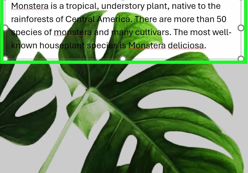
into a picture the way Photoshop does. Instead, you place text objects (like text boxes, WordArt, or shapes)
on top of the imageor you put the image inside a shape and type there.
Once you learn the three methods below, you’ll be labeling screenshots, designing banners, and making
“SALE! TODAY ONLY!” graphics with the confidence of someone who definitely did not just Google it five minutes ago.
Way 1: Add a Text Box on Top of the Picture (Fast + Flexible)
If you only learn one method, make it this one. A text box is the Swiss Army knife of “put words on an image.”
You can place it anywhere, rotate it, style it, and even group it with the picture so it moves as one tidy unit.
Step-by-step: Overlay a text box on an image
-
Insert your picture.
Go to Insert > Pictures and choose an image from your computer (or your OneDrive, depending on your setup). -
Insert a text box.
Go to Insert > Text Box, then choose Draw Text Box (or drag out a preset box).
Click and drag to draw the box near the picture. -
Type your text, then drag the box onto the photo.
Click the edge of the text box (not inside the text) and move it over the picture.
Want angled text? Use the circular rotation handle at the top of the box and tilt it like you’re designing a movie poster. -
Remove the box background and border.
With the text box selected, go to Shape Format:- Shape Fill > No Fill
- Shape Outline > No Outline
Now the text looks like it’s sitting directly on the image, instead of inside a suspicious white rectangle.
-
(Optional) Add a readable “label” background.
If your photo is busy (hello, confetti backgrounds), readability matters.
Keep a fill color, then lower the transparency so the image shows through.
A slightly transparent fill behind text is the difference between “professional” and “why is this impossible to read?” -
Group the text and picture so they don’t drift apart.
Click the picture’s edge, then hold Ctrl (Windows) or Command (Mac) and click the text box edge.
On Picture Format (or Shape Format), choose Group > Group.
When to use the text box method
- You want simple labels (“Front Door,” “Step 2,” “Before,” “After”).
- You need multiple text areas on one image (callouts, arrows, notes).
- You want maximum control over placement, font, and spacing.
Mini example: Labeling a screenshot (clean and readable)
Imagine you’re writing a tutorial and you’ve got a screenshot of Word’s ribbon. Add a text box that says
“Click Insert > Pictures”, then give that text box a semi-transparent fill so it pops without blocking the screenshot.
Now it looks like a real guidenot a frantic cry for help.
Way 2: Use WordArt (When Your Text Needs a Little Drama)
WordArt is basically “text with stage lighting.” It’s made for attention-grabbing words: titles, headlines, badges,
and the occasional sarcastic caption. If you want outlined text, shadows, glow, or curved lettering, WordArt gets you there fast.
Step-by-step: Add WordArt on top of a picture
- Insert the photo (same as Way 1): Insert > Pictures.
-
Insert WordArt.
Go to Insert > WordArt, pick a style, and type your text. -
Drag WordArt over your image.
Click the outside edge of the WordArt object and move it where you want on the picture. -
Customize for readability.
On Shape Format (or Drawing Tools Format), adjust:- Text Fill (solid color is often best)
- Text Outline (a thin outline can save your text on bright backgrounds)
- Text Effects (shadow, glow, reflectionuse responsibly)
- Transform (curve the text for badges or circular labels)
-
(Recommended) Group WordArt + picture.
Select both objects (Ctrl/Command-click) and use Group so they move together.
When to use WordArt
- You’re designing a cover page, poster headline, or bold caption.
- You need curved or stylized text (like a badge or ribbon effect).
- You want text that stands out without manually fiddling with a text box background.
Quick reality check: Keep it tasteful
WordArt is powerful, but like hot sauce, a little goes a long way. For professional documents, a clean font +
subtle outline or shadow is usually plenty. Save the neon glow + 3D bevel combo for your “Garage Sale Extravaganza”
flyer (which, honestly, sounds kind of fun).
Way 3: Put the Picture Inside a Shape (Then Type in the Shape)
This is the “everything stays together” method. Instead of placing text on top of a separate image, you create a shape,
fill the shape with your picture, and then type inside the shape. One object. One bounding box. Fewer headaches.
Step-by-step: Fill a shape with a picture and add text
-
Insert a shape.
Go to Insert > Shapes and choose a rectangle (or rounded rectangle for a softer look).
Drag to draw it roughly the size you want. -
Fill the shape with your picture.
Select the shape, then go to Shape Format:- Shape Fill > Picture… (choose your image)
Now your shape becomes a photo container.
-
Remove the outline (optional).
If you don’t want a border, choose Shape Outline > No Outline. -
Add text inside the shape.
Click the shape and start typing (or right-click and choose Add Text, depending on your version).
Format your font like normal. -
Adjust text placement.
Use paragraph alignment (left/center/right) and line spacing.
If text feels cramped, look for text box/shape text options to adjust internal margins.
Why this method is awesome
- It’s automatically “grouped.” The picture and text are one object.
- Great for banners and headers. Think newsletter mastheads or section breaks.
- Cleaner layout control. Less accidental shifting when you edit surrounding text.
Heads-up: The picture position inside the shape is limited
In many Word apps, you can’t freely slide the image around inside the filled shape the way you might in a design program.
So choose a photo that crops nicelyor resize the shape to get the framing you want.
Pro Tips: Keep Text Readable and Everything in Place
The three methods above are the “how.” These tips are the “why did my text jump to page three when I sneezed?”
Let’s keep your overlay text stable, readable, and not haunted.
1) Use Wrap Text settings for better control
If your picture is “In Line with Text,” Word treats it like a giant letter of the alphabet. That’s why it can feel
sticky and hard to position. Switching to a wrapping option like Square, Tight,
Behind Text, or In Front of Text gives you much better freedom to move objects.
2) Pin the picture so it stops drifting
If your layout keeps shifting when you add paragraphs, select the picture and look for an option like
Fix Position on Page. This helps keep the image (and your overlay text) from wandering when the document changes.
3) Group objects early (especially for multi-label images)
If you have a photo plus three callouts plus one arrow plus a small caption, that’s five objects that can slide out of alignment.
Group related items (or group everything) so your carefully placed labels don’t slowly drift into chaos.
If the Group button is grayed out, check that each object’s wrapping is not set to “In Line with Text.”
4) Make text readable without blocking the image
- Add an outline to text (especially for white text on light images).
- Use a semi-transparent background behind text when the photo is busy.
- Keep fonts simple for instructions: sans-serif fonts are often easier to read on images.
- Don’t shrink text to microscopic size just to “make it fit.” Break lines instead.
5) Don’t forget accessibility basics
If your document is meant to be shared widely (school, work, public web), add alt text to images so screen readers
can describe them. Also, be careful with text placed “Behind Text” or “In Front of Text”it can create reading issues if text overlaps.
A good habit is to keep essential information as real text in the document whenever possible, and use overlay text mainly for labels and visuals.
FAQ + Troubleshooting
“I can’t select the pictureWord keeps selecting the text instead.”
Try clicking the edge of the picture (not the center), or use the Selection Pane if your version offers it.
Another workaround: temporarily move the text box away, select the image, then reposition.
“Group is grayed out. Why?”
This usually happens when one or more objects are set to In Line with Text.
Change wrapping for the picture and the text box/WordArt to something else (Square/Tight/In Front of Text, etc.),
then try grouping again.
“My text box has weird padding. The text won’t sit where I want.”
Text boxes and shapes can have internal margins. If your text feels “pushed in,” open the text/shape formatting options
and adjust the internal spacing. Also check line spacingsometimes the “mystery gap” is just paragraph spacing.
“Can I do this in Word for the web?”
You can often view overlay text and WordArt online, but some creation/editing features are limited compared to the desktop app.
If you don’t see the options you need, open the document in the desktop version for full layout controls.
“What’s the best method for a flyer or poster?”
For flyers: use WordArt for the headline and text boxes for details. Then group the main pieces.
If you want the cleanest single-object design, use the shape-with-picture-fill method and type inside it.
Conclusion: Pick the Method That Matches Your Goal
To write on pictures in Word, you’re really choosing a layout strategy:
text box overlays for everyday labeling, WordArt for stylized titles, and
picture-filled shapes for the clean “all-in-one” approach. Once you add smart wrapping,
group objects, and boost readability with outlines or transparent fills, Word stops acting like a drama queen and starts behaving like a design tool.
(A slightly stubborn design tool. But still.)
Extra: Real-World Experiences Related to “How to Write on Pictures in Word”
Here’s what tends to happen in the real world: someone opens Word because it’s familiar, drops in a picture, and tries to click on the photo and start typing.
Word politely refuses, because Word is a document editor, not a canvas app. That moment usually leads to one of three “experience paths,” and
recognizing which path you’re on makes everything easier.
Experience Path #1: The Screenshot Labeler.
This is the most common scenario in tutorials, school assignments, and work instructions: you’re making a step-by-step guide and you need
labels like “Step 1,” “Click here,” or “Settings > Privacy.” The first time you do it, you might spend ten minutes wrestling the text into place
and then lose it when the picture moves. The best upgrade here is learning to group the text box and the image early.
Once grouped, you can copy/paste the whole labeled graphic into another page or another document without rebuilding everything.
People also learn quickly that readability beats perfection: if the screenshot has lots of tiny icons and bright colors, a little semi-transparent
background behind the label text is not “cheating”it’s the difference between “helpful guide” and “eye exam.”
Experience Path #2: The Flyer Maker.
Flyers are where WordArt shinesbecause flyers need a headline that looks intentional.
A typical experience: you put “OPEN HOUSE” on a photo, it looks great, you print it, and suddenly the text is harder to read than it was on screen.
That’s when people discover outlines and shadows. A thin outline around light-colored text can keep the headline readable across both bright and dark
parts of a photo. Another lesson flyer makers learn: the more fonts and effects you use, the less “official” it looks.
Most flyers get better when you limit yourself to one bold headline style (WordArt is fine), one clean body font, and consistent spacing.
Word can absolutely handle thisjust don’t ask it to become a nightclub sign unless that’s the assignment.
Experience Path #3: The “I Want It to Stay Put” Survivor Story.
This is the person who adds gorgeous overlay text, then edits a paragraph above it, and suddenly the entire layout shifts.
The solution experience teaches is that Word connects objects to the surrounding text with anchors and wrapping rules.
Once someone learns to switch an image away from “In Line with Text” and use a more controlled wrap setting, everything calms down.
In documents that get edited a lot (reports, newsletters, classroom handouts), the most stable designs are the ones that are grouped and positioned
deliberately. Even better: building the design in one area (like a blank section), grouping it, and then placing it where it belongs.
That keeps the “moving parts” together, so the document can grow without the design scattering like startled birds.
One more practical experience that comes up constantly: accessibility and sharing.
When overlay text is essential (like a labeled diagram), people realize they should still include meaningful context in the surrounding paragraph or caption,
and add alt text to the image. That way, if someone can’t see the image clearlyor if the document is converted to another formatthe information isn’t lost.
Word is perfectly capable of handling accessible documents, but it helps when the creator remembers that “pretty” and “understandable” should travel together.
If you’ve ever felt like Word was making this harder than it needed to be, you’re not imagining ityou’re just using a document tool like a design canvas.
The good news is that once you learn these three methods, you’ll start seeing Word differently. Text boxes become labels. WordArt becomes a headline tool.
Shapes become photo containers. And suddenly, “write on pictures in Word” goes from frustrating to routinelike tying your shoes, except with more menus.
Sources (for drafting accuracy):
