Table of Contents >> Show >> Hide
- Why 2026 Paint Trends Feel So Different
- 1. Warm Khaki and Sanded Neutrals
- 2. Earthy Greens and Smoky Blue-Greens
- 3. Dusty Mauves and Plaster Pinks
- 4. Deep Blue-Charcoals and Midnight Teals
- 5. Rich Cocoa, Mahogany, and Burnt Browns
- How to Choose the Right 2026 Paint Trend for Your Home
- Biggest Mistakes to Avoid With 2026 Paint Colors
- Real-World Experiences: What These 2026 Paint Trends Actually Feel Like at Home
- Conclusion
If your walls still look like they’re emotionally attached to 2018 gray, 2026 has news for them. Designers are leaning into paint colors that feel warmer, softer, moodier, and far more personal than the icy whites and flat grays that dominated for years. The new palette is not about chasing a flashy “look at me” color for social media clout. It is about creating rooms that feel lived in, restorative, and interesting the second you walk through the door.
That shift is showing up everywhere, from major paint brands’ Color of the Year picks to designer interviews about what clients actually want in living rooms, kitchens, bedrooms, and bathrooms. Instead of sterile whites and cool greiges, the strongest paint color trends for 2026 center on earthy depth: warm khakis, smoky greens, dusky mauves, atmospheric blue-charcoals, and rich brown-reds that feel grounded rather than gloomy. In other words, the mood board for 2026 looks less “waiting room with a throw pillow” and more “stylish home where someone definitely owns good candles.”
If you want an easy way to refresh your home without gutting a bathroom or selling a kidney for custom millwork, paint is still the fastest transformation tool in the toolbox. Below, designers’ favorite 2026 paint colors break down into five big trend families, plus practical tips for choosing the right one for your space.
Why 2026 Paint Trends Feel So Different
The biggest story in interior paint trends this year is emotional warmth. Homeowners want rooms that feel welcoming and layered, not blank and performatively minimal. Designers are talking more about comfort, craftsmanship, nostalgia, restoration, and “new neutrals” with personality. That is why the 2026 palette feels more nuanced than the clean-white-and-black era.
Another big change is that people are getting bolder, but in a grown-up way. Instead of loud primaries or trendy neon accents, they are choosing colors with depth: muddied pinks, olive-toned greens, blue-charcoals, and browns with red or charcoal undertones. These shades feel easier to live with every day, which matters when the goal is a beautiful room, not a 12-second makeover reel.
1. Warm Khaki and Sanded Neutrals
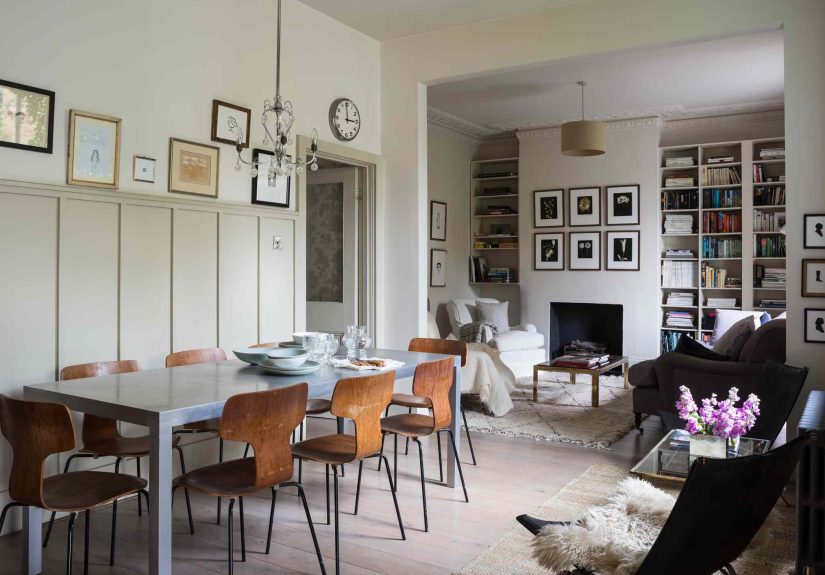
The first major trend is the rise of warm neutral paint colors that feel softer and more soulful than standard beige. Think khaki, sandstone, oatmeal, wheat, mushroom, and creamy taupe. These are not the sleepy tans of decades past. The 2026 version has more complexity, often with yellow, brown, or gray undertones that make a room feel settled and elegant rather than bland.
This is the trend for anyone who says, “I want neutral walls, but I don’t want my house to feel like a rental.” Warm khaki works beautifully in living rooms, hallways, kitchens, and open-plan spaces because it creates a flexible backdrop without that cold, gallery-white effect. It also pairs especially well with oak floors, linen upholstery, rattan accents, unlacquered brass, aged bronze, marble, and creamy trim.
How to use it well
Warm khaki sings when it has texture around it. Pair it with plaster finishes, woven shades, chunky ceramics, wood furniture, and soft off-whites. If you want a crisp contrast, use creamy white trim rather than bright white. Stark trim can make a warm wall look muddy, which is not the vibe unless you are intentionally decorating a chic archaeology lab.
For a more elevated look, try color continuity. Paint walls one warm neutral, then use a slightly lighter version on the ceiling and trim. The result feels tailored, calm, and expensive in a way that whispers rather than screams.
2. Earthy Greens and Smoky Blue-Greens
If 2026 had an official “take a deep breath” color family, it would be earthy green. Designers are especially excited about muted eucalyptus, smoky jade, warm sage, olive, moss, and blue-green shades that blur the line between classic and contemporary. These tones bring in a subtle biophilic feel, meaning they connect your interior with the grounding energy of the natural world.
This trend works because green has range. A soft eucalyptus can feel airy and restorative in a bathroom or bedroom. A muddier olive can make a study or mudroom look smart and sophisticated. A smoky jade or blue-green can turn a kitchen island, built-in cabinetry, or pantry into the most interesting thing in the room without making it feel trendy in a disposable way.
Where it works best
Earthy green paint is especially effective in rooms where you want calm with character: bedrooms, home offices, reading nooks, powder rooms, and kitchens. It looks fantastic with walnut, white oak, warm brass, blackened steel, natural stone, and creamy whites. If your home gets a lot of natural light, these shades often shift beautifully throughout the day, which makes them feel richer and more alive.
One trick designers love is using smoky blue-green on cabinetry instead of walls. It adds depth to the room without closing it in. If you do want to go bolder, color drenching with a green tone on walls, trim, and even the ceiling can make a small room feel deliciously cocooning.
3. Dusty Mauves and Plaster Pinks
Pink is having a remarkably sophisticated glow-up. In 2026, it is less bubblegum and more “old European apartment with excellent lighting.” Designers are favoring dusty mauves, plaster pinks, muted rose, and smoky blush tones that read almost like neutrals. These shades have enough brown, gray, or beige in them to feel grounded, which is why they are gaining traction in homes that want softness without sweetness overload.
This is one of the most interesting designer paint colors of the year because it works on two levels. First, it adds warmth to a room in a way white and gray never can. Second, it flatters almost everything around it, from marble and brass to walnut, linen, leather, and ivory upholstery. Done right, a dusty mauve wall feels romantic, modern, and quietly luxurious.
How to keep pink from feeling precious
The secret is contrast. Pair mauve or plaster pink with darker woods, aged brass, black accents, or earthy stone. In a powder room, it can look dreamy with dramatic sconces and a veined marble vanity. In a bedroom, it feels calm and elevated with ivory bedding, a walnut headboard, and textured drapery.
If you are pink-curious but commitment-phobic, start with a small room. Powder rooms, guest rooms, dressing areas, and reading corners are ideal places to test this trend. Chances are good that once you see how nuanced it looks on the wall, you will stop thinking “pink” and start thinking “why does this room suddenly look expensive?”
4. Deep Blue-Charcoals and Midnight Teals
For people who want drama without the heaviness of black, blue-charcoal paint and midnight teal are among the smartest color trends of 2026. These shades are rich and atmospheric, but they still feel soothing. That balance is exactly why designers love them. They can anchor a room, create intimacy, and still play nicely with both traditional and modern furnishings.
Deep blue-charcoals work especially well in bathrooms, dining rooms, libraries, offices, and bedrooms where you want mood. Midnight teal adds a green undertone that feels especially current, offering a bit more complexity than navy. It is bold, yes, but it does not have the formal stiffness that some darker blues can carry.
Best styling partners for moody blues
These shades look stunning with polished nickel, chrome, marble, brass, warm wood, cognac leather, and creamy textiles. If you are worried a dark wall will shrink the room, remember that dark colors can actually blur edges and create depth, especially when used across trim and walls together. The finish matters, too. An eggshell or matte finish often makes these colors look richer and more velvety.
This is a great trend for homeowners who are bored with safe neutrals but are not ready to turn the dining room tomato red. It brings personality, polish, and a touch of cinematic mood without going full haunted manor.
5. Rich Cocoa, Mahogany, and Burnt Browns
Brown is back, and this time it is wearing better shoes. One of the strongest paint color trends for 2026 is the embrace of rich browns, burnt umbers, cinnamon tones, cocoa shades, and mahogany-inspired hues. These colors feel grounded, tailored, and deeply comforting. They also connect beautifully to the broader return of dark wood furniture, vintage styling, and layered interiors.
If you still associate brown paint with a depressing den from the 1990s, allow 2026 to stage an intervention. Today’s browns are warmer, softer, and more dimensional. Some lean red, some lean charcoal, and some land in that perfect cocoa zone that makes a room feel instantly more intimate.
Why this trend works now
Brown supports the move away from sterile minimalism. It adds weight and warmth, which makes it ideal for libraries, dining rooms, bedrooms, offices, and even kitchen cabinetry. A mahogany or cocoa wall can feel refined and cocooning rather than dark and dated, especially when paired with cream, blush, dusty blue, olive, or brass.
This is also the most convincing choice for full-on color drenching. When walls, trim, ceiling, and built-ins are all wrapped in a rich brown, the room takes on a clubby, enveloping elegance. It is bold, but in a grown-up “I read hardcovers and know how to mix a cocktail” kind of way.
How to Choose the Right 2026 Paint Trend for Your Home
Before you fall in love with a trending shade on your phone, do a little reality check. Your room’s lighting, flooring, tile, stone, and furniture all influence how paint will look in real life.
Start with the room’s mood
If you want airy and adaptable, lean toward warm khakis or mushroomy neutrals. If you want restorative, look at eucalyptus or sage. If you want softness with personality, explore mauves and plaster pinks. If you want drama, deep blue-charcoals and cocoa browns are your friends.
Test undertones, not just color names
A “neutral” can pull yellow, green, pink, or gray. A “green” can look blue in one room and muddy in another. Always sample large swatches and look at them in morning, afternoon, and evening light. Paint is basically a shape-shifting little goblin, and lighting is its favorite trick.
Think about your fixed finishes
Warm floors, brass hardware, and cream stone tend to love the 2026 palette. Cool gray flooring and stark white countertops may need more careful coordination. In that case, a balanced khaki, smoky blue-green, or soft mauve may be easier to live with than a strongly red or yellow brown.
Biggest Mistakes to Avoid With 2026 Paint Colors
- Choosing by trend alone: A color can be popular and still be completely wrong for your light.
- Using bright white trim automatically: Many of these warmer wall colors look better with softer, creamier trim.
- Ignoring sheen: Dark colors often look richer in matte or eggshell, while higher gloss can magnify imperfections.
- Skipping samples: Never trust a two-inch paint chip to make a life decision for your living room.
- Forgetting adjacent rooms: Your home should feel connected, even if each room has its own personality.
Real-World Experiences: What These 2026 Paint Trends Actually Feel Like at Home
One of the most interesting things about the 2026 color trends is how different they feel once they are on real walls instead of tiny swatches. Warm khaki, for example, tends to surprise people the most. On a sample card, it can seem underwhelming, almost too safe. But once it is painted across a living room with natural light, wood tones, and soft textiles, the whole space usually feels calmer, warmer, and more finished. It stops looking like “beige” and starts reading as intentional.
Earthy greens often create the biggest emotional shift. In a home office, a smoky sage or muted eucalyptus can make the room feel quieter and more focused almost overnight. In kitchens, blue-greens and olive-toned shades tend to make cabinetry feel custom, even when the layout itself has not changed. Homeowners often describe these colors as restful, but not sleepy. That is a pretty useful trick for a room where you answer emails, burn toast, and pretend you are absolutely staying organized this year.
Dusty mauves and plaster pinks are the shades people are most nervous about before painting and the most delighted by afterward. In small spaces like powder rooms, they often create a flattering, glowy effect that makes the room feel special without feeling gimmicky. They also play nicely with warm lighting in the evening, which is not something every neutral can brag about. The common reaction is not “wow, pink,” but “wow, this room feels soft and expensive.” That is a very different sentence, and an important one.
Deep blue-charcoals and midnight teals tend to feel best in rooms where you want mood over brightness. They can make a bathroom feel spa-like, a dining room feel intimate, or a bedroom feel wonderfully cocooned. The key experience people report with these darker shades is that the room somehow feels both smaller and bigger at the same time: cozier because the walls recede into shadow, and more dramatic because everything in the space suddenly has contrast and presence.
Rich browns and mahogany tones bring the strongest before-and-after transformation. A flat, forgettable room can look layered and architectural once wrapped in a cocoa or burnt-brown paint. These shades are especially effective with bookshelves, millwork, and older homes that already have trim, molding, or character details to highlight. Even newer rooms can benefit, because the color adds age, depth, and a collected look that new construction often lacks.
The main lesson from all five trends is that the best paint colors in 2026 are not just prettier; they are more experiential. They change the way a room feels when you wake up in it, work in it, or wind down at the end of the day. That is why these colors are resonating now. They are not just decorative. They are atmospheric.
Conclusion
The best paint color trends in 2026 are less about novelty and more about nuance. Designers are moving toward colors that feel warm, grounded, and expressive without being exhausting to live with. Warm khakis make a home feel tailored. Earthy greens bring calm. Dusty mauves soften a room beautifully. Blue-charcoals add mood. Cocoa and mahogany tones create richness and depth.
If you want to instantly refresh your space this year, start with the feeling you want your room to have, then choose the trend family that delivers it. In 2026, the smartest paint choices are not the loudest ones. They are the ones that make your home feel more like home the moment the brush dries.