Table of Contents >> Show >> Hide
- Why Your Kitchen Island Is the Perfect Place for Color
- How to Choose the Right Kitchen Island Color
- 19 Kitchen Island Color Ideas for a Striking Accent
- 1. Classic Navy Blue
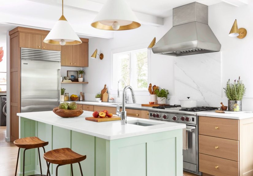
- 2. Soft Sage Green
- 3. Deep Forest or Olive Green
- 4. Charcoal Gray or Soft Black
- 5. Crisp White with Contrasting Countertops
- 6. Warm Greige or Taupe
- 7. Dusty Powder Blue
- 8. Bold Cobalt or Royal Blue
- 9. Terracotta and Clay Tones
- 10. Sunny Buttery Yellow
- 11. Lime or Citrus Green Pop
- 12. Rich Eggplant or Aubergine
- 13. Blush or Dusty Rose
- 14. Natural Wood or Stained Island
- 15. Two-Tone Kitchen Island
- 16. High-Contrast Black-and-White Island
- 17. Smoky Blue-Green
- 18. Universal Khaki and Warm Neutrals
- 19. Color-Blocked or Graphic Island
- Real-Life Lessons from Colorful Kitchen Islands
- Final Thoughts
If the kitchen is the heart of the home, the island is the heartbeat. It’s where homework gets done, snacks mysteriously disappear, and guests gravitate like magnets at every party. That’s exactly why your kitchen island is the perfect place to go bold with color and turn a hardworking surface into a show-stopping focal point.
Designers have been treating kitchen islands like statement furniture pieces for years, painting them in richer, deeper, or more playful hues than the surrounding cabinets. A contrasting island can visually ground the room, break up a sea of white, and make even a simple builder-grade kitchen look custom and intentional.
Why Your Kitchen Island Is the Perfect Place for Color
Painting all your cabinets forest green or inky navy can feel like a big commitment. But the island? That’s a much smaller target with maximum impact. Color on the island:
- Adds a focal point in the center of the room, naturally drawing the eye.
- Breaks up monotony in all-white or all-wood kitchens without overwhelming the space.
- Feels custom, even if everything else is straight out of the big-box store.
- Is easier to change later. Repainting one island is far less painful than repainting every cabinet in the room.
Current color trends lean into deep blues, calm greens, and earthy neutrals, with pops of citrus and terracotta for the bold among us.
How to Choose the Right Kitchen Island Color
Before you grab the nearest gallon of paint labeled “Something Blue-ish,” pause for a quick game plan:
- Look at your fixed finishes. Countertops, backsplash, flooring, and existing cabinet color should all harmonize with your island color.
- Decide on contrast level. Do you want the island to pop (think navy in a white kitchen) or whisper (soft greige against warm white)?
- Consider lighting. Natural light will soften even bold colors. In darker kitchens, you might want a lighter or more saturated hue so the island doesn’t feel heavy.
- Match the mood. Deep colors feel sophisticated and cozy; brighter hues feel energetic and playful.
- Test, don’t guess. Paint large samples on poster board and move them around the island throughout the day.
19 Kitchen Island Color Ideas for a Striking Accent
1. Classic Navy Blue
Navy blue is the little black dress of kitchen island colors: timeless, flattering, and surprisingly versatile. Designers consistently rank navy as one of the best choices for lower cabinets and islands because it adds depth without feeling harsh.
Pair a navy kitchen island with warm white cabinets, marble or quartz countertops, and brass or brushed gold hardware for a crisp, tailored look. It suits everything from coastal to traditional to modern farmhouse. If you’re nervous about bold color but want to try something beyond gray, navy is your safest “daring” choice.
2. Soft Sage Green
Sage green has been quietly taking over kitchens because it brings a calm, nature-inspired vibe without screaming “trend.” On an island, sage looks especially good against white or cream cabinets, warm wood floors, and natural stone or butcher-block tops.
It’s a great choice if you like color but still want a soothing, spa-like feel while you’re frantically packing school lunches at 7:59 a.m.
3. Deep Forest or Olive Green
For a bolder take on green, try a deep forest or olive tone. These moodier greens align with broader trends toward earthy, grounded palettes and pair beautifully with leathered stone, black hardware, and warm woods.
Use forest green on the island to anchor a bright, airy kitchen or to complement brass light fixtures and woven stools for a sophisticated “chef’s kitchen” look.
4. Charcoal Gray or Soft Black
A charcoal gray or soft black island is dramatic without feeling too stark. Many designers recommend these slightly softened blacks because they provide contrast but still show subtle undertones that tie into stone, tile, or wood.
Pair a charcoal island with white cabinets and light counters for a classic black-and-white kitchen, or combine it with warm beige walls and wood floors for a European-inspired, cozy feel.
5. Crisp White with Contrasting Countertops
Sometimes the “color” on your island is actually the countertop. A white island with a dramatic veined stone slab or a rich butcher-block top can be just as attention-grabbing as a bright hue.
This works especially well in darker or more colorful kitchens, where a white island becomes the visual pause that balances stronger elements around it.
6. Warm Greige or Taupe
If you’re committed to a neutral but want something softer than white and less severe than gray, greige (a gray-beige mix) or taupe is your friend. Paint your island greige to bridge warm wood floors and cooler stone countertops, or to harmonize different materials in an open-concept space.
Greige islands also age gracefully as trends shift, making them ideal if you’re thinking about resale value.
7. Dusty Powder Blue
Not into deep navy but still love blue? Try a soft, powdery blue. Celebrities and designers alike have used gentle blue islands to bring personality to otherwise neutral kitchens, making the space feel friendly and relaxed rather than formal.
Powder blue pairs beautifully with oak cabinets, black countertops, and marble backsplashes, and it looks especially charming with vintage-style hardware or cottage-inspired decor.
8. Bold Cobalt or Royal Blue
On the opposite end of the spectrum, cobalt or royal blue is for those who want their kitchen island to be the star of the show. These saturated blues shine in contemporary and eclectic spaces where color is part of the overall design story.
Keep surrounding elements simplethink flat-front white cabinets, minimal hardware, and a streamlined backsplashso the bold blue island looks intentional, not chaotic.
9. Terracotta and Clay Tones
Earthy terracotta and clay shades are on the rise, echoing broader paint trends toward sunbaked, warm hues. On a kitchen island, these colors add warmth and personality while still feeling grounded and organic.
Pair a terracotta island with creamy off-white cabinets, matte black fixtures, and textured tile for a Mediterranean-inspired, cozy vibe.
10. Sunny Buttery Yellow
If your kitchen tends to feel dark or gloomy, a soft buttery yellow island can act like permanent sunshine. It’s cheerful without going full highlighter, especially when you choose a muted, slightly creamy shade.
Combine yellow with white or light wood cabinetry and simple hardware. The result is charming and cottage-likeperfect if you love vintage rugs, open shelving, and lots of plants.
11. Lime or Citrus Green Pop
Feeling brave? Citrus-inspired hueslime, chartreuse, and zesty yellow-greenturn a kitchen island into a pure energy shot. Designers often use these colors in otherwise neutral spaces to keep things playful and modern.
To avoid visual overload, let the island be the main bright element and keep cabinets, counters, and backsplash relatively calm.
12. Rich Eggplant or Aubergine
Eggplant tonesdeep purple with brown or gray undertonesare an underrated way to get a jewel-box effect in the kitchen. They read sophisticated rather than whimsical, especially when paired with brass hardware and stone counters.
An aubergine island works particularly well with warm white or greige cabinets and oak or walnut floors, echoing the richness of stained wood but with a twist.
13. Blush or Dusty Rose
Blush has grown up. Dusty rose or muted pink islands don’t look “nursery”; instead, they feel modern and slightly romantic when combined with marble, black fixtures, and simple cabinetry.
This color shines in small kitchens where a softer hue keeps the room feeling light but still memorable.
14. Natural Wood or Stained Island
Not every island has to be painted. Letting the wood showeither in a natural finish or with a richer stainadds warmth, texture, and timeless character. Wood islands look especially striking in kitchens with painted perimeter cabinets, creating a subtle two-tone effect that’s more about material than color.
Choose a stain that ties into your floor color or window trim so the island feels “built in,” not random.
15. Two-Tone Kitchen Island
Want to get fancy? Treat the island like its own mini two-tone kitchen. You might stain the base in wood and paint the drawers a deep blue, or paint the island body one color and the panels or posts another.
Designers often use this trick to highlight architectural details like turned legs, beadboard, or inset panels. Just keep the palette tighttwo colors plus your countertop is plenty.
16. High-Contrast Black-and-White Island
A black island with a bright white countertop (or vice versa) delivers the kind of high-contrast drama you see in magazine spreads.
This combo works beautifully in modern, classic, or farmhouse kitchens and pairs nicely with metallic lighting and barstools. If your home leans more minimal, this might be your go-to move.
17. Smoky Blue-Green
Blue-green hues that sit between teal and jade are showing up in many “color of the year” and trend forecasts because they feel both fresh and timeless. On an island, a smoky blue-green anchors the space while still reading colorful.
Combine this shade with warm neutrals, woven textures, and soft white walls for a relaxed, collected feel that won’t go out of style anytime soon.
18. Universal Khaki and Warm Neutrals
Paint brands are leaning into warm, versatile neutralslike khaki, mushroom, and puttythat pair well with nearly any style. A khaki-toned island can subtly stand out against slightly lighter cabinets, offering dimension without obvious contrast.
This is a smart pick if you love a minimalist, “quiet luxury” look but still want your island to be defined.
19. Color-Blocked or Graphic Island
For the maximalists: use color-blocking on your island. Paint the base one shade and the end panels or open shelves another, or use graphic stripes or a dipped effect (darker color on the bottom, lighter on top).
This works best in very simple kitchens where the rest of the elements are clean and restrained, letting the island become your bold, artful centerpiece.
Real-Life Lessons from Colorful Kitchen Islands
So what actually happens after someone paints their kitchen island a bold color? A lot of homeowners share similar “before and after” feelings:
First, there’s the panic. The paint goes on, the color looks ten times brighter when it’s wet, and you start wondering if you’ve made a terrible life choice. This is normal. Paint almost always looks more intense mid-project, especially under work lights and with no styling in place yet.
Then, the kitchen gets put back together. Counter stools return, rugs roll out, pendant lights get turned on, and suddenly that navy or sage or terracotta island doesn’t look wildit looks intentional. People are often surprised by how quickly their eye adjusts and how quickly the island starts feeling like it was always meant to be that way.
Many homeowners also notice that a colored island changes how they use the room. A once-forgotten overhang becomes the go-to laptop spot. Guests stop circling the kitchen and just park themselves at the island. Kids naturally gravitate there for snacks or homework, because the island feels like a designated zone rather than just more counter space.
There’s also the “decluttering effect.” When the island becomes the star, you don’t need as many decorative objects elsewhere. Instead of filling every shelf and corner, a few well-chosen itemsa pretty bowl of lemons on a sage island, a wooden cutting board leaning against a black base, a vase of greenery on a greige islandare enough to make the room feel styled.
Practical lessons show up too. People who choose darker colors like navy, charcoal, or forest green often comment that the island hides scuffs and shoe marks better than white did, especially around seating areas. Those who go for lighter colors, like powder blue or blush, love how the island brightens their kitchen, but they may become a little more protective of kids’ markers and spaghetti night.
Another common experience: once the island changes, other updates start to fall into place. A new set of barstools, a different rug runner, swapped-out pendantssuddenly there’s a clear direction for the kitchen’s personality. The island color becomes a reference point for future decisions, making it easier to say, “Yes, that works” or “No, that fights the palette.”
Even in homes that are being prepped for resale, real estate agents will often note that a well-chosen island color can make listing photos stand out. A tasteful navy or sage island in an otherwise neutral kitchen reads as “designer” and “updated” without scaring buyers who don’t want to repaint an entire kitchen.
At the end of the day, painting the island is a relatively low-risk, high-reward move. If you fall in love with the color, greatyou’ve got your new kitchen personality. If you eventually change your mind, it’s a weekend project and a couple of paint trays away from something entirely different. Your island can evolve with you: navy this year, smoky green the next, maybe even citrus orange when you’re feeling bold and caffeinated.
Final Thoughts
Your kitchen island doesn’t have to blend in. Whether you gravitate toward deep navy, calming sage, warm khaki, or a full-on citrus statement, the right color can transform your island from “extra counter space” into the striking accent that ties your entire home together.
Start with your existing finishes, decide how dramatic you want to go, test a few shades, and then commit. You might be surprised how a simple color change on one hardworking piece of furniture makes your whole kitchen feel fresher, more personal, and a lot more fun to live in.