Table of Contents >> Show >> Hide
- What a Color Palatte Tool Actually Does (Beyond Picking “Cute Blue”)
- The Quick Color Theory You’ll Actually Use
- A Practical Workflow: Build a Palette That Works in the Real World
- Accessibility: Where Palette Tools Earn Their Keep
- Building a Color System (So You Don’t Re-Decide Blue 47 Times)
- Specific Examples: Using a Color Palatte Tool Like a Pro
- Common Palette Mistakes (And How Tools Help You Dodge Them)
- How to Choose the Right Color Palatte Tool
- Conclusion: Make Color Decisions Once, Then Reuse Them Everywhere
- Experiences With Color Palatte Tools: The Good, the Bad, and the “Why Is My Button Invisible?”
A Color Palatte Tool (yes, sometimes spelled “palette,” sometimes typed in a hurry like the rest of us) is basically a design sidekick that helps you pick colors that look good together, stay readable, and don’t make your users feel like they’re trapped inside a neon sign.
The best part: a modern color palette tool doesn’t just “suggest five pretty swatches.” It can generate harmonies, extract colors from photos, build light/dark sets, map colors to UI roles, and even warn you when your button text is doing that “invisible ink” thing on certain backgrounds. If you’ve ever launched a design and then noticed your call-to-action looks like it’s hiding from responsibilitycongrats, you’ve met the problem a palette tool is built to solve.
What a Color Palatte Tool Actually Does (Beyond Picking “Cute Blue”)
At its core, a color palette tool helps you create a cohesive set of colors for a brand, website, app, presentation, or product. But the real value is in the “rules and reality” layer:
- Harmony generation: complementary, analogous, triadic, and other classic relationships so colors feel intentional, not accidental.
- Adjustable controls: hue, saturation, and lightness/value sliders to fine-tune without guessing.
- Accessibility checks: contrast ratio evaluation for text, icons, and UI components.
- System-building: tonal scales and role-based tokens (primary, secondary, surface, text, error, etc.) for consistent UI.
- Export options: HEX/RGB/HSL values, CSS variables, design tokens, and sometimes direct Figma/Sketch integration.
Think of it like a recipe tool for color: you can freestyle, but the tool helps you avoid serving “raw chicken” in the form of unreadable text.
The Quick Color Theory You’ll Actually Use
You don’t need a PhD in “Advanced Vibes.” You need a few practical concepts that palette tools bake into their generators:
1) Hue, Saturation, Lightness (HSL): the “Three Knobs” of Sanity
Most palette tools let you tweak colors in HSL because it matches how humans think: “Make it bluer,” “less intense,” “a bit lighter.” When you adjust these knobs thoughtfully, you can keep a brand color recognizable while making it work across backgrounds, buttons, and headings.
2) Harmony Rules: Why Some Combos Feel Effortless
Harmony rules are the color-wheel relationships palette tools use to generate combinations:
- Analogous: neighbors on the wheelsmooth, calm, cohesive (great for backgrounds and branding).
- Complementary: oppositeshigh contrast and energy (great for accents and CTAs).
- Triadic: three evenly spaced colorsbold, playful, balanced (great for brands with personality).
A smart color palette generator doesn’t just produce these schemesit helps you choose a “dominant” color and use others as accents, so your layout doesn’t become a confetti cannon.
A Practical Workflow: Build a Palette That Works in the Real World
Here’s a repeatable approach you can use with almost any Color Palatte Tool, whether you’re designing a landing page, a mobile app, or a slide deck that needs to look like you slept at least six hours this week.
Step 1: Pick a Base Color With a Job
Start with a color that represents the brand or the main action. Ask: what is this color for?
- Brand anchor: the recognizable “this is us” color (logos, key highlights).
- Action color: the “click me” color (primary buttons).
- Atmosphere color: the mood setter (backgrounds, surfaces).
Example: Suppose your base is a confident blue #1F6FEB (trustworthy, modern, friendly). That’s your starting point, not your entire personality.
Step 2: Generate Harmony Options, Then Choose One Direction
Use the tool’s harmony generator to explore options, but don’t adopt every suggestion like you’re collecting stray cats. Pick a direction:
- Clean + professional: analogous blues/teals + neutral grays.
- Energetic + conversion-focused: complementary accent (blue + warm orange) for CTAs.
- Playful + youthful: triadic scheme with controlled saturation.
Step 3: Build a Neutral Foundation (So Your Colors Have Somewhere to Live)
Neutrals are what make your bright colors feel intentional instead of chaotic. A strong palette typically includes:
- Background: near-white or near-black depending on theme
- Surface: cards, panels, containers
- Text: primary and secondary text colors
- Borders/dividers: subtle lines for structure
Example neutral set (light theme):
Background: #FFFFFF • Surface: #F6F8FA • Text: #111827 • Muted text: #4B5563 • Border: #E5E7EB
Step 4: Add One Accent Color That’s Allowed to Be Loud
Most designs need a single accent that draws attention. The trick is to keep it rare so it stays meaningful.
Example accent (complement to blue): a warm orange #F59E0B or #FB8500. Use it for:
- Primary call-to-action button (sparingly)
- Badges or highlights
- Key chart points
Step 5: Apply the 60-30-10 Rule (A Simple Anti-Chaos Guardrail)
If your palette tool gives you five colors and you use them all equally, your layout will look like a showroom for highlighters. A classic guideline is:
- 60%: dominant (often neutrals/background)
- 30%: secondary (supporting surfaces or secondary brand tone)
- 10%: accent (CTA, emphasis)
This is not a law handed down by the design godsbut it’s a fantastic “training wheels” rule when you need balance fast.
Accessibility: Where Palette Tools Earn Their Keep
Pretty colors are nice. Readable, inclusive colors are betterespecially because “I can see it on my screen” is not the same as “everyone can see it everywhere.”
Contrast Ratios: The Non-Negotiable Numbers
A serious accessible color contrast workflow checks contrast ratio between foreground and background. For many web contexts:
- Normal text: aim for at least 4.5:1
- Large text: aim for at least 3:1
- Enhanced readability (stricter): 7:1 for normal text is often used as a high bar
- UI components & graphical objects: commonly checked at 3:1
Practical note: don’t “round up” a failing contrast score in your head like you’re trying to pass math class. If your tool says 4.49:1, it’s not the same as 4.5:1.
Don’t Rely on Color Alone
Palette tools also help you avoid the classic mistake: using only color to communicate meaning (like red text for “error” with no icon, label, or message). People with color-vision differences, low vision, or just a phone in bright sunlight will thank you. Good design pairs color with text labels, icons, patterns, or position.
A Mini Contrast Workflow You Can Use Today
- Pick your text color (e.g.,
#111827) and background (e.g.,#FFFFFF). - Test contrast in a contrast checker.
- Adjust lightness first before changing huethis keeps brand identity stable.
- Check interactive states: hover, focus, disabled, and pressed states often fail contrast quietly.
- Test in dark mode, because the “same colors” behave differently against dark surfaces.
Building a Color System (So You Don’t Re-Decide Blue 47 Times)
A palette is a start. A UI color system is a plan. The moment your product has more than a few screens, you want structure:
Roles: Color With a Purpose
Instead of “ButtonBlue” and “HeaderBlueButSlightlyDifferent,” define roles:
- Primary: main actions
- Secondary: supporting actions
- Surface: backgrounds and containers
- On-primary / on-surface: text/icon colors that sit on top of those surfaces
- Success / warning / error: semantic feedback colors
Many design systems (like Material and Fluent) encourage this approach because it scales. You can redesign your brand color later without rewriting every component.
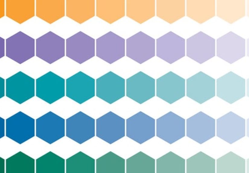
Tonal Palettes: One Color, Many Useful Shades
A smart color palette tool can generate a tonal rangelight to darkso your primary color works in multiple contexts. This is especially valuable for:
- Button backgrounds vs. button text
- Hover/pressed states
- Charts (multiple tints of a hue)
- Dark mode adaptations
Example tonal set for a blue base (illustrative):
90: #DCEBFF • 70: #8AB8FF • 50: #1F6FEB • 30: #1449A8 • 10: #0B1F44
Specific Examples: Using a Color Palatte Tool Like a Pro
Example 1: A SaaS Landing Page Palette That Converts (Without Eye-Strain)
Goal: make CTAs obvious, keep text readable, feel modern and credible.
- Background:
#FFFFFF - Surface:
#F6F8FA - Primary (brand/action):
#1F6FEB - Accent (CTA highlight):
#FB8500 - Text:
#111827 - Muted text:
#4B5563
How the palette tool helps: generate complementary accent options, then run contrast checks for button text on both primary and accent colors. You’ll often discover that “white text on orange” works in one shade but fails in anotherso you pick the shade that’s both on-brand and readable.
Example 2: A Calm Wellness App Palette (That Still Has Hierarchy)
Goal: soothing, not sleepyclear hierarchy for actions and navigation.
- Dominant: soft mint surface
#E8F7F1(60%) - Secondary: deep teal
#0F766E(30%) - Accent: coral highlight
#F97316(10%) - Text: near-black
#0B1220
Tool move: use an analogous generator around teal for supportive colors, then restrict saturation so your UI doesn’t look like a tropical fish tank.
Example 3: Data Visualization Palette (Because Charts Love to Betray You)
Charts are where “looks fine” becomes “wait, which line is which?” fast. A palette tool can help you:
- pick colors that remain distinct for color-vision differences
- use tints for grouping without losing contrast
- avoid pairing red/green without additional cues
Pro tip: if two chart colors are only different by hue but share similar lightness, they can blur together. Many palette tools let you compare colors by perceived brightness so you can fix that before your stakeholders start arguing over the “blue-ish one.”
Common Palette Mistakes (And How Tools Help You Dodge Them)
- Too many accents: if everything is highlighted, nothing is highlighted. Use one accent and earn it.
- Ignoring states: hover, focus rings, disabled buttonspalette tools help you generate consistent state colors instead of improvising.
- Contrast surprises: gradients and images can break text readability; tools help you test worst-case spots, not just average ones.
- Brand color everywhere: your brand color is not your background color, your border color, your text color, and your personality.
How to Choose the Right Color Palatte Tool
Whether you’re picking a tool for yourself or writing a guide for readers, here’s what matters most:
- Accessibility features: contrast checks, non-text contrast support, and guidance for readable pairings.
- Harmony + control: generators are great, but manual tuning is essential.
- Export formats: HEX/RGB/HSL at minimum; CSS variables or tokens are a bonus.
- Workflow integration: works with your design tools (or at least doesn’t fight them).
- Support for themes: easy creation of light/dark variants and tonal scales.
Bottom line: the “best” palette tool is the one that makes good choices fasterand makes bad choices harder.
Conclusion: Make Color Decisions Once, Then Reuse Them Everywhere
A Color Palatte Tool isn’t just about aestheticsit’s about consistency, usability, and clarity. Use it to generate harmonies, build neutrals, control accents, and validate contrast. If you do it right, your palette becomes a reusable system: faster design, fewer debates, and far less “why is this button purple on this one page?” energy.
And remember: a palette is successful when it disappears into the experienceusers shouldn’t notice your colors as “colors.” They should notice that everything feels clear, confident, and easy to use.
Experiences With Color Palatte Tools: The Good, the Bad, and the “Why Is My Button Invisible?”
The first time most people use a color palette tool, they treat it like a vending machine: insert a base color, receive five perfect swatches, walk away victorious. Then real life shows upusually in the form of a stakeholder saying, “Can we make the button pop more?” (Translation: “Can we set it on fire?”) That’s when you learn palette tools aren’t just for generating colors; they’re for negotiating reality.
One memorable project: a clean, minimal SaaS homepage with a gorgeous deep navy. The palette tool produced a lovely complementary orange accent, and everything looked fantasticuntil the team slapped white text on the orange button and viewed it on a slightly dim laptop. Suddenly, the CTA wasn’t “pop,” it was “whisper.” A quick contrast check showed the orange shade was just a bit too light for white text. The fix wasn’t dramatic: we nudged the accent darker by adjusting lightness, kept the same hue, and the button went from “maybe clickable?” to “obviously the next step.” The best part was how calm the solution felt. No new color drama. Just a smarter shade.
Another time, a brand refresh went sideways because everyone fell in love with a trendy pastel palette. Pastels are adorablelike kittens wearing tiny sweaters. But they’re also notorious for failing contrast when used for text or critical UI elements. The palette tool made it easy to keep the pastel vibe while introducing deeper supporting tones: pastel surfaces for backgrounds, darker “on-surface” text colors for readability, and a more saturated accent reserved for key actions. Same mood, better usability, fewer people squinting like they’re reading fine print on a shampoo bottle.
Color tools also taught a hard lesson about consistency. On one app, designers kept inventing new grays because “this screen feels slightly different.” That sounds harmless until you have 14 grays, none of which match, and your UI looks like it was assembled from unrelated screenshots. Building a role-based systemsurface, border, muted text, primary textwas the turning point. Once those roles existed, the palette tool stopped being a brainstorming toy and became a system generator. Changes became deliberate: if the surface gray shifted, it shifted everywhere it was meant to live.
The funniest (and most painful) experience is the “dark mode betrayal.” A palette that looks perfect on white can become muddy on charcoal. Blues can turn electric, warm accents can look like warning labels, and subtle borders can vanish entirely. Palette tools that support tonal scales and dark-mode previews are lifesavers here. Instead of guessing, you build a tone ladder and assign roles that adapt across themes. Suddenly, dark mode stops being a redesign and becomes a controlled translation.
After enough projects, you start to trust a simple truth: the palette tool doesn’t replace taste. It protects your taste from chaos. It helps you keep your brand recognizable, your UI readable, your accents meaningful, and your “pop” requests grounded in reality. And that’s a pretty great superpower for something that looks like a set of colored squares.