Table of Contents >> Show >> Hide
- Why “Photoshop + Dreams” Is a Real Workflow (Not a Mug Slogan)
- Using Dreams Without Becoming That Friend Who Says “I Had a Vision”
- Photoshop as a Playground: Build a Non-Destructive Creative Habit
- A Repeatable Workflow: From Dream to Finished Visual
- 1) Translate the dream into a “creative sentence”
- 2) Build a 10-minute mood board (quick and ruthless)
- 3) Prototype composition with shapes first
- 4) Build the image stack (with editability on purpose)
- 5) Color grade like a storyteller
- 6) Check readability and accessibility (because “beautiful” should also be readable)
- 7) Export like a professional who respects bandwidth
- 8) Archive the “thinking,” not just the final
- Common Traps (and How to Escape With Dignity)
- Conclusion: The Most Useful Creative Tools Aren’t Always Tangible
- Experience Add-On: of “Photoshop and Dreams” in Real-Life Moments
- SEO Tags
Some people have a toolbox. I have two: Photoshop and dreams. One is made of panels, pixels, and politely bossy keyboard shortcuts. The other shows up at 3:17 a.m. with a plot twist, a color palette, and absolutely no respect for my calendar.
If that sounds dramatic, it’s because creative work is dramaticjust in a quiet, “why does this shadow feel emotionally unavailable?” kind of way. But the pairing is more practical than it seems. Photoshop is where ideas become deliverables. Dreams are where ideas show up uninvited, wearing glitter, asking to be turned into something real.
This is a guide for anyone who designs, retouches, illustrates, or builds visuals for the web and wants a workflow that honors both sides of the creative brain: the disciplined craft side and the “what if the logo was a jellyfish?” side. We’ll talk process, specific Photoshop techniques, and the surprisingly useful role of sleep in creative problem solvingwithout treating your subconscious like a mystical vending machine that only accepts incense.
Why “Photoshop + Dreams” Is a Real Workflow (Not a Mug Slogan)
On paper, Photoshop and dreams sound like opposites. Photoshop is structure: layers, masks, files, exports, deadlines. Dreams are chaos: symbolic elephants, floating staircases, and the sudden conviction that you can fly if you just believe hard enough (you can’t, please don’t test that).
But together, they map onto a classic creative loop: generate → shape → test → refine. In design-thinking terms, you empathize and define in the real world, ideate in a freer space, prototype in your tools, test with eyes and feedback, then iterate until the piece works. The magic isn’t in skipping stepsit’s in moving between them without losing the original spark.
Dreams are a messy ideation engine
Dreams can connect ideas that feel unrelated when you’re awake. That’s part of why people often wake up with a “wait… that might actually work” feeling. Sleepespecially certain stageshas been linked to memory processing and creative problem solving, which can help your brain form new associations. In plain language: your mind quietly reorganizes the closet while you’re offline, then hands you a weird-but-interesting outfit in the morning.
Photoshop is where the mess becomes a method
Photoshop doesn’t just “make things pretty.” It lets you prototype quickly, build non-destructively, compare variations, and ship visuals that work across devices. It’s the bridge between imagination and the real world where file sizes, accessibility, and client notes exist (and yes, clients can absolutely ask you to “make it pop” like it’s a legally enforceable instruction).
Using Dreams Without Becoming That Friend Who Says “I Had a Vision”
Let’s keep it grounded: you don’t need to interpret every dream like it’s a prophecy. You just need to capture the raw creative materialimages, moods, metaphors, and unexpected combinations.
Step 1: Collect dream fragments like design references
Keep a notes app or a notebook by your bed. When you wake up, write down:
- Three images you remember (even if they’re ridiculous)
- One emotion (tense, playful, lonely, electric, calm)
- One “rule” the dream world followed (gravity sideways, everything neon, faces blurred, etc.)
That’s it. You’re not decoding symbolismyou’re gathering creative ingredients. Think of it as sourcing textures, not writing a dissertation.
Step 2: Try “dream incubation” like a pre-brief
If you’re stuck on a visual problem, you can nudge your brain by focusing on it before sleep. Not obsessingjust lightly priming. For example:
- “I need a hero image concept that feels warm but not cheesy.”
- “How do I show ‘security’ without using a lock icon again?”
- “What’s a fresh way to combine these two brand colors?”
You’re basically leaving a polite sticky note for your subconscious. It may ignore you. It may respond with a dream about a giraffe using your laptop. But sometimes it hands you a metaphor that’s actually useful.
Step 3: Borrow the “sweet spot” before deep sleep
There’s evidence that the early transition into sleep (that drifting, half-dreaming zone) can be especially fertile for novel associations. Practically, that means short naps or a few minutes of dozing can occasionally unlock ideasespecially if you wake and capture them quickly. If you’ve ever had a brilliant thought while nodding off, congratulations: your brain has been freelancing without telling you.
Photoshop as a Playground: Build a Non-Destructive Creative Habit
If dreams generate ideas, your Photoshop workflow determines whether those ideas survive contact with reality.
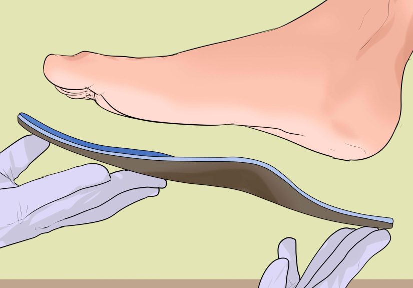
The number-one habit that keeps creative work flexible is non-destructive editing. In Photoshop, this usually means leaning on layers, masks, adjustment layers, and Smart Objects so you can change your mind without burning the whole project down.
The core set-up (aka “future you will send a thank-you email”)
- Layer groups for organization (Background, Subject, Type, Effects, Color, etc.)
- Layer masks instead of erasing
- Adjustment layers instead of direct edits
- Smart Objects for elements you might resize or filter repeatedly
- Smart Filters so effects stay editable
Why does this matter? Because creativity is basically controlled indecision. The best work often comes from trying versions: brighter, darker, cropped, minimal, maximal, “what if the type was 12% more confident?” Non-destructive workflows let you explore without fear.
A Repeatable Workflow: From Dream to Finished Visual
Here’s a practical flow you can reuse for social graphics, web headers, posters, thumbnails, product imagesanything visual.
1) Translate the dream into a “creative sentence”
Dreams are vibes. Projects need words. Write a single sentence like:
- “A calm, surreal poster where light feels like water.”
- “A gritty, high-contrast banner that says ‘fast’ without a speedometer cliché.”
- “A playful collage that looks handmade but reads clean on mobile.”
This sentence becomes your mini-brief. It keeps you from getting lost in the dreamy sauce.
2) Build a 10-minute mood board (quick and ruthless)
Pull 8–12 references: lighting, texture, typography mood, composition styles. You’re not copying; you’re collecting signals. In Photoshop, create a simple reference canvas and drop them in. Label what you like: “soft grain,” “wide margins,” “unexpected shadow color,” “type feels editorial.”
3) Prototype composition with shapes first
Before you touch details, block your layout with simple rectangles and circles. Yes, it feels like kindergarten. Yes, it works.
- Create a group called Layout.
- Use shape layers for major regions (image area, headline zone, CTA zone).
- Set quick guides and margins so the piece breathes.
This stage prevents you from spending 45 minutes perfecting a shadow for an element that will later move two inches to the left.
4) Build the image stack (with editability on purpose)
Now bring in photography, illustration, textures, or generated elements. Convert key elements to Smart Objects when you know you’ll resize, warp, or filter them. Use masks to blend, not erasers to destroy.
Example: You dreamed about “a city made of paper.” In Photoshop, you can:
- Place a city photo as a base layer.
- Add a paper texture above it, set blending mode, then mask where needed.
- Use adjustment layers (Curves, Hue/Saturation, Gradient Map) clipped to specific groups.
- Add subtle shadows with soft brushes on separate layers, masked for control.
5) Color grade like a storyteller
Color isn’t decoration; it’s meaning. If the piece should feel safe, your contrast and saturation choices should support that. If it should feel bold, you might tighten contrast and simplify the palette.
A simple approach:
- Use Gradient Map for a cohesive tone (keep opacity low if needed).
- Add Selective Color to tame problem hues.
- Use Curves to shape light direction and depth.
Bonus tip: flip the canvas horizontally occasionally. It’s like catching your design in a mirrorsuddenly the weird alignment stops hiding.
6) Check readability and accessibility (because “beautiful” should also be readable)
If your design includes text, check contrastespecially for web graphics and thumbnails. The point isn’t to make everything sterile; it’s to ensure people can actually see what you made. If your headline only works in a dark room at 2 a.m., that’s not a designit’s a secret.
7) Export like a professional who respects bandwidth
For web publishing, export formats matter. Older formats like JPEG and PNG are common, but modern formats like WebP and AVIF can often deliver smaller files at comparable quality (with some support considerations depending on context). Your goal: crisp visuals that load fast.
Practical export habits:
- Name versions clearly (Project_Name_Size_Version).
- Export multiple sizes (desktop, mobile, thumbnail).
- Zoom out to 25% and 12.5% to catch artifacts and type issues.
8) Archive the “thinking,” not just the final
Save your layered file. Keep key variations. A month later, when someone asks for a new format or a different headline, you’ll be able to adjust in minutes instead of recreating everything while whispering, “I used to be happy.”
Common Traps (and How to Escape With Dignity)
Trap: You start polishing before you decide what it is
Solution: Separate stages. Prototype first. Polish later. Your future self will thank you, your deadline will stop yelling, and your eye will develop faster.
Trap: Your layer stack becomes a horror movie
Solution: Name layers like you’re collaborating with a stranger (because future you is a stranger). Group logically. Color-label sections. You don’t need perfectionjust navigability.
Trap: You treat dreams like instructions instead of inspiration
Solution: Extract the principle, not the plot. If the dream felt weightless, maybe your composition needs more negative space. If it felt tense, maybe your contrast is too gentle. Use the emotion as direction.
Trap: You work late, sleep poorly, and wonder why ideas feel stale
Solution: Sleep isn’t a luxury for creatives; it’s part of the pipeline. Your brain needs downtime to connect dots. You can’t “optimize” your way out of being human. (If you try, your coffee budget will form its own personality and start making decisions.)
Conclusion: The Most Useful Creative Tools Aren’t Always Tangible
Photoshop is the craft tool: the place where layers become meaning and pixels become persuasion. Dreams are the idea tool: messy, generous, occasionally absurd, and capable of handing you connections you wouldn’t consciously plan.
When you treat them as a team, you get a workflow that’s both inventive and repeatable. You gather strange sparks (dream fragments), turn them into a clear direction (a one-sentence brief), prototype fast (shapes and rough comps), build flexibly (non-destructive Photoshop habits), and ship responsibly (readability and export choices).
So yesmy work tools are Photoshop and dreams. One keeps me honest. The other keeps me brave. And together, they make it possible to sit down at a blank canvas and think, “Okay. Let’s make something that feels like it came from somewhere real.”
Experience Add-On: of “Photoshop and Dreams” in Real-Life Moments
There’s a particular kind of morning that only creative people understand: you wake up with a half-remembered image in your head and a full-remembered to-do list on your phone. The to-do list is loud. The image is quiet. If you don’t catch it fast, it slips away like a bar of soap in a bathtubdramatic, unnecessary, and somehow still your fault.
So you do the ritual. You reach for your notes before your brain fully boots. You write: “Blue hallway. Floating type. Light like dust.” It looks like nonsense, but it’s good nonsensebecause it has mood. Later, when you’re staring at a client brief that says “modern, clean, premium,” you realize your dream gave you a direction: minimal composition, cool highlights, soft grain, and typography that feels like it’s hovering rather than shouting.
Then comes the Photoshop partthe responsible adult in the relationship. You open a new file, set up guides, and start blocking shapes. You drop in a stock photo as a placeholder, not because it’s perfect, but because your brain needs something to react to. You create a group called “Dream Stuff” and another called “Client-Friendly Version,” because you’ve learned that inspiration and approval sometimes need separate rooms.
Halfway through, you catch yourself doing the classic mistake: zooming in to 3200% to fix a detail no one will ever notice. That’s when you zoom out, flip the canvas, and laugh a littlebecause the design is suddenly sideways in your eyes, and you can see the real problem. The headline isn’t “off,” it’s timid. Your dream wasn’t timid. Your dream was floating typography in a blue hallway like it paid rent there. You nudge the scale, tighten the spacing, and the whole thing starts to feel intentional.
Later, revisions arrive. They always arrive. Sometimes they arrive in a friendly email, sometimes they arrive like a raccoon breaking into your kitchen at midnight. “Can we make the logo bigger?” they ask. “Also can we make it feel more luxurious and youthful and serious?” Sure. Absolutely. Let me just consult my other tool: dreams.
And weirdly, that’s when the dream tool helps againnot by giving you a new layout, but by reminding you of the core feeling you’re chasing. You don’t chase every note literally. You chase the emotion: lightness, clarity, quiet confidence. In Photoshop, that means simplifying the palette, letting whitespace breathe, and using contrast so text reads cleanly on every screen.
By the end, you export web-ready files, save the layered PSD, and leave a few hidden variations tucked in a folder like snacks for future you. And when you shut your laptop, you realize the truth: Photoshop handled the “how.” Dreams handled the “why.” The project didn’t just get finishedit got a soul. Even if that soul started as “blue hallway. floating type. light like dust.”