Table of Contents >> Show >> Hide
- Why Pink Gets a Bad Rap (and Why Designers Keep Using It Anyway)
- Trick #1: Pick a Pink That Behaves Like a Neutral
- Trick #2: Ground Pink With Serious Neutrals
- Trick #3: Pair Pink With Deep, Confident Colors
- Trick #4: Use the 60-30-10 Rule So Pink Doesn’t Take Over
- Trick #5: Let Texture Do Half the Work
- Trick #6: Choose the Right Finish and Sheen
- Trick #7: Use Pattern Like a Diplomat
- Trick #8: Put Pink Where It’s Unexpected
- Trick #9: Style It Like a Gallery, Not a Candy Shop
- Room-by-Room Playbook: Sophisticated Pink That Actually Works
- The Biggest Mistakes That Make Pink Look Too Sweet (and the Fix)
- Experiences: Real-World Pink Makeovers and What Designers Notice (500+ Words)
- Conclusion: Pink, But Make It Grown-Up
Pink has a reputation problem. Somewhere between bubblegum lip gloss, birthday balloons, and that one childhood bedroom wallpaper nobody wants to talk about,
pink got labeled as “cute” first and “serious” never. Which is funnybecause designers use pink all the time, and not just in nurseries or powder rooms.
The secret is that sophisticated pink isn’t a color… it’s a strategy.
When pink looks grown-up, it behaves like a neutral, plays nicely with texture, and knows when to be the lead singer versus the backup vocalist.
It’s less “cotton candy” and more “rosé at a rooftop bar”still fun, but with better lighting and a strong sense of boundaries.
Let’s break down the designer tricks that pull pink out of the “sweet” category and into “stylish, layered, and expensive-looking.”
Why Pink Gets a Bad Rap (and Why Designers Keep Using It Anyway)
Pink is emotionally loud. Even soft pinks can feel like a statement because we’ve been trained to read them as playful, romantic, or youthful.
But color is context. The same blush that looks sugary next to bright white and flimsy décor can look refined next to walnut wood,
creamy linen, and a moody navy.
Designers also love pink because it’s flattering. It warms up rooms the way candlelight warms up faces.
Used well, pink makes spaces feel welcoming, lived-in, and “I definitely have my life together” (even if the junk drawer says otherwise).
Trick #1: Pick a Pink That Behaves Like a Neutral
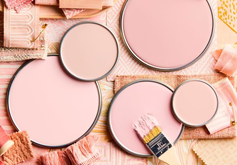
If you want sophisticated, start with pinks that don’t shout. Think: dusty rose, blush-beige, clay pink, muted mauve, soft terracotta-pink,
or “the inside of a seashell” pink. These shades have complexityoften a touch of gray, brown, or beige that keeps them grounded.
Shop for undertones, not just the color name
Two pinks can look identical in a store and completely different on your wall. That’s undertone drama.
Some pinks lean peach (warm), others lean lilac (cool), and some lean brown or beige (the secretly-sophisticated MVPs).
Warm pinks feel cozy and glowy; cool pinks feel airy and modern; brown-based pinks read like neutrals with personality.
Test in real lightmorning, afternoon, and at night
Lighting is where pink either becomes “elegant blush” or “surprise strawberry milk.”
Paint a sample (or use large peel-and-stick swatches) and watch it across the day.
North-facing rooms can make colors feel cooler and a bit moodier; warm evening light can turn some pinks extra rosy.
The goal is a pink you like in multiple lighting conditions, not just at 2:17 p.m. on a sunny Tuesday.
Trick #2: Ground Pink With Serious Neutrals
Sophisticated pink always has a supporting cast. If pink is the dessert, neutrals are the dinner that makes it feel intentional.
Pair pink with shades that add weight: warm whites, soft taupes, mushroom grays, camel, charcoal, or espresso.
Try “creamy” instead of “crisp” white
Bright, icy white can make pink look more juvenile by comparisonlike pink is trying to be “cute.”
Creamy whites and warm off-whites soften the contrast and help pink feel like a natural part of the palette.
The whole room reads calmer, richer, and less like a candy aisle.
Add a dark anchor (yes, even if you’re nervous)
If you’ve ever wondered why a pink room in a magazine looks expensive, check the dark accents.
A black metal frame, a charcoal rug, a deep wood side table, or a smoky mirror frame gives pink something to push against.
Contrast is confidence. And confidence is never childish.
Trick #3: Pair Pink With Deep, Confident Colors
Pink becomes sophisticated when it’s treated like a real color in a real palettenot a decorative sprinkle on top.
The fastest way to do that is to pair it with deeper hues that add drama and balance.
Pink + green: nature’s favorite power couple
Blush with sage feels calm and classic. Dusty rose with olive feels earthy and modern. Pink with emerald feels bold and tailored.
It works because it echoes nature: flowers and leaves, sunsets and gardens. If you want pink to feel “designed,” add green.
Pink + navy: preppy, polished, and surprisingly timeless
Navy makes pink feel crisp and intentional, like it has a meeting at 9 but still knows where the best brunch is.
Use navy in upholstery, rugs, cabinetry, or painted trim to give pink a clean, structured edge.
Pink + burgundy/oxblood: moody and elegant
For maximum sophistication, keep pink muted and let burgundy bring the drama.
Think dusty pink walls with a wine-colored velvet chair, or blush textiles with deep red art and warm wood.
This pairing feels layered, grown-up, and a little European (even if your view is a parking lot).
Pink + warm neutrals: camel, tan, and natural wood
When pink meets leather, walnut, rattan, linen, or travertine, it instantly reads more elevated.
Warm neutrals make pink feel like a “design decision,” not a theme.
Trick #4: Use the 60-30-10 Rule So Pink Doesn’t Take Over
Designers often rely on a simple ratio to keep color balanced: roughly 60% dominant color, 30% secondary, 10% accent.
If pink is your dominant color (like walls), keep the rest more restrainedneutrals, woods, and a darker color for depth.
If pink is your accent, make it the 10%: pillows, art, lampshades, florals, or a single upholstered chair.
This is how you avoid the “everything is pink and now I live inside a macaron” problem.
Unless that’s your dream. In which case, carry onjust do it in velvet.
Trick #5: Let Texture Do Half the Work
The difference between sweet and sophisticated is often texture.
Pink in flat, shiny, plastic-y materials can feel juvenile. Pink in rich, tactile materials feels curated.
Use natural materials to make pink feel grounded
Pair pink with oak, walnut, cane, marble, limestone, terracotta, woven baskets, or chunky linens.
These materials bring “real life” energy into the space, which keeps pink from feeling costume-y.
Go plush in small doses
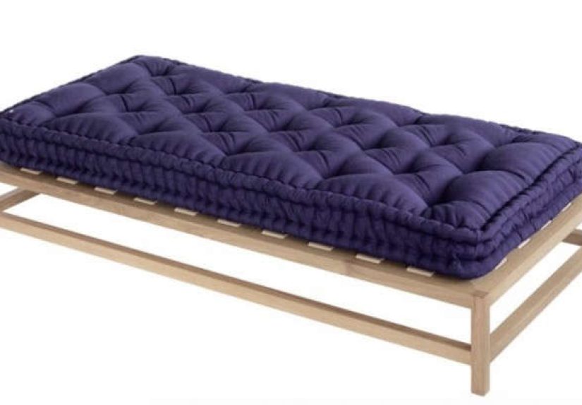
Velvet, mohair, bouclé, and thick wool make pink feel luxe. A dusty rose velvet chair reads sophisticated instantly.
The trick is to keep the silhouette clean and the palette tightone plush pink moment is a statement; five becomes a themed lounge.
Trick #6: Choose the Right Finish and Sheen
Here’s a designer truth: sheen changes color. A pink that looks soft in matte can look brighter (or harsher) in high gloss.
That doesn’t mean gloss is badit just means it’s powerful.
Matte or eggshell walls = modern, rich, forgiving
Lower-sheen walls tend to look more sophisticated and hide imperfections better.
They also make color look deeper and more “paint-like” (in a good way).
If you’re nervous about pink, matte is your best friend because it softens the impact.
Use higher sheen for trim, doors, or a surprise moment
Want pink to feel architectural? Paint the trim a few shades deeper than the walls, or use a satin/semi-gloss finish on doors.
This creates dimension without needing more colors. It’s subtle, but it reads high-end.
Trick #7: Use Pattern Like a Diplomat
Pattern is where pink can either look chic or look like a cupcake exploded.
The trick is to balance scale, color, and negative space.
Pick patterns with contrast and structure
Stripes, geometrics, tailored florals, block prints, and graphic wallpaper can make pink feel modern.
Look for patterns that include neutrals, black, navy, olive, or warm brownsthose tones “adultify” the pink.
Let one pattern be the star
If you’re doing a bold pink wallpaper, keep the rest simple. If you’re doing patterned textiles, let walls be calm.
Sophistication is often just restraint wearing a really good outfit.
Trick #8: Put Pink Where It’s Unexpected
Pink doesn’t have to be on every wall to feel intentional. In fact, surprise placements often look the most designer.
- Ceilings: A barely-there blush overhead can make a room feel warm and flattering.
- Trim and millwork: Pink on baseboards or built-ins feels custom, especially with a deeper accent nearby.
- Inside cabinets: A muted pink interior behind glass-front doors looks curated, not childish.
- Front door: A dusty rose or clay-pink door is charming and modernespecially with dark hardware.
Trick #9: Style It Like a Gallery, Not a Candy Shop
Styling is where pink gets upgraded. Sophisticated rooms have intentional “adult objects” (lamps, art, ceramics, books)
and fewer novelty items. If your décor feels like it could be bought in one cart at a single store… it’ll read younger.
Use art to add edge
Black-and-white photography, oversized abstract prints, or moody landscapes can keep pink from feeling too precious.
Art adds narrative. And narrative is the opposite of theme décor.
Pick metals with warmth
Brass, aged bronze, and warm nickel pair beautifully with pink and help it feel elevated.
Highly reflective chrome can work, but it tends to push pink more modern and “pop,” so choose it intentionally.
Room-by-Room Playbook: Sophisticated Pink That Actually Works
Living room: treat pink like upholstery or an atmospheric wall color
For a grown-up living room, try dusty rose walls with cream curtains, walnut furniture, and a navy or charcoal rug.
Or keep walls neutral and bring pink through one major piece: a sofa, a pair of chairs, or a large artwork.
Add black accents (frames, lighting, coffee table legs) for definition.
Bedroom: blush as a “soft neutral”
Bedrooms love pink because it’s soothing without being cold. Use pale blush walls with warm white bedding,
light wood nightstands, and a textured headboard (linen, cane, or upholstered in a deeper neutral).
The “sophisticated” move is to skip overly frilly details and lean into calm, layered textiles.
Kitchen: pink in small doses, paired with serious materials
In kitchens, pink shines as tile, accessories, or paint on an islandespecially when paired with stone, wood, and dark hardware.
Think blush zellige-style tile with creamy cabinets and aged brass pulls, or a muted mauve pantry door with black hinges.
Keep counters and floors grounded so the pink reads modern, not novelty.
Bathroom: the easiest place to go bold
Bathrooms are small, so color-drenching can look intentional instead of overwhelming.
Try a clay-pink wall with warm lighting and brass fixtures, or a dusty rose vanity with a stone countertop.
If you want an extra designer flex: pair pink with deep green trim or moody art.
Entryway or home office: pink as “confidence color”
A muted pink entry feels welcomingespecially with dark hooks, a patterned runner, and a vintage mirror.
In a home office, pink can be energizing if it’s grounded: dusty pink walls, a walnut desk, black task lighting, and crisp art.
It’s productive, but still human. Like a to-do list with good hair.
The Biggest Mistakes That Make Pink Look Too Sweet (and the Fix)
-
Mistake: Pairing pink with bright white and pastel-only accents.
Fix: Swap in creamy whites, warm woods, and one dark anchor (navy, charcoal, or espresso). -
Mistake: Using a super “clean” pink with no undertone complexity.
Fix: Choose a pink with gray, beige, or clay undertones for a more neutral, sophisticated feel. -
Mistake: Too many small pink accessories scattered everywhere.
Fix: Consolidate pink into one or two intentional moments (one large textile, one piece of art, one statement lamp). -
Mistake: Ignoring lighting and ending up with “surprise Pepto.”
Fix: Sample in your room at different times of day, and pick a pink that stays stable. -
Mistake: Making everything “cute.”
Fix: Add tailored shapes, substantial materials, and grown-up stylingfewer novelty items, more texture and art.
Experiences: Real-World Pink Makeovers and What Designers Notice (500+ Words)
If you ask designers how pink turns sophisticated in real homes, you’ll hear the same themes again and again: sampling, grounding, and restraint.
Pink is one of those colors that can feel wildly different once it’s no longer a tiny square on a paint chip. In real rooms, it reacts to light, floors,
and even your neighbor’s tree outside the window like it’s auditioning for a role.
One common “pink success story” starts in the powder room. Homeowners often want a bold moment there because the space is small, and it feels lower-risk.
The rooms that land the most sophisticated usually skip the bright, candy tones and go for something dustythen add a warm metal and a great mirror.
The difference is immediate: instead of “cute bathroom,” it becomes “boutique hotel bathroom.” The magic isn’t just the pink; it’s the supporting cast:
an aged brass sconce, a stone countertop, a vintage runner, or an inky framed print that adds contrast.
Another pattern shows up in living rooms, especially when someone wants to move beyond gray but isn’t ready for full jewel-tone commitment.
Designers often nudge them toward a blush-beige wall because it behaves like a neutral while still making the space feel warmer and more personal.
The “grown-up” look appears when that wall color gets paired with substantial furniturewalnut, leather, dark metaland textiles that feel tactile.
Even a single detail, like a charcoal rug or black-framed art, can change the mood from “sweet” to “tailored.”
Then there’s the lighting lesson. People frequently fall in love with a pink in a bright showroom and get surprised at home.
In cooler natural light, some pinks look grayer or slightly mauve; in warm evening light, they can look rosier.
That’s why the most experienced designers treat pink like a perfume: you try it on, live with it, and see how it wears over time.
A smart approach is to test a few optionsone that leans warm, one that leans cool, and one that leans neutral (beige/gray).
In many homes, the “neutral-leaning” pink wins because it stays sophisticated in more lighting conditions.
In rentals, the success stories usually rely on strategic pink rather than full commitment. Designers might add pink through a rug with muted tones,
a large abstract print that includes blush, or linen curtains with a warm rosy cast. The trick is scale: one bigger pink element tends to look more intentional
than six small accessories sprinkled around like confetti. And because renters can’t always change floors or cabinets, grounding becomes even more important
darker woods, black accents, and layered neutrals help pink feel like part of a designed palette instead of a temporary mood swing.
The biggest real-world takeaway is simple: sophisticated pink isn’t about avoiding funit’s about editing.
Pink becomes elevated when it’s balanced, anchored, and surrounded by materials that feel authentic.
When you treat pink like a real design choice (not a theme), it stops being “sweet” and starts being “style.”
Conclusion: Pink, But Make It Grown-Up
The “secret” to sophisticated pink isn’t a single magical shadeit’s what you pair it with and how you use it.
Choose complex, muted pinks that behave like neutrals. Balance them with grounded materials and confident contrast.
Use texture, sheen, and scale to keep the look intentional. And remember: pink doesn’t need to be everywhere to be powerful.
Sometimes the most sophisticated pink is the one that knows when to whisper.