Table of Contents >> Show >> Hide
- Why “Outdated” Happens So Fast in Kitchens
- 1) Picture-Frame Backsplashes (a.k.a. the “Tile Necklace” Above the Range)
- 2) Speckled Granite Countertops That Look Like TV Static
- 3) Open Shelving Everywhere (Because Dust Deserves a Display, Too)
- 4) Fluorescent Box Lighting and Dropped Ceilings
- 5) Over-the-Range Microwaves That Visually (and Literally) Crowd the Cook
- How to Update a Dated Kitchen Without a Full Gut Job
- Conclusion: A Kitchen That Ages Well Is One That Lives Well
- Real-Life Renovation Experiences: What Homeowners Learn the Hard Way
Kitchens are the only room in the house that has to perform like a restaurant, look like a magazine spread,
and survive a household that treats the fridge like a community bulletin board. So when a kitchen trend goes bad,
it doesn’t just go badit goes public. Quickly.
The good news: “dated” doesn’t mean “doomed.” Most outdated kitchen trends can be softened, edited, or swapped
without taking out a second mortgage (or your load-bearing wall). The goal is simple: keep the parts that work,
retire the parts that scream a specific decade, and rebuild a kitchen that feels like younot a rerun.
Why “Outdated” Happens So Fast in Kitchens
Design trends move faster than ever, but kitchens age even faster because they’re filled with high-visibility elements:
cabinets, countertops, lighting, appliances, and backsplashes. If one of those features is overly specifictoo patterned,
too ornate, too “this was hot in 2006”your whole kitchen can feel stuck in time.
Interior designers tend to agree on a timeless formula: prioritize function, avoid fussy details that are hard to clean,
and choose a calm “foundation” (cabinetry, counters, major finishes) that can handle evolving tastes. Then have fun with
the easy stuffhardware, stools, paint, pendantsbecause those can change as often as your favorite playlist.
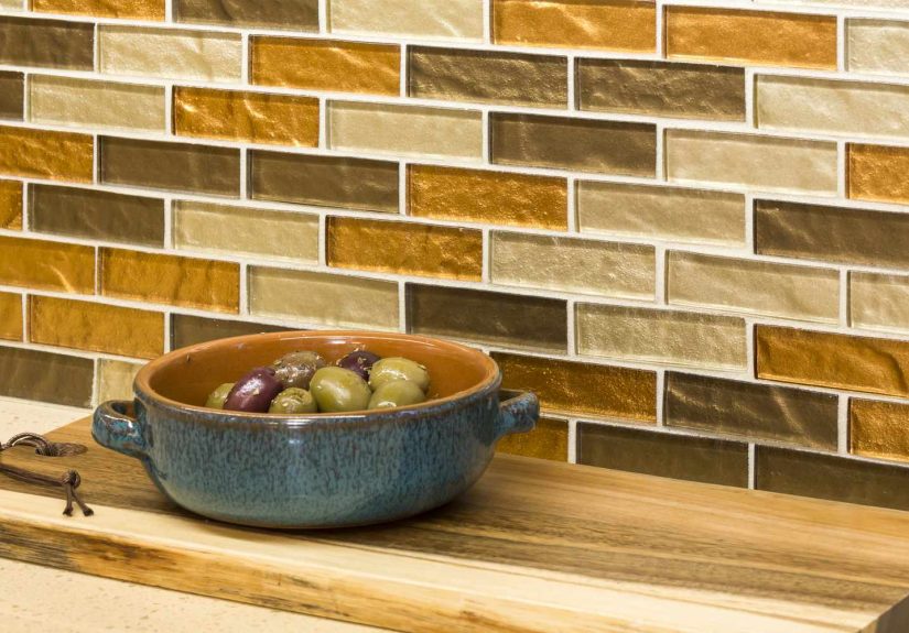
1) Picture-Frame Backsplashes (a.k.a. the “Tile Necklace” Above the Range)
You know the look: a decorative panel behind the stove framed by a thick border, like the backsplash is posing for a portrait.
It was wildly popular in the early 2000sespecially in kitchens that loved “statement” moments.
Today, designers are pretty blunt: it reads busy, breaks up the wall visually, and feels more decorative than deliberate.
Why designers want it to stay in the past
The problem isn’t that it’s “bold.” The problem is that it’s bold in a way that doesn’t play well with the rest of the room.
That framed panel grabs attention but rarely connects to the surrounding materials, so it looks like a random accessory instead
of part of the architecture. And those extra edges and seams? They’re basically tiny grease collectors doing what grease collectors do.
Do this instead
- Go full-height and continuous: Run your backsplash from counter to upper cabinets (or even to the ceiling) for one clean field.
- Use slab or large-format materials: Fewer grout lines = easier cleaning and a calmer look.
- Create a focal point without “framing” it: If you want drama, choose one standout tile or stone and let it breatheno border required.
If you’re stuck with a picture-frame backsplash for now, editing helps: simplify nearby décor, swap out busy accessories,
and lean into a cohesive color palette so the backsplash stops yelling and starts speaking at an indoor voice level.
2) Speckled Granite Countertops That Look Like TV Static
Granite itself isn’t the villain. The villain is the ultra-speckled, high-contrast granite that dominated kitchens for years.
It’s the countertop equivalent of a loud necktie: technically impressive, visually relentless, and impossible to ignore.
Designers often say this is one of the quickest ways to date a kitchen.
Why it reads dated
Speckled granite tends to fight every other element in the room. It competes with cabinet grain, clashes with backsplashes,
and makes paint colors look “off” because your eye is constantly sorting a confetti of tones. It also announces a very specific era
of “luxury kitchen” designone that leaned hard on shiny finishes and bold patterning.
Functionally, natural stone can require maintenance and resealing. That’s not a deal-breaker, but it’s a mood-killer if you were promised
“effortless elegance” and got “weekly anxiety.”
Do this instead
- Pick calmer movement: Look for stone with larger, softer veining or more consistent tone.
- Consider honed or leathered finishes: They feel warmer and hide daily life better than high gloss.
- Mix materials strategically: Butcher block on an island paired with a quieter perimeter counter can add warmth without chaos.
If replacement isn’t happening soon, you can “turn down the volume” by choosing simple backsplash tile, quieter hardware,
and paint colors pulled from the countertop’s most subtle undertones (not the loudest flecks).
3) Open Shelving Everywhere (Because Dust Deserves a Display, Too)
Open shelving had a strong run, and in the right kitchen it can still look great. But designers increasingly warn against
wall-to-wall open shelves in a real-world cooking space. In photos, it’s airy and curated. In real life, it’s a part-time job
you didn’t apply for.
Why designers push back
Kitchens produce a special kind of grime: a dust-and-grease combo that clings to surfaces like it’s paying rent.
Open shelves turn everyday dishes into décorwhich sounds cute until you realize your cereal bowls now require styling, spacing,
and regular wiping. If you’re not naturally tidy (and most humans are not naturally “magazine tidy”), open shelving can make a kitchen
feel cluttered fast.
Do this instead
- Use open shelving as an accent: One small section for frequently used items (or genuinely pretty pieces) can be enough.
- Try glass-front uppers: You get the “lighter” look without inviting grease onto every plate.
- Lean into drawers: Deep drawers for dishes and cookware are easier to access and keep the visual field calm.
Want the open-shelf vibe without the open-shelf consequences? Treat it like a “capsule wardrobe.”
Keep only what you use weekly, stick to a simple color story, and don’t store anything up there that you’d rather not wash.
4) Fluorescent Box Lighting and Dropped Ceilings
Nothing says “I renovated in an era when we feared shadows” like a big fluorescent ceiling panel. Add a dropped ceiling, and you’ve got a one-two
punch: the room feels lower, the light feels colder, and everyone looks like they’re auditioning for a DMV photo.
Designers routinely call this combo a dead giveaway that a kitchen is overdue for an update.
Why it feels outdated
Harsh overhead lighting flattens everythingfaces, finishes, food, the joy in your soul. It also tends to create strong shadows exactly where you
don’t want them: on counters where you prep meals. Dropped ceilings can make a kitchen feel boxed in, and the big panel fixture becomes the focal
point whether you want it or not (you do not).
Do this instead
- Layer your lighting: Combine ambient (overall), task (work areas), and accent (mood) lighting.
- Add under-cabinet lighting: It makes counters safer and instantly more high-end.
- Use warmer, modern fixtures: Pendants over an island and discreet recessed lighting can coexist peacefully.
If you can’t change the ceiling right now, lighting still gives you leverage. Swap bulbs to a warmer temperature, add under-cabinet strips,
and introduce a statement pendant to shift attention away from the “office ceiling” vibe.
5) Over-the-Range Microwaves That Visually (and Literally) Crowd the Cook
Over-the-range microwaves were a popular space-saving move, but designers and renovation pros increasingly flag them as a feature people regret.
They can dominate the visual line of sight, complicate ventilation choices, and place a hot appliance at an awkward height for many households.
Why it’s falling out of favor
The biggest issue is ergonomics. A microwave that requires lifting hot liquids up and out at face level is not exactly the safety flex we need.
It can also limit your hood options, and it often becomes the “main character” in a kitchen wall that should feel intentional, not appliance-first.
When homebuyers and designers talk about more universal, user-friendly kitchens, this setup often lands on the “there’s a better way” list.
Do this instead
- Microwave drawers: Convenient access, cleaner sightlines, and less lifting.
- Built-in wall placement: Especially effective in a tall cabinet bank where it looks integrated.
- Prioritize ventilation: Choose a hood that fits your cooking habits, then place the microwave where it works best.
Not remodeling soon? A quick visual fix is to upgrade the range hood area (even a simple, better-proportioned hood) and keep the microwave exterior
clean and minimalbecause fingerprints are the accessory nobody asked for.
How to Update a Dated Kitchen Without a Full Gut Job
If a full remodel isn’t happening right now, you still have powerful “high-impact, lower-drama” upgrades:
- Lighting first: Replace harsh fixtures, add under-cabinet lights, and consider one statement pendant.
- Hardware refresh: New pulls/knobs can make cabinets feel current in an afternoon.
- Paint strategically: A calmer wall color can reduce visual noise around busy counters or backsplashes.
- Edit the backsplash zone: Even a simple, cohesive tile can modernize the whole wall.
- Declutter surfaces: Designers aren’t being meanclear counters truly read more modern.
Conclusion: A Kitchen That Ages Well Is One That Lives Well
Trends aren’t evil. They’re just impatient. The safest path is choosing finishes that look good on a random Tuesdaynot only under perfect lighting
on social media. If your kitchen currently features a picture-frame backsplash, speckled granite, wall-to-wall open shelving, fluorescent lighting,
or an over-the-range microwave that steals the spotlight, don’t panic. You don’t need to erase your kitchen’s personalityyou just need to give it
a smarter, calmer backbone.
Real-Life Renovation Experiences: What Homeowners Learn the Hard Way
If you’ve ever walked into a kitchen and immediately known the year it was remodeled, congratulationsyou’ve experienced the “time capsule effect.”
Designers see it all the time during consultations: the homeowner loves the layout, hates the vibe, and can’t quite explain why the room feels stuck.
The answer is almost always a handful of loud, era-specific choices working together like an accidental boy band.
One of the most common stories goes like this: “We thought open shelving would make the kitchen feel bigger.” And it doesright up until the first
month of real cooking. The shelves become a museum of mismatched mugs, spice jars, and that one random blender cup that somehow multiplies.
Then comes the cleaning reality: a fine film that appears on everything, especially near the stove. Homeowners describe it as “dust,” but it behaves
like dust that went to culinary school and specialized in grease. The fix is rarely “rip it all out.” More often, it’s “keep one small shelf, add
closed storage, and let the kitchen breathe again.”
Picture-frame backsplashes create a different kind of regret: it’s not constant mess, it’s constant visual interruption. Homeowners notice
it most when they try to refresh the room with paint or new hardware. Suddenly, the backsplash doesn’t coordinate with anything, because it was never
meant to coordinateit was meant to be a solo act. Designers often recommend replacing it with a continuous backsplash that runs cleanly across the wall.
People are shocked by how “new” the kitchen feels afterward, even when nothing else changes. It’s like removing one loud accessory and realizing you had
a great outfit underneath the whole time.
Then there’s speckled granite. Homeowners don’t usually hate granitethey hate how it dominates the room. Many describe shopping for barstools or rugs
and feeling like nothing looks right. That’s the speckle effect: it introduces so many competing colors that other choices start to feel wrong by default.
When people finally swap to a quieter surface (or even just calm down the backsplash and paint), they often say the kitchen feels “lighter” and “cleaner”
even though the square footage hasn’t changed at all. The countertop was doing all the talking, and it wasn’t exactly saying anything helpful.
Fluorescent lighting regrets are immediate and universal. Homeowners usually mention it the moment they walk you in: “Ignore the lightingit’s terrible.”
The lighting is, in fact, terrible. It makes food look less appetizing, emphasizes clutter, and turns every late-night snack run into a scene from a suspense
movie. The best part? Lighting upgrades can feel magical without being structural. Adding under-cabinet lighting and warmer fixtures is one of those changes
that makes people say, “Why didn’t we do this sooner?”which is renovation-speak for “I’d like to invoice my past self.”
Over-the-range microwaves inspire a quieter regret, usually discovered during daily use. People notice awkward lifting, steam that doesn’t vent well, or the
visual heaviness above the range. Many families end up wanting a better hood for cooking performance and a safer, easier microwave location. When they switch
to a drawer microwave or an integrated cabinet setup, the kitchen instantly feels more intentionallike the room was designed, not assembled from a
“space-saving solutions” flyer.
The big takeaway from these real-life experiences is surprisingly hopeful: you rarely need to redo everything. Updating one or two high-impact elements
especially lighting, backsplash, and the most visually dominant surfacecan pull a kitchen out of its time capsule and into something that feels current,
comfortable, and genuinely livable.