Table of Contents >> Show >> Hide
- How to Read a “Dangerous vs. Safe” Family Map Without Getting Fooled
- What the Big Family Maps Agree On
- Where the “Danger” Signals Stack Up
- The Hidden Twist: Some of the “Safest” States Are Financially Brutal
- Health Access Can Make or Break a Family Start
- Environment and Climate Risk: The Map Layer Families Forget
- What Families Actually Experience Behind the Maps
- How to Use These Maps the Smart Way
- Conclusion
If you’ve ever looked at one of those colorful U.S. maps ranking the “best” and “worst” places to raise kids, you already know the basic story: the Northeast and Upper Midwest often look pretty friendly, while parts of the South and Southwest face tougher odds. But here’s the thing nobody tells you in the headline: “dangerous” doesn’t just mean crime.
For families, danger can look like a lot of things: a high infant mortality rate, limited maternity care, weak child health coverage, expensive child care, poor air quality, or a budget so tight it squeaks when you buy diapers. In other words, the map isn’t just about whether someone steals your catalytic converter. It’s also about whether you can get an OB appointment, afford day care, and make it through the month without eating “creative” leftovers three nights in a row.
This article breaks down what the data really shows when you combine family-focused rankings with health, child well-being, affordability, and environmental indicators. The result is a more realistic map of where starting a family tends to be saferand where it can be much harder.
How to Read a “Dangerous vs. Safe” Family Map Without Getting Fooled
Before we rank anything, here’s the key rule: no single map tells the whole story. Some rankings prioritize schools and affordability. Others focus on health outcomes. Others are all about crime. If you’re choosing where to start a family, you need a blended view.
The five lenses that matter most
For a family-start decision, the most useful maps usually combine some version of these:
- Health and maternal care: infant outcomes, insurance coverage, prenatal access, hospital systems.
- Child well-being: poverty rates, school performance, neighborhood conditions.
- Safety and public risk: violent crime and broader community stability.
- Affordability: child care, housing, and income pressure (because “safe” is harder if you’re financially drowning).
- Environmental stress: air quality and extreme weather exposure.
That’s why some states rank high on one map but low on another. A state can be physically safer but financially brutal. Another state can be cheaper but struggle with health access or child outcomes. Welcome to America: where every decision comes with a spreadsheet.
What the Big Family Maps Agree On
A strong starting point is the kind of state-by-state comparison families actually search for: “Where is the best place to raise kids?” One of the most cited consumer rankings (WalletHub) compares states across dozens of family indicators, and the pattern is pretty clear: the top of the list is dominated by states with stronger education, health, and economic fundamentals, while the bottom includes states dealing with tougher safety and household-stability challenges.
States that frequently show up as the safest to start a family
When you layer multiple sources together, a familiar group keeps appearing near the top:
- Massachusetts
- New Hampshire
- Minnesota
- Vermont
- New Jersey (and nearby Northeast states)
These states tend to perform well because they repeatedly show strength in child well-being, health system performance, and insurance coverage. In plain English: families are more likely to have a decent shot at good schools, medical care, and a stable support system.
Massachusetts is the poster childfor good reasons
Massachusetts shows up near the top in multiple frameworks, and it’s not just because people there can pronounce “Worcester” without blinking.
On family rankings, Massachusetts lands at or near the top. On child-focused measures, it also performs well: the Annie E. Casey Foundation’s KIDS COUNT data highlights the Northeast as a consistent leader, and Massachusetts is repeatedly cited as one of the stronger states overall. It also posts stronger education and child-outcome indicators than many peers.
Health data reinforces the same picture. Massachusetts appears among the top states in overall health system performance, and it’s often used as a benchmark when national reports compare infant mortality and avoidable deaths across states. Even on infant mortality, it tends to sit on the low end of the range nationally, which is one of the most meaningful indicators for families starting out.
New Hampshire and Minnesota are “quietly strong” family states
New Hampshire and Minnesota don’t always get the same hype as Massachusetts, but they’re data darlings in family maps. New Hampshire stands out for low child poverty and strong child well-being performance. Minnesota consistently appears in top-tier child and family rankings, and it performs well across several health and community indicators.
That doesn’t mean these states are perfectno state is. But they tend to offer fewer “stacked risks” at once. If you’re a new parent, that matters. You can handle one challenge. It’s when everything gets hard at the same time that families get squeezed.
Where the “Danger” Signals Stack Up
Now for the uncomfortable part. Some states appear near the bottom of family rankings over and overnot because residents are doing anything wrong, but because the structural conditions are tougher. These are often states where several risks overlap: weaker child well-being, higher poverty, worse infant outcomes, lower insurance coverage, and gaps in health access.
New Mexico: the data flashes red in multiple categories
New Mexico frequently appears near the bottom in broad family rankings, and the supporting data helps explain why. Crime data from federal justice reporting shows New Mexico at the high end of violent victimization and homicide rates in recent state comparisons. KIDS COUNT data also shows serious child well-being challenges, including weaker fourth-grade reading proficiency and higher child poverty than top-performing states.
That combination matters because it creates a “compound risk” environment for new families. It’s not one statisticit’s the accumulation of stressors: safety concerns, education gaps, and economic pressure happening at the same time.
Mississippi: persistent health and child-well-being risks
Mississippi is another state that shows up repeatedly in the higher-risk group for families. National health system comparisons place it near the bottom overall, and infant mortality rates remain among the highest in the country in recent federal and nonprofit health analyses.
Child and family data points in the same direction. KIDS COUNT and Census-based summaries show higher poverty burdens in Mississippi than the national average, and broader reports on child well-being continue to flag the state as facing substantial challenges across economic and health dimensions.
That doesn’t mean families can’t thrive in Mississippimany do. It means the systems around families are doing less of the heavy lifting.
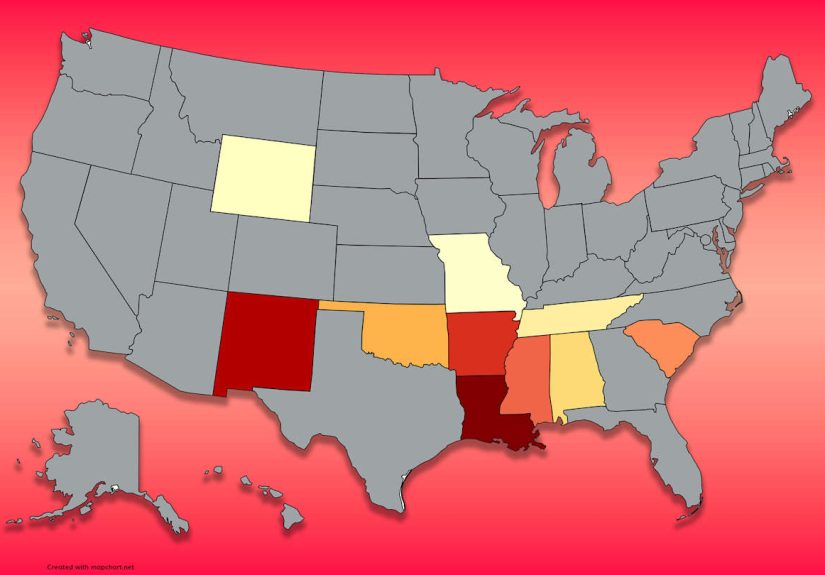
Louisiana, Texas, West Virginia, and parts of the South/Southwest
These states show up often in the “harder places to start a family” conversation, but for different reasons:
- Louisiana and New Mexico both post very high child poverty rates in recent KIDS COUNT data.
- Texas is a recurring outlier on uninsured rates, including for children, in Census health coverage summaries.
- West Virginia shows up in low-ranked health-system groupings and is often cited for very high avoidable death rates compared with top states.
- Mississippi appears in multiple bottom-tier lists, especially for health and infant outcomes.
When a map paints the South or Southwest with a darker shade, this is usually what it’s capturing: not a single “bad state,” but a cluster of policy, access, and affordability issues that create more risk for families.
The Hidden Twist: Some of the “Safest” States Are Financially Brutal
Here’s where the story gets spicy. Some of the states that look safest on family maps are also the ones that can punch your wallet in the face.
Child care is the biggest plot twist. Child Care Aware of America’s affordability analysis shows just how extreme infant care costs can get, and several high-performing family states are also among the least affordable for center-based infant care. Massachusetts, for example, ranks among the least affordable states for infant center care in the group they list, with a very high annual price and a massive share of single-parent median income going to care. Hawaii, California, Maryland, and Oregon also land near the top of the “least affordable” list.
That means a state can be amazing on schools, health systems, and safetyand still feel impossible for a young family with one income, student loans, and a baby who thinks sleep is optional.
Why affordability changes the “safe” map
If you only look at crime or health, Massachusetts and Minnesota look fantastic. If you add child care, housing costs, and general cost-of-living pressure, the picture gets more complicated. Economic Policy Institute data also reinforces the broader affordability problem: child care costs are now more expensive than rent in most states and more expensive than mortgages in all states plus D.C. That’s not a budgeting issue. That’s a structural issue.
So the best family map is not “safe vs. unsafe.” It’s more like:
- Safe but expensive (many Northeast and West Coast states)
- Affordable but higher-risk on health or child outcomes (some Southern/Southwestern states)
- Balanced middle-ground options (some Midwest states, depending on metro area)
Health Access Can Make or Break a Family Start
For brand-new families, maternal and infant care often matters more than people realizeright up until you need it urgently.
March of Dimes reports that large portions of U.S. counties still qualify as maternity care deserts, with millions of women and hundreds of thousands of babies living in areas with limited or no nearby maternity care access. That doesn’t affect every state equally, and it can dramatically change the real-life safety of starting a family in rural or underserved areas.
Even in a “good” state, you can be in a maternity access gap. And in a lower-ranked state, that gap is often wider. That’s why state maps are helpfulbut county-level reality is where family life happens. Federal tools from HRSA can help families look at maternal and infant health geography in more detail before a move.
Environment and Climate Risk: The Map Layer Families Forget
Parents usually think about schools and neighborhoods first, which makes sense. But environmental risk is increasingly part of the family-safety equation.
The American Lung Association reports that a very large share of Americans live in counties with unhealthy ozone or particle pollution levels, and poor air quality is tied to serious health risksincluding concerns relevant to pregnancy and infant health. If you’re choosing where to start a family, air quality isn’t a “nice to know.” It belongs on the same checklist as schools and pediatricians.
Extreme weather matters too. NOAA’s recent billion-dollar disaster summaries show the U.S. is experiencing frequent, high-cost weather disasters with significant loss of life. For families, that can mean insurance costs, evacuation stress, interrupted work, school closures, and long-term housing instabilityespecially in regions exposed to hurricanes, severe storms, or wildfire smoke.
What Families Actually Experience Behind the Maps
Composite experiences based on common patterns in the data
Experience 1: “Safe state, scary child care bill.” A couple moves to a highly ranked Northeast state because the schools are good, the hospitals are excellent, and the town feels like a postcard. They feel smart. They are smart. Then the baby arrives, and they realize infant care costs almost as much as a second rent payment. One parent starts doing spreadsheet gymnastics at 11:30 p.m. They debate working opposite shifts. They debate moving farther out. They debate whether grandparents can come help for six months. Nothing is “wrong” with the statethis is exactly what the data predicts. It’s a safer environment in many ways, but affordability becomes the dominant stressor.
Experience 2: “Lower costs, higher uncertainty.” Another family chooses a lower-cost area in a state that ranks worse on health and child indicators. On paper, the house is affordable and they have more square footage. But over time, the trade-offs appear: longer drives for specialist care, fewer child care options, a thinner hospital network, and more concern about local school outcomes. If a parent loses a job or the child needs extra services, the margin for error is smaller. The day-to-day can still be happy and stable, but the family feels like it has to self-manage more risk because the local systems are stretched.
Experience 3: “The county matters more than the state.” A family sees a state ranked near the bottom and crosses it off immediately. Later, they discover one metro area in that same state has strong hospitals, a lower crime rate, a good public preschool program, and a support network through relatives. Meanwhile, a “top” state they loved has one county with sky-high housing costs, long pediatric wait times, and miserable commute traffic. This is the biggest lesson hidden in every map: state rankings are useful, but they are blunt instruments. Your ZIP code, commute, and access to care often determine your actual family experience more than the statewide average.
Experience 4: “Health access changes everything.” A first-time mom in a rural county has to drive over an hour for prenatal appointments. She takes extra time off work, pays more for gas, and stresses every time weather turns bad. A friend in a high-performing state can reach a major hospital in 20 minutes and gets a same-week pediatric appointment after delivery. Neither family is “better,” but the infrastructure around them is very different. That difference affects postpartum recovery, mental health, and even whether parents feel confident having another child. This is exactly why maternity access data deserves a seat at the table in any family-safety conversation.
Experience 5: “The map is a start, not the answer.” The families who tend to make the best moves use state rankings as a first filter, then zoom in. They compare counties, hospital networks, child care waitlists, housing costs, insurance coverage, and local schools. They talk to parents in neighborhood groups. They look at weather risks and air quality. They ask not just, “Is this state safe?” but “Can we build a stable life here in the next five years?” That question is less dramatic than a viral map headlinebut it’s much better for actual families.
How to Use These Maps the Smart Way
If you’re deciding where to start a family, use this simple order:
- Start with state-level family maps to identify likely strong and weak candidates.
- Check child well-being and health outcomes (poverty, infant health, insurance coverage).
- Price out child care immediately (don’t wait until after you fall in love with a neighborhood).
- Zoom into county and metro data for hospitals, schools, and commute realities.
- Stress-test your budget for one income, emergencies, and child care spikes.
The safest state to start a family isn’t always the one with the prettiest map color. It’s the one where your family can stay healthy, pay the bills, and get help when life inevitably gets messy.
Conclusion
When you combine family rankings with health, poverty, child care, and environmental data, the “safest” states to start a family are often in the Northeast and parts of the Midwestespecially places like Massachusetts, New Hampshire, and Minnesota. Meanwhile, many states in the South and Southwest face tougher structural challenges, with higher poverty burdens, weaker health outcomes, or lower insurance coverage making the family-start journey harder.
But the biggest takeaway is this: don’t use a state map as a final answer. Use it as your opening move. The real decision lives at the county, city, and household-budget level. Families don’t raise kids in state averages. They raise them in neighborhoods, school districts, and daily routines.