Table of Contents >> Show >> Hide
- Why a Bed-Stuy Parlor Floor Dining Room Just Feels Different
- The Look, Decoded: What Makes This Dining Room Modern (and Still Warm)
- Townhouse-Proof Layout: How to Make the Dining Zone Feel Spacious
- Palette + Materials: The Bed-Stuy Modern Playbook
- Steal This Look: The “Key Pieces” Checklist
- Measurements That Save You From Regret (and Returns)
- How to Get the Bed-Stuy Modern Look in 7 Steps
- Common Mistakes That Break the Spell
- High/Low: Two Ways to Steal the Look
- Final Take: The Most Brooklyn Part of This Look Is the Confidence
- Experience Notes: What It’s Like to Live With This Kind of Dining Room (500+ Words)
There’s something about a Brooklyn townhouse parlor floor that makes even a Tuesday night meal feel slightly more glamorous than it has any right to.
You climb the stoop, step into rooms with lofty ceilings and historic trim, and suddenly your takeout containers are begging for real plates.
The “modern parlor floor dining room” lookespecially in Bed-Stuyhits that sweet spot: old bones, fresh restraint, and a little vintage swagger.
This article breaks down how to recreate the vibe of a Bed-Stuy parlor-floor dining room styled with a confident mix of midcentury classics, modern European pieces,
and soulful vintage findsset against restored architectural woodwork and quietly elegant walls. You’ll get layout rules that actually work in a narrow townhouse,
a copy-and-paste-able palette, and a “steal this look” checklist you can adapt whether your budget is “designer showroom” or “I just met my credit card statement.”
Why a Bed-Stuy Parlor Floor Dining Room Just Feels Different
The parlor level is historically the show-off floorthe one designed for receiving guests and entertaining, usually one level up from the street with higher ceilings
and the best architectural details. That original purpose still matters: the proportions invite a dining room that feels ceremonial without being stiff.
In Bed-Stuy, those details often include moldings, tall windows, fireplaces or mantels, and the kind of patina you can’t fake with a “distressing glaze tutorial.”
The modern twist is simple: keep the bones, edit the clutter, and choose furniture that feels intentional rather than themed.
Think “gallery calm” with “good chair.” A parlor floor doesn’t need more dramait already has it built in.
The Look, Decoded: What Makes This Dining Room Modern (and Still Warm)
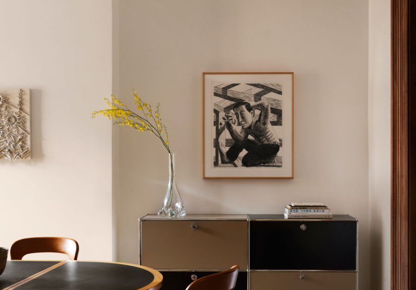
1) Restored details + quiet walls = the ultimate backdrop
The secret sauce is contrast. Historic woodwork and moldings create rhythm and texture; smoother wall finishes (fresh plaster or a mineral, chalky paint look)
keep the room from feeling busy. When the background is calm, the furniture reads like a curated collection instead of a furniture store aisle.
If your walls are bright-white and flat, you can still mimic the softness by choosing a warm white and a finish that isn’t aggressively shiny.
The goal is “glows at 4 p.m.” rather than “dentist office at 9 a.m.”
2) A mix of erasmidcentury, modern European, and vintagewithout looking random
This is not a matching-set dining room. The modern Bed-Stuy formula is: one strong table, seating that has craft (woven seats, wood joinery, sculptural backs),
and a few pieces that look like they’ve lived a lifebecause they have. Mixing periods makes the room feel collected, not decorated.
3) A “front-room dining room” layout that suits townhouse life
Many townhouses are long and relatively narrow, with light coming primarily from the front and back. Putting the dining area toward the front window can be a win:
it gets natural light for daytime use (homework, puzzles, WFH lunches) and looks great at night with layered lighting.
It also gives you a welcoming “enter, drop your bag, sit down” energy that feels social instead of formal.
Townhouse-Proof Layout: How to Make the Dining Zone Feel Spacious
A parlor floor dining room usually needs to do more than one job: dinners, laptops, board games, a quick “I’ll just set this here” landing zone.
Your layout should protect three things: circulation, chair comfort, and visual breathing room.
Start with clear circulation paths
- Keep a main walkway open from entry toward the rest of the floor (or the stair hall) so the room doesn’t feel like an obstacle course.
- Float the table when possibledon’t shove it against a wall unless you truly need a banquette situation.
- Use a low sideboard (or console) on the long wall to store linens, candles, serving pieces, and the “nice napkins” you swear you’ll use.
Pick a table shape that respects the room’s geometry
Narrow rooms love ovals and rounds because they soften corners and make chair movement easier. But rectangles can work beautifully if you keep proportions right
and avoid tables that feel like a runway.
Add a small seating moment if you have the front-room depth
If your dining room shares space with a front parlor zone, steal this move: a single lounge chair (or pair of compact chairs) near the window.
It makes the room feel “lived in,” gives someone a spot to chat while dinner finishes, and keeps the dining area from feeling like a one-purpose showroom.
Palette + Materials: The Bed-Stuy Modern Playbook
The vibe is “warm minimal,” not “sterile minimal.” You want neutrals that flatter old wood and let a few bolder notes pop without shouting.
Go-to palette
- Walls: warm white, creamy off-white, or a barely-there greige with a soft finish
- Wood: natural oak/beech/walnut tones that complement existing trim
- Contrast: black accents (frames, lamp bases, a tabletop edge) for graphic clarity
- One “wink” color: rust, burnt orange, deep green, or a muted blue (often through one chair, art, or textiles)
Materials that make the room feel expensive (even when it isn’t)
- Woven seating (paper cord, rush, cane) for texture and craft
- Natural fibers (linen, wool, jute blends) for softness and durability
- Plaster-like wall texture (real plaster, mineral paint look, or a matte/eggshell that doesn’t glare)
- Patina-friendly metals (aged brass, blackened steel) so fingerprints don’t become your household villain
Steal This Look: The “Key Pieces” Checklist
Here’s the shopping-and-styling spine of a modern Bed-Stuy parlor-floor dining room. Use it like a recipe: follow it closely for the same vibe,
or swap ingredients based on what you already own.
The statement table: flexible, sculptural, and built for real life
A modular or extendable table is a parlor-floor power move. One standout example: a vintage Danish modular dining table concept that can shift between
smaller console-like halves, a round configuration, or an expanded oval for guests. That flexibility is gold in a townhouse where rooms work overtime.
- Investment vibe: vintage Scandinavian modular/extendable table in warm wood + a darker top edge
- Mid-budget vibe: a solid-wood oval extension table with simple legs
- Budget vibe: a clean-lined wood table with good proportions (focus on shape and scale)
Dining chairs: “light presence,” comfort, and craftsmanship
Chairs are where this look quietly flexes. Midcentury-inspired chairs with woven seats (especially paper cord) feel airy, classic, and tactile.
They also play well with old trim because they don’t competejust complement.
- Steal-the-look detail: woven-seat chairs in oak or black-oak tones
- Easy upgrade: swap two chairs for armchairs at the table ends for a more “host-ready” silhouette
- Budget trick: keep chair frames simple and add texture with seat material (woven, upholstered linen-look, or cane)
Rug: anchor the room and make chairs glide without drama
If your dining room rug is too small, the room will look cramped and your chairs will catch the edge like it’s their job.
The most reliable rule: size the rug so chairs stay on it even when pulled out. Flatweaves and low-pile rugs work best here.
- Best textures: flatweave wool, low-pile wool, or a tight-weave natural fiber blend
- Color strategy: keep it tonal so the table and chairs read as the main event
- Townhouse reality: choose durable materials that forgive crumbs, scuffs, and the occasional dramatic spaghetti night
Lighting: layer it like a pro (and skip the “one overhead sun” effect)
A parlor floor deserves flattering light. Use a pendant or chandelier for presence, then add wall sconces or lamps to soften shadows
and create that “everyone looks like they slept eight hours” glow.
- Over-table: a modern pendant with a simple shade (paper, linen, opal glass, or a minimal metal form)
- Support lighting: sconces or a pair of lamps on a sideboard
- Bonus: an uplight or picture light to make art feel intentional
Art + objects: keep it edited, not empty
The look is “considered,” not cluttered. One large piece of art, a mini gallery wall in simple frames, or a sculptural object on the sideboard
is usually enough. Let the historic details stay visibleyour moldings would like credit, thank you.
Measurements That Save You From Regret (and Returns)
You don’t need to become a professional space planner, but a few guidelines prevent the most common dining-room mistakes.
Think of these as “boring rules that make the room feel amazing.”
Table sizing basics
- Depth matters: tables around 30–36 inches deep tend to feel comfortable for place settings and serving pieces.
- Seating goals: if you want to host bigger groups, look for tables sized to seat six to eight comfortablyoften by going longer or adding extensions.
- Leg placement: pedestal bases or legs near corners can make seating easier (less knee-knocking).
Rug sizing basics
- Rule of thumb: add roughly two feet around the table so chairs stay on the rug when pulled out.
- Function first: the rug should make chair movement smooth and protect floors, not just “decorate the rectangle.”
How to Get the Bed-Stuy Modern Look in 7 Steps
Step 1: Calm the background
Choose a warm neutral wall color. If your trim is gorgeous, let it be the stardon’t paint the walls a color that fights it.
If your trim is… less gorgeous, neutrals still help because they don’t spotlight every flaw.
Step 2: Choose the table first
The table sets the tone. Aim for a piece with honest materials and clean lines. If you can, choose extendable or modulartownhouse living loves flexibility.
Step 3: Add chairs with texture
Woven seats, curved backs, or sculptural silhouettes bring warmth without adding visual clutter.
If you want the most “designer” payoff, pick chairs that look light but feel sturdy.
Step 4: Layer lighting (your future selfies will thank you)
Do a statement overhead fixture, then add sconces or lamps. Use warm bulbs and dimmers if possible.
The goal is “cozy dinner party” instead of “interrogation scene.”
Step 5: Anchor with a proper rug
Choose a low-pile rug sized so chairs glide. Keep the pattern subtle or tonal unless your room is extremely minimal.
Step 6: Add one great piece of art (or a tight gallery wall)
Go bigger than you think, especially with high ceilings. Scale is what makes the room feel finished.
Step 7: Style with restraint
A few objects beat a shelf of objects. Try: one tall vase, a shallow bowl, a stack of two books, and one candle.
Stop there. Walk away. You did it.
Common Mistakes That Break the Spell
- Too-small rug: chairs catch edges, the room shrinks visually, and everyone gets annoyed.
- One light source: overhead-only lighting makes faces shadowy and corners sad.
- Matching set overload: when everything matches, the room can feel dated instead of collected.
- Ignoring scale: tiny art on a tall wall reads accidental. Go larger or group pieces with intention.
- Blocking circulation: a parlor floor should feel gracefuldon’t make guests squeeze past furniture.
High/Low: Two Ways to Steal the Look
The investment-leaning version
- Vintage Scandinavian extendable/modular table
- Iconic woven-seat chairs (or a mix with armchairs at the ends)
- Flatweave wool rug in a warm neutral
- Statement pendant + classic sconces
- Art with real presence (large-scale, strong framing)
The budget-smart version
- Simple oval/rectangular wood table with good proportions
- Textured chairs (woven-look seats or cane-back styles)
- Low-pile rug sized correctly (this is the non-negotiable)
- One overhead fixture + two plug-in sconces or lamps
- Thrifted frames + one oversized print for impact
Both versions work because the “look” isn’t about one brand. It’s about balance: historic backdrop + edited modern forms + tactile materials + lighting that’s kind
to both people and architecture.
Final Take: The Most Brooklyn Part of This Look Is the Confidence
A Bed-Stuy parlor-floor dining room doesn’t need to prove anything. The bones already tell a story. Your job is to make the furniture and finishes feel like
a thoughtful next chapter: modern enough to feel fresh, vintage enough to feel human, and comfortable enough that people linger at the table.
Steal the structure, steal the restraint, steal the textureand then add one personal twist (a bold chair, a weird ceramic, a piece of art that makes you smile).
That’s how the look becomes yours, not a carbon copy.
Experience Notes: What It’s Like to Live With This Kind of Dining Room (500+ Words)
People romanticize brownstones for the “movie set” momentssunlight through tall front windows, original moldings that look hand-drawn, a stoop that makes
everyday arrivals feel ceremonial. But the day-to-day experience of a modern parlor-floor dining room is less about perfection and more about rhythm.
The room becomes a soft stage for whatever life throws at it: quick breakfasts, long conversations, a laptop open next to a placemat, someone pacing while
waiting for a delivery, and the inevitable moment when you realize the dining table is the most honest piece of furniture you own. It doesn’t care what you planned.
It hosts what happens.
The first thing you notice is how the space changes with light. In many townhouses, the parlor floor gets a front wash of daylight, then a slower fade into evening.
Warm white walls (especially ones with a plaster-like softness) don’t just sit therethey shift. Morning light makes everything crisp; late afternoon light turns the room
buttery; nighttime asks you to get serious about lamps and sconces. That’s why layered lighting isn’t a “designer extra”it’s a quality-of-life upgrade.
One overhead fixture gives you function. Two or three secondary light sources give you atmosphere. And atmosphere is what makes people stay seated.
Next comes the furniture reality check. A beautiful chair that looks great in photos but feels like a dental waiting room is a betrayal. In a home where you actually
want people to gather, comfort becomes part of the aesthetic. Woven-seat chairs are a quiet hero here: they look light, they add texture, and they tend to feel better
over a longer sit. They also play nicely with old woodwork because they don’t visually “thud” into the room. They hover, they breathe, they let the architecture speak.
Then there’s the rugoften the most debated item in a dining room, mostly because it’s both practical and emotional. Practical: chairs need to slide, floors need protection,
and crumbs will happen no matter how strongly you believe in “no eating in the dining room” (said no one with a life). Emotional: the rug defines the room.
When it’s sized correctly, the dining area feels grounded and generous; when it’s too small, the room feels like it’s wearing shoes two sizes down.
In a parlor floor space with tall ceilings, you want that grounded feelinglike the room has a center of gravity.
Hosting in this kind of dining room tends to be more relaxed than formal. The space reads “elevated,” but the best versions feel approachable.
A flexible table (extendable or modular) changes the social flow: you can keep it compact for everyday life, then open it up when people come over.
That small shift matters in a townhouse because rooms often serve multiple purposes. The dining room might also be your craft zone, your puzzle headquarters,
your “we need to talk” spot, and your “let’s celebrate” spotall in the same week. Flexibility makes the room feel like it’s working with you instead of against you.
Finally, the most real experience note: a modern Bed-Stuy dining room looks best when it isn’t trying too hard. The charm is in the mixhistoric details with a bit of patina,
modern pieces that keep the space feeling current, and a few vintage finds that add soul. The room should feel like a confident handshake, not a sales pitch.
If you can sit down, exhale, and imagine someone hanging around for “just one more round of dessert” (or a mocktail, or tea, or whatever your house does),
you’ve stolen the look in the only way that matters: you made it livable.