Table of Contents >> Show >> Hide
- What You’ll Learn
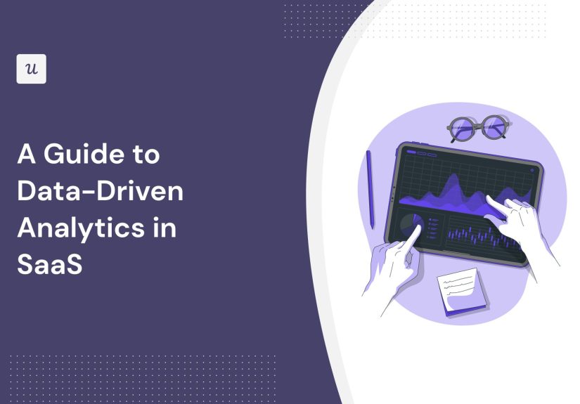
- What “Data-Driven” Actually Means in SaaS
- Start With a North Star Metric (and Add Guardrails)
- The SaaS Metrics That Actually Matter (and Why)
- Instrumentation: Your Tracking Plan Is the Foundation
- The Modern SaaS Analytics Stack (Simple → Scalable)
- The Analyses That Move Revenue and Retention
- Experimentation That Doesn’t Lie to You
- Data Quality and Governance: Trust Is the Real KPI
- Operationalize Insights: Make Analytics Do Work
- Common SaaS Analytics Mistakes (So You Can Avoid Them)
- A Practical 30-60-90 Day Plan
- Field Notes: of Real-World Lessons (So You Don’t Learn Them the Hard Way)
- Lesson 1: “We need better dashboards” is usually code for “We don’t agree on definitions.”
- Lesson 2: Instrumentation debt behaves like credit card debt (fine… until it isn’t).
- Lesson 3: The best metrics are “boring” because they’re stable.
- Lesson 4: Segmentation is where the money is.
- Lesson 5: Activation is not a momentit’s a path.
- Lesson 6: Data-driven doesn’t mean “data-only.”
- Wrap-Up
“We’re data-driven,” says every SaaS company… right before someone makes a decision because a Slack thread “felt convincing.”
Real data-driven analytics isn’t about having more dashboards. It’s about building a system where the right data shows up
at the right time, for the right people, so decisions get smarter (and faster) without turning your team into a full-time
committee of chart enthusiasts.
This guide walks through the practical playbook: which SaaS metrics matter, how to instrument your product, what a modern data
stack looks like, how to avoid “vanity-metric cosplay,” and how to operationalize insights so they change outcomesnot just slide decks.
What “Data-Driven” Actually Means in SaaS
In SaaS, you don’t just ship a productyou run an ongoing relationship with customers. That means analytics has to answer three questions
on repeat:
- Are we delivering customer value? (Activation, time-to-value, usage patterns, outcomes.)
- Is the business healthy? (MRR/ARR growth, churn, retention, unit economics.)
- What should we do next? (Priorities, experiments, forecasts, and targeted interventions.)
The “data-driven” part isn’t a personality trait. It’s a workflow:
define metrics → collect clean data → analyze → decide → act → measure impact.
If your loop stops at “analyze,” congratulationsyou’ve built a dashboard museum.
The best teams also separate leading indicators (things that predict outcomes) from
lagging indicators (the outcomes themselves). Example: a drop in “first project created” might predict churn
long before churn shows up on a finance report.
Start With a North Star Metric (and Add Guardrails)
A North Star metric is the one number that best represents customer value delivered at scalesomething that,
if it goes up, your business tends to get healthier. It’s not “pageviews” or “signups.” It’s closer to
“teams who completed a meaningful workflow” or “accounts that hit an outcome threshold.”
How to pick a good North Star
- It ties to real value: measures the “aha” moment customers pay for, not just early clicks.
- It’s sensitive to product changes: moves when you improve onboarding, features, or reliability.
- It can be influenced cross-functionally: product, marketing, sales, and success can all help move it.
- It’s hard to game: if people can inflate it without real impact, they will (sometimes accidentally).
Add guardrail metrics
Every North Star needs “don’t break the business” guardrailsotherwise you’ll optimize one number while quietly setting the kitchen on fire.
Common guardrails include:
- Retention / churn: don’t trade short-term activation for long-term churn.
- Gross margin / support load: don’t boost usage by creating a customer support avalanche.
- Performance / reliability: don’t ship “growth” that makes the app slow and rage-clicky.
Pro tip: treat your North Star like a headline, and your supporting metrics like the article. The headline is short; the article explains what happened.
The SaaS Metrics That Actually Matter (and Why)
A metric’s job is to help you make a decision. If no decision changes based on it, it’s not a metricit’s trivia.
Here’s a practical set to cover product, revenue, growth, and customer health.
Revenue and growth metrics
- MRR / ARR: recurring revenue baseline; track new, expansion, contraction, and churned revenue separately.
- Net new MRR: (new + expansion) − (contraction + churn). The “are we actually growing?” number.
- ARPA / ARPU: average revenue per account/user; useful for pricing and packaging decisions.
- Net Revenue Retention (NRR): how much revenue you keep + expand from existing customers (a retention super-metric).
- Gross Revenue Retention (GRR): how much revenue you keep without counting expansion; great for spotting leakage.
Retention and churn metrics
“Churn” can mean customers leaving, revenue leaving, or usage fading. Pick the one that matches your business model (and define it clearly).
- Customer churn rate: churned customers ÷ starting customers (for a period).
- Revenue churn / MRR churn: churned MRR ÷ starting MRR (captures bigger account losses).
- Cohort retention: retention curves by signup month (or first-payment month) show whether product improvements stick.
- Logo vs. revenue churn: losing a small customer and losing a big customer are different problemsmeasure both.
Acquisition and unit economics
- CAC: customer acquisition cost; include the real costs (tools, people, adsyes, all of it).
- CAC payback period: how long it takes to recover CAC from gross profit.
- LTV (carefully): lifetime value is powerful, but fragile if your churn inputs are noisyuse ranges, not fantasies.
- Conversion rates: visitor → signup → activated → paid (and, in B2B, lead → qualified → closed-won).
Product analytics metrics (where the “why” lives)
- Activation rate: % of new users/accounts that reach the “aha” moment.
- Time-to-value: how long it takes to hit that moment (shorter is usually better).
- Feature adoption: usage of core features (and whether adoption correlates with retention/expansion).
- Engagement / stickiness: DAU/MAU or WAU/MAU (use what fits your product’s natural cadence).
Customer success and support health
- Product-qualified signals: usage patterns that predict retention or expansion (e.g., “3+ teammates invited”).
- Support load: tickets per account, time to first response, time to resolution.
- Experience signals: CSAT, NPS, and qualitative themes (quant + text insights together).
A quick “metric map” you can steal
| Team | Primary metrics | Useful slices |
|---|---|---|
| Product | Activation, time-to-value, retention cohorts | Persona, plan, channel, account size |
| Growth | Signup→activation funnel, PQLs, trial-to-paid | Acquisition source, landing page, experiment |
| Sales | Pipeline velocity, win rate, ACV, sales cycle | Segment, industry, lead source |
| Customer Success | NRR/GRR, expansion, risk signals | Health score, feature adoption, support usage |
| Finance | MRR/ARR, gross margin, CAC payback | Plan, cohort, contract length, channel |
Instrumentation: Your Tracking Plan Is the Foundation
Most analytics pain is not “we don’t have enough charts.” It’s “we don’t trust the data.” The fix starts before dashboards:
with a tracking plana living document that defines the events you collect, what they mean, and how they should be used.
What to include in a tracking plan
- Event taxonomy: consistent names like
signup_completed,project_created,invoice_sent. - Properties: event details (plan type, workspace size, feature flags, device, channel).
- Identity rules: how anonymous users become known users; how users roll up to accounts in B2B.
- Definitions: what counts as “active,” “activated,” “churned,” and “retained.”
- Governance: owners, QA checks, and change management (“who approves new events?”).
Don’t track everythingtrack decisions
Tracking “every click” feels productive until you realize you’ve built a data landfill. Start with the decisions you need to make:
onboarding improvements, pricing tests, lifecycle messaging, churn reduction, and expansion. Then instrument the minimum events needed
to answer those questions reliably.
Privacy and compliance (the grown-up part)
- Minimize PII in event data (hash or avoid sensitive fields when possible).
- Document data retention and access rules (especially if you’re working toward SOC 2 or similar standards).
- Be explicit about consent where required and keep your tracking aligned with your policies.
The Modern SaaS Analytics Stack (Simple → Scalable)
Your stack should match your stage. Early on, speed beats perfection. As you scale, “one source of truth” beats speed.
A practical SaaS analytics architecture usually includes these layers:
1) Data sources
- Product events: web/app tracking, feature usage, onboarding milestones.
- Billing: subscriptions, invoices, renewals, refunds, plan changes.
- CRM: leads, pipeline stages, close dates, ACV.
- Support: tickets, categories, response times, satisfaction.
- Marketing: campaign performance, attribution inputs, lifecycle messaging engagement.
2) Collection and routing
Many teams use a customer-data or event-routing layer so product events can feed multiple destinations (product analytics, warehouse, marketing).
This reduces “we track it three different ways” syndrome.
3) Warehouse + transformation
A cloud data warehouse becomes your long-term memory. Transformations (often ELT-style) turn raw events into trusted tables:
clean user/account models, subscription fact tables, and standardized metric definitions.
4) BI + product analytics
- BI dashboards: business performance, finance, executive reporting.
- Product analytics: funnels, cohorts, paths, feature adoption, segmentation.
5) Activation (reverse ETL / operational analytics)
The “endgame” is not insightit’s impact. Activation pushes warehouse-defined audiences and attributes back into tools where work happens:
CRM, marketing automation, customer success platforms, and ad platforms. That’s how analytics becomes action.
The Analyses That Move Revenue and Retention
Here are the “greatest hits” of SaaS analyticsmethods that repeatedly pay rent across product, growth, and success.
1) Funnel analysis (find where value leaks)
Build funnels around meaningful steps, not random clicks. Example onboarding funnel:
- Sign up completed
- Workspace created
- First teammate invited
- First key action (e.g., project created / integration connected)
- Outcome reached (e.g., report shared / invoice sent)
Then segment the funnel: by acquisition channel, persona, plan type, and device. You’ll often find that “overall conversion”
hides wildly different experiences.
2) Cohort retention (see if improvements stick)
Plot retention curves by cohort (signup month or first paid month). If your product got better, newer cohorts should retain better.
If retention is flat no matter what you ship, your “improvements” might be cosmeticor aimed at the wrong users.
3) Segmentation (your averages are lying)
In SaaS, the average user is a fictional character. Segment by:
account size, industry, use case, plan tier, lifecycle stage, and feature adoption.
The goal is not fancy slicingit’s clarity about which customers are thriving and which are struggling.
4) Feature adoption tied to outcomes
Track adoption, but don’t stop there. Ask: Does this feature correlate with retention, expansion, or satisfaction?
If a feature is heavily used but doesn’t improve outcomes, it might be a distractionor it might need better guidance to create value.
5) Expansion signals (find growth inside your base)
Expansion often follows a pattern: more teammates, deeper usage, more integrations, higher frequency, and broader feature adoption.
Build “expansion likelihood” signals carefully, validate them against real renewals/upgrades, and use them to prioritize
customer success outreach.
Experimentation That Doesn’t Lie to You
A/B testing is powerfulbut only if you treat it like science, not vibes. The goal is to learn what causes improvements, not just what
correlates with them.
Experiment design basics
- Start with a hypothesis: “If we shorten setup, activation will increase for SMB teams.”
- Pick one primary metric: usually a leading indicator tied to value (activation, time-to-value).
- Add guardrails: retention, revenue, support load, performance.
- Define your population: new users vs. existing users; SMB vs. mid-market vs. enterprise.
When not to A/B test
Some changes are too broad, too slow, or too intertwined for clean A/B testing (pricing overhauls, major redesigns, enterprise sales motions).
In those cases, use quasi-experimental approaches: phased rollouts, matched cohorts, and careful before/after comparisonswith humility.
Data Quality and Governance: Trust Is the Real KPI
If leaders don’t trust the numbers, they’ll “gut-feel” decisions back into existence. Data quality is how you prevent that.
Common data quality issues (and quick fixes)
- Duplicate events: add idempotency keys and dedup logic in transformation.
- Broken identities: standardize user and account identifiers early.
- Definition drift: document metrics and enforce them (semantic layer / metric catalog if needed).
- Silent tracking changes: require PR review for analytics instrumentation like you do for billing code.
Ownership model that works
- Data owners: each critical dataset/metric has an accountable owner (not “everyone,” which means no one).
- Data stewards: maintain definitions, quality checks, and documentation.
- Monitoring: automated tests for freshness, null spikes, volume anomalies, and schema changes.
Operationalize Insights: Make Analytics Do Work
The best analytics systems don’t just tell you what happened. They trigger what happens next.
Turn dashboards into decisions
- Weekly business review: same core metrics, same definitions, short narrative: what changed and why.
- Decision logs: write down what you decided and which metric will prove you right (or wrong).
- Alerts: notify teams when key metrics move beyond thresholds (activation dips, churn spikes, outage-driven behavior changes).
Examples of “data activation” that pays off
- Lifecycle messaging: users who didn’t complete setup get contextual help within 24 hours.
- Sales prioritization: product-qualified accounts get routed to sales with context (what they used, what they tried).
- Churn prevention: accounts showing risk patterns (usage drop + support friction) trigger success outreach.
The point: your data warehouse shouldn’t be a library. It should be a power plant.
Common SaaS Analytics Mistakes (So You Can Avoid Them)
- Vanity-metric worship: celebrating signups while activation quietly collapses.
- Metric soup: 87 KPIs, 0 clarity. Pick a few, define them, and use them.
- No single source of truth: finance and product disagree, so everyone chooses the number they like best.
- Overbuilding the stack: buying every tool before you’ve defined what you’re trying to learn.
- Ignoring segmentation: averages hide the fact that one customer segment is thriving while another is churning.
- Skipping governance: analytics breaks silently, and you find out during a board meeting. Fun!
A Practical 30-60-90 Day Plan
Days 1–30: Define and instrument
- Pick a North Star metric + 3–5 supporting metrics + guardrails.
- Create a tracking plan: key events, properties, identity rules, naming conventions.
- Instrument onboarding milestones and the core value loop.
- Establish one dashboard that leadership agrees is “the weekly truth.”
Days 31–60: Build trust and core analysis
- Set up cohort retention reporting and the activation funnel with segmentation.
- Create a clean user/account model (especially for B2B).
- Document metric definitions in plain English.
- Add basic data quality checks (freshness, volume anomalies, schema changes).
Days 61–90: Operationalize and experiment
- Launch 1–2 high-confidence experiments (onboarding, pricing page, in-product guidance).
- Deploy data activation: push audiences to marketing/CS tools for targeted outreach.
- Create a weekly decision rhythm: insights → actions → measured impact.
- Start building predictive signals carefully (risk, expansion) and validate against outcomes.
Field Notes: of Real-World Lessons (So You Don’t Learn Them the Hard Way)
Even strong teams stumble in predictable ways when they try to “go data-driven.” Here are patterns that show up again and againand how
the best SaaS operators handle them.
Lesson 1: “We need better dashboards” is usually code for “We don’t agree on definitions.”
When leadership asks for a new dashboard every week, it’s often not a tooling problem. It’s an alignment problem. One team calculates
churn based on cancellations, another uses revenue impact, and someone else is counting “inactive users.” The fix isn’t a prettier chart.
It’s a shared metric dictionary: what counts, when it counts, and where the truth lives. The fastest way to regain trust is to publish
definitions next to the numbers and assign an owner who keeps them consistent.
Lesson 2: Instrumentation debt behaves like credit card debt (fine… until it isn’t).
Early-stage teams ship quickly and “we’ll clean up tracking later.” That’s normal. But if you scale without paying down instrumentation debt,
you eventually hit a wall: product events break, identity gets messy, and every analysis turns into detective work. Teams that win long-term
treat analytics like billing: changes require review, QA, and a rollback plan. They also keep event names boring and consistentbecause
nobody wants to debug button_click_final_final_v7 at 2 a.m.
Lesson 3: The best metrics are “boring” because they’re stable.
A flashy KPI that changes definition every quarter is worse than no KPI. Teams with durable analytics choose stable, outcome-oriented measures:
activation tied to real value, retention cohorts, NRR/GRR, and time-to-value. They avoid “metric-of-the-month” syndrome by separating
core health metrics (always tracked) from initiative metrics (temporary, project-specific).
Lesson 4: Segmentation is where the money is.
Many SaaS products serve multiple personasadmins, end-users, managersand multiple segmentsSMB, mid-market, enterprise.
If you only look at blended averages, you’ll ship the wrong fixes. Strong teams segment early and often:
the onboarding funnel by acquisition channel, retention by plan tier, expansion by account size, and product usage by persona.
This is how you find “we retain great in mid-market but leak in SMB because setup is too heavy,” or “enterprise churn is fine, but
expansion stalls without feature X adoption.”
Lesson 5: Activation is not a momentit’s a path.
Teams often define activation as one event (“created first project”), then wonder why churn stays high. In practice, activation is a
sequence: setup → first value → repeated value → shared value (team adoption). The best analytics models track that sequence and measure
drop-off at each step. They also focus on time-to-value: even if users activate, taking seven days instead of seven minutes
can destroy conversion in competitive markets.
Lesson 6: Data-driven doesn’t mean “data-only.”
Numbers tell you what happened. Qualitative signalssupport themes, sales call notes, user interviewstell you why.
High-performing SaaS teams combine both: they use analytics to locate the problem precisely, then use qualitative feedback to design the fix.
After shipping, they return to the metrics to confirm impact. That full loop is what “data-driven” is supposed to mean.