Table of Contents >> Show >> Hide
- Why Turquoise Works in Real Homes (Not Just in Vacation Rentals)
- Turquoise vs. Teal vs. Aqua (So You Don’t Accidentally Paint “Pool Noodle Blue”)
- How to Pick the Right Turquoise Paint Color
- Best Turquoise Paint Colors (Brand-by-Brand Picks)
- Where Turquoise Looks Best in the Home
- Foolproof Color Pairings with Turquoise
- Make Turquoise Look Designer-Intentional (Not Accidental)
- Common Turquoise Mistakes (and How to Avoid Them)
- Experience Stories & Lessons Learned (Real-World Turquoise Moments)
- Final Thoughts
Turquoise is the paint color equivalent of opening a window and letting your house breathe. It’s lively without being loud,
soothing without being sleepy, and it can swing from “spa day” to “statement moment” depending on how you style it.
In other words: turquoise is the friend who shows up with coffee, a playlist, and zero drama.
But turquoise can also be a little… unpredictable. Under warm bulbs it can look greener, in north-facing light it can lean
bluer, and at night it can decide to cosplay as a deep teal. The good news? That’s not a flawit’s a feature, as long as you
choose the right shade for your room, your lighting, and your vibe.
Why Turquoise Works in Real Homes (Not Just in Vacation Rentals)
Turquoise sits in the blue-green family, which is why it feels refreshing and balanced. Blue tends to read as calm and clean.
Green feels grounded and natural. Turquoise borrows the best from both, which makes it surprisingly flexible: it can look coastal,
modern, eclectic, vintage, or even classic when paired with the right neutrals.
Designers love turquoise because it plays well with everything from crisp whites to warm woods to brass accents. Homeowners love it
because it adds personality without turning a room into a circus tent (unless you want thatno judgment).
Turquoise vs. Teal vs. Aqua (So You Don’t Accidentally Paint “Pool Noodle Blue”)
These three words get used interchangeably, but they’re not identical:
- Turquoise is typically brighter and often leans a bit greenerthink tropical water.
- Teal is deeper and moodier, often with a touch of gray or extra bluethink velvet sofa energy.
- Aqua is lighter and airierthink beach-glass pastel.
If you want “happy, clean, and fresh,” start with turquoise or aqua. If you want “rich, dramatic, and grown-up,” teal is your lane.
How to Pick the Right Turquoise Paint Color
1) Start with the Undertone: Blue-Forward, Green-Forward, or Gray-Softened
The undertone is the secret ingredient. A turquoise that’s more blue-forward reads crisp and cool. A greener turquoise feels warmer
and more energetic. Add gray and it becomes more sophisticated and forgivinggreat if you’re nervous about going too bold.
Quick cheat: if you’re decorating with warm woods, tan leather, or creamy whites, a greener turquoise usually looks amazing.
If your home leans modern with bright whites and chrome, a bluer turquoise often feels cleaner.
2) Use LRV (Light Reflectance Value) Like a Flashlight for Your Decision
LRV measures how much light a color reflects. Higher LRV = brighter, airier walls. Lower LRV = deeper, moodier impact.
Turquoise spans a wide range, so LRV is a practical way to avoid surprises.
- High-LRV turquoise works well in small rooms, hallways, and low-light spaces that need a lift.
- Low-LRV turquoise looks stunning in dining rooms, libraries, powder rooms, and accent wallswhere drama is welcome.
3) Choose the Right Finish (Because Turquoise + Shine = Spotlight)
Turquoise has natural energy, so sheen matters:
- Matte/Flat: modern, velvety, hides wall imperfectionsgreat for living rooms and bedrooms.
- Eggshell/Satin: the “everyday hero” finisheasy to clean, soft glow, great for hallways and family spaces.
- Semi-gloss: best for trim, doors, cabinets, and bathrooms where moisture and cleaning happen.
Best Turquoise Paint Colors (Brand-by-Brand Picks)
Below are standout turquoise and blue-green options that designers and homeowners reach for again and again. Use them as a shortlist,
then sample in your space (turquoise absolutely deserves a real-life test drive).
Sherwin-Williams Turquoise Favorites
-
Aqua-Sphere (SW 7613):
A lively blue that feels modern and upbeat. Great for a playful powder room, laundry room, or a bold accent wall.
Pair with bright white trim and light oak for a clean, coastal look. -
Aqueduct (SW 6758):
A rich coastal blue-green that’s energetic without being neon. Try it on an entryway, an accent wall, or built-ins to create a “welcome home” moment.
Looks especially good with warm whites, rattan, and brushed brass.
Benjamin Moore Turquoise Favorites
-
Palladian Blue (HC-144):
A soft, airy blue-green that’s famous for feeling calm and breathable. Ideal for bedrooms, bathrooms, and open-plan living spaces
where you want color that behaves like a neutral. -
Galápagos Turquoise (2057-20):
Rich and ocean-deepperfect when you want a statement color that still feels classy. Gorgeous on cabinetry, built-ins, or a powder room
where you can lean into high contrast with white and metallics. -
Aegean Teal (2136-40):
A sophisticated blue-green with depth. If you like turquoise but want it “a little more tailored,” this is a strong contender for dining rooms,
offices, and cozy living rooms.
BEHR Turquoise Favorites
-
Caribbean Current (P460-7):
A commanding blue-green that reads like tropical water at dusk. Use it as an accent wall, on cabinetry, or in a powder room with warm metals
and white tile. -
Turquoise Blue (PPH-50):
A fresh, bright turquoise that feels cheerful and clean. Works well in creative spaces, kids’ rooms (that you still want to look stylish),
or as a pop on furniture. -
Caribbean Blue (PPH-58):
Brighter, more “true blue” than green. Great when you want turquoise’s happiness with a stronger blue backbonethink coastal bedrooms and airy kitchens.
Valspar Turquoise Favorites
-
Blue Turquoise (5006-10C):
A cooler teal-leaning turquoise with a deeper feel. Great for accent walls, built-ins, or a dramatic powder room. If your home has lots of white,
this shade adds instant depth and polish.
PPG + Glidden Turquoise Favorites
-
Tint of Turquoise (PPG1232-5):
A saturated teal-aqua green with a jewel vibe that still feels playful. It shines in sunrooms, creative studios, and lively living roomsespecially with
white trim and a small dose of coral or terracotta accents. -
Torrid Turquoise (PPG1232-7):
Deeper and bolderideal for an accent wall, a front door, or cabinetry when you want drama. Pair with off-whites and black accents for a graphic, modern look.
Dunn-Edwards Turquoise Favorites
-
Rare Turquoise (DEA133):
Dark, aquatic, and boldan excellent statement color for cabinets, libraries, dining rooms, and powder rooms. Balance it with warm neutrals so the room feels
intentional, not like an aquarium (unless that’s your theme; again: no judgment).
Where Turquoise Looks Best in the Home
Bathrooms: Instant Spa Energy
Turquoise in a bathroom is almost unfairit looks fresh with white tile, bright with mirrors, and clean with chrome or brushed nickel.
Use a soft turquoise on walls for a calm spa effect, or go deep on a vanity for a high-end boutique-hotel vibe.
Kitchens and Cabinets: Crisp, Happy, and Surprisingly Classic
Turquoise cabinets can look vintage, modern, or coastal depending on hardware and counters. For a timeless feel, pair turquoise lower cabinets with:
white uppers, warm wood shelves, and simple hardware. If you want contemporary, bring in matte black or brushed brass.
Bedrooms: Calm Without Being Boring
A pale turquoise can be a “soft neutral” that still has personality. Layer it with creamy bedding, warm wood nightstands, and textured fabrics.
If you want bolder turquoise, keep the rest of the palette simple: white, sand, and one accent color (like navy).
Front Doors and Accents: A Small Dose with Big Personality
Turquoise on a front door is friendly, memorable, and curb-appeal gold. It’s also a great way to enjoy turquoise without committing an entire room.
Add a turquoise bench, dresser, or built-in for that “designer touch” without repainting your life.
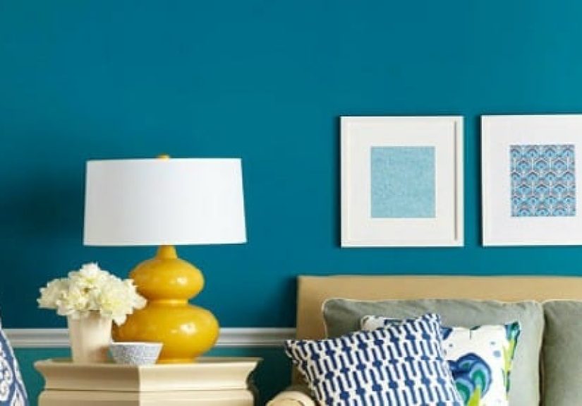
Foolproof Color Pairings with Turquoise
Turquoise can be the star or the supporting actor. Here are combinations that rarely fail:
- Turquoise + Warm White: clean, coastal, and bright (perfect for kitchens and bathrooms).
- Turquoise + Greige: modern and calming (great for open-plan living).
- Turquoise + Navy: classic, tailored, and a little nautical (works beautifully in bedrooms and offices).
- Turquoise + Coral: playful and upbeat (best in small dosespillows, art, and accessories).
- Turquoise + Mustard/Ochre: bold, artsy, and warm (great for eclectic spaces).
- Turquoise + Brass: instant elegance (especially in powder rooms and dining rooms).
- Turquoise + Natural Wood: balanced and welcoming (oak, walnut, rattan, bamboo).
Make Turquoise Look Designer-Intentional (Not Accidental)
Use the 60-30-10 Rule
If turquoise is your main wall color, keep it as the 60% and build with a calm 30% secondary (like warm white or greige) and a 10% accent
(like coral, navy, or brass). If turquoise is an accent, reverse it: let neutrals dominate and use turquoise as the “pop.”
Repeat the Color at Least Three Times
This is a simple trick that makes turquoise feel like part of a plan. Example: turquoise walls + turquoise in artwork + turquoise in a small accessory.
Three appearances and suddenly your room looks styled, not random.
Texture Is Your Best Friend
Turquoise loves texture. Pair it with linen, jute, leather, matte ceramics, woven baskets, and natural wood to keep the color grounded.
If you go glossy everywhere, turquoise can feel “loud” faster than you’d expect.
Common Turquoise Mistakes (and How to Avoid Them)
- Skipping samples: Turquoise shifts a lot with light. Always sample on multiple walls and view it morning, afternoon, and night.
- Over-saturating a dark room: Deep turquoise in low light can feel heavy. If the room is dim, consider a lighter turquoise or use it as an accent.
- Forgetting your fixed finishes: Check the turquoise against flooring, countertops, tile, and upholstery. If your tile is warm, choose a turquoise that isn’t icy.
- Too many “competing” colors: Turquoise already has personality. Let it shine by limiting other bold colors to one or two accents.
Experience Stories & Lessons Learned (Real-World Turquoise Moments)
People who choose turquoise usually start with the same thought: “I want my home to feel happier.” And turquoise deliversoften immediately. One of the
most common experiences is painting a small space first (like a powder room) and being shocked at how “finished” it looks with minimal effort. Turquoise
plus a mirror, a clean white trim, and decent lighting can make a tiny room feel like it has a personality and a résumé.
Another very real turquoise experience: the sample surprise. Homeowners often pick a turquoise chip they love, paint a test patch, and then watch it
change character throughout the day. Morning light can make it look crisp and beachy. Late afternoon might pull out the green undertone. At night,
under warm bulbs, it can cozy up and look richersometimes even a bit more teal. The lesson most people share: sample on more than one wall and look at it
in multiple lighting conditions. Turquoise isn’t being difficult; it’s just showing range.
There’s also the “too much of a good thing” moment. Some folks go all-inturquoise walls, turquoise rug, turquoise curtainsand then realize the room feels
like it’s yelling “VACATION!” at 6 a.m. (not always ideal if you’re trying to have a calm breakfast and not mentally board a cruise ship). The fix tends to be
simple: pull back to a neutral base and use turquoise as the star. Paint the walls turquoise but keep textiles neutral. Or keep walls neutral and do turquoise
cabinetry or an accent wall. Turquoise thrives when it has breathing room.
A surprisingly positive experience shows up when turquoise meets wood. People who are nervous about turquoise often relax the second they see it next to oak,
walnut, or even bamboo. Wood tones add warmth and make turquoise look intentional instead of “too bright.” Add brass hardware and suddenly the room feels
curatedlike you hired a designer, even if your “design assistant” was a Saturday playlist and a hardware store run.
Finally, many homeowners talk about turquoise as a confidence color. It’s often someone’s first step away from safe grays and beiges. They paint one room,
love the mood boost, and then start experimenting with other blue-greens in the housemaybe a softer version in a bedroom or a deeper one on a front door.
The biggest takeaway from these experiences is consistent: turquoise is easiest to live with when you (1) respect the lighting, (2) balance it with neutrals,
and (3) let texture and warm materials keep it grounded. Do that, and turquoise becomes less of a “bold choice” and more of a “why didn’t I do this sooner?”
Final Thoughts
Turquoise can be bright and playful, calm and airy, or deep and dramatic. The “best” turquoise paint color isn’t a single shadeit’s the one that works with
your home’s light, your fixed finishes, and how you actually live in the space. Start with undertones, check LRV, sample like a responsible adult,
and pair turquoise with neutrals and natural textures so it feels stylishnot chaotic.
If you want your home to feel fresher, friendlier, and a little more alive, turquoise is a seriously smart choice. And if anyone asks why you painted your
laundry room a tropical blue-green? Tell them it’s “self-care,” but for your walls.