Table of Contents >> Show >> Hide
- Start With Strategy: Who Is This Home For?
- Plan Like a Retailer: The Tour Is a Product Experience
- Make the Floor Plan Look Its Best
- Color and Materials: Neutral, But Never Boring
- Kitchens and Baths: Where Emotions Meet Budgets
- The Invisible Design Team: Light, Scent, Sound, and Temperature
- Show the Upgrades Without Turning the Home Into a Sales Poster
- Smart and Sustainable: Make It Easy to Understand
- Curb Appeal: The Walk-Up Is Part of the Floor Plan
- Model Home Readiness: Keep It “Camera-Ready” Without Losing Your Weekend
- Common Mistakes That Quietly Tank the Wow Factor
- Field Notes: of Real-World Showhouse Wisdom
- Conclusion
A showhouse model home is basically a first date between a buyer and a floor plan. The house is dressed up, the lighting is flattering,
and everyone’s pretending the laundry room stays spotless 24/7. Your job? Make visitors fall a little bit in lovefastwithout crossing
into “this looks like a furniture catalog exploded” territory.
Done right, a model home does three big things at once: it explains the layout, it sells the lifestyle, and it quietly persuades people
to upgrade the things they didn’t know they wanted until five minutes ago. This guide breaks down how to design a showhouse model home
that feels aspirational, believable, and easy for buyers to imagine as their future.
Start With Strategy: Who Is This Home For?
Build a buyer “character,” not a vague demographic
“Everyone” is not a target market. Designing for everyone usually creates a home that emotionally connects with… no one. Start with a clear
buyer profile: first-time buyers, move-up families, empty nesters, or remote-work-heavy professionals. Then translate that into design decisions:
storage needs, durability, tech expectations, entertaining style, and what “luxury” means at this price point.
Write a simple lifestyle story (and stick to it)
The best model homes feel like a life already in motion. Not a staged crime scene, not a museum, and definitely not “we bought the entire
decor aisle in one afternoon.” Pick a storyline: “Saturday brunch with friends,” “busy school mornings,” “quiet, spa-like evenings,” or
“WFH without losing your mind.” Every room should support that narrative.
Plan Like a Retailer: The Tour Is a Product Experience
Design the first 30 seconds on purpose
Buyers decide how they feel about a home quickly. Your entry needs to be bright, uncluttered, and confident. Create a clean sightline to a
“wow” momentoften the kitchen, the great room, or a view to the backyard. Think of it like a storefront window display: one strong impression,
not ten competing ones.
Merchandise with vignettes, not clutter
Model home staging works best when it’s intentional and minimal: a reading chair with a lamp and throw, a dining table set for a casual meal,
a bar tray on a console. These small scenes help buyers picture how they’ll use the space. The trick is restraintenough styling to feel lived-in,
not so much that it feels like the home comes with a full-time stylist named “Brittany.”
Make the Floor Plan Look Its Best
Right-size furniture to protect the perception of space
Model homes rise or fall on scale. Oversized sectionals can shrink a room; tiny furniture can make a space feel awkward and unfinished. Choose
pieces that define circulation paths and show comfortable clearances. If the plan is open-concept, use rugs, lighting, and furniture placement
to create “zones” without building walls.
Highlight flexibility: the “I can use this room for…” factor
Modern buyers love multipurpose spaces. Turn a loft into a media lounge, a bedroom into a home office, or a nook into a homework station.
The goal is to demonstrate options without confusing people. A simple cue is enough: a desk, good task lighting, and organized shelving can
sell the idea of productivity better than a wall sign that says “HUSTLE.”
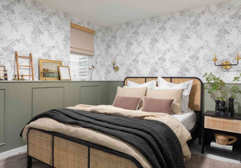
Color and Materials: Neutral, But Never Boring
Use a calming base palette so buyers can project their style
In a showhouse model home, the base should be broadly appealing: warm whites, soft greiges, gentle taupes, or pale neutrals that keep rooms
bright. You can still be stylishjust channel your boldness into accents and texture instead of painting the main living area electric cactus green.
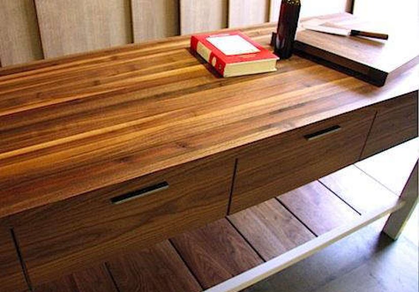
Texture is your secret weapon
Neutrals can feel rich when you layer materials: wood tones, woven textiles, matte ceramics, subtle patterns, and mixed metals. Combine smooth
and tactile finishesthink: a clean quartz countertop paired with a warm wood island stool and a soft, nubby rug. This reads as “designer” without
scaring buyers who prefer classic choices.
Choose finishes that survive foot traffic and curious fingers
Model homes get heavy use. Pick durable flooring, wipeable wall paint, and performance fabrics that can handle constant showings. In kid-friendly
communities, you want “beautiful” and “practical” to be best friends. In higher-end communities, durability still mattersjust in a quieter, more
expensive-looking way.
Kitchens and Baths: Where Emotions Meet Budgets
Kitchen staging: clean counters, great lighting, and purposeful details
Kitchens sell homes. Keep counters mostly clear to emphasize workspace. Add a couple of simple moments: a cutting board, a bowl of fruit, a cookbook
on a stand. Then make lighting do the heavy liftingpendants over the island, under-cabinet lighting, and bright, consistent bulbs that flatter the finishes.
If the pantry is a feature, stage it like a boutique grocery store: tidy bins, labels, and a sense that someone here drinks sparkling water on purpose.
Bathrooms should feel like a mini retreat
Bathrooms don’t need to be huge to feel luxurious. Crisp towels, coordinated hardware, clean mirrors, and layered lighting go a long way. Show buyers
where to put things: baskets, drawer organizers, and tasteful accessories signal “this home has storage” without shouting it.
The Invisible Design Team: Light, Scent, Sound, and Temperature
Lighting: layer it like a pro
Natural light is the headliner, but it needs backup. Combine ambient (ceiling fixtures), task (lamps, under-cabinet), and accent (art lights, sconces)
to make every room feel welcoming. Avoid harsh, mismatched bulbs; consistency matters for both in-person tours and listing photos.
Comfort matters more than you think
If the home feels too hot or too cold, buyers rush. Keep temperature comfortable and stable during showings, and make sure airflow isn’t noisy or drafty.
Comfort is part of luxuryeven if the price point is “starter home with dreams.”
Scent and sound: subtle, not “mall candle aisle”
The goal is “fresh and clean,” not “vanilla-cookie hurricane.” Neutral scents (clean linen, mild citrus) work best. For sound, soft background music can
make tours feel relaxed, but keep it low and inoffensive. Nobody should have to shout over a playlist titled “EDM For Open Houses.”
Show the Upgrades Without Turning the Home Into a Sales Poster
Make premium options feel integrated, not “added on”
Buyers love upgrades when they can see and feel the benefit: taller cabinets, better lighting, thoughtful built-ins, upgraded trim, or a statement backsplash.
The key is balancetoo many premium finishes can make the home feel unattainable. Feature upgrades where they matter most (kitchen, primary suite,
curb appeal) and keep the rest cohesive.
Teach without lecturing
If you use signage, keep it minimal and helpful. Consider a simple “design highlights” sheet, QR codes for finish details, or a small display in the sales
office rather than labels stuck everywhere. The home should feel like a place to live, not a showroom where you’re afraid to breathe.
Smart and Sustainable: Make It Easy to Understand
Demonstrate smart features in a friendly way
If the home includes smart locks, thermostats, lighting, or security, show how it workssimply. A small display with “Tap here to see scenes” can make
technology feel approachable rather than intimidating. Keep it reliable. A smart home that glitches during a tour is basically a sitcom plot.
Make efficiency visible
Buyers respond to features they can grasp quickly: good insulation, efficient HVAC, quality windows, and practical ventilation. Use easy language in your
materials, and connect features to benefits (“quieter rooms,” “more even temperatures,” “lower energy use”) rather than burying people in technical specs.
Curb Appeal: The Walk-Up Is Part of the Floor Plan
Design the approach like a welcome sequence
The exterior sets expectations before anyone steps inside. Keep landscaping neat, layer lighting along paths, and make the front door area feel intentional:
a clean mat, a modern house number, and one or two simple accessories. If there’s a porch, stage it. Outdoor seating helps buyers imagine daily life
beyond the living room.
Outdoor living spaces should look usable
If the home has a patio or deck, show how it works: a table for dining, a small lounge setup, or a fire pit moment (if appropriate). Outdoor space sells
best when it looks like an extension of the interiornot a lonely slab of concrete with a single chair facing the neighbor’s fence.
Model Home Readiness: Keep It “Camera-Ready” Without Losing Your Weekend
Create a simple daily checklist
Model homes need systems. A practical checklist helps the home stay consistent: straighten pillows, clear fingerprints, empty trash, refresh bathrooms,
spot-clean floors, and keep counters tidy. If tours happen daily, treat it like hospitality: reset the home so the next visitor gets the same great experience.
Plan for safety and durability
Anchor furniture where needed, choose accessories that won’t shatter under gentle curiosity, and keep walkways clear. If kids tour the home, they will
touch everything. If adults tour the home, they will also touch everythingjust while pretending they aren’t.
Common Mistakes That Quietly Tank the Wow Factor
- Over-theming: A “Tuscan villa” kitchen in a modern subdivision can feel dated instantly. Let materials and textures do the storytelling.
- Too much stuff: Styling should clarify the room, not fill it. Visual breathing room makes spaces feel larger and more premium.
- Ignoring buyer realities: If your audience works from home, show a workstation. If they have kids, show storage. If they entertain, show seating.
- Bad lighting: One harsh ceiling light can undo thousands of dollars in finishes. Layer lighting everywhere.
- Furniture that blocks flow: If visitors bump into chairs, they’ll remember the annoyance, not the crown molding.
Field Notes: of Real-World Showhouse Wisdom
Here’s what design teams, builders, and stagers commonly learn after they’ve done a few showhouse model homesespecially the kind of lessons no one
mentions until you’re standing in the living room the night before the grand opening, holding a label maker and questioning your life choices.
First: timelines are not your friend. Even when you plan early, something arrives late. A backordered sofa, a delayed light fixture, the one piece of art
that looked perfect online but shows up looking like it was printed on a waffle. The pros handle this by building a “flex list” from day one: backup rugs,
backup accent chairs, and alternative lighting that fits the same electrical plan. It’s not pessimismit’s design adulthood.
Second: buyers notice what’s easy to understand. A dramatic tile pattern might get compliments, but practical features get commitments. A clearly staged
mudroom with hooks, a bench, and baskets communicates “your mornings can be calmer.” A pantry with tidy storage says “you can find the snacks when you’re
hangry.” A primary closet that looks organized signals “there’s room for your life.” These are not glamorous wins, but they are the wins that sell homes.
Third: the “right” amount of personality is smaller than you think. Many teams start too bold because bold is funand it photographs well. Then they walk
the home like a buyer and realize the space feels like someone else’s strong opinion. The sweet spot is a neutral foundation with controlled moments of color:
a statement light, a textured wallpaper in a powder room, a couple of great art pieces. It reads as curated, not chaotic.
Fourth: scale mistakes are painfully common and surprisingly expensive. A dining table that’s too large doesn’t just look offit makes the whole room feel
smaller, and buyers start doubting the floor plan. Pros measure everything, tape it out, and test walkways like they’re choreographing a dance number.
If you can’t comfortably “tour” the home, your buyers won’t either.
Fifth: keep your hero moments where the buyer naturally pauses. In many homes, that’s the kitchen island, the primary bed wall, and the backyard view.
If your best styling is hidden in a corner bedroom that half the visitors skip, you’ve spent money in the wrong place. A well-staged island with warm
pendant lighting and two or three beautiful objects can create more emotional pull than an entire room full of decorative extras.
Finally: maintenance is design. A model home is a living marketing asset, not a one-time photoshoot. The teams that win long-term create a reset routine:
fewer fragile accessories, washable textiles, easy touch-up paint, and smart storage for the “stuff you hide right before a tour.” The goal isn’t perfection;
it’s consistency. Buyers should feel the same “wow” on a random Tuesday as they do on opening weekend.
Conclusion
Designing a showhouse model home is part design, part psychology, part retail strategyand part making sure the pillows look like they’ve never been sat on
(while still feeling like a human is allowed to live there). Focus on the buyer, tell a simple lifestyle story, keep the foundation neutral and elevated, and
use lighting, texture, and smart merchandising to create emotional connection. When visitors can picture their routines in the space, you’ve done the job.