Table of Contents >> Show >> Hide
- What a Fabric Swatch Set Actually Is
- Why Designers (and the Rest of Us) Hoard Swatches
- Common Types of Fabric Swatch Sets
- What to Look For on a Swatch Label (The Tiny Print That Saves You)
- Performance Numbers Without the Headache
- Special Situations: Pets, Kids, and “This Sofa Gets Used” Homes
- Safety & Codes: When Fabric Needs Paperwork
- How to Test a Swatch at Home Like You Mean It
- How to Build (or Buy) the Right Swatch Set
- Common Swatch Mistakes (So You Don’t Have to Learn the Hard Way)
- Conclusion: Tiny Swatches, Big Confidence
- Hands-On Experiences: What a Fabric Swatch Set Taught Me (The Extra )
A fabric swatch set is basically a handful of tiny textiles that somehow holds the power to decide whether your sofa looks “clean and modern” or “I tried my best.” It’s the low-cost, low-commitment way to touch, bend, drape, and side-eye a fabric before you spend real money on real yardage (or a real piece of furniture).
If you’ve ever ordered fabric online and thought, “That oatmeal beige looked warmer on my screen,” welcome. Screens lie. Lighting changes. Fabrics behave differently when they’re stretched, sat on, steamed, or exposed to everyday life (kids, pets, snacks, the occasional dramatic red wine moment). A fabric swatch set helps you make decisions with your hands and your eyeslike a responsible adult who has learned from past decorating choices.
What a Fabric Swatch Set Actually Is
A fabric swatch is a small cut piece of the exact fabric you’d receive by the yard or on a finished productsame weave, same finish, same texture. A fabric swatch set is a curated group of those swatches, typically organized on cards, rings, or in a swatch book so you can compare multiple options side-by-side.
Sizes vary by retailer and purpose. Upholstery brands often use compact squares (easy to file), while DIY and outdoor suppliers may provide larger pieces to show pattern scale and stripe direction. For example, some upholstery swatches are around 4″ x 4″ for quick comparisons, while other suppliers offer 6″ x 6″ swatches or long strip formats to display stripes properly. And some custom-print services provide bigger swatches (like 8″ x 8″) so you can judge print clarity and color more realistically.
Why Designers (and the Rest of Us) Hoard Swatches
A swatch set does three things your laptop absolutely cannot: proves color in your lighting, reveals texture and sheen, and helps you predict how a fabric will live.
1) Color reality check
A warm white can turn icy under cool LEDs. A gray can suddenly look lavender near a green wall. A swatch lets you test in your actual room at morning, afternoon, and evening lightbecause fabric is basically a moody actor that changes its performance depending on the spotlight.
2) Texture you can’t “zoom” into
Performance velvet, boucle, linen blends, brushed twillstexture affects how formal, cozy, or durable a piece feels. Two fabrics can share a color family and still read totally different once you feel the hand (that’s “hand” as in feel, not “hand” as in a tiny fabric gremlin).
3) Practical compatibility
Swatches let you test against paint chips, flooring, countertop samples, and existing furniture. They also help you judge pattern scale and repeatespecially for stripes, plaids, and large motifs where the “cute little print” turns into a “giant flower takeover” once it’s on a full sofa.
Common Types of Fabric Swatch Sets
Not all swatch sets are built the same. Choosing the right type saves time (and prevents your coffee table from becoming a fabric sample landfill).
Individual swatches (“just let me see THIS one”)
Perfect when you’ve already narrowed it down. Many retailers let you order a single swatch directly from the product page. This is the “I’m 90% sure but I’ve been wrong before” approach.
Swatch cards and color cards
These are organized collectionsoften solids or coordinated linesmounted on cards. They’re great for comparing color families quickly (navy vs. “also navy” vs. “navy but make it slightly sadder”).
Swatch books (a.k.a. the designer’s portable fabric library)
Swatch books bundle a large assortment into a book format. They’re especially useful for upholstery, outdoor, and marine projects where performance and color accuracy matter and you want to compare many options efficiently.
Educational swatch kits
These focus on learning: fiber content, woven vs. knit construction, and how different fabrics behave. If you’re building sewing confidence or sourcing for multiple projects, an educational kit turns your fabric stash into a reference library instead of a mystery drawer.
What to Look For on a Swatch Label (The Tiny Print That Saves You)
A good swatch set doesn’t just hand you fabricit hands you context. Here’s what you want to see (or ask for).
Fiber content
- Cotton: breathable, comfortable, can wrinkle, may fade depending on dyes/finishes.
- Linen: crisp texture, gorgeous drape, wrinkles like it’s paid hourly to do so.
- Polyester: durable, often stain-resistant, can mimic natural fibers, varies widely in quality.
- Rayon/viscose: soft, drapey, can be delicate depending on weave and finishing.
- Nylon: strong, abrasion-resistantcommon in performance blends.
- Acrylic: often used outdoors; good color retention in many applications.
- Wool: resilient and naturally insulating; can be excellent for upholstery when properly constructed.
Construction: woven, knit, or coated
Construction influences stretch, seam performance, and wear. Wovens often feel stable and tailored; knits can be forgiving and cozy; coated fabrics (like vinyl or polyurethane on a substrate) prioritize wipeability and moisture resistance.
Fabric weight (GSM or oz/yd²)
Weight matters more than people think. It affects drape, opacity, durability, and even how a fabric hangs on curtains. Fabric weight is commonly listed in GSM (grams per square meter) or ounces per square yard (oz/yd²). As a general rule: lightweight fabrics drape and flutter, midweights balance structure and movement, and heavyweight fabrics tend to hold shape and resist wear better.
Care and cleaning
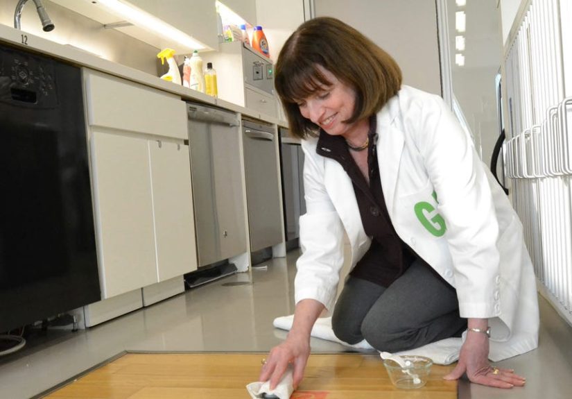
Look for cleaning codes and care instructions. Some upholstery fabrics are “spot clean only.” Others can handle water-based cleaners or mild soap solutions. Your future self, kneeling beside a sofa with a towel and a thousand regrets, will thank you for checking this now.
Pattern repeat and directionality
If the swatch is a stripe or a large motif, consider ordering more than one swatchor a larger sampleso you can see how repeats line up. Stripe direction, nap (like velvet pile), and sheen can change the perceived color when viewed from different angles.
Performance Numbers Without the Headache
If you’ve ever seen “30,000 double rubs” and thought, “Cool, so my couch survives 30,000 humans?”you’re not alone. Performance testing is helpful, but it needs interpretation.
Abrasion: Wyzenbeek vs. Martindale
Two common abrasion tests measure resistance to surface wear: Wyzenbeek (reported in “double rubs”) and Martindale (reported in “cycles”). They use different motions and methods, so results don’t translate neatly. In other words, a great score in one test doesn’t automatically guarantee a great score in the other.
For contract and heavy-use contexts, industry guidelines often set minimum thresholds. For example, one set of widely referenced voluntary guidelines for woven indoor upholstery lists minimum abrasion targets for low-traffic (private spaces) and high-traffic (public spaces) applications, and also notes that abrasion results alone are not a reliable indicator of lifespan. Translation: abrasion is one clue, not the whole mystery novel.
Colorfastness: light and crocking
Colorfastness to light speaks to fading resistance under exposure (think sunny windows). Crocking is dye transfer from rubbingdry or wetonto another surface (like your favorite light-colored jeans). If you’re choosing a deep navy, saturated red, or intense black, crocking ratings are your quiet hero.
Physical properties: pilling, seam slippage, and strength
Pilling is those little fuzz balls that appear after friction (hello, sweater elbows). Seam slippage is when the yarns shift at seams under stressespecially important for upholstery and heavier drapery. Breaking strength gives you a sense of how much tension the fabric tolerates.
Special Situations: Pets, Kids, and “This Sofa Gets Used” Homes
If your home includes paws, crayons, or a family member who believes coasters are a suggestion, your swatch set should include at least a few performance fabric options.
Performance upholstery
Performance fabrics often focus on stain resistance, easy cleaning, and durability. Some are engineered to repel liquids and resist odors, and many brands emphasize simple spot-cleaning routines for everyday messes.
Outdoor and sun-heavy rooms
For patios, porches, boats, and bright sunrooms, you’ll want fabrics designed to resist fading and handle moisture. Outdoor fabric sample programs are especially worth it because the texture and stiffness can feel very different from indoor upholstery. A swatch is where you find out whether “outdoor chic” feels like “comfortable cushion” or “polite tarp.”
Safety & Codes: When Fabric Needs Paperwork
If you’re sourcing for commercial spaces (hospitality, events, offices) or certain installations, flammability and code compliance can matter. Two terms show up often:
- NFPA 701: commonly referenced for hanging textiles like draperies and curtains, testing flame propagation/ignition resistance under defined conditions.
- California TB 117-2013: frequently cited in upholstery contexts in the U.S. (especially for contract specifications), tied to smolder resistance requirements.
Important: codes vary by jurisdiction and application, and “pass” depends on the specific test method, end-use, and installation. If you’re specifying for a public space, confirm requirements with your supplier and local code authority. (This is the part where your fabric becomes an adult and gets a folder.)
How to Test a Swatch at Home Like You Mean It
Swatches aren’t meant to sit in a neat stack while you “think about it.” Put them to work:
1) Drape it in context
Place swatches on the actual surface they’ll live near: over your sofa arm, next to your rug, beside your paint sample, against your headboard. If you ordered multiple swatches, narrow down favorites quickly by comparing them in the same spot.
2) Check lighting throughout the day
Look at your swatches morning, afternoon, and evening. The same fabric can read brighter, duller, warmer, or cooler depending on light temperature and direction.
3) Try a gentle “life simulation”
- Rub test: lightly rub with a white cloth to see if any dye transfers (especially on dark colors).
- Wrinkle test: scrunch and release to see if it creases dramatically.
- Spot test: for performance swatches, a tiny water drop can reveal absorption vs. beading.
How to Build (or Buy) the Right Swatch Set
The smartest swatch set is the one that matches your project. Here are practical paths:
Option A: Order targeted swatches from finalists
Many suppliers let you add samples directly from a fabric pagesome even encourage it because returns on cut yardage can be limited or tricky. If you’re torn between three neutrals and two bolds, order all five. The cost of a few swatches is tiny compared to reupholstering a whole chair because the “perfect greige” turned green.
Option B: Get a swatch book for a specific category
Doing outdoor cushions, marine covers, or multiple DIY projects? A swatch book can be a time-saver because it groups compatible fabrics and colors in one place, often with notes on recommended uses and key specs.
Option C: Use educational swatch kits to learn fabrics faster
If you’re newer to sewing or sourcing, a kit that covers common categories (knits vs. wovens, fiber types, and finishes) helps you build intuition. It’s like flashcardsexcept you can make pants out of them (not recommended, but technically possible).
Organizing tips so your swatches don’t become “mystery squares”
- Label everything: brand, colorway, fiber content, and where you ordered it.
- Store out of direct sun: UV can shift color over time (ironic, yes).
- Keep a decision board: pin finalists next to paint/rug samples in one spot.
- Photograph in consistent light: helpful for referencejust don’t make final decisions from photos alone.
Common Swatch Mistakes (So You Don’t Have to Learn the Hard Way)
- Trusting the screen more than the swatch. Your monitor is not a certified color authority.
- Ignoring texture and sheen. Matte vs. lustrous can change color perception dramatically.
- Not considering scale. Small swatches can hide a huge pattern repeat; order extra or larger samples.
- Skipping performance info for high-use items. Dining chairs and “pretty but delicate” rarely get along.
- Forgetting directionality (nap, velvet pile, stripes). Orientation impacts appearanceand sometimes yardage needs.
- Not testing in multiple lighting conditions. The “perfect” fabric at noon can look totally different at night.
Conclusion: Tiny Swatches, Big Confidence
A fabric swatch set is the easiest way to bring certainty to a process that’s otherwise full of guesswork. It helps you evaluate color honestly, compare textures, understand performance, and avoid expensive “oops” moments. Whether you’re sewing curtains, choosing upholstery, or planning a full-room refresh, swatches turn your decision into something you can see, touch, and testbefore you commit.
Hands-On Experiences: What a Fabric Swatch Set Taught Me (The Extra )
The first time I took a fabric swatch set seriously, it was because I didn’t want to repeat a past mistake: ordering a “warm sand” upholstery fabric that arrived looking like “damp cardboard.” This time, I ordered a real swatch setseveral neutrals, a couple of textured weaves, and one “be brave” color I fully expected to eliminate immediately.
Day one, I did what any calm and rational person would do: I draped swatches over everything. Sofa arm, throw pillow, rug corner, even the dog bed (the dog was… curious). Two fabrics that looked nearly identical online were instantly exposed. One had a subtle sheen that made it feel dressy but also showed every shadow and fingerprint. The other was more matte and forgivinglike it had quietly accepted that life involves crumbs.
The lighting test was the real plot twist. In bright morning light, my favorite “clean ivory” looked perfect. By late afternoon, it leaned gray. Under warm lamps at night, it turned butterypleasant, but not what I thought I was buying. Meanwhile, a fabric I’d dismissed as “too beige” became the most balanced option across all lighting. I left finalists taped to the wall for two full days, because if I can overthink a fabric choice now, I can avoid overpaying to fix it later.
Then came the “life simulation.” I did a gentle rub test with a white cloth on the darkest swatch because I’ve learned that new dark fabrics can sometimes transfer dye, especially if they’re heavily saturated. I also tried a tiny water drop on a performance swatch. Watching the water bead instead of soak in was oddly satisfyinglike the fabric was saying, “Nice try.”
The biggest surprise wasn’t just which fabric wonit was how much calmer the decision felt. The swatches turned a vague online gamble into a clear comparison. And once the choice was made, those leftover swatches didn’t go to waste. I kept them labeled in a binder ring for future paint touch-ups, pillow projects, and the inevitable moment someone asks, “What color is your sofa again?” (Answer: the one I tested under three light bulbs and a suspiciously judgmental sunset.)