Table of Contents >> Show >> Hide
- Why Bullet Points in Photoshop Feel Weird (But Aren’t Hard)
- Before You Start: Set Yourself Up for Bullet Success
- Way #1: Type a Bullet with Keyboard Shortcuts (Fastest)
- Way #2: Insert a Bullet from the Glyphs Panel (Most Reliable)
- Way #3: Copy & Paste a Bullet (Best When You’re in a Hurry)
- Way #4: Make a Clean Bulleted List (Hanging Indent + Smart Spacing)
- Common Bullet Point Problems (And Quick Fixes)
- Conclusion
- Bonus: of Real-World Experience (So Your Bullets Behave)
If you’ve ever tried to make a nice, tidy bulleted list in Photoshop, you’ve probably discovered a surprising truth:
Photoshop is incredible at editing photos… and mildly confused by the concept of “a list.”
The good news? Adding bullet points is absolutely doable. The even better news? You don’t have to summon a design wizard
or sacrifice a keyboard to the Adobe gods.
In this guide, you’ll learn four simple, reliable ways to insert a bullet point symbol (•) in Photoshopplus how to make
your bullets align like they belong in a professional layout (instead of looking like they wandered in from a group chat).
Why Bullet Points in Photoshop Feel Weird (But Aren’t Hard)
Photoshop is primarily a pixel-based design tool, not a page-layout app. That matters because true “bulleted lists” are usually
a paragraph formatting feature (think: Word, InDesign, Google Docs). Photoshop text layers can handle paragraph formatting and
indents, but it doesn’t center its entire personality around lists.
Translation: you can add bullet points in Photoshop easilyyou just have to insert the bullet character yourself and (if needed)
set up spacing so the text lines up cleanly.
Before You Start: Set Yourself Up for Bullet Success
Use Paragraph Text (Not Point Text) for Real Lists
If you’re making more than one bullet, create a text box. Select the Type Tool (T), then click and drag to draw a text area.
This gives you paragraph-style behavior, which makes indentation and alignment much easier than clicking once and typing forever in a single line.
Choose a Font That Actually Includes the Bullet Glyph
Most standard fonts include the bullet character, but not all. If your bullet turns into a random box, a hollow tofu rectangle, or
an “I tried” symbol, switch to a more complete font (many system fonts handle this well).
Way #1: Type a Bullet with Keyboard Shortcuts (Fastest)
This is the quickest method when it worksand when it doesn’t, it usually fails in a very dramatic way (nothing happens, or you open a menu,
or your laptop pretends it doesn’t know what numbers are).
On Mac: Option + 8
- Select the Type Tool (T) and click inside your text layer.
- Press Option + 8.
- You should see the bullet point symbol: •
On Windows: Alt + 0149 (Numeric Keypad)
- Click inside your Photoshop text layer.
- Make sure Num Lock is on.
- Hold Alt and type 0149 on the numeric keypad (not the number row above letters).
- Release Alt to insert •
Troubleshooting (Because Keyboards Love Drama)
-
No numeric keypad? Many laptops require enabling an embedded numpad with Fn + a key that toggles Num Lock.
If that’s too annoying (it often is), skip to Way #2 or Way #3. -
Alt + 7 vs Alt + 0149: Some people use Alt + 7, but results can vary depending on Windows code pages and app behavior.
Alt + 0149 is typically more consistent. -
Try Unicode bullet: In some contexts, you may see Alt + 8226 used for the Unicode bullet (decimal for U+2022).
If your workflow supports it, it can be a handy backup.
SEO note for the humans and robots: this method is often searched as “Photoshop bullet point shortcut,” “Alt code bullet in Photoshop,”
or “Option 8 bullet Photoshop.” You’re welcome, future you.
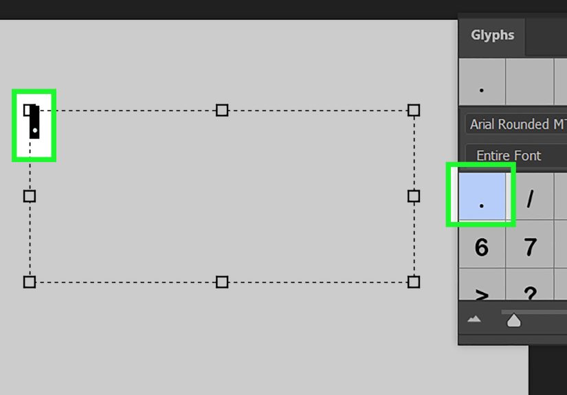
Way #2: Insert a Bullet from the Glyphs Panel (Most Reliable)
When the keyboard shortcut is being stubborn, the Glyphs panel is your calm, dependable friend who shows up on time and brings snacks.
It lets you insert special characters (including bullet points) directly into your text.
Steps
- Open your document and select the Type Tool (T).
- Click inside the text layer where you want the bullet.
- Go to Window > Glyphs to open the Glyphs panel.
-
In the Glyphs panel, choose the same font you’re using (or browse the grid) and find a bullet character like •.
(Different fonts may show multiple bullet styles.) - Double-click the bullet glyph to insert it into your text.
Pro Tip: Use Glyphs to Pick a Matching Bullet Style
Need a smaller bullet? A hollow circle? A decorative dot? Glyphs is where you can choose a bullet that matches your design vibe.
Just remember: bullet appearance depends on the font. Switch fonts and your bullet might change its outfit.
Way #3: Copy & Paste a Bullet (Best When You’re in a Hurry)
Sometimes the simplest solution is the most satisfying: copy a bullet from somewhere else and paste it into Photoshop.
This is also a great method when you need a specific bullet style quickly (solid, hollow, square, etc.).
Quick Copy (Yes, You Can Copy This)
• ◦ ▪ –
Windows: Use Character Map
- Open Character Map (search “Character Map” in the Start menu).
- Select a font (try common fonts if you can’t find the bullet at first).
- Find the bullet character, click it, and choose Select then Copy.
- Paste into Photoshop (Ctrl + V) inside your text layer.
Mac: Use the Character Viewer (Emoji & Symbols)
- Click inside your Photoshop text layer.
- Open the Character Viewer (often Control + Command + Space).
- Search for “bullet” and insert the one you want.
Why This Works So Well
Copy/paste bypasses the “do I have a numeric keypad?” problem and the “why does Alt open menus?” problem.
It’s also a great workaround if you’re building a list and want consistent bullets across multiple text layersjust copy the same bullet each time.
Way #4: Make a Clean Bulleted List (Hanging Indent + Smart Spacing)
Adding a single bullet is easy. Making a list that looks polished is where most people start bargaining with the universe.
The goal is a classic “hanging indent” layout:
- The bullet sits slightly to the left.
- The text lines up vertically.
- If a line wraps, the second line aligns with the first line of textnot under the bullet.
Step-by-Step: The Photoshop-Friendly Hanging Indent
- Create a text box (click and drag with the Type Tool).
- Type your list like this (manually):
• First bullet item that might wrap onto a second line if it’s long enough
• Second bullet item
• Third bullet item - Open the Paragraph panel (Window > Paragraph) if it isn’t visible.
- Set a Left Indent (example: 24 px). This moves the whole paragraph inward.
-
Set a First Line Indent to a negative value (example: -24 px). This pulls only the first line (and the bullet) back out,
creating the hanging indent effect. -
Adjust spacing after the bullet:
- If tabs aren’t behaving, use a single space or an em space from the Glyphs/Character Viewer for consistent spacing.
- Keep it subtlebullets should guide the eye, not throw a party.
Optional Upgrade: Custom “Bullet” Shapes for a Branded Look
Want something more custom than a standard dot? You can create bullet points using shapes:
- Select the Ellipse Tool and draw a small circle (hold Shift for a perfect circle).
- Fill it with a solid color (or a gradient if you’re feeling fancy).
- Duplicate it for each list item and align them with Smart Guides.
- Pair the shapes with text lines (no bullet character needed).
This approach is slower, but it’s gold for UI mockups, infographics, and branded social graphics where bullet styling matters.
Common Bullet Point Problems (And Quick Fixes)
Problem: My bullet is a weird square or missing character
That’s usually a font issue. Switch to a font with better Unicode coverage, or insert the bullet using the Glyphs panel and test another font.
Problem: Alt code doesn’t work in Photoshop
Confirm Num Lock is on and that you’re using the numeric keypad. If you’re on a laptop without a keypad, use Glyphs or copy/paste instead.
Problem: Wrapped lines don’t align neatly
Use paragraph indents: set a left indent and a negative first line indent to create a hanging indent. This is the “it finally looks professional” fix.
Problem: My bullets aren’t consistent across text layers
Stick to one font and one insertion method. If you’re copying bullets from different sources, you may accidentally mix characters that look similar
but aren’t identical (yes, typography can be petty).
Conclusion
Photoshop may not be the king of bulleted lists, but you’ve got optionsand they’re all pretty painless once you know where to look.
Use the keyboard shortcut when you want speed, the Glyphs panel when you want reliability, copy/paste when you want convenience, and paragraph indents
when you want that clean “this was designed on purpose” look.
SEO Tags (JSON)
Bonus: of Real-World Experience (So Your Bullets Behave)
I’ve added bullet points in Photoshop in situations that ranged from “professional brochure design” to “please save this last-minute Instagram carousel
before the client notices we built it in the wrong size.” Here’s what actually matters when you’re doing this in the wild.
First: the Glyphs panel is the MVP when consistency is non-negotiable. Keyboard shortcuts are fast, but teams are messysomeone’s on Windows,
someone’s on Mac, someone’s on a laptop whose numeric keypad exists only in legend. If you’re building templates or repeatable layouts, inserting the bullet
from Glyphs reduces the risk that a teammate’s “bullet” becomes a different symbol (or just… nothing). When you’re handing off a layered PSD, boring and
consistent beats clever and fragile every time.
Second: wrapped lines are where “fine” becomes “not fine.” A single bullet looks good no matter what. But the moment an item wraps onto line two,
your layout either looks professional or looks like a grocery list written during turbulence. The hanging indent trick (left indent + negative first line indent)
is what separates “I typed bullets” from “I designed a list.” I’ve watched entire slides feel more premium just because the second lines aligned cleanly.
It’s a tiny typographic detail that screams polish.
Third: don’t underestimate spacing after the bullet. Tabs can be inconsistent across environments, and Photoshop doesn’t give you the same
tab-stop control you’d get in a layout-focused app. In practice, I’ll often use a regular space for short labels, but for longer lists I’ll insert an em space
(from Glyphs/Character Viewer) so the gap is consistent and visually balanced. It’s the typography equivalent of hemming your pants: nobody applauds, but everyone
notices when you don’t do it.
Fourth: shape bullets are underrated when you need brand consistency. If your brand uses a specific dot style (a tiny square, a colored circle,
a rounded diamond), trying to force a font to match can be a losing battle. Drawing a small ellipse shape and duplicating it is slower, sure, but it gives you
pixel-perfect controland you can recolor it instantly across the design. For UI mockups or infographics, I’ll choose shape bullets almost every time.
Finally: if you’re doing heavy list formatting often, it’s worth remembering a slightly uncomfortable truth:
Photoshop is not the best tool for long-form typesetting. If the content is list-heavy and text is the star, building the final layout in a
layout tool and bringing it into Photoshop as needed can save hours. But when Photoshop is the tool you’ve gotand it often isthese bullet methods will keep
your text clean, aligned, and client-proof.