Table of Contents >> Show >> Hide
- What You’ll Learn
- Build: Start With One Goal (Yes, Just One)
- The Landing Page Blueprint (Copy + Layout + Trust)
- 1) Above-the-fold: headline, subhead, CTA, and one visual
- 2) The body: benefits, proof, objections, details
- 3) The CTA and form: friction is real, so be kind
- 4) Mobile-first layout, speed-first assets
- 5) SEO foundations: rank without turning the page into a keyword smoothie
- 6) Measurement: if you can’t measure it, you can’t improve it
- Audit: A 30–60 Minute Landing Page Checkup (No Yoga Mat Required)
- Step 1: Diagnose the problem type (traffic, message, friction, or trust)
- Step 2: Copy and clarity audit (the “would a stranger get it?” test)
- Step 3: UX and layout audit (visual hierarchy and distraction control)
- Step 4: Form and error-handling audit (where conversions go to die)
- Step 5: Speed and Core Web Vitals audit (because patience is not a renewable resource)
- Step 6: SEO audit (make it discoverable, not spammy)
- Step 7: Accessibility audit (your conversion rate includes humans with assistive tech)
- Improve: The Conversion Loop (Measure → Hypothesize → Test → Learn)
- Example: A Landing Page Structure You Can Copy Today
- Common Landing Page Mistakes (and the Fix)
- Conclusion: Build for Humans, Audit with Data, Improve with Tests
- Field Notes: What Teams Commonly Learn After Shipping (Extra ~)
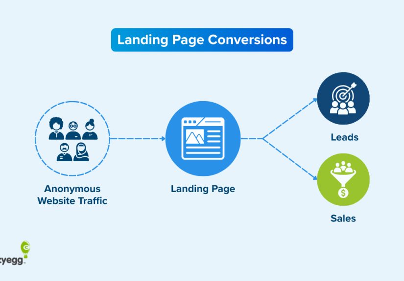
A landing page is basically a handshake that either turns into a deal… or an awkward “sooo, anyway” as your visitor hits the back button.
The good news: you don’t need magical design powers or a PhD in Button Science to make a landing page work. You need clarity, proof, speed,
and a process that treats your page like a living productnot a one-and-done poster taped to the internet.
This guide walks you through how to build a landing page from scratch, audit what’s holding it back, and
improve it with an experimentation loop that keeps conversions rising without turning your website into a Frankenstein lab.
Build: Start With One Goal (Yes, Just One)
The fastest way to sabotage a landing page is to ask it to do six jobs at once:
“Download the guide, book a demo, follow us, subscribe, buy now, and also admire our brand story.”
Your visitor didn’t come for a buffet. They came for a decision.
Pick the primary conversion
Decide what success looks like in one sentence. Examples:
- Lead gen: “Get qualified prospects to request a demo.”
- Ecommerce: “Get shoppers to add the product to cart.”
- Signup: “Get users to start a free trial.”
- Event: “Get attendees to register.”
Everything on the page either supports that goalor it’s a distraction wearing a nice outfit.
Define the “message match” before you touch design
Your landing page should feel like the next step of the ad/email/social post that sent the click.
If the ad promises “Same-day shipping,” the landing page headline shouldn’t open with “Welcome to Our Solutions Ecosystem.”
Keep the promise. Make the visitor feel like they landed where they meant to land.
The Landing Page Blueprint (Copy + Layout + Trust)
1) Above-the-fold: headline, subhead, CTA, and one visual
Above the fold is not a sacred altar, but it is prime real estate. Use it to answer four questions quickly:
What is this? Who is it for? Why should I care? What do I do next?
- Headline: clear outcome + audience. Example: “Book More Qualified Calls With a 15-Minute Landing Page Audit.”
- Subhead: how it works, in plain English. Example: “We review your offer, UX, SEO signals, and Core Web Vitalsthen give you a prioritized fix list.”
- Primary CTA: specific and honest. Example: “Get My Audit Checklist” beats “Get Started” when the visitor wants info.
- Visual: show the product, the deliverable, or the transformation (not a random stock photo of people high-fiving a laptop).
2) The body: benefits, proof, objections, details
A great landing page reads like a confident conversation:
you make a claim, you back it up, you remove friction, and you ask for the next step.
A weak landing page reads like an overly excited brochure that never answers “okay, but will it work for me?”
Use benefits that map to pain
Features are fine, but benefits are what people buy. Instead of “AI-powered insights,” try:
“See exactly where visitors hesitateso you can fix the step that’s bleeding conversions.”
Add proof like a grown-up
Proof isn’t just testimonials. Use a mix:
- Customer logos (only if true and allowed)
- Mini case studies (“Before/after” metrics with context)
- Quotes that mention outcomes, not vibes
- Security/privacy notes where relevant (especially near forms and checkout)
Handle objections proactively
Make a short FAQ that answers the “yeah, but…” thoughts:
pricing, time, requirements, what happens after submission, refund policy, data usage, and who it’s for (and not for).
3) The CTA and form: friction is real, so be kind
Your CTA is not a motivational poster. It’s a contract. If the button says “Book a Demo,” don’t route them into a 12-step interrogation form.
Make CTA text specific
- “See Pricing”
- “Download the Checklist”
- “Start Free Trial”
- “Get a Quote”
Avoid vague CTAs unless your product is literally “Getting Started.”
Keep forms shortand explain the trade
Every field is a tiny tax on momentum. Ask only what you need for the next step.
If you must ask more, explain why: “Phone number (so we can confirm your preferred time).”
Accessibility isn’t optional
Forms should have clear labels, helpful error messages, and validation that works even if scripts fail.
Also: don’t rely on placeholder text as the label. Placeholders are not commitment material.
4) Mobile-first layout, speed-first assets
Most landing pages are judged in under 10 seconds, often on a phone, often on a mediocre connection, often while someone is
standing in line thinking “if this is hard, I’m out.”
- Design for thumbs: large tap targets, obvious CTA placement, no microscopic text.
- Use fast media: compress images, avoid massive background videos, lazy-load below-the-fold assets.
- Prevent layout shift: reserve space for images/embeds so the page doesn’t jump like it’s avoiding responsibility.
5) SEO foundations: rank without turning the page into a keyword smoothie
Landing pages can rankespecially for product, service, and “solution + location” intentwhen they’re genuinely helpful.
Keep the basics clean:
- One H1 that matches the core offer and intent.
- Descriptive title tag and meta description (written for humans).
- Scannable structure (H2/H3 sections that match real questions).
- Unique content (avoid near-duplicate city/service pages without meaningful differentiation).
- Indexing strategy: if you have temporary PPC-only pages, decide whether they should be indexed.
6) Measurement: if you can’t measure it, you can’t improve it
Before you launch, confirm you can answer:
How many people visited? Where did they come from? What did they do?
Where did they drop?
- Track the primary conversion event (form submit, purchase, signup).
- Track micro-conversions (CTA clicks, scroll depth, form start, checkout step completion).
- Use UTMs consistently for campaigns.
- Set up a clean thank-you page or confirmation state so conversions are unambiguous.
Audit: A 30–60 Minute Landing Page Checkup (No Yoga Mat Required)
Auditing is how you find the conversion leaks without guessing. Here’s a practical checklist that works whether your page is new,
old, or held together by hope and legacy JavaScript.
Step 1: Diagnose the problem type (traffic, message, friction, or trust)
- High traffic + low conversion: usually message mismatch, friction, or weak offer.
- High bounce + low time on page: unclear headline, slow load, or wrong audience.
- Good engagement + low form completion: form friction, unclear “what happens next,” or trust issues.
- Good conversion but low quality leads: targeting mismatch, vague CTA, or lack of qualification.
Step 2: Copy and clarity audit (the “would a stranger get it?” test)
- Is the value proposition obvious in 5 seconds?
- Does the headline match the ad/email promise?
- Are benefits concrete (outcomes) rather than abstract (buzzwords)?
- Does the CTA describe the next step accurately?
- Is the page scannable (bullets, short sections, meaningful headings)?
Step 3: UX and layout audit (visual hierarchy and distraction control)
- Can you find the CTA instantly on desktop and mobile?
- Is there only one primary CTA per screen, or are you running a CTA cage match?
- Is navigation minimized when the goal is conversion (and not exploration)?
- Do trust elements appear near the decision point (CTA/form), not buried at the bottom like a secret?
Step 4: Form and error-handling audit (where conversions go to die)
- Are labels persistent and associated with their inputs?
- Are required fields clearly marked?
- Are error messages specific (“Enter a valid email”) and positioned where users notice?
- Does validation work gracefully (server-side validation exists; client-side is helpful but not the only guardrail)?
- Is the privacy note clear and non-threatening (“We’ll email the checklist. No spam.”)?
Step 5: Speed and Core Web Vitals audit (because patience is not a renewable resource)
Run a performance audit and look for obvious offenders: oversized images, heavy scripts, third-party tags, and layout shifts.
Practical improvements often include compressing media, deferring non-critical scripts, and simplifying above-the-fold rendering.
- Check Largest Contentful Paint (LCP) for loading speed.
- Check Interaction to Next Paint (INP) for responsiveness.
- Check Cumulative Layout Shift (CLS) for visual stability.
- Use audit tooling to surface the biggest, most fixable opportunities.
Step 6: SEO audit (make it discoverable, not spammy)
- Is the page indexable (unless intentionally blocked)?
- Is there a single H1 that matches search intent?
- Are headings descriptive and helpful (not “Our Features” repeated five times)?
- Is the content original, useful, and aligned with what a searcher wants?
- Are images optimized with descriptive alt text where appropriate?
Step 7: Accessibility audit (your conversion rate includes humans with assistive tech)
- Keyboard navigation works (you can tab through the page logically).
- Forms have labels, instructions, and clear error recovery.
- Color contrast is readable (especially for CTAs and error states).
- Focus states are visible (so users can see where they are).
Improve: The Conversion Loop (Measure → Hypothesize → Test → Learn)
“Best practices” are a great starting point. They’re not a finish line. Improvements come from disciplined testing:
change one thing, measure the outcome, keep what works, and document what you learned so you stop re-learning the same lessons every quarter.
1) Write hypotheses like you mean it
A strong hypothesis links a change to a user behavior and a metric. Example:
“If we replace the generic CTA with ‘See Pricing’ and add a short pricing teaser, more visitors will click the CTA because it reduces uncertainty.”
2) Prioritize tests by impact and effort
Don’t start by redesigning the whole page. Start where your funnel is leaking.
High-impact, lower-effort tests often live in:
- Headline and subhead clarity
- CTA specificity and placement
- Form length and field order
- Social proof near the CTA
- Speed fixes (especially above the fold)
3) Run clean experiments
- Define the primary metric (conversion rate) and guardrails (bounce rate, lead quality, revenue per visitor).
- Keep variants focusedavoid changing five elements at once unless you’re doing a deliberate “page vs. page” test.
- Use enough data to trust the result; small samples can lie with confidence.
- Document outcomes, including “it didn’t work,” so you build institutional memory.
4) High-impact test ideas (steal these, it’s fine)
- CTA rewrite: “Get Started” → “Get the Checklist” / “Book a 15-Min Demo” / “See Plans.”
- Form reduction: remove one field; test progressive profiling later.
- Trust placement: move testimonials next to the form, not under three screens of content.
- Objection killer: add “What happens next” right under the CTA.
- Speed pass: compress hero images, defer non-critical scripts, reduce tag bloat.
- Offer framing: swap feature-led copy for outcome-led copy (“Save 3 hours/week” beats “Automated workflows”).
Example: A Landing Page Structure You Can Copy Today
Here’s a straightforward structure for a service or SaaS landing page. Adjust the details, keep the logic.
Hero section
- Headline: “Improve Your Landing Page Conversion Rate in 14 Days.”
- Subhead: “Get a prioritized plan covering copy, UX, SEO signals, speed, and accessibilitybased on your real user behavior.”
- Primary CTA: “Get My Audit Plan”
- Microcopy: “No spam. We’ll send one email with the plan and a short follow-up.”
Proof block
- 3 short testimonials focused on outcomes
- 1 mini case study: problem → change → result
- Trust markers: security/privacy statement if you collect data
Benefits and how it works
- 3–5 benefit bullets (outcomes)
- 3-step process (simple)
- FAQ addressing the top objections
Second CTA
Repeat the CTA after you’ve built the case. Don’t make people scroll back up like they’re searching for the exit in a hotel hallway.
Common Landing Page Mistakes (and the Fix)
-
Mistake: The headline is clever but unclear.
Fix: Trade clever for specific. You can be witty after you’re understood. -
Mistake: Too many CTAs competing.
Fix: One primary action. Secondary actions can exist, but they should look secondary. -
Mistake: The form asks for a life story.
Fix: Ask for what you need to start. Qualify later with progressive steps. -
Mistake: The page loads slowly because 14 scripts are “mission critical.”
Fix: Make a tag budget. Defer what you can. Remove what you can’t justify. -
Mistake: You can’t tell what improved because nothing is tracked cleanly.
Fix: Define the primary conversion event and confirm it fires reliably.
Conclusion: Build for Humans, Audit with Data, Improve with Tests
A landing page isn’t “done” when it’s published. It’s done when it consistently turns the right visitors into the next stepwithout confusing,
delaying, or scaring them off with vague CTAs and slow loads.
If you do nothing else: tighten your goal, clarify your headline, make the CTA honest,
reduce form friction, and run a performance + accessibility audit. Then test improvements in a loop.
That’s how landing pages get betterone measurable change at a time.
Field Notes: What Teams Commonly Learn After Shipping (Extra ~)
After teams build a few landing pages, a pattern shows up: the first version is usually designed for the company, not the visitor.
It’s nobody’s faultinternal knowledge is a blessing and a curse. When you know your product deeply, you forget what it feels like to arrive cold.
That’s why many “pretty” landing pages still underperform: they’re optimized for internal comfort (“We should mention every feature!”) instead of
user decision-making (“Is this for me, and is it worth it?”).
Another common discovery is that lead quality is often the hidden KPI that changes everything. A page can convert like crazy and still
create a sales team mutiny if the promise is too broad. Teams often fix this with simple qualification: a clearer CTA (“See pricing” vs. “Talk to sales”),
a short “best for” section, or a single dropdown that routes the lead (“Team size” or “Use case”). The key is to qualify without punishing:
your best prospects shouldn’t have to jump through a flaming hoop just to raise their hand.
Speed work also tends to be underestimated. Teams will spend days debating button colors while a 4MB hero image quietly torpedoes mobile performance.
The “experience” lesson here is that performance improvements are often unsexy but disproportionately powerful. Compressing images, trimming
third-party scripts, and preventing layout shifts rarely win design awardsbut they reduce friction for every visitor, across every channel.
And when you’re paying for clicks, every fraction of a second matters more than your feelings about that beautiful autoplay background video.
Testing teaches humility, fast. Many teams expect “best practices” to win automatically. Then a weird variant winslike a darker design, a shorter page,
or a blunter headlineand everyone learns the same lesson: context rules. Audience sophistication, device mix, traffic source, and brand trust
change what works. The practical takeaway is to test in a way that preserves learning: keep variants focused, write down hypotheses, and treat results as
evidence about your users, not a referendum on anyone’s taste.
Finally, teams often learn that landing pages don’t live alone. Message match between ad → page, page → thank-you, and follow-up email sequence can
raise or lower conversion dramatically. If the visitor expects a checklist and receives a sales pitch, trust drops. If the form says “we’ll call you”
and nobody calls, the experience breaks. Landing pages are part of a system. The teams that improve fastest align the whole path:
promise, page, conversion, and next stepso the visitor never feels tricked, rushed, or lost.