Table of Contents >> Show >> Hide
- What Is Acrylic Paint Pouring (and Why This Palette Works So Well)?
- Materials and Supplies
- Set Up Your Space Like a Pro (So You Don’t Cry Later)
- Plan Your Peaches, Pinks, and Blues Palette
- Mixing Paint for Pouring: Consistency First, Ratios Second
- Pick Your Pour Style: Four Techniques That Look Amazing in Pastels
- Step-by-Step Project: Peachy Sunset + Ocean Blues Flip Cup Pour
- Want Cells? Here’s the Safe, Practical Reality
- Troubleshooting: Fix the 8 Most Common Problems
- Drying and Finishing: Make It Last (Not Just Look Pretty for One Day)
- Easy Project Variations (Same Colors, New Vibes)
- Experiences and Lessons You’ll Have While Learning This (Add-On)
- Sources I Learned From (No Links)
If you’ve ever looked at a paint pour and thought, “That looks like a sunset took a vacation at the beach,” you’re in the right place.
A peach, pink, and blue paint pour is basically the color palette of a dreamy summer playlistsoft, bright, and just dramatic enough to feel like art.
And the best part? You don’t need a fine arts degree or a mystical talent for “being one with the paint.”
You need a level surface, the right consistency, and the willingness to accept that paint pouring is equal parts planning and letting go.
This guide walks you through a complete DIY acrylic paint pouring project using peaches, pinks, and bluesplus tips for avoiding muddy colors,
preventing cracking, getting smooth flow, and finishing your piece so it actually lasts.
Expect practical steps, specific examples, and a few light jokesbecause if you can’t laugh at a paint spill, what can you laugh at?
What Is Acrylic Paint Pouring (and Why This Palette Works So Well)?
Acrylic pouring (also called fluid art) is a technique where you mix acrylic paint with a pouring medium so it flows across a surface.
Instead of brushstrokes, you get ribbons, puddles, lacing, marbling, and those mesmerizing “cells” people zoom into like they’re studying a new planet.
The peaches–pinks–blues combo works because it naturally creates a gentle gradient: warm tones (peach/pink) play nicely with cool tones (blue),
and a little white turns everything into soft, airy pastels. With smart contrast (like a deeper navy or teal), your piece keeps definition instead of blending into one big “cotton candy soup.”
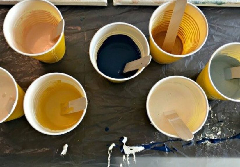
Materials and Supplies
You can start simple, but the quality of a few items matters a lotespecially your pouring medium and your paint consistency.
Core supplies
- Acrylic paint (fluid/soft body is easiest; craft paint can work with extra care)
- Pouring medium (made for acrylic pouring to improve flow and reduce cracking/crazing)
- Disposable cups (mixing cups + one “main cup” for layering)
- Stir sticks/popsicle sticks
- Canvas, wood panel, or primed board
- Drop cloth or plastic table covering (paint pouring is not a tidy hobby)
- Level (a small bubble level helps a lot)
- Gloves and apron/old shirt
- Something to elevate your surface (cups, blocks, push pins in canvas corners)
Optional but helpful
- White paint (for pastels, negative space, and contrast control)
- Palette knife (for scraping cups clean and nudging edges)
- Small spray bottle of water (for tiny adjustments only)
- Silicone/cell medium (only if you want cellsskip if you’re sealing with varnish later and want a simpler finish)
- Varnish (spray or brush-on) for finishing once fully dry
Set Up Your Space Like a Pro (So You Don’t Cry Later)
Paint pouring success is 50% paint and 50% setup. Here’s the goal: a protected surface, a level painting area, and room for drips.
Many beginners mess up by starting on a slightly tilted tablethen the pour slides off like it’s late for an appointment.
Quick setup checklist
- Cover the table with plastic or a drop cloth.
- Place your canvas/panel in a tray or on a raised rack to catch drips.
- Elevate the canvas so paint can run off the edges (push pins in the corners work great for canvases).
- Use a bubble level and adjust with folded paper/cardboard under the tray until it’s flat.
- Keep paper towels nearby. You will need them. This is not optional.
Plan Your Peaches, Pinks, and Blues Palette
The easiest way to keep a pastel pour looking intentional (instead of “I poured every color I own because I panicked”) is to limit your palette and vary your values:
light, medium, and dark. Values create structure even when colors blend.
A balanced palette example (beginner-friendly)
- Peach (warm light/medium)
- Blush Pink (light)
- Hot Pink or Coral (medium accent)
- Sky Blue (light/medium)
- Teal or Deep Blue (dark contrast)
- White (brightener + negative space controller)
Simple mixing ideas (so you can customize)
- Soft peach: white + a tiny touch of orange + a whisper of pink.
- Dusty rose: pink + a touch of white + a pin-drop of blue or brown to mute it.
- Ocean teal: blue + a little green + white to soften.
- Beach-night navy: dark blue with just enough white to keep it pourable and not overpowering.
Keep one color “deep” (teal/navy) and one color “bright” (white or a crisp sky blue). That contrast is what makes the soft shades pop.
Mixing Paint for Pouring: Consistency First, Ratios Second
Here’s the truth: there’s no single universal pouring recipe because paints and mediums vary by brand and thickness.
What matters most is that each color ends up the same pourable consistencyoften described as warm honey or melted ice cream.
If one color is thick and another is watery, the thick one can sit like a stubborn rock while the watery one sprints across the canvas.
Starter mixing approaches (choose one)
- Classic beginner mix: start around a 1:1 paint-to-medium approach for many general-purpose pours (especially with craft paints).
- Manufacturer-style medium-heavy mix: some pouring mediums are designed to use a small amount of color in a larger amount of medium for very smooth films and reduced crazing.
- Fluid acrylic-friendly mix: fluid paints often need less medium than heavy-body paints.
The “trace test” (a practical consistency check)
- Stir slowly until smooth (fast stirring makes bubbles).
- Lift the stir stick and let paint ribbon back into the cup.
- If the ribbon melts back into the surface in about 1–2 seconds, you’re in a good starting zone.
- If it sits on top like a line of frosting, it’s too thick. If it disappears instantly like soup, it’s too thin.
Use water only in tiny amounts if needed. Too much water can weaken the paint film and increase the risk of cracking, especially in thick pours.
Your pouring medium is there to improve flow while keeping the acrylic binder strong.
Pick Your Pour Style: Four Techniques That Look Amazing in Pastels
1) Dirty Pour (the classic “wow, I made that?” method)
You layer colors into one cup (without fully mixing them), then pour. This creates ribbons and marblingperfect for sunset-like peaches and pinks blending into ocean blues.
2) Flip Cup (dirty pour’s dramatic cousin)
You fill a cup with layers, place the canvas on top, flip it, then lift the cup. It gives stronger bursts of color and often looks more “designed.”
3) Open Cup (great for dreamy gradients)
A cup sits on the canvas while paint flows out around it, creating soft rings and waves. With peaches and blues, this can look like a pastel tide.
4) Dutch Pour (blown-out cloud vibes)
You pour paint puddles and use moving air (like a hair dryer on a gentle setting) to push paint outward into feathery effects.
This is gorgeous for pink–blue “cotton candy sky” looks, especially when you keep white as a major player.
Step-by-Step Project: Peachy Sunset + Ocean Blues Flip Cup Pour
This is a reliable starter project that produces an eye-catching result even if it’s your first time.
We’ll aim for a soft sunset center and cooler blues drifting outward.
Step 1: Prep your surface
- Place your canvas/panel on risers inside a tray.
- Level it carefully.
- If using a raw wood surface, prime it first (gesso helps reduce absorbency issues).
Step 2: Mix your colors
Mix each color separately with pouring medium until you hit that smooth, ribboning consistency.
Make sure your white is also pour-readywhite often needs extra mixing time because it can be thicker.
Step 3: Decide your “main character” colors
For this palette, pick:
Peach + blush pink as your warm focus,
sky blue as your light cool bridge,
and teal/deep blue as your contrast.
White is your peacekeeperit helps everything blend without turning gray.
Step 4: Layer the cup
In a clean main cup, layer paints in this repeating order:
white → peach → pink → white → sky blue → white → teal/deep blue.
Repeat once or twice depending on cup size.
Pour slowly down the side of the cup to keep layers distinct.
Step 5: Flip and release
- Place the cup upside down on the canvas (or place canvas over cup and flip togetherwhichever feels safer).
- Let it sit for 10–20 seconds so paint settles.
- Lift the cup straight up.
Step 6: Tilt like you mean it (but not too much)
Tilt the canvas gently in different directions to help paint cover the surface.
Think “slow dancing,” not “shake-a-polaroid.”
If you over-tilt, the pretty bands stretch into one blended layer.
Step 7: Finish the edges
Let paint flow over the sides. Use a gloved finger or a small tool to smooth any bare spots on edges.
Clean edges make the piece look intentional and gallery-ready.
Step 8: Leave it alone to dry
Cover the piece with a clean box or tub (without touching the wet paint) to keep dust and pet hair out.
Keep it level while dryingthis is where your earlier leveling effort pays rent.
Want Cells? Here’s the Safe, Practical Reality
“Cells” happen when layers separate in a controlled way, often helped by silicone/cell mediums and differences in density.
You can absolutely make beautiful peach–pink–blue pours without cells (and finishing is easier).
If you do want cells, use a purpose-made cell additive sparingly and plan to clean residue before varnishing.
Safety note: some artists use heat tools or open flame to encourage cells or pop bubbles. If you’re younger, skip open flame entirely.
If you choose to use any heated tool, have a responsible adult handle it, keep your area ventilated, and prioritize safety over “more cells.”
A great alternative is to focus on clean color flow, lacing, and gradientspastels look amazing even without dramatic cells.
Troubleshooting: Fix the 8 Most Common Problems
1) “My colors turned muddy”
- Use fewer colors (4–6 including white).
- Limit over-tilting. Too much movement blends everything.
- Separate warm and cool zones: keep peaches/pinks near each other and blues near each other with white bridging.
- Add a dark contrast color (teal/navy) in small amounts for definition.
2) “The paint won’t move”
- Mixture is too thickadd a small amount of medium and remix.
- Your surface may not be level, causing uneven spread.
3) “It ran right off the canvas”
- Mixture is too thinuse less water and more medium next time.
- Use slightly less total paint, or tilt less aggressively.
4) “Cracks or crazing appeared”
- Often caused by paint layers drying at different rates (too thick on top, still-wet underneath).
- Avoid excessive water, extreme heat, or rushing the drying process.
- Use a pouring medium designed to reduce cracking and keep the environment stable (temperature/humidity swings can stress the paint film).
5) “Bubbles everywhere”
- Stir slower and let mixed cups sit for a few minutes before pouring.
- Tap cups lightly to encourage bubbles to rise.
- Use gentle techniques rather than aggressive whipping.
6) “Bald spots” (little empty holes)
- Not enough paint coveragetilt slowly until coverage is complete.
- Sometimes very slick surfaces need better priming.
7) “My pour looks flat”
- Add value contrast: a deeper blue/teal and a brighter white.
- Try a swipe of white through the warm area for movement.
- Use a tiny metallic accent (optional) to add sparkle without chaos.
8) “My colors separated weirdly”
- Different viscosities are fightingmatch thickness across all colors.
- Mix thoroughly, especially if you added a cell additive.
Drying and Finishing: Make It Last (Not Just Look Pretty for One Day)
Paint pours can feel dry on top fairly quickly, but thick pours take longer to dry fully.
Be patient before sealingrushing is how you trap moisture and create cloudiness, tackiness, or later cracking.
When can you varnish?
- Many manufacturers recommend waiting until the painting is fully dry before varnishing (sometimes up to a couple of weeks depending on thickness and conditions).
- Thicker pours may need longer in real lifeespecially if you used lots of medium or created deep puddles.
Before varnishing (especially if you used silicone/cell additives)
- Make sure the painting is fully dry.
- If silicone was used, gently clean the surface following your varnish manufacturer’s guidance so the finish adheres properly.
- Apply multiple thin coats rather than one thick coat for a clearer, more even finish.
- Work flat in a ventilated, dust-free space.
If varnish feels intimidating, start with a quality spray varnish designed for acrylics and follow label directions carefully.
Resin finishes can look stunning but involve chemicals and careful mixingif you go that route, treat it like a serious workshop project with proper safety precautions and adult supervision.
Easy Project Variations (Same Colors, New Vibes)
- Coasters: Pour on ceramic tiles for a quick win.
- Beach wave stripe: Keep peach/pink concentrated on one side and blues on the other for a “sunset meets ocean” gradient.
- Minimalist negative space: Use lots of white and fewer colors for an airy, modern look.
- Ring pour: Pour in a steady circle to build soft peach–pink–blue bands.
Experiences and Lessons You’ll Have While Learning This (Add-On)
The first experience you’ll have with a peach–pink–blue paint pour is that your brain will try to treat it like normal painting… and the paint will politely ignore your plans.
That’s not failure. That’s the whole point of pouring. It teaches you to guide the process instead of controlling it.
And honestly? That’s a surprisingly useful life skill for everything from group projects to trying to keep your earbuds from tangling.
A big early lesson is how much consistency changes everything. You’ll pour one cup that behaves like glossy ribbon candysmooth, even, gorgeous.
Then you’ll pour another cup that moves like cold oatmeal and wonder if your paint is mad at you.
What’s happening is usually simple: one color is thicker or thinner than the others.
After a few tries, you’ll start paying attention to the way paint falls off the stir stick, how quickly it blends back into the cup, and how it moves when you tilt.
You’ll get a feel for itlike learning pancake batter by sight. (Yes, art and breakfast are connected. Respect the batter.)
Another experience: you’ll learn that white is not “just white.” In pastel pours, white is the negotiator between warm peaches and cool blues.
Too little white and your colors can clash or turn gray when blended too much.
Too much white and the whole piece can look washed outpretty, but missing that “wow” contrast.
Over time you’ll find your sweet spot: enough white to make peaches and pinks glow, and enough deeper blue to add depth like ocean shadows.
This is where your style starts to show up: some people love soft dreamy clouds, others want bold tidal waves.
You’ll also experience the emotional roller coaster known as “the ugly stage.” Mid-tilt, pours can look messy.
Colors might feel uneven. The composition can look questionable.
It’s tempting to keep tilting and “fixing” until everything blends into one smooth gradient… which is exactly how you accidentally erase all the interesting detail.
With practice, you’ll learn to pause, set the canvas down, and look for what’s already workingmaybe the peach is lacing into the sky blue beautifully, or the teal is creating a crisp border.
Sometimes the best move is doing less. (This is also true for texting. Put the phone down. Walk away.)
Practical experience you’ll gain fast: paint pouring is messy in a very specific way. It doesn’t explode everywhere; it drips everywhere.
You’ll start developing small habits that make cleanup easierlike keeping cups in one “wet zone,” having a trash bag open, and wiping gloves before touching anything important.
You may also learn the heartbreak of setting a wet canvas down on a surface that wasn’t protected.
Once you’ve done that once, you’ll become the kind of person who covers tables like you’re prepping for a glitter festival.
You’ll also discover that your favorite results often happen when you try something small and specific:
“What if I add a thin ribbon of coral between peach and white?”
“What if I only tilt twice and keep more negative space?”
“What if I place the dark blue only on one side to anchor the piece?”
Those little experiments teach you more than trying to copy an exact look from a video.
Over time, you’ll build a personal “recipe book” in your headwhat mixes flow best, what color order you like, and what kinds of movement feel most you.
And when you finally lift the cup and the colors bloom into a soft peach–pink–blue wave that looks like a sunset drifting into seafoam?
That moment feels like magic… even though it’s really just planning, consistency, and patience wearing a fancy cape.
Sources I Learned From (No Links)
- Golden Artist Colors (pouring technique guidance and material considerations)
- Just Paint (Golden’s educational articles on acrylic pouring)
- Liquitex (pouring medium usage and varnishing guidance)
- Dick Blick (acrylic pouring and “cells” project guidance)
- The Spruce Crafts (beginner-friendly explanations of acrylic pouring methods)
- Michaels (paint pouring category and common supply ecosystem)
- Plaid/FolkArt (pouring medium usage notes)
- DecoArt (pouring medium product guidance)
- Instructables (community-style acrylic pour walkthroughs and tips)
- Jennifer Rizzo (beginner acrylic pour overview)
- Left Brained Artist (mixing and cracking/crazing discussions)