Table of Contents >> Show >> Hide
- What Is WordArt in Microsoft Word?
- How to Insert WordArt in Microsoft Word
- How to Edit WordArt Text
- How to Format WordArt in Word
- How to Curve, Bend, or Circle Text with WordArt
- How to Move, Resize, Rotate, and Wrap WordArt
- Best Ways to Use WordArt Without Overdoing It
- Common WordArt Problems and How to Fix Them
- Step-by-Step Example: Create a Stylish Flyer Heading
- Practical Experiences Using WordArt in Real Documents
- Conclusion
If plain text is doing the bare minimum in your document, WordArt is the coworker who shows up in color, brings snacks, and somehow makes the whole meeting better. Whether you are creating a school flyer, a party invitation, a classroom handout, a mini poster, or a title page that needs a little personality, WordArt in Microsoft Word can help your text stand out without forcing you to learn graphic design at 2 a.m.
That said, WordArt works best when you use it with purpose. A strong heading, a curved logo-style title, or a polished callout can make a document look more engaging. Too much WordArt, on the other hand, can make your page feel like a time machine back to the internet café era. The good news is that modern Microsoft Word gives you much more control than the old-school rainbow explosion people remember.
In this guide, you will learn how to insert WordArt in Microsoft Word, how to format it, how to bend or curve text, how to convert normal text into WordArt, and how to avoid the most common mistakes. By the end, you will know exactly how to use WordArt like a pro instead of like someone discovering fonts for the first time.
What Is WordArt in Microsoft Word?
WordArt is a text feature in Microsoft Word that lets you apply decorative styles and visual effects to text. Instead of leaving your words as plain font on a page, WordArt allows you to add fills, outlines, shadows, glows, reflections, 3-D effects, rotation, and transformations such as arching or curving the text.
In simpler terms, WordArt turns regular text into design text. It sits somewhere between standard typography and graphic design. You still type real text, but Word gives that text extra style tools so it can function like a visual element.
People commonly use WordArt for:
- Document titles and cover pages
- Flyers and posters
- Event invitations
- Classroom materials
- Newsletters
- Certificates and signs
- Creative headings in reports or handouts
The best part is that WordArt is built into Word, so you do not need separate design software just to make a heading look less sleepy.
How to Insert WordArt in Microsoft Word
If you want to add WordArt from scratch, the process is straightforward. Microsoft has made it a built-in option on the Insert tab, which means it is only a few clicks away.
Method 1: Insert New WordArt
- Open your Microsoft Word document.
- Click the area where you want the WordArt to appear.
- Go to the Insert tab on the Ribbon.
- In the Text group, click WordArt.
- Choose a style from the WordArt gallery.
- A text box with placeholder text will appear.
- Type your own words to replace the sample text.
That is the basic way to insert WordArt in Word. Once it appears, you can drag it, resize it, rotate it, and style it further. Think of the preset style as the appetizer, not the whole meal.
Method 2: Convert Existing Text to WordArt
Already typed your heading? No need to delete it and start over. Word also lets you convert existing text into WordArt.
- Select the text you want to transform.
- Go to the Insert tab.
- Click WordArt.
- Choose the style you want.
Word will apply the selected WordArt look to the text you highlighted. This is a great shortcut when you are editing a document and suddenly realize your title has the visual energy of unbuttered toast.
How to Edit WordArt Text
Once WordArt is inserted, editing the text is easy. Click inside the WordArt object and type just like you would in a normal text box. You can also highlight individual letters or words and apply font changes from the Home tab.
You can change:
- Font style
- Font size
- Bold, italic, and underline
- Letter spacing
- Text alignment
- Uppercase and lowercase formatting
This matters because WordArt is not just about flashy effects. A clean font combined with subtle styling often looks better than a dramatic effect piled on top of an already dramatic font. In design, restraint is not boring. It is powerful.
How to Format WordArt in Word
After you insert WordArt, the real fun begins. When you click the WordArt object, Word displays a contextual formatting tab. Depending on your version of Word, this may appear as Shape Format or Drawing Tools Format. This is where you can refine the look.
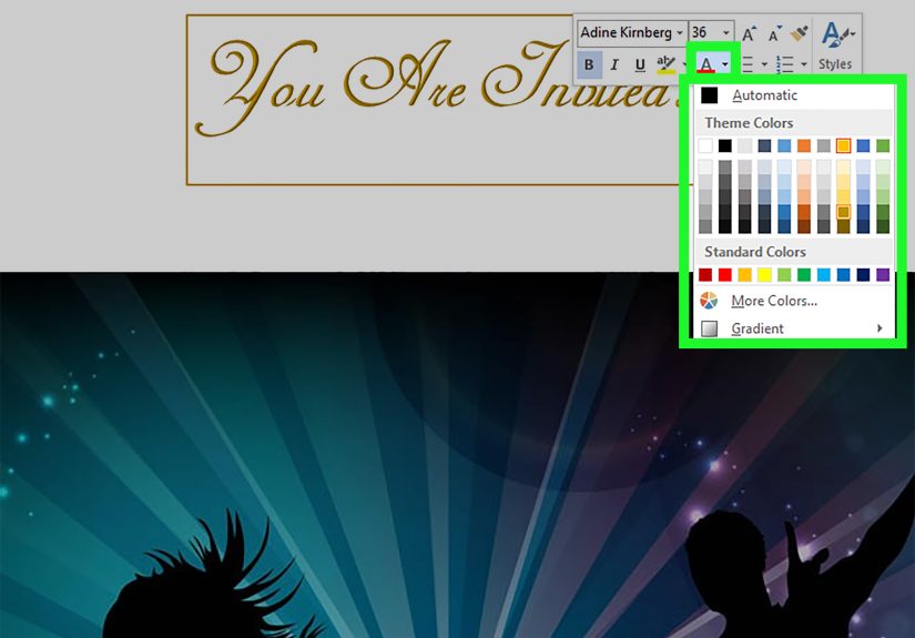
Change the Text Fill
Text Fill controls the inside color of the letters. You can use a solid color, gradient, picture fill in some workflows, or even remove the fill completely for a hollow look.
To change it:
- Select the WordArt text.
- Go to Shape Format.
- Click Text Fill.
- Choose your preferred color or effect.
Change the Text Outline
Text Outline controls the border around the letters. This is useful when you want the text to stand out against a busy background.
- Select the WordArt.
- Click Text Outline.
- Pick a color, weight, or style.
A thin outline can look polished. A giant neon outline can look like the heading wants its own reality show. Choose wisely.
Add Text Effects
The Text Effects menu is where WordArt becomes truly customizable. You can apply:
- Shadow
- Reflection
- Glow
- Bevel
- 3-D rotation
- Transform effects for curved or warped text
These options help you create everything from sleek modern headings to playful poster text. For most web-publishing and professional-looking documents, subtle shadow or glow works far better than stacking every available effect like you are building a sandwich nobody asked for.
How to Curve, Bend, or Circle Text with WordArt
One of the most searched WordArt tasks is making text curve. This is especially useful for badges, logos, labels, invitations, and circular title designs.
How to Curve WordArt Text
- Insert or select your WordArt.
- Go to Shape Format.
- Click Text Effects.
- Hover over Transform.
- Choose a curve, arch, circle, or warp style.
Once the effect is applied, you can resize the WordArt box or drag the yellow adjustment handle to change the curvature. This is where many people accidentally create text that looks like it is melting. Move slowly and preview the result often.
Common transform options include:
- Arch Up
- Arch Down
- Circle
- Button
- Wave
- Inflate
- Deflate
If you want text around a circle or shape, WordArt is usually the easiest built-in tool. It is not as advanced as dedicated design software, but for Word documents, it gets the job done surprisingly well.
How to Move, Resize, Rotate, and Wrap WordArt
WordArt behaves a lot like a text box or shape, which means you can reposition it anywhere on the page.
Move WordArt
Click the border of the WordArt object and drag it to a new location.
Resize WordArt
Drag a corner handle to make it larger or smaller. Using the corners usually preserves the design better than dragging side handles.
Rotate WordArt
Use the circular rotation handle above the object to tilt it. This is handy for playful layouts, labels, or diagonal poster titles.
Adjust Text Wrapping
If WordArt is not sitting where you want, click the layout options near the object and try settings such as:
- In Front of Text
- Behind Text
- Square
- Tight
- Top and Bottom
Text wrapping is especially important when WordArt overlaps images, shapes, or regular paragraph text. Many layout problems are not actually WordArt problems. They are wrapping problems wearing a fake mustache.
Best Ways to Use WordArt Without Overdoing It
WordArt is useful, but it works best when it supports your message instead of trying to steal the entire spotlight.
Use It for High-Impact Text Only
Headlines, section dividers, invitation titles, and short callouts are ideal. Entire paragraphs in WordArt are usually a bad idea unless your goal is to make reading feel like cardio.
Match the Tone of the Document
A playful school project can handle bright colors and curved text. A business proposal should probably keep things clean and subtle. Know your audience before your heading arrives dressed like a circus banner.
Limit the Number of Effects
Pick one or two enhancements that support readability. For example, a solid fill and a light shadow often look better than fill, outline, glow, bevel, 3-D rotation, and a dramatic warp all at once.
Check Readability
Fancy text still needs to be readable. If people have to tilt their head, squint, and negotiate with destiny just to read your title, the styling went too far.
Common WordArt Problems and How to Fix Them
The Formatting Tab Is Missing
Click directly on the WordArt object. If needed, double-click it. The formatting tab only appears when the object is selected.
I Cannot Edit the Text
Click inside the WordArt rather than clicking only the outer frame. Sometimes it takes a second click to place the text cursor inside.
The WordArt Looks Blurry or Odd
Try a simpler font, reduce effects, or resize the object more proportionally. Extreme stretching can make WordArt look awkward.
The Text Wrap Is Messed Up
Open layout options and change the wrap style. Often, switching to In Front of Text or Square solves the problem quickly.
The Curved Text Does Not Look Right
Resize the WordArt object and adjust the yellow handle. The shape of the text often depends as much on the object size as on the transform style itself.
Step-by-Step Example: Create a Stylish Flyer Heading
Let us say you are making a flyer for a school bake sale, office fundraiser, or community event. A plain heading like “Spring Bake Sale” works, but WordArt can make it much more eye-catching.
- Open your flyer in Word.
- Go to Insert > WordArt.
- Select a simple style with strong contrast.
- Replace the placeholder text with Spring Bake Sale.
- Change the font to something bold and readable.
- Use Text Fill to apply a warm color like orange or dark pink.
- Add a light Text Outline for separation.
- Apply a soft Shadow effect.
- Resize the heading so it fits the page width cleanly.
- Set text wrapping to position it neatly above the flyer content.
The result is a title that looks intentional and polished without requiring Photoshop, a design degree, or emotional support from a printer.
Practical Experiences Using WordArt in Real Documents
One of the most useful things I have learned about WordArt in Microsoft Word is that it shines brightest when it solves a visual problem, not when it exists just to show off. In real documents, WordArt is less about being flashy and more about guiding attention. For example, when creating classroom worksheets, event flyers, church bulletins, club posters, or simple business signs, a WordArt title can immediately tell readers where to look first. That makes the page feel organized before anyone reads a single sentence.
In practice, the most successful WordArt designs are usually the simplest ones. A bold heading with a clean fill color and a gentle shadow tends to outperform a heavily warped, glossy, glowing, multi-colored headline. Why? Because readers need to understand the message instantly. If the effect gets in the way of the words, the design is working against you. Many people discover this after experimenting for ten minutes and accidentally creating text that looks like it belongs on a theme park snack stand. Fun, yes. Useful, not always.
Another real-world lesson is that WordArt becomes much more valuable when paired with layout awareness. For instance, a heading may look perfect by itself, but once you place it over an image or next to a block of text, readability changes. That is why text outline, shadow, and wrap settings matter so much. In newsletters and handouts, I have found that even a subtle outline can make WordArt much easier to read over a photo background. Without that extra contrast, the title may look stylish up close but disappear from across the room or on a printed page.
Curved WordArt is especially helpful for invitations, certificates, labels, and badge-like designs. A circular or arched title can make a simple document feel more custom and less template-driven. Still, curved text takes patience. The first attempt often looks either too flat or too bent. The trick is to adjust the object size, then fine-tune the transform handle until the curve feels balanced. Once you get used to that rhythm, the process becomes much easier.
There is also a practical productivity angle. WordArt can save time when you need something visually stronger than plain text but do not want to leave Word for another program. That is a huge advantage for teachers, students, office staff, small business owners, and anyone creating quick documents under deadline. You can build a polished title, adjust the colors to match a brand or event theme, and keep everything inside one file.
Perhaps the biggest experience-based takeaway is this: WordArt works best when it supports the document’s purpose. For a formal report, a minimal style is the smarter move. For a birthday invitation, seasonal poster, or classroom banner, you can be more playful. Matching the effect to the situation is what separates good design from random decoration. In other words, WordArt is a tool, not a costume party. Use it with intention, and it can make ordinary documents look surprisingly professional.
Conclusion
Learning how to use and insert WordArt in Microsoft Word is one of those small skills that pays off more often than people expect. It helps you create stronger titles, more engaging flyers, better-looking handouts, and documents that do not feel visually flat. The basic workflow is simple: insert WordArt, type your text, then customize the fill, outline, effects, transform, size, and layout until it fits your design.
The secret is not using every feature at once. The secret is knowing which feature makes the message clearer, stronger, and more attractive. Used well, WordArt can add style without sacrificing readability. Used badly, it can look like your document fell into a font blender. Aim for the first outcome, and your Word documents will instantly look more polished.