Table of Contents >> Show >> Hide
- Why color swatches are helpful (and why they can also betray you)
- Step 1: Start with what you can’t (or won’t) change
- Step 2: Shop swatches like a scientist (not like a raccoon)
- Step 3: Learn to read a swatch (undertone, value, and finish)
- Step 4: Bring swatches home and test them in context
- Step 5: Upgrade from tiny swatches to real paint samples
- Step 6: Use a simple decision matrix (so your brain stops spinning)
- Common swatch mistakes (and how to avoid them)
- Quick swatch playbook for tricky spaces
- Use digital tools the right way (helpful, not holy)
- Your final pick checklist
- Real-world experiences: what actually happens when you bring swatches home
- Conclusion
- SEO Tags
Color swatches are the gateway drug of home improvement. One minute you’re “just grabbing a few paint chips,”
and the next you’re standing in your living room holding 37 tiny rectangles like you’re about to perform a
very emotional magic trick.
The good news: swatches really can help you choose the right paint colorif you use them the right way.
The bad news: swatches are also tiny liars. They don’t show texture, they don’t show sheen, and they absolutely
don’t show what your hallway looks like at 9:14 p.m. under that one bulb you keep forgetting to replace.
Let’s fix that.
Why color swatches are helpful (and why they can also betray you)
Paint color is relativeyour walls don’t exist in a vacuum
A paint chip is a useful starting point because it gives you a hue family, a general “vibe,” and a way to
narrow thousands of choices down to a shortlist. But paint color changes based on context:
lighting direction, time of day, nearby finishes (floors, countertops, upholstery), and even what’s outside
your windows. A swatch viewed in a bright store aisle is basically the paint equivalent of a flattering
bathroom selfiereal life will be… more honest.
Small swatches hide undertones
Many colorsespecially whites and neutralscarry subtle undertones (yellow, pink, green, blue, violet, gray).
On a tiny chip, those undertones can be hard to see. On an entire wall? Suddenly your “warm greige” is reading
“mysterious swamp fog” next to your beige tile. The goal of swatches is not to pick the final color; it’s to
identify the right direction and eliminate the wrong ones fast.
Step 1: Start with what you can’t (or won’t) change
Before you touch a swatch rack, take inventory of the fixed or expensive elements in the space. These are your
“non-negotiables,” and paint should cooperate with themnot the other way around.
- Flooring: wood tone, tile color, carpet warmth/coolness
- Large furniture: sofa fabric, rugs, big chairs you actually keep
- Cabinetry and countertops: stone veining, quartz undertones, backsplash
- Trim color: is it crisp white, creamy white, or something older with warmth?
- Metal finishes: brushed nickel, warm brass, black, mixed metals
Quick rule: if it’s staying put, it gets a vote. Paint is flexible. Your countertops are not.
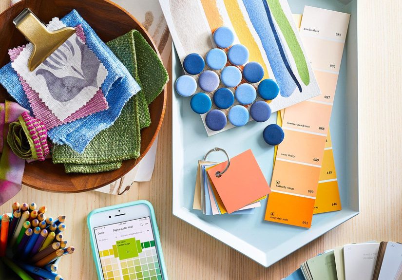
Step 2: Shop swatches like a scientist (not like a raccoon)
The best swatch strategy is structured, not chaotic. Chaos is how you end up with “three possible whites”
and no idea why one looks minty.
Use the “strip strategy”
Instead of picking one chip from ten different colors, pick color strips (the ones with multiple
shades from light to dark in the same family). Strips help you see:
- how the color behaves at different depths (light vs. medium vs. deep)
- which shade feels right for your room’s brightness
- whether undertones get stronger as the color gets darker
Stay in a tight lane at first
Give yourself boundaries. Pick a general direction“warm off-white,” “soft blue-gray,” “earthy sage,”
“deep charcoal”and gather swatches inside that lane. If you don’t set boundaries, you’ll be comparing
“cloud white” to “midnight navy” and calling it decision-making.
Grab a few “control swatches”
Add these to your stack to make comparisons easier at home:
- A true white (for detecting undertones)
- A mid-tone neutral (to check whether your choice feels too light/dark)
- Your current wall color (so you can see what’s changing)
Step 3: Learn to read a swatch (undertone, value, and finish)
Undertone: the “secret ingredient” in paint color
Undertone is what makes two “similar” colors behave completely differently in the same room. Here’s a practical
way to spot it:
- Place your candidate swatch next to a true white chip.
- Look at the candidate in natural daylight (near a window, not directly in sun).
- Ask: does it look slightly pink? green? yellow? gray? blue?
This is especially important with whites and off-whites. Many “white” paints are actually lightly tinted,
and swatches help you catch those hints before they move in and start paying rent.
Value: how light or dark the color will feel
You don’t just choose a color; you choose how bright the room feels. Even if you love a hue, the wrong depth can
make a room feel flat, gloomy, or overly stark. Swatch strips are helpful here because they show the same hue at
different strengths. If a room is naturally dim, you may prefer a lighter version of the same color family.
Finish (sheen) changes how color reads
Paint finish affects light reflection. Higher sheen tends to reflect more light and can make color feel sharper
and sometimes darker or more intense, while flatter finishes can read softer and hide wall imperfections better.
Swatches don’t fully show sheen, so keep finish in mind while you narrow your shortlist.
Step 4: Bring swatches home and test them in context
Don’t judge swatches against your existing wall color
Your current wall color will influence what you see. If your walls are warm beige, almost anything cool will look
extra icy by comparison. To reduce “color contamination,” tape swatches onto a sheet of plain white paper, foam board,
or even a clean white notebook page.
Move the swatches around the room
Tape 3–5 finalists onto a portable white board and carry them to the areas that matter:
- near the largest window (brightest light)
- in the darkest corner (where color can go weird)
- next to flooring and large furniture
- beside trim and doors
Test at different times (yes, really)
Do a quick “lighting schedule” so you’re not surprised later:
- Morning: cooler daylight in many homes
- Midday: brightest, most revealing light
- Evening: warm artificial light changes everything
Tip: turn on the lamps you actually use. If you always live under warm bulbs at night, your paint color should be
chosen under warm bulbs at night. Otherwise you’re basically choosing a date outfit under grocery-store fluorescents.
Step 5: Upgrade from tiny swatches to real paint samples
Once swatches get you down to 2–4 contenders, stop arguing with paper and start testing paint. This is the step
that saves you from repainting (or pretending you “meant” for it to look like that).
Option A: Paint sample boards (portable and low drama)
Paint sample boards are large pieces of poster board or foam board painted with your test color. They’re great because
you can move them from wall to wall and room to room without painting directly on your walls.
- Make boards large enough to see the color “in real life,” not as a postage stamp.
- Do two coats so the color is accurate.
- Label each board with the color name and brand (future-you will forget).
- If possible, wrap paint around the edges so you can see it from different angles.
Option B: Paint directly on the wall (bigger is better)
If you paint test patches on the wall, go larger than you think. A tiny square can look cute; a larger area shows
how the color behaves as a field of color. Place samples near elements you can’t change (flooring, cabinets, tile)
so you see how everything plays together.
Option C: Peel-and-stick samples (fast, tidy, and surprisingly helpful)
Peel-and-stick paint samples can be a convenient middle ground: bigger than chips, cleaner than paint patches, and
easy to reposition. They’re not perfect, but they can speed up the elimination processespecially for neutrals where
undertones are the whole game.
Step 6: Use a simple decision matrix (so your brain stops spinning)
When you’re stuck between “Color A” and “Color B,” your feelings will flip hourly. Give your choice a structure:
| Criteria | What you’re checking | Winner? |
|---|---|---|
| Undertone match | Works with floors/counters/trim | ___ |
| Daylight behavior | Looks good in morning + midday | ___ |
| Night behavior | Looks good under your bulbs/lamps | ___ |
| Room mood | Feels like the vibe you want (calm, cozy, crisp, dramatic) | ___ |
| Whole-home flow | Plays nicely with nearby rooms | ___ |
You’re not searching for perfection; you’re searching for the color that wins most categories in your actual life.
Common swatch mistakes (and how to avoid them)
-
Choosing in the store only: store lighting is not your lighting. Swatches are for shortlisting, not
final decisions. -
Ignoring undertones: “neutral” doesn’t mean “undertone-free.” Compare against true white to reveal
what’s hiding. - Testing one wall only: one wall can be bright, another can be shadowy. Move sample boards around.
- Testing too small: if it looks great as a 3-inch chip, congratsyou’ve proven it looks great as a 3-inch chip.
- Forgetting sheen: a color in matte vs. satin vs. semi-gloss can read noticeably different.
- Trusting phone photos: cameras “correct” light and change color. Use your eyes in the room.
Quick swatch playbook for tricky spaces
North-facing rooms (often cooler light)
If a room gets cooler, softer daylight, some cool grays and whites can look extra chilly. When swatching, include a few
warmer options in the same depth so you can compare and choose what makes the room feel balanced rather than bleak.
South-facing rooms (lots of warm light)
Warm sunlight can make warm neutrals look even warmer. If you’re swatching creams or beiges, include at least one option
that’s slightly more neutral so you can see if your room is already doing the warming for you.
Kitchens and baths (hard surfaces reflect color)
Tile, stone, and cabinets bounce color around like a pinball machine. When swatching, test your top options right next to
the backsplash and countertop. This is where undertones either harmonize… or start a feud.
Exteriors (weather is a filter)
Outdoor color shifts with clouds, sun, shade, and surrounding landscaping. Swatch on multiple sides of the house if possible,
because “front porch shade” and “full afternoon sun” can make the same color look like two different decisions.
Use digital tools the right way (helpful, not holy)
Online visualizers and paint apps can help you explore palettes and get a rough preview, especially if you’re starting from zero.
But screens aren’t color-accurate enough for a final decision. Use tech to narrow options, then use swatches and samples to decide.
Your final pick checklist
- You’ve tested 2–4 finalists in your room’s real lighting (day and night).
- You’ve compared against true white to confirm undertones.
- You’ve checked the color next to floors, trim, and major furniture.
- You’ve chosen a sheen that makes sense for the room and the wall condition.
- You’ve lived with your top choice long enough to stop “panic-refreshing” your decision.
Real-world experiences: what actually happens when you bring swatches home
Let’s talk about the part no one mentions in the paint aisle: swatches behave like they’re auditioning for different roles
depending on the hour. In the morning, your “clean white” looks fresh and bright. By late afternoon, it’s giving “warm marshmallow.”
At night, under warm lamps, it might drift into “buttered popcorn.” None of this means you chose wrongit means you’re finally seeing
the color in a real environment instead of a perfectly lit retail display.
A common experience is the Undertone Plot Twist. You bring home three “almost identical” greiges. On the kitchen table,
they still look identical. Then you tape them near your flooring, step back, and suddenly one looks pink, one looks green, and one looks
like it has a tiny drop of purple drama in it. This is exactly why swatches are valuable: they help you catch the twist while it’s still
a paper problem, not a “repaint the whole room” problem.
Another classic moment: the Shadow Corner Reality Check. A color can look gorgeous on the brightest wall and totally wrong
in the darker corner where your hallway turns. If you’ve ever said, “Why does this wall look different?”congratulations, you’ve discovered
that light is not evenly distributed, and paint color is basically light in costume. This is why sample boards are so helpful: you can move
the same painted color into the brightest and darkest areas and see if it still feels like itself.
People also tend to underestimate how much neighboring colors influence the result. A warm wood floor can make a neutral wall
look cooler by comparison. A green lawn outside can throw a subtle green cast into a room. A bold rug can reflect its tones onto the wall,
especially in brighter light. Swatches let you test whether your paint color is truly harmonious or just “fine” when it’s standing alone.
The trick is to stop judging swatches in isolationalways judge them near something real: a cushion, a countertop sample, a piece of artwork,
or even the cabinet door you’re not replacing this decade.
And yes, there’s the emotional experience: decision fatigue. Paint has too many options, and your brain eventually stops seeing differences
and starts seeing only feelings. When that happens, take a break. Leave the swatches up for a full day, then look again with fresh eyes.
If one option keeps feeling calm and easy (instead of “exciting but stressful”), that’s usually your winner. Paint is not a tattoo; you can
change it later. But you deserve to pick a color that makes your daily life feel betternot one that turns into a nightly debate with your
own ceiling lights.
Conclusion
Color swatches are powerful when you treat them like a process: shortlist in the store, test at home, compare undertones, and sample big enough
to see what the color does in your actual lighting with your actual stuff. The “right” paint color isn’t the one that looks best on a tiny chip
it’s the one that looks good in the morning, still looks good at night, and plays nicely with the pieces you already own. Use swatches to narrow
your options, then let real samples make the final call. Your future self (and your roller tray) will thank you.