Table of Contents >> Show >> Hide
- Table of Contents
- What the Yellow Building Is (and Why It Matters)
- Dogpatch: The Neighborhood That Makes the Building Make Sense
- Adaptive Reuse, Not Costume Design
- Inside: Materials, Light, and the “Warm Modern” Playbook
- The Signature Move: Transparency Between Spaces
- Why Yellow Works (Beyond the Obvious)
- A Micro Mixed-Use Model: Food + Retail + Community
- Design Lessons You Can Steal (Legally)
- How to Experience It Like a Design Nerd (Without Being Annoying)
- Extra: of On-the-Ground Style “Experiences”
- Conclusion
Some buildings whisper. This one practically waves at you from across the blockwearing a butter-yellow coat that says,
“Yes, I’m cheerful, and yes, I’m also old enough to have opinions about the Gold Rush.”
Welcome to San Francisco’s “Yellow Building,” a Dogpatch landmark that pairs 19th-century bones with a modern, light-filled interior
shaped by Sagan Piechota Architecture. It’s adaptive reuse with a sense of humor: a historic barn turned into a mini-ecosystem
of food, coffee, and retail that feels equal parts neighborhood hangout and design case study.
In architecture, we love to talk about “place-making.” The Yellow Building doesn’t just make a placeit makes a whole mood.
You come for a coffee or a meal, and you leave with a new appreciation for daylight, wood grain, and the subtle social engineering
that happens when designers put people (and businesses) in visual conversation with each other.
What the Yellow Building Is (and Why It Matters)
The Yellow Building is a historic structure in San Francisco’s Dogpatch neighborhood that’s been reimagined as a small cluster
of complementary uses under one roof. Think of it as a “concept shop,” but with real neighborhood utility:
a place where you might grab coffee, share a meal, browse a bottle, and linger just long enough to accidentally learn something about
timber framing and why reclaimed wood feels emotionally stable.
The appeal isn’t only the programit’s the way the program is stitched together. The project leans into a classic adaptive-reuse dilemma:
how do you preserve character without freezing it in amber? Sagan Piechota’s approach threads that needle by keeping the rustic DNA
while sharpening the experience with modern clarity. The result is not “old building with trendy stuff inside,” but a cohesive environment
where history and contemporary life share the same air.
If you’re wondering why designers keep bringing up this building years after it opened, it’s because it demonstrates something many cities
struggle to do well: create a destination that still behaves like a local. It’s memorable without being theme-ylike a highlighter
that somehow also reads as sophisticated. (That’s harder than it sounds.)
Dogpatch: The Neighborhood That Makes the Building Make Sense
Dogpatch is one of San Francisco’s most distinct urban fabric stories. Historically tied to industrial work and worker housing,
the area developed with a practical, no-fuss spiritan identity that still shows up in its mix of modest Victorians, former warehouses,
and repurposed industrial sites. Over time, it’s become a neighborhood where craft, food, design, and art increasingly overlap,
creating the perfect ecosystem for a building that wants to be both useful and quietly iconic.
This matters because architecture is never just an objectit’s a negotiation with context. In a place with a strong historic thread,
“new” doesn’t have to mean “loud.” Dogpatch has the kind of authenticity that punishes fakeness. You can’t drop in a glossy,
placeless interior and expect it to feel right. The Yellow Building works because it respects the neighborhood’s industrial-worker roots
while acknowledging Dogpatch’s present-day evolution into a creative, mixed-use district.
And if you want a broader lens, the Central Waterfront has long been discussed as an area with potential to shift over time toward more
mixed-use intensity. Projects that celebrate existing structuresrather than wiping them outhelp neighborhoods evolve without losing
the texture that made them desirable in the first place.
Adaptive Reuse, Not Costume Design
Adaptive reuse can go two ways. The first is “historic cosplay”: exposed brick, a vintage sign, maybe a reclaimed door slapped onto a wall
like a trophy. The second is deeper: you study the building’s structure and spatial logic, then build a contemporary experience that feels
inevitablelike the building always wanted to be this, it just needed the right decade.
The Yellow Building leans toward that second approach. The structure has the feel of a barn-like volumean older shell with an openness
that can handle communal gathering. That’s an architectural advantage: a generous interior volume invites flexible layouts,
large shared tables, and clear sightlines. Instead of carving the building into small, precious rooms, the design strategy keeps air and
light moving through the space, preserving the “big old building” feeling while delivering modern comfort.
In San Francisco, adaptive reuse also has a practical side that’s not as Instagrammable: safety and seismic performance.
Older buildings often require thoughtful upgrading so they can keep serving the city. While every structure is different,
the city’s broader approach to existing buildings and seismic strengthening underscores how retrofits can be integrated without forcing
unnecessary additional workan important principle when you’re trying to preserve character and control project scope.
The best adaptive reuse doesn’t treat upgrades as an enemy of beauty; it treats them as part of the design brief. Done well,
safety, comfort, and identity become the same project, not three separate arguments.
Inside: Materials, Light, and the “Warm Modern” Playbook
The interior experience reads as “warm modern,” which is design-speak for: clean lines, natural materials, and a vibe that doesn’t scold you
for wanting to be comfortable. Wood plays a starring rolefloors, tabletops, and accents that ground the space and soften the industrial
edge. The effect is the opposite of sterile: it’s refined, but you’re not afraid to set down your coffee.
The communal-table layout does more than maximize seating. It changes behavior. Shared tables create a social neutrality:
you can be alone without feeling lonely and you can be with people without needing a private booth fortress.
This is architectural hospitalitydesign that quietly manages human comfort.
Daylight is treated like an ingredient. The building’s openness and window placement allow light to flood in and bounce off pale surfaces,
making the interior feel larger and more optimistic. Add in soaring volume, exposed rafters, and a restrained palette, and the space becomes
an easy background for daily life. The design doesn’t compete with conversation; it supports it.
Furniture choices (think modern classics and simple silhouettes) reinforce the idea that the building itself is the main character.
When a space has strong bones, your best move is to stop yelling over it.
The Signature Move: Transparency Between Spaces
One of the most memorable design decisions here is the deliberate visual connection between different tenants. Instead of treating each
business like a sealed-off kingdom, the project encourages cross-pollinationliterally letting you see from one space into another.
In practical terms, that can turn a “quick dinner” into “oh, wait, what’s next door?” which is basically the retail version of
“just one more episode.”
This is more than a cute trick. It’s a spatial strategy that supports a mixed-use ecosystem. When you can see adjacent activity,
you feel part of a larger whole. It increases perceived safety (more eyes, more life) and amplifies curiosity.
It also reduces the “mall effect,” where each storefront is isolated and the corridor is just circulation. Here, circulation becomes
experience.
Importantly, transparency doesn’t mean chaos. The building still needs boundariesacoustics, back-of-house zones, moments of intimacy.
The design balances openness with enough definition that each use keeps its identity. Think of it as neighbors chatting over a fence:
connected, but not sharing a toothbrush.
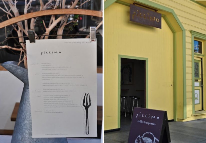
Why Yellow Works (Beyond the Obvious)
Let’s talk about the elephant in the roomexcept it’s not an elephant, it’s a giant yellow building, and it’s doing the visual equivalent
of standing under a spotlight. Color on exteriors is often treated as branding, but here it also functions as urban wayfinding.
In a city of fog and muted tones, yellow is a confidence move. It says, “You have arrived,” even if your GPS is still buffering in 2011.
Yellow also does something psychologically useful: it signals warmth and approachability. That matters for mixed-use spaces
that rely on spontaneous drop-ins. The building is not hiding. It’s not trying to be a secret club. It’s a neighborhood anchor.
And the contrast is key. A bold exterior paired with a calm, material-driven interior creates a satisfying sequence:
excitement outside, ease inside. It’s like a book cover that grabs you, then a story that keeps you.
From a design standpoint, the exterior color becomes part of the building’s identity without forcing the interior to mimic it.
That restraint is a sign of maturitydesign that knows when to stop.
A Micro Mixed-Use Model: Food + Retail + Community
The Yellow Building’s “stack” of uses has a logic that feels obvious once you experience it: food and drink create dwell time;
retail benefits from dwell time; and the neighborhood benefits from a place where people naturally gather.
This is mixed-use at a human scale, not a mega-development strategy diagram.
When the building originally brought together a restaurant, a wine-focused shop, and a clothing/store environment, it created a loop:
coffee leads to browsing, browsing leads to “I should eat,” eating leads to lingering, lingering leads to “fine, I’ll look at the ceramics.”
The building becomes a small urban machine that turns time into community.
There’s also an underlying values story. The tenants’ emphasis on craft, quality, and local sourcing aligns with the building’s
reuse ethos. You can’t convincingly sell “thoughtfulness” inside a space that looks like it was assembled in a hurry.
Here, the architecture quietly backs up the businesses’ narrative: considered, grounded, and not trying too hard.
In a city where third places (spaces that aren’t home or work) can feel scarce or transactional, a building like this carries cultural weight.
It’s not just a place to buy things; it’s a place to be.
Design Lessons You Can Steal (Legally)
1) Let the old building do the talking
If a structure has history, texture, and volume, don’t bury it. Highlight it with restraint: simple surfaces, honest materials, and clear
spatial organization. The Yellow Building shows how a “light touch” can feel richer than a heavy-handed makeover.
2) Use transparency to create a “shared story”
Visual connections between spaces aren’t only prettythey’re operational. They encourage exploration, improve perceived safety, and make
multiple uses feel like one destination. It’s a clever way to make a mixed-use project feel coherent without forcing sameness.
3) Choose a bold exterior, then calm down inside
Cities need legibility. A memorable exterior helps. But interiors need comfort and longevity. By making the interior material-driven,
the building avoids trendy burnout. Your eyes get a break, and that’s the ultimate luxury.
4) Communal tables are social architecture
A shared table isn’t just furnitureit’s a behavior cue. It signals openness and reduces the “this seat is only for a certain type of person”
vibe. In neighborhood spaces, that matters.
5) Respect the realities of building in San Francisco
Adaptive reuse in SF often intersects with seismic considerations and existing-building requirements. The lesson isn’t “let codes design your
building.” It’s “make the technical work part of the design narrative,” so safety and beauty aren’t enemies.
How to Experience It Like a Design Nerd (Without Being Annoying)
You don’t need to show up with a tape measure and a suspiciously intense interest in joinery. (Please don’t.)
Here’s a better approach: treat the building like a sequence.
-
Start outside: Notice how the color works as a landmark. Pay attention to how the building sits in the street context
it’s assertive without being oversized. -
Watch the transition: The moment you enter, the atmosphere shifts from “cheerful beacon” to “warm refuge.”
That contrast is intentional. -
Follow the sightlines: Look for the visual connections between spaceswhat you can see, what you can’t,
and how that influences where you want to go next. -
Read the materials up close: Reclaimed wood, simple detailing, and a restrained palette are doing the heavy lifting.
The design isn’t shouting; it’s persuading. -
Notice the people: The ultimate test of architecture is behavior. Are people lingering? Talking? Working?
A good room supports multiple “modes” without friction.
If you leave thinking, “That felt easy,” congratulationsyou just experienced good design. It’s supposed to feel inevitable,
like a well-edited paragraph.
Extra: of On-the-Ground Style “Experiences”
You approach the corner in Dogpatch and, for a split second, your brain does that delightful glitch where it can’t decide whether it’s seeing
architecture or a friendly warning label. Yellow, in this context, isn’t just a colorit’s a public service announcement:
“Yes, there’s something worth stopping for right here.” The building catches light differently than its neighbors. Even on a gray day,
it looks like it’s generating its own weather.
The street around you feels like classic Dogpatch: industrial edges softened by small-scale life. You might hear a distant roll-up door,
a bike chain clicking, footsteps headed toward galleries. The Yellow Building sits in that mix like a hinge between eraspart Victorian
memory, part modern routine. You pause outside longer than expected because the façade is doing what good façades do:
making a promise before you even enter.
Inside, the first sensation is volume and calm. The light is generous. The materials feel honest. You notice wood under your hands,
wood underfoot, wood overheadwarmth without fuss. The space doesn’t demand that you perform “cool.” It’s inviting in a way that’s hard to
fake and even harder to sustain, which is why it’s so satisfying when you find it.
You choose a spot and realize how the room gently choreographs you. Communal tables make you feel like you can stay without claiming
territory. The seating encourages conversation but doesn’t force it. You can be quietly alone, loudly with friends, or somewhere in between.
That flexibility is the real luxury: a space that adapts to your day instead of insisting you adapt to its vibe.
Then the building’s signature trick starts working on youthose glimpses into adjacent spaces. You notice movement next door.
Someone browsing. Someone laughing. Someone holding a coffee like it’s an accessory (and, honestly, it kind of is).
The visual connection creates curiosity without pressure. You don’t feel sold to; you feel invited. It’s the difference between
“Buy this” and “Come see.”
When you step back outside, you notice how the building behaves in the neighborhood ecosystem. It’s not a standalone monument.
It’s a nodeone that pulls you into Dogpatch’s wider loop of streets, studios, and industrial relics turned creative spaces.
You walk away with a weirdly specific set of memories: the glow of the façade, the softness of the interior light, the sense that
the building was designed to help you slow down without announcing that it’s doing so.
And that’s the lasting experience: the Yellow Building doesn’t just look good in photos; it feels good in real time.
It proves that adaptive reuse can be practical, social, and emotionally resonantwhile still letting a 19th-century structure keep its
dignity. You came for a coffee or a meal. You left with a tiny masterclass in how architecture can be both a landmark and a living room
for a neighborhood.