Table of Contents >> Show >> Hide
Light blue is one of those rare colors that can act sweet, polished, coastal, modern, classic, or quietly luxurious depending on what you pair it with. In other words, it is the overachiever of the color world. Give it crisp white and it feels fresh. Add blush pink and it turns romantic. Bring in warm beige, brass, or wood tones and suddenly it looks like it owns a very nice vacation home.
If you have ever stared at a light blue wall, sofa, dress, cabinet, or throw pillow and thought, “Great, now what?” you are in exactly the right place. The good news is that light blue is incredibly flexible. The slightly trickier news is that not every pairing creates the same mood. Some combinations feel airy and relaxed, while others feel dramatic, tailored, or unexpectedly bold.
Below, you will find 11 perfect shades that go with light blue, plus practical advice on how to use each pairing without turning your room, outfit, or mood board into a color experiment gone rogue.
Why Light Blue Works So Well
Before we get to the pairings, it helps to understand why light blue is such an easy color to decorate with. It sits in that magical zone between color and neutral. It has more personality than white or beige, but it is still soft enough to behave like a backdrop. That makes it ideal for bedrooms, bathrooms, kitchens, nurseries, entryways, and even living rooms that need a little more life without shouting for attention.
Light blue also reflects light beautifully. In many spaces, it creates an airy effect that feels open, clean, and calming. That is why it often shows up in small rooms, coastal interiors, cottage-style spaces, and relaxed modern homes. The key is matching its undertone. Some light blues lean gray, some lean green, and some have a powdery softness that almost tips into lavender. Once you know the undertone, choosing companion colors becomes much easier.
What Color Goes With Light Blue? 11 Perfect Shades
1. Crisp White
If you want a pairing that never misses, start with crisp white. Light blue and white create a clean, bright look that feels timeless rather than trendy. This combination works beautifully in bedrooms, bathrooms, kitchens, and anything vaguely coastal. It is also a safe choice if you are decorating a small space and want it to feel lighter and more open.
Use this duo when you want light blue to feel fresh and polished. White trim against light blue walls looks sharp. White bedding on a light blue wall feels cloud-like. White upholstery paired with soft blue accents feels classic and easy. The result is calm, breezy, and hard to mess up.
2. Creamy Ivory
If crisp white feels a little too icy for your taste, creamy ivory is the warmer cousin who brings cookies and good manners. Ivory softens light blue and gives it a more inviting, layered look. This is a great option if your home leans traditional, farmhouse, transitional, or cozy coastal.
Think ivory curtains with pale blue walls, or a light blue accent chair with cream upholstery nearby. This pairing works especially well in rooms where you want softness without sliding into sugary pastels. It says, “I have taste,” not, “I decorated entirely from a baby shower palette.”
3. Sandy Beige
Light blue and sandy beige are one of the most natural pairings you can choose. Together, they evoke sky, water, and shoreline without feeling overly themed. Beige adds warmth that keeps light blue from feeling chilly, while light blue keeps beige from looking flat or sleepy.
This combination is perfect for living rooms, bedrooms, and open spaces that need balance. A light blue wall with a beige sofa, a jute rug, woven textures, and natural wood can look effortlessly pulled together. It is especially useful if you want a calm color scheme with a little personality but still want most of the room to feel neutral.
4. Soft Greige
Greige is that wildly useful blend of gray and beige that designers keep returning to because it plays well with almost everything. Pair it with light blue and you get a sophisticated palette that feels current, restrained, and surprisingly elegant.
This is a smart choice if you like modern interiors, clean lines, matte finishes, and subtle contrast. A greige sofa against light blue walls looks refined. Light blue cabinetry with greige stone counters feels upscale. Even in fashion, a pale blue shirt with greige trousers looks polished without trying too hard. It is quiet luxury without the drama or the trust fund.
5. Heather Gray
Gray is a natural partner for light blue because both colors have a calming, cool-toned quality. The trick is choosing the right gray. A soft, heathered gray works better than a harsh concrete tone if you want the room to feel restful instead of corporate.
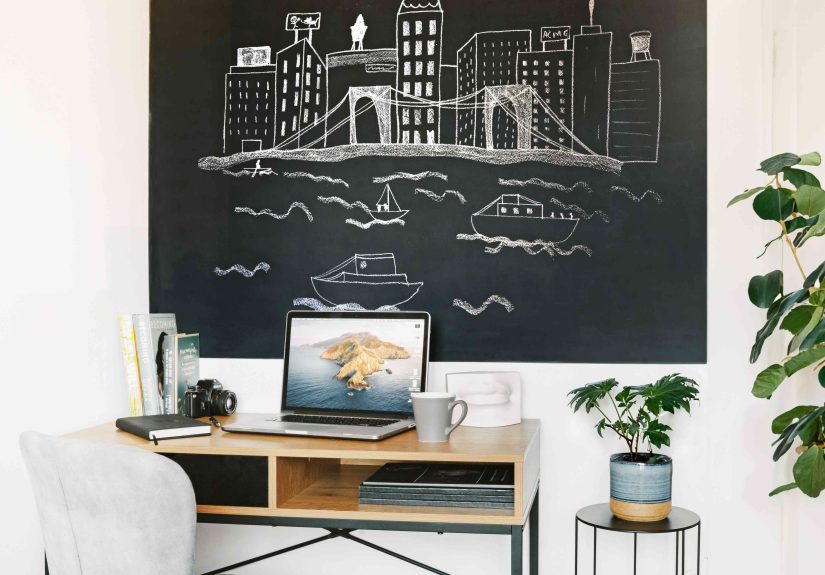
Use this pairing in bedrooms, reading nooks, or home offices where you want focus and softness at the same time. Gray upholstery, rugs, or curtains help anchor light blue walls. If your light blue has a dusty or blue-gray undertone, this combination becomes especially seamless. It creates a layered monochromatic feel without being boring.
6. Navy Blue
Pairing light blue with navy is proof that one color family can still deliver contrast. Navy adds depth, structure, and seriousness to light blue’s airy personality. It is the visual equivalent of putting a blazer over a linen shirt. Suddenly everything looks sharper.
This pairing works best when light blue is the dominant tone and navy appears through accents such as pillows, trim, an upholstered headboard, cabinetry, or art. In a bedroom, light blue walls with navy bedding feel crisp and tailored. In a bathroom, light blue tile with navy accessories looks rich and clean. If you want a palette that feels timeless rather than trendy, this is a winner.
7. Blush Pink
Blush pink with light blue is soft, charming, and more versatile than people expect. This is not just for nurseries or ultra-feminine spaces. When done with muted shades, the combination can feel elegant, airy, and grown-up.
Blush adds warmth to light blue without overpowering it. Try light blue walls with blush upholstered chairs, blush pillows on a pale blue bed, or a blue-and-blush artwork combination in a neutral room. If you want a space to feel friendly, relaxed, and a little romantic, this pairing delivers. It is sweet, but in a good way, like a bakery that also serves excellent coffee.
8. Peachy Coral
If blush pink is gentle, peachy coral is its livelier cousin. This color pairing brings warmth, energy, and personality to light blue. Because blue and orange sit opposite each other on the color wheel, coral adds contrast while still feeling approachable.
Use coral when you want light blue to feel sunnier and more playful. It works beautifully in entryways, powder rooms, kids’ spaces, breakfast nooks, and cheerful living rooms. The easiest way to use it is through accents: artwork, pillows, ceramics, florals, or one statement chair. A little coral goes a long way, which is great news for anyone who loves color but fears commitment.
9. Sage Green
Sage green and light blue create a soft, layered palette inspired by nature. The combination feels peaceful, fresh, and slightly collected, as if the room naturally came together over time instead of being assembled in one heroic weekend.
This pairing shines in bedrooms, bathrooms, and kitchens. Think pale blue cabinets with sage walls, or a light blue bedroom with sage textiles and botanical prints. Because both colors are muted, the overall effect is serene rather than high-contrast. Add warm wood or brass for depth and the whole palette starts to sing.
10. Mustard Yellow
Mustard yellow gives light blue a cheerful jolt of energy. It is a classic cool-meets-warm combination, but it feels more stylish and grounded than bright primary yellow. Where light blue is airy and relaxed, mustard is rich and sunny. Together, they create balance.
This pairing works especially well when used in moderation. A mustard throw, lamp, bench, or art piece can wake up a soft blue room instantly. In fashion, a light blue button-down with a mustard accessory can look playful and smart. If you want a palette with a bit more optimism and edge, mustard is a strong choice.
11. Golden Brass
Golden brass is not a wall color, but it absolutely deserves a place on this list because it looks fantastic with light blue. Brass adds warmth, shine, and a hint of sophistication. Light blue can sometimes feel a little cool on its own, and brass helps correct that beautifully.
Use brass hardware on light blue cabinetry, a gold-framed mirror in a pale blue bathroom, or warm metallic lighting in a light blue bedroom. This combination feels elevated without being flashy. It works in traditional, vintage-inspired, glam, and even minimalist spaces. If light blue is the calm friend, brass is the friend who tells it to wear better jewelry.
How to Choose the Right Pairing for Your Space
The best color to pair with light blue depends on the mood you want to create. If you want a room to feel airy and timeless, choose white or ivory. If you want warmth, go for beige, greige, or brass. If you want softness, choose blush or sage. If you want contrast, use navy or mustard. And if you want a little more personality without chaos, peachy coral is a great middle ground.
Always test colors in the actual room before committing. Light blue shifts more than people expect depending on sunlight, lamp light, flooring, and surrounding finishes. A powdery blue that looks dreamy in the morning can turn slightly gray by evening, while a blue with green undertones may suddenly read more coastal than classic. Swatches are cheaper than regret.
Common Mistakes to Avoid With Light Blue
The biggest mistake is pairing light blue with other cool tones without enough warmth. Too much icy gray, stark white, and chrome can make a room feel sterile. To prevent that, add texture and warmth through wood, woven materials, beige textiles, brass accents, or creamier whites.
Another mistake is ignoring undertones. Not all light blues are the same. A dusty blue-gray may look elegant with greige and black, while a sky blue might shine more with white, coral, or sandy beige. Treat light blue like a color family, not a single personality.
Conclusion
So, what color goes with light blue? Quite a lot, actually, but the best choices are the ones that support the mood you want. Crisp white keeps it fresh, ivory makes it cozy, beige and greige warm it up, gray refines it, navy adds depth, blush and coral bring charm, sage keeps it natural, mustard adds happy contrast, and brass delivers the finishing sparkle.
If you are decorating with light blue, the smartest move is not asking whether it works. It does. The better question is what kind of story you want it to tell. Serene retreat? Classic cottage? Polished modern space? Cheerful, collected room with just enough personality? Light blue can do all of that. It is flexible, beautiful, and far less fussy than it looks. Honestly, more colors should take notes.
Real-World Experiences With Light Blue: What People Often Notice
One of the most common experiences people have with light blue is that it looks different once it is actually in the room. On a paint chip, it may seem soft and delicate. On four walls, it can feel brighter, grayer, cooler, or even slightly greener depending on the light. South-facing rooms often make light blue feel warmer and friendlier, while north-facing rooms can pull out its cooler side. That is why people who end up loving light blue usually test it first instead of trusting a tiny sample card and a dream.
Another frequent experience is that light blue makes a room feel emotionally easier to live in. That sounds dramatic, but it is true. Bedrooms painted light blue often feel calmer at night and fresher in the morning. Bathrooms gain a spa-like quality almost immediately. Small kitchens can feel less boxed in. In home offices, light blue tends to create a gentle background that is easier on the eyes than a bright white wall. It is one of those colors people do not always notice right away, but they often notice how the room feels after it is there.
People also discover that light blue is surprisingly cooperative with things they already own. Existing white trim, beige rugs, wood floors, brass hardware, woven baskets, and gray upholstery often work with it better than expected. That makes light blue especially appealing for real homes, not just picture-perfect ones. You do not need to replace every piece of furniture because one wall became pale blue. In many cases, the color helps older pieces look more intentional.
Of course, there are also learning moments. Some people pair light blue with too many cold materials and then wonder why the room feels a little distant. Others choose a baby-blue tone when they really wanted something dustier and more sophisticated. And many people realize that light blue needs contrast somewhere, whether through navy pillows, warm wood, sage accents, black frames, or brass lighting. Without that contrast, the room can drift into “pleasant but sleepy” territory.
Still, when people get the balance right, light blue becomes a color they stick with for years. It adapts well as seasons change. In spring and summer, it feels airy and bright. In fall and winter, it can still work beautifully when layered with cream knits, caramel leather, warm wood, or moody navy. That flexibility is a big reason people return to it again and again. It is not loud, but it is never dull. It has personality without demanding the spotlight every second of the day.
In real life, that may be the biggest reason light blue keeps winning. It is easy to live with. It plays nicely with other colors. It can feel relaxed, classic, polished, or cheerful. And once people find the right companion shade, they often realize the color was never the problem. They just needed the right supporting cast.