Table of Contents >> Show >> Hide
- Jump to a Technique
- Before You Start: The “Dimension” Cheat Codes
- 1) Limewash: Soft, Cloudy Movement That Looks Expensive
- 2) Color Washing (Glaze Wash): Watercolor Vibes for Grown-Ups
- 3) Rag Rolling: Texture That’s Charming, Not Chaotic
- 4) Sponging & Stippling: The Easiest Way to Fake Depth
- 5) Strié (Brush Dragging): A Faux Linen Finish That Elevates Everything
- 6) Ombré Blending: A Gradient That Makes a Room Feel Designed
- 7) Layered Stenciling: “Painted Wallpaper” With Real Depth
- Conclusion: Depth, Delivered
- Experience-Based Notes: What Usually Happens When You Try These (And Why It’s Normal)
- 1) The first-coat panic is basically a rite of passage
- 2) You will learn what “open time” means, whether you want to or not
- 3) The wall will look worse right before it looks better
- 4) Your tools matter more than your talent
- 5) Lighting changes everything (and can save you)
- 6) Smaller “practice zones” build confidence fast
- 7) The best finishes look intentional because they’re restrained
Flat walls are fine. Beige walls are… also fine. But if your room feels like it’s missing that “wow” factor, the solution might not be new furniture or a complicated renovationit might be paint applied in a smarter (and more playful) way.
“Dimension” in home decor doesn’t have to mean chunky texture or bold murals. Sometimes it’s soft movement that changes with the light. Sometimes it’s an optical trick that makes a ceiling feel taller. And sometimes it’s a subtle pattern that looks like you hired a designerwhen you really just bribed a friend with pizza to hold a ladder.
Below are seven creative paint techniques that add depth, texture, and personality to walls, trim, and even furniturewithout turning your home into an art-school final project. (Unless that’s your vibe. In that case: carry on.)
Before You Start: The “Dimension” Cheat Codes
These techniques look different, but they succeed for the same reasons: contrast, layering, and light. Keep these principles in your back pocket and you’ll get a more professional finish (and fewer “why does it look patchy?” moments).
Cheat Code #1: Use a glaze medium when you need time
Glaze is basically the “slow motion” button for paint. It gives you longer working time and adds transparencyperfect for rag rolling, sponging, color washing, and strié. If you’ve ever tried blending paint and felt like it dried the second you blinked, glaze is your new best friend.
Cheat Code #2: Sheen creates depth even when color doesn’t
Want dimension without loud contrast? Do tone-on-tone with different sheens. For example, a matte base with a satin stencil pattern can look subtle in shade and dramatic when sunlight hits it. It’s the “quiet luxury” of paint tricks.
Cheat Code #3: The light in your room is part of the design
Texture and layering read strongest when light grazes the surfacethink side lighting from windows or lamps. If you have overhead-only lighting, consider adding a wall sconce or floor lamp to help your new finish show off.
Fast prep checklist (because future-you will thank you)
- Patch holes and sand rough spots (decorative finishes highlight bumpsyes, even the “tiny” ones).
- Clean walls to remove dust and oils so your layers bond well.
- Protect floors and trim; many techniques are intentionally “messy” (artistically messy, not chaos messy).
- Safety basics: ventilate the room, wear eye protection when cutting in overhead, and consider a mask for sanding. If your home is older, be cautious with old paint layers and follow lead-safe practices where applicable.
Tools you’ll reuse across techniques
- Painter’s tape, drop cloths, and a good angled brush
- Mini roller (for edges and small furniture) + standard roller (for walls)
- Glaze medium (for faux finishes) and a few empty containers for mixing
- Sea sponges, clean cotton rags, microfiber cloths
- A wide wallpaper brush or specialty dragging brush (for strié)
1) Limewash: Soft, Cloudy Movement That Looks Expensive
Limewash is the finish you choose when you want your wall to look like it has a backstory. It creates soft tonal variation and visible brush movementlike a suede-y, old-world patinawithout screaming, “Look! I learned a technique!”
Best for
- Accent walls, bedrooms, living rooms, ceilings (yes, ceilings can be dramatic too)
- Homes that lean organic, Mediterranean, modern rustic, or “I collect pottery”
- Spaces where you want depth without a busy pattern
How to do it (and actually like the result)
- Prep and prime appropriately. Limewash behaves differently depending on what’s underneath; a compatible primer helps consistency.
- Stir often. Many lime-based products settle faster than standard wall paint.
- Apply in loose, overlapping strokes. Think “X” or cloud-like motions rather than tight, perfect lines. The irregularity is the pointit creates that high/low depth.
- Let the first coat dry before judging. Limewash often looks uneven mid-process and settles as it cures.
- Add a second coat for richer movement. More layers can increase dimension and soften transitions.
Design ideas that reliably look good
- Warm neutral limewash + linen textiles for a calm, layered look.
- Muted green limewash in a reading nook to make wood tones look richer.
- Deep charcoal limewash on a single wall behind artmoody, not flat.
Common mistakes to avoid
- Overworking the brush strokes until the wall looks “scrubbed” instead of softly varied.
- Skipping surface prep and expecting limewash to hide imperfections (it usually doesn’t).
- Using it in high-impact zones without planning for maintenance and touch-ups.
2) Color Washing (Glaze Wash): Watercolor Vibes for Grown-Ups
Color washing adds dimension by layering a translucent, tinted glaze over a base coat. The result can range from soft and romantic to bold and Mediterraneanlike your wall is wearing a sheer sweater over a crisp shirt.
Best for
- Dining rooms, powder rooms, hallways, or any spot that needs “something” without wallpaper commitment
- Old-world, cottage, coastal, eclectic, or European-inspired decor
- Walls where you want depth that reads from across the room
Step-by-step for a believable finish
- Paint and fully dry your base coat. Satin or eggshell often plays nicely under a wash.
- Mix your glaze wash. You want a translucent mixstart lighter than you think and test on a board or hidden wall area.
- Apply in loose, crisscross strokes. Many people like a “crow’s foot” or overlapping pattern so it blends without obvious starts and stops.
- Soften edges as you go. Use a dry brush, rag, or sponge to feather harsh lines and keep transitions gentle.
- Work in manageable sections. Don’t paint the whole wall and then try to blend; you’ll be racing dry time.
Quick style upgrades
- Two-tone wash: Use a slightly warmer wash near lamps and a cooler wash near windows for subtle complexity.
- Frame it: Wash only within a taped rectangle to create a “painted panel” behind a console or bed.
- Soft mural background: A wash makes an excellent base for simple shapes or lettering.
3) Rag Rolling: Texture That’s Charming, Not Chaotic
Rag rolling is a classic faux finish: you roll or dab a paint-and-glaze mixture with a rag to create a mottled texture. The best rag-rolled walls look like aged plaster or softly variegated fabriccozy, dimensional, and forgiving.
Best for
- Accent walls, guest rooms, cottages, traditional spaces, and “too many blank walls” situations
- Rooms where you want texture without a strong pattern
- DIYers who like a “happy accident” aesthetic
How to rag roll without getting repeating “stamps”
- Base coat first, fully dry.
- Mix paint with glaze medium. This extends working time and keeps the layer translucent.
- Bundle your rag. Twist or bunch cotton into a loose cylinder or ballavoid perfectly smooth folds.
- Work in small areas (about 2 feet). Apply glaze/paint mix with a brush or roller, then roll/dab with the rag. Rotate the rag frequently so the pattern stays random.
- Feather edges. Overlap sections slightly so you don’t get visible “patch boundaries.”
Make it modern
- Tone-on-tone neutrals (like warm white over greige) for subtle depth.
- One bold color, one soft color (like dusty navy over pale blue) for a richer, velvet-like feel.
- Try it on furniture like the back panel of a bookcase for a surprise texture moment.
4) Sponging & Stippling: The Easiest Way to Fake Depth
Sponging gets a bad rap because some 90s versions were… enthusiastic. But done with restraint, it’s an easy technique that adds dimension through gentle mottling. Think “stone-like softness,” not “birthday-party face paint.”
Best for
- Powder rooms, laundry rooms, kids’ spaces, accent niches, and ceilings you want to soften
- Disguising minor wall flaws (sponging can be more forgiving than flat, solid color)
- People who want a high-impact technique with a low learning curve
How to sponge paint like a minimalist, not a time traveler
- Apply and dry your base coat.
- Use a glaze mix for the top color. It helps keep the effect translucent and blendable.
- Dampen and wring out the sponge. A soaking sponge = drips and blobs.
- Dab lightly in a random pattern. Rotate your wrist and vary pressure to avoid repetition.
- Step back every few minutes. Up close you’ll want to “fix” everything; from 6 feet away it often looks perfect.
Stylish variations
- Monochrome sponge: One color family, two strengths. Sophisticated and subtle.
- Two-sponges method: A larger sponge for base mottling, a smaller one for highlights.
- Stipple accents: Use a stiff brush to stipple around a stencil or border for extra depth.
5) Strié (Brush Dragging): A Faux Linen Finish That Elevates Everything
Striéalso called brush draggingcreates fine linear texture by pulling a dry brush through a wet glaze layer. The effect can mimic linen, denim, or gently weathered paint. It’s especially good on trim, doors, paneling, and cabinetry when you want “texture” without literal texture bumps.
Best for
- Cabinet doors, built-ins, wainscoting, paneling, and feature walls
- French country, transitional, coastal, and classic interiors
- Spaces that need vertical lines to feel taller (hello, low ceilings)
How it works (the simple version)
- Paint and dry your base coat.
- Roll or brush on a thin glaze layer. Work in sections so the glaze stays wet.
- Drag a dry brush through the wet glaze. Pull in straight, overlapping passes for soft stripes.
- Wipe the brush between passes. Keeping the brush drier helps the lines read crisp, not muddy.
- Repeat with consistent pressure. Too heavy creates harsh lines; too light disappears.
Easy ways to customize the look
- Vertical drag for height and an airy feel.
- Diagonal drag for a more casual, “textile” vibe (great for coastal).
- Two-tone strié (a subtle glaze over a base) for understated luxury.
6) Ombré Blending: A Gradient That Makes a Room Feel Designed
Ombré is a gradient transition from dark to light (or one hue to another). It adds dimension by creating movement and soft “atmosphere.” Done well, it looks like a modern mural. Done poorly, it looks like you painted during an earthquake. (We’re aiming for the first one.)
Best for
- Home offices, creative studios, kids’ rooms, headboard walls, and stairwell accent walls
- Spaces that need a focal point without bold pattern repetition
- Anyone who wants “art” without hanging a giant canvas
A practical way to get smooth blends
- Pick 3 core paints: dark, medium, light (same color family).
- Mix transition shades: make “in-between” colors by blending equal parts (dark+medium, medium+light).
- Block your wall into bands. Paint the darkest band first, then the next shade, and so on.
- Blend while edges are wet. Use vertical strokes with a brush to soften where bands meet, adding your transition shade in the overlap zone.
- Keep a wet edge. Work steadily so you’re blending paint that’s still workable.
Color combinations that rarely miss
- Sand → warm white for a calm, sunlit feel.
- Deep teal → pale seafoam for modern coastal energy.
- Terracotta → blush for a warm, desert-sunset look.
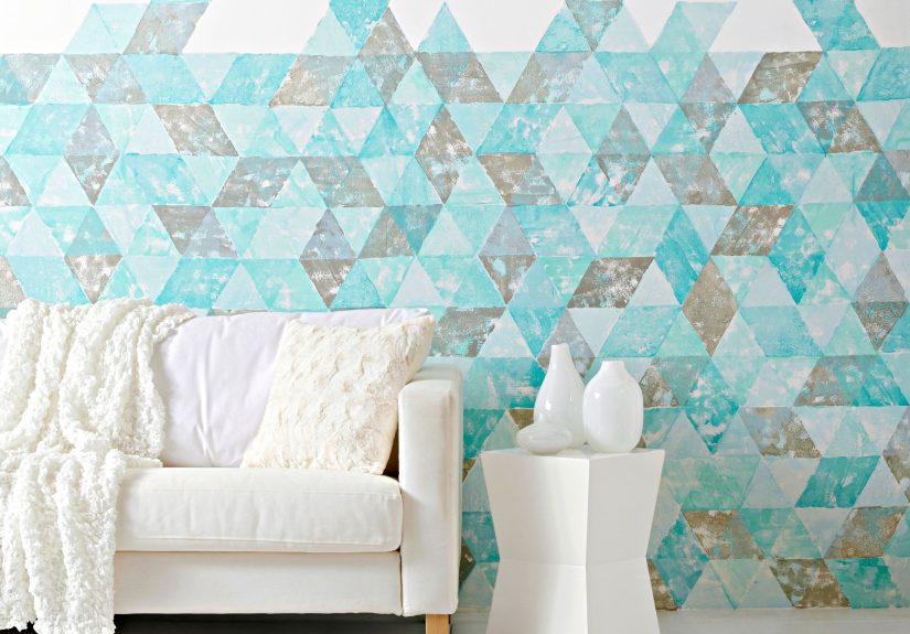
7) Layered Stenciling: “Painted Wallpaper” With Real Depth
Stenciling is the easiest way to add patternand pattern adds instant dimension. The secret to making a stencil look high-end isn’t complexity; it’s layering: tone-on-tone color, a shift in sheen, or a subtle shadow effect.
Best for
- Entryways, powder rooms, behind open shelving, or inside bookcases
- Furniture refreshes (dresser fronts, headboards, cabinet sides)
- Renters or commitment-shy decorators who want impact in a smaller zone
Stencil techniques that add dimension (pick one or combine)
- Tone-on-tone: base color + stencil in a slightly lighter/darker shade.
- Sheen shift: matte base + satin stencil (same color) for “hidden pattern” drama.
- Soft shadow: stencil the main color, then add a tiny offset pass in a deeper shade to mimic depth.
How to stencil cleanly (no bleed, no rage)
- Position and level your stencil. Start from a corner or a central focal point and tape it securely.
- Use a “dry brush” or lightly loaded roller. Offload excess paint onto a paper towel first.
- Tap or roll lightly. Heavy pressure pushes paint under edges.
- Lift slowly. Pulling fast can smear a still-wet edge.
- Repeat with guides. Mark corners or use stencil alignment cues for consistent spacing.
Where stenciling looks especially intentional
- Inside a painted arch behind a bed or console.
- On the back panel of built-ins for depth behind books and decor.
- On stair risers for a small, high-reward design flex.
Conclusion: Depth, Delivered
Adding dimension with paint is less about “being artistic” and more about choosing the right kind of layering for your space. If you want soft, expensive movement, reach for limewash or color washing. If you want texture that hides sins (and adds charm), rag rolling and sponging are your friends. If you want tailored polish, strié gives you that fabric-like finish. And if you want pattern without wallpaper drama, layered stenciling is the cheat code.
Start small if you’re nervous: a bookcase back, a powder room, a single accent wall. The best part? Even one dimensional surface can make the whole room feel more designedlike you upgraded the space without replacing a single piece of furniture.
Quick takeaways
- Use glaze when you need blend time and translucency.
- Work in sections to avoid hard edges and drying surprises.
- Let layers dry before judgingmany finishes “settle” as they cure.
- Consider sheen as a secret weapon for subtle dimension.
- Test first on poster board or a hidden areayour future self will be calmer.
Experience-Based Notes: What Usually Happens When You Try These (And Why It’s Normal)
The internet makes decorative paint techniques look effortless: someone glides a brush across a wall, the camera cuts, and suddenly the room looks like a boutique hotel. Real life is slightly messier (and includes at least one moment where you whisper, “Oh no.”). Here are the most common “this is happening to me” experiences DIYers and homeowners reportplus how to ride them out.
1) The first-coat panic is basically a rite of passage
Limewash and color washing often look patchy, streaky, or uneven while they’re wet. That’s because these finishes depend on translucency and layered movement. What looks “wrong” at minute five can look intentional at hour five. The trick is to keep your strokes consistent, step back, and evaluate after dryingpreferably in the same lighting you live with at night.
2) You will learn what “open time” means, whether you want to or not
Blending techniques (ombré, strié, many glaze-based finishes) require paint that stays workable long enough to soften transitions. If you feel like you’re sprinting, glaze medium is your best upgrade. It slows drying and helps you blend without dragging semi-dry paint into weird ridges. In practice, it turns “I’m losing control” into “Okay, I have options.”
3) The wall will look worse right before it looks better
There’s a specific moment in rag rolling, sponging, and stenciling when the surface looks too busy up closelike you’ve overdone it. Then you step back six feet (the distance your guests will actually view it), and suddenly it reads as soft texture and depth. This is why stepping back periodically isn’t just motivationalit’s quality control.
4) Your tools matter more than your talent
A wrung-out sea sponge, a clean rag that isn’t shedding fuzz, a good angled brush, and painter’s tape that seals properly can make a beginner’s work look polished. On the flip side, a soaking sponge or an over-loaded stencil brush can create blobs and bleed that feel discouraging. The “pro move” is often just offloading paint onto a towel before it touches the wall.
5) Lighting changes everything (and can save you)
Dimensional finishes are basically a collaboration with your lighting. Side light makes texture and layering pop; flat overhead light can make everything look subtler. If your finish feels underwhelming, try adding a lamp that washes the wall from the side before you assume the technique failed. It’s surprisingly common for a finish to look “fine” at noon and “wow” at 7 p.m.
6) Smaller “practice zones” build confidence fast
If you’re unsure, try the technique on something low-stakes: the back of a bookcase, a closet wall, a piece of thrifted furniture, or a large primed board. Many people find that doing even a single test panel teaches their hands the pressure and rhythm needed for the real wall. Plus, a test board becomes a handy reference when you’re mixing colors later.
7) The best finishes look intentional because they’re restrained
It’s tempting to keep adding “one more pass” for drama. But the most designer-looking results are often the ones that stop slightly earlier than you think. A light sponge layer, a subtle sheen shift stencil, or a gentle ombré can read more expensive than a high-contrast version. If you want more impact, consider concentrating it on one wall or one feature (like paneling or built-ins) instead of everywhere.
Bottom line: these techniques aren’t just paint tricksthey’re atmosphere builders. And once you do one successfully, you’ll start seeing blank surfaces as opportunities. (You’ve been warned.)