Table of Contents >> Show >> Hide
Note: Body-only HTML, ready for web publishing
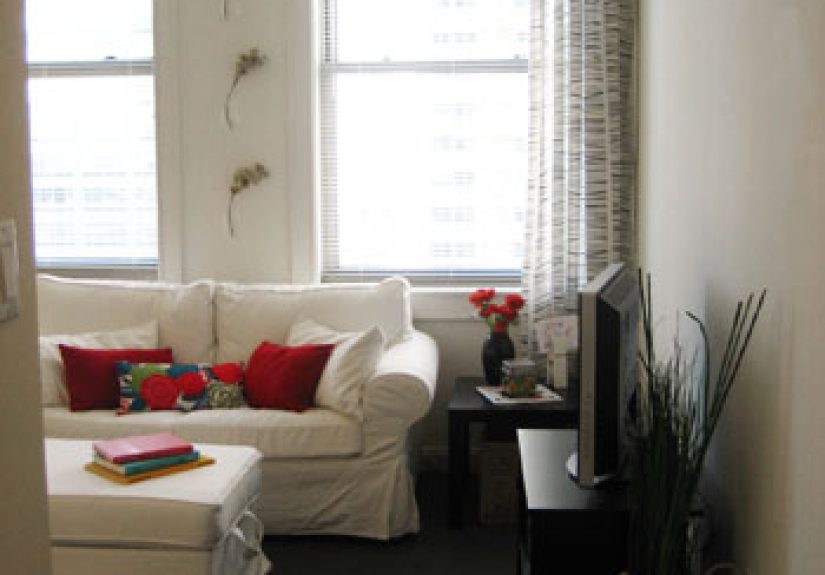
Every home has that one room. You know the one. It has perfectly nice walls, a perfectly innocent ceiling, and furniture that technically fits, yet somehow the whole space feels like it got dressed in the dark. That was Carrie’s problem. Her living room wasn’t ugly, exactly. It was just confused. The sofa looked stranded, the rug looked apologetic, the lighting had all the charm of a dentist’s office, and the room somehow felt both crowded and unfinished. Quite a trick, really.
Carrie’s design dilemma is a familiar one for homeowners: how do you make a room feel stylish, comfortable, practical, and personal without turning it into a cluttered showroom or a beige waiting area? The good news is that this kind of room problem is fixable. Better yet, it’s fixable without knocking down walls, hiring a magician, or setting your credit card on fire.
The solution came down to a handful of smart design moves that professionals return to again and again: start with how the room should function, correct the furniture layout, choose the right rug size, layer the lighting, soften the room with textiles, and create a color story that actually knows where it’s going. Once those pieces fell into place, Carrie’s room stopped fighting itself and started making sense.
What Was Carrie’s Real Design Problem?
At first glance, Carrie thought she had a decorating problem. In reality, she had a planning problem. That distinction matters. A lot of people try to solve awkward rooms by buying more stuff: more pillows, more baskets, more candles, more “accent” objects that end up looking like they were panic-purchased at 8:42 p.m. on a Saturday. But a room rarely improves because it gains more objects. It improves when those objects work together.
Carrie’s room had five classic issues.
1. The Layout Didn’t Support Real Life
The furniture was arranged around the walls, leaving a giant dead zone in the middle. It looked safe, but it didn’t feel inviting. Conversation was awkward. The coffee table was too far from some seats and too close to others. Walking through the room felt like navigating an obstacle course designed by someone who resented ankles.
2. The Rug Was Too Small
This is one of the most common design mistakes in American homes. A too-small rug makes furniture look disconnected, shrinks the room visually, and gives the entire setup a temporary, pieced-together feel. Carrie’s rug floated under the coffee table like it had no legal relationship to the sofa or chairs.
3. The Lighting Was Flat
One overhead fixture was doing all the work, and it was not happy about it. The room had no layered lighting for reading, relaxing, or evening ambiance. Instead of looking warm and lived-in, the space felt harsh at night and dull during the day.
4. The Curtains Were Working Against the Room
The drapes were hung too low and ended awkwardly. Rather than making the windows feel generous, they made the walls seem shorter. It was the design equivalent of wearing pants that are somehow both too long and too short.
5. The Room Had No Visual Rhythm
Nothing tied the space together. The colors were scattered, the textures were random, and there was no focal point beyond “well, here we are.” A room doesn’t need to be perfectly matched, but it does need a clear sense of direction.
The Fix: A Smarter Design Strategy
Once Carrie stopped asking, “What should I buy?” and started asking, “How should this room work?” everything changed. Great interior design is not about stuffing a room with trendy pieces. It is about solving a set of visual and functional problems in a way that still feels personal. Here is how Carrie’s design dilemma was solved.
Start With Function, Not Accessories
First, Carrie defined what the room needed to do. It had to serve as a place for conversation, occasional movie nights, and everyday lounging. That meant the seating had to support both comfort and flow. The sofa was pulled away from the wall to create a more intentional seating zone. Two chairs were angled inward, not outward, so the space felt social instead of scattered. A coffee table with the right scale anchored the arrangement and gave every seat access to a surface.
This was the turning point. Instead of decorating a room, Carrie was organizing an experience. The room began to feel useful, and useful rooms almost always end up looking better.
Choose a Rug That Deserves the Room
Then came the rug correction. Carrie replaced her undersized rug with one large enough to anchor the seating group. Ideally, at least the front legs of the major furniture pieces should rest on the rug; in many rooms, getting all the legs on the rug looks even better. The larger rug instantly made the room feel more cohesive and more expensive, even though the rest of the furniture stayed the same.
This single change also created visual calm. A properly scaled rug tells the eye where the room begins and ends. It gives furniture a relationship to one another. It says, “Yes, these pieces know each other. They arrived together.”
Layer the Lighting Like a Grown-Up
Carrie added three kinds of lighting: ambient, task, and accent. The overhead fixture stayed, but it no longer had to behave like the sole employee on a holiday weekend. A floor lamp went beside the reading chair, a table lamp landed on a side table near the sofa, and a smaller accent light added glow to a shelf and artwork.
This transformed the mood of the room. Layered lighting gives a living room flexibility. Bright enough for guests. Soft enough for a quiet evening. Focused enough for reading. It also adds depth, because light coming from different heights makes a room feel more dimensional and less flat.
Hang Curtains Higher and Let Them Finish the Job
Next, Carrie rethought the windows. The curtain rod was raised closer to the ceiling line, and the panels were widened enough to frame the window without blocking too much daylight. The fabric lightly skimmed the floor, which made the room feel taller and more polished.
It is a subtle move, but it works hard. Curtains are not just for privacy. They soften edges, add texture, and visually stretch a room. In Carrie’s case, they also introduced a gentle contrast that kept the walls from looking flat.
Build a Color Palette With Warmth and Intention
Carrie’s original room had a few nice colors, but they weren’t having a productive conversation. The new approach was more disciplined. She kept a calm base of warm neutrals, then layered in a few repeat accent tones through pillows, art, and smaller accessories. The space felt unified without becoming boring.
This is where many homeowners get stuck. They worry that a coherent palette means everything has to match exactly. It does not. Good rooms usually rely on repetition, contrast, and texture rather than strict matching. A tan sofa, ivory curtains, brass accents, muted blue pillows, and a rust-toned throw can feel far richer than a room where every single item tries to be “greige” and emotionally unavailable.
Use Texture to Add Life Without Adding Clutter
Because Carrie did not want the room to feel overfilled, texture became the secret weapon. A woven rug, linen-look drapes, a wood coffee table, a ceramic lamp, and a nubby throw gave the room warmth and variation. Texture creates interest without demanding attention. It is one of the best ways to make a space feel layered and thoughtful.
That matters in neutral rooms especially. Without texture, a calm palette can read as flat. With texture, it reads as collected, comfortable, and intentional.
Hide Storage in Plain Sight
Carrie also had a practical issue: everyday clutter. Remote controls, chargers, magazines, mail, and the random objects that somehow migrate into living rooms needed a home. Instead of adding more decorative clutter to “distract” from the mess, she introduced storage that looked like furniture. A coffee table with drawers, a basket for throws, and a console with closed storage kept the room functional without sacrificing style.
This is one of the least glamorous design truths and one of the most important: a beautiful room that cannot absorb normal life will stop looking beautiful very quickly.
Before and After: Why the Room Finally Worked
After the redesign, Carrie’s room felt larger, even though no square footage was added. It felt calmer, even though it had more layered detail. It felt more stylish, but also more livable. That is the sweet spot.
- Better layout: seating created conversation and easy movement.
- Better scale: the rug and furniture proportions finally made sense.
- Better lighting: the room changed mood naturally from day to night.
- Better softness: curtains and textiles warmed up the architecture.
- Better storage: daily clutter stopped hijacking the design.
- Better cohesion: repeated colors and textures made the space feel finished.
Most importantly, the room reflected Carrie better. It no longer looked like a collection of decent purchases. It looked like a home with personality and purpose.
Design Lessons Anyone Can Steal From Carrie
Carrie’s design dilemma may sound personal, but the lessons are surprisingly universal. Whether you are dealing with a narrow living room, awkward windows, a small apartment, an open-concept family room, or a space that simply feels “off,” the same principles apply.
Measure Before You Buy
Guesswork is where a lot of design drama begins. Measure your rug zone, your traffic paths, your window height, your sofa depth, and your available wall space. Style is wonderful. Measuring tape is wiser.
Create Zones
Even a single room benefits from clear zones. A rug can define a conversation area. A lamp and chair can suggest a reading corner. A console can signal an entry edge. Zones make rooms feel intentional instead of accidental.
Mix Comfort With Structure
A room needs softness, but it also needs shape. Pair upholstered pieces with wood, metal, stone, or woven textures. Add round shapes if the room feels too boxy. Add clean lines if the room feels too fluffy. Balance is what makes a room feel sophisticated.
Don’t Let Trends Boss You Around
Carrie did not solve her room by chasing the latest internet obsession. She solved it by using timeless design logic and then personalizing it. Trends can be fun, but they should be guests, not landlords.
How to Solve Your Own Design Dilemma
If your room feels unfinished, mismatched, or frustrating, resist the urge to buy six decorative objects and hope for a miracle. Instead, work through the room in this order:
- Define how the room should function.
- Fix the furniture layout.
- Scale the rug properly.
- Add layered lighting.
- Improve curtains or window treatments.
- Repeat a focused color palette.
- Add texture and practical storage.
That process works because it solves the bones of the room first. Once the bones are right, the pretty details land much more gracefully.
Carrie’s Experience After the Makeover
What made Carrie happiest was not that the room looked “designer.” It was that the room finally felt easy. Before the redesign, she was always adjusting something. She would straighten pillows, move a side table, shift a lamp, or complain that the space looked messy five minutes after she cleaned it. Guests tended to hover instead of settle. Even Carrie herself often sat in the kitchen because the living room felt strangely formal and uncomfortable at the same time.
After the changes, the room became part of her routine instead of a background annoyance. Morning coffee moved to the reading chair by the window because the lighting finally felt soft and usable. Friends naturally took the two accent chairs and leaned into conversation because the seating arrangement made sense. Movie nights got cozier because the lamps and overhead light could work together instead of forcing one all-or-nothing mood. The larger rug softened sound, the curtains made the room feel gentler, and the storage pieces quietly handled the everyday clutter that used to collect on every visible surface.
One of the most surprising parts of the transformation was how much more confident Carrie felt making future design decisions. Once she understood why the room worked, she stopped second-guessing every small choice. She knew how to judge scale. She understood that texture could do as much heavy lifting as color. She realized that comfort was not the enemy of style; in many cases, it was the reason style succeeded. That insight spilled into the rest of her home. Suddenly she was evaluating spaces by function, flow, light, and proportion rather than by whether a single trendy item looked cute in a product photo.
She also discovered that a solved design dilemma does not mean a room becomes frozen in time. The room could still evolve. She could swap pillow covers seasonally, rotate artwork, add a new throw, or bring in a vintage side table without unraveling the entire design. That flexibility was part of the success. The room had structure now. It could absorb small changes without collapsing into chaos.
In the end, Carrie’s experience is what many homeowners are really searching for. Not perfection. Not a showroom. Not a room so precious no one can put down a coffee mug. What people actually want is a space that supports real life while still feeling beautiful. Carrie’s design dilemma was solved not by one magic purchase, but by a series of smart, grounded decisions that honored both style and everyday living. And honestly, that is the best kind of makeover: the one that looks good, works hard, and lets people relax without wondering whether the rug is having a crisis.
Conclusion
Carrie’s design dilemma was never just about decor. It was about flow, comfort, proportion, and clarity. Once those issues were addressed, the room stopped feeling awkward and started feeling intentional. That is the real lesson here. Great design is not about chasing perfection. It is about making a room function beautifully and look like it belongs to the person who lives there.
If your own space feels off, take heart. The solution is usually less mysterious than it seems. Fix the layout. Respect scale. Layer the lighting. Choose textiles that soften the room. Use color with purpose. Add storage that supports real life. Do that, and your own design dilemma may be solved faster than you think.