Table of Contents >> Show >> Hide
- Why Bedroom Color Schemes Matter More Than You Think
- How to Choose the Best Bedroom Color Scheme
- 10 Bedroom Color Schemes That Actually Work
- 1. Soft Blue, White, and Sand
- 2. Sage Green, Cream, and Natural Wood
- 3. Warm White, Greige, and Taupe
- 4. Dusty Pink, Mushroom, and Ivory
- 5. Navy, Taupe, and Brass
- 6. Olive Green, Camel, and Cream
- 7. Lavender Gray, White, and Charcoal
- 8. Terracotta, Clay, and Linen
- 9. Charcoal, Oatmeal, and Soft Black
- 10. Blue-Gray, White, and Walnut
- Best Bedroom Color Schemes by Mood
- Common Bedroom Color Mistakes to Avoid
- How to Pull the Whole Bedroom Together
- Real-Life Experiences With Bedroom Color Schemes
- Conclusion
- SEO Tags
Choosing the right bedroom color scheme sounds easy until you are standing in the paint aisle holding twelve swatches that all look like “quiet beige with commitment issues.” The good news is that a beautiful bedroom palette is not about copying a trend from a magazine and hoping your lamp forgives you. It is about creating a room that feels restful, flattering in real light, and cohesive from wall color to bedding to wood tones.
The best bedroom color schemes usually do three things well: they support sleep, they work with the room’s natural light, and they give the space personality without turning it into a visual caffeine shot. Some people want a soft retreat that whispers, “Please put your phone down.” Others want a dramatic cocoon that says, “Yes, I do have excellent taste, thanks for noticing.” Both approaches can work beautifully when the colors are balanced with the right undertones, contrast, and texture.
In this guide, you will find practical bedroom wall color ideas, designer-inspired combinations, and easy ways to choose a palette that fits your space. Whether you love warm neutrals, earthy greens, romantic mauves, or moody navy, there is a bedroom paint color scheme here with your name on it.
Why Bedroom Color Schemes Matter More Than You Think
The bedroom is different from the kitchen, office, or living room because it has one major job: helping you relax. That does not mean the room has to be boring. It just means the palette should feel intentional. Color affects how spacious a room feels, how cozy it feels at night, how bright it looks in the morning, and how well your furniture and textiles play together.
Light bedroom colors such as warm white, soft greige, pale sage, or airy blue can make a small room feel more open. Darker hues like charcoal, forest green, deep navy, and chocolate brown can make a large bedroom feel wrapped up and luxurious. The trick is not choosing light versus dark as a rule. The trick is choosing the right version of that color for your room’s size, lighting, and mood.
Three questions to ask before picking a color scheme
- How do you want the room to feel? Calm, cozy, dramatic, romantic, airy, grounded, or hotel-like?
- What kind of light does the room get? North-facing rooms often feel cooler, while south-facing rooms usually look warmer and brighter.
- What stays in the room? Flooring, curtains, furniture, and bedding all influence which undertones will look right.
How to Choose the Best Bedroom Color Scheme
Before you fall in love with a paint name like “Moonlit Cashmere” or “Philosophical Moss,” step back and build the palette from the room itself. Start with your largest fixed elements. If your floor is warm oak, a chilly gray may fight it. If your bedroom gets very little natural light, a stark cool white can feel flat and gloomy. If your room is flooded with sunshine, you have more flexibility to explore deeper tones.
A reliable formula is to choose one dominant color, one supporting neutral, and one accent. This keeps the bedroom cohesive without feeling too matchy-matchy. For example, sage green walls, ivory bedding, and black metal accents feel balanced and fresh. Or try warm taupe walls, creamy white curtains, and dusty blue pillows for a softer, layered look.
Do not skip sampling
Paint colors change throughout the day. Morning light, evening light, and warm bulbs can all shift how a color appears. A white paint that looks soft online may turn slightly yellow in one room and bluish in another. Test large swatches on more than one wall and check them at different times of day before committing. Your future self, ladder, and wallet will appreciate this deeply.
10 Bedroom Color Schemes That Actually Work
1. Soft Blue, White, and Sand
This is the classic “exhale” palette. Soft blue walls paired with crisp white bedding and sandy beige accents create a bedroom that feels relaxed without looking sleepy. It works especially well in coastal, transitional, and traditional spaces. Add natural textures like linen curtains, woven baskets, or light wood furniture to keep the palette warm and livable.
Best for: creating a serene, timeless primary bedroom.
2. Sage Green, Cream, and Natural Wood
Sage green has earned its popularity honestly. It feels grounded, easy on the eyes, and quietly stylish. Pair it with cream rather than stark white for a softer look, then bring in oak, walnut, or rattan for texture. This palette feels connected to nature, which makes it especially good for people who want their bedroom to feel restorative instead of overdesigned.
Best for: calming bedrooms with organic, modern, or farmhouse-inspired decor.
3. Warm White, Greige, and Taupe
If you love neutral bedroom color schemes, this one is a champion. Warm white walls create brightness, greige softens the space, and taupe adds depth. The result feels clean but not clinical. This palette also gives you enormous freedom with bedding, rugs, and art because it plays nicely with almost everything.
Best for: small bedrooms, resale-friendly updates, and anyone who wants peace without committing to obvious color.
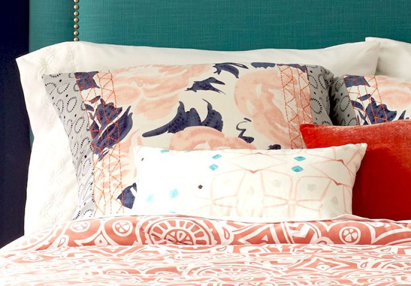
4. Dusty Pink, Mushroom, and Ivory
This is a grown-up pink bedroom that does not look like it borrowed its shoes from a tween. Dusty pink works beautifully when muted and paired with earthy companions like mushroom brown, putty, or soft ivory. The palette feels romantic, soft, and elegant without becoming sugary.
Best for: feminine bedrooms, guest rooms, and spaces that need warmth with a gentle personality.
5. Navy, Taupe, and Brass
Navy is one of the best colors for a moody bedroom because it is dramatic yet dependable. Pair it with taupe, oatmeal, or soft brown to keep the room from feeling too cold. Brass or antique gold accents add a little polish. Think boutique hotel, but one where the minibar does not charge you eight dollars for almonds.
Best for: larger bedrooms, accent walls, and sophisticated modern-traditional spaces.
6. Olive Green, Camel, and Cream
Olive green is richer and moodier than sage, but still earthy and calming. Camel tones in leather, wood, or textiles warm up the space and prevent the green from feeling heavy. Cream bedding brightens everything. This palette has a collected, designer feel and works especially well with vintage or rustic pieces.
Best for: cozy, layered bedrooms with personality.
7. Lavender Gray, White, and Charcoal
If you want something soft but a little less expected, try a muted lavender-gray. It can feel dreamy, sophisticated, and surprisingly versatile. White keeps it fresh, while charcoal or black accents add definition. The key is choosing a dusty, muted version rather than a bright purple that starts acting like it owns the room.
Best for: elegant bedrooms and spaces that need subtle color with a polished edge.
8. Terracotta, Clay, and Linen
Warm earth tones are having a well-deserved moment. Terracotta, cinnamon, clay, and baked peach bring warmth and intimacy, especially in bedrooms that feel too stark or impersonal. Pair them with linen, creamy whites, and matte black or bronze accents for a refined earthy look.
Best for: south-facing bedrooms, bohemian spaces, and anyone who wants warmth without going all the way to brown.
9. Charcoal, Oatmeal, and Soft Black
Dark bedroom color schemes can feel incredibly restful when balanced properly. Charcoal walls create depth, oatmeal bedding adds softness, and black accents sharpen the look. Use layered textures such as bouclé, velvet, wool, or matte wood so the room feels rich instead of flat.
Best for: dramatic bedrooms and modern interiors with plenty of contrast.
10. Blue-Gray, White, and Walnut
Blue-gray sits in the sweet spot between cool and cozy. It feels calm like blue, but more flexible and understated. White trim and bedding keep the palette clean, while walnut furniture adds warmth and richness. This scheme works across many design styles, from classic to Scandinavian to contemporary.
Best for: homeowners who want a timeless bedroom wall color that will not feel dated next year.
Best Bedroom Color Schemes by Mood
For a calming bedroom
Choose soft blue, pale green, warm white, muted lavender, or gentle gray-greige tones. Keep contrast low and use bedding in similar tones for a peaceful layered effect.
For a cozy bedroom
Look at earthy browns, taupe, olive, terracotta, clay, and creamy beige. Add warm woods, textured throws, and soft lighting so the room feels like a retreat rather than a cave.
For a luxurious bedroom
Try navy, deep green, charcoal, aubergine, or rich brown paired with lighter bedding and metallic details. Saturated color on walls can make the room feel intentionally enveloping and expensive.
For a small bedroom
Light neutrals, soft sage, pale blue-gray, and warm whites help the room feel open. That said, small bedrooms can also handle darker hues if you want a jewel-box effect. The secret is consistency: fewer jarring contrasts and more tonal layering.
Common Bedroom Color Mistakes to Avoid
- Picking color from a phone screen alone. Digital images lie politely but effectively.
- Ignoring undertones. Beige, gray, white, and green all have undertones that can clash with flooring and furniture.
- Using harsh bright colors everywhere. A little punch can be fun, but too much stimulation defeats the purpose of a restful bedroom.
- Forgetting textiles. Bedding, curtains, rugs, and upholstered headboards can make or break the palette.
- Choosing trend over comfort. If a trendy color makes you feel restless, it is not your bedroom color. It is just a popular stranger.
How to Pull the Whole Bedroom Together
A bedroom color scheme is not just about paint. The most inviting rooms repeat the palette across materials and layers. If your walls are warm greige, echo that softness in the rug, drapery, or upholstered bed. If your wall color is bold, use bedding and curtains to soften the look. Wood tones matter too. Light woods make cool palettes feel more relaxed, while dark woods can deepen and enrich warm or moody rooms.
Accent colors should feel intentional, not random. Rust, mustard, black, blush, denim blue, and olive can all work beautifully in bedroom decor when they connect back to the main palette. Art, lampshades, pillows, and benches are great places to repeat those tones without overwhelming the room.
Real-Life Experiences With Bedroom Color Schemes
Living with a bedroom color scheme is very different from admiring one for six seconds on a screen while eating chips. In real life, color becomes part of your daily rhythm. A soft blue bedroom can feel cool and clean in the morning, especially when daylight hits white bedding and pale curtains. Many people describe that kind of room as mentally quiet. It does not demand attention. It simply lets the day begin without drama.
Warm neutrals create a different experience. In bedrooms with creamy white, taupe, oatmeal, and soft beige, the mood often feels cocoon-like. These colors are especially comforting at night under warm lamps. They flatter wood furniture, woven textures, and natural fabrics in a way that makes the whole room feel settled. Homeowners often like these palettes because they are flexible. You can change your bedding, add a darker throw, switch your artwork, and the room still works.
Green bedrooms tend to feel balanced in a very specific way. Sage green is often described as peaceful and fresh, almost like cracking a window open after cleaning the room. Olive and deeper greens feel more grounded and intimate. They can make a bedroom feel mature, layered, and cozy, especially in fall and winter. A green bedroom also tends to age well because it has one foot in neutral territory and one foot in color.
Dark bedroom color schemes are the most misunderstood. People worry that navy, charcoal, or chocolate walls will make the room feel smaller or gloomy. Sometimes they do, but often they make the room feel secure and luxurious. The experience depends on balance. When darker walls are paired with warm lighting, lighter bedding, and enough texture, the room can feel like a high-end hotel suite. It becomes a place you want to retreat to, not escape from.
Then there are the warmer, more expressive palettes like terracotta, dusty pink, clay, or muted mauve. These rooms often feel personal and emotionally warm. They are less icy and less formal than gray-heavy palettes. In real homes, these shades can be surprisingly livable because they soften hard edges and give plain furniture more character. People often find them flattering too. The room looks better in evening light, and frankly, so do you.
The biggest lesson from real bedroom makeovers is that the “best” color scheme is usually the one that feels good at 6:30 a.m. and 10:30 p.m. It should look nice in daylight, but it also needs to support rest, comfort, and routine. That is why sampling matters so much. A paint chip cannot show you the mood of a whole room after sunset. But once the right color is on the wall, you feel it immediately. The bedroom becomes quieter, warmer, softer, or richer in exactly the way you hoped. That is when a color scheme stops being decoration and starts becoming part of how home feels.
Conclusion
The best bedroom color schemes are not chosen by trend alone. They are built around mood, light, comfort, and the way the room is actually used. Soft blues and greens can create a peaceful retreat. Warm neutrals offer flexibility and timelessness. Earthy colors add comfort and depth. Darker shades bring drama and cocoon-like luxury when balanced with lighter layers and texture.
If you are updating your bedroom, start with the feeling you want most. Then test colors in your own light, work with your existing finishes, and build a palette that looks good in the morning and even better when the lamp clicks on at night. A great bedroom color scheme does not just decorate a room. It changes the way the room welcomes you back every day.