Table of Contents >> Show >> Hide
- Why dashboards make value feel real
- The best dashboards do not show more data. They show the right story.
- What a great enterprise dashboard includes
- The metrics that actually help enterprise customers see value
- Why dashboards matter even more in enterprise sales and renewal cycles
- The most common dashboard mistakes
- How to build a dashboard enterprise customers will actually love
- A simple example of dashboard-led value communication
- Conclusion
- Extra Experiences: What this looks like in the real world
- SEO Tags
Enterprise customers are not hard to impress because they are grumpy by default. They are hard to impress because they have seen every promise before. Better efficiency. More visibility. Faster workflows. Smarter decisions. Lower costs. Happier teams. A partridge in a pear tree. By the time your product enters a six-figure or seven-figure buying conversation, the customer has already heard the same shiny story from five other vendors with polished slides and suspiciously confident sales reps.
That is why a great dashboard matters so much. It turns “trust us” into “here, look.” It makes value visible. It shortens the distance between adoption and proof. And in enterprise software, proof is what keeps customers engaged, expands the account, and makes renewal conversations much less dramatic.
If you want enterprise customers to feel value early and often, your dashboard cannot be an afterthought. It cannot be a decorative panel full of charts that nobody understands and everybody politely ignores. It needs to become the customer’s running scoreboard, operating room, and evidence binder all in one. When done right, an enterprise dashboard helps users understand what is happening, why it matters, and what they should do next.
Why dashboards make value feel real
Enterprise software is often purchased by one group, implemented by another, and judged by a third. That creates a messy reality. Executive sponsors care about outcomes. Daily users care about speed and clarity. Customer success teams care about adoption, retention, and risk. Finance wants measurable return. Operations wants fewer surprises. A great dashboard is one of the few assets that can speak to all of them without needing a translator.
In practical terms, a dashboard helps enterprise customers answer four questions fast:
- Are we using the product?
- Is it helping the business?
- Where are we falling behind?
- What should we do next?
If your dashboard answers those questions clearly, customers feel progress. If it does not, they feel uncertainty. And uncertainty is the natural habitat of churn.
This is the big reason dashboards matter in enterprise accounts: they connect product activity to business outcomes. A login count alone does not prove value. A feature click does not prove value. But when a dashboard shows adoption trends, workflow completion, response times, risk indicators, and business KPIs in one place, the customer can finally see the chain of cause and effect. Suddenly the product is no longer “software we bought.” It becomes “software that is moving numbers we care about.”
The best dashboards do not show more data. They show the right story.
One of the most common dashboard mistakes is trying to prove value by displaying everything. That approach usually creates a screen that looks like mission control had a rough weekend. Enterprise customers do not need more clutter. They need confidence.
A strong enterprise dashboard tells a focused story. At the top, it highlights the few metrics that matter most. Below that, it provides context, trends, and supporting detail. Then it lets users drill deeper if they need more explanation. This structure matters because busy executives want instant clarity while operators and analysts want the ability to explore.
In other words, a great dashboard respects how people actually work. It gives leadership a headline, managers a diagnosis, and practitioners a path forward.
What story should your dashboard tell?
For most enterprise products, the story should follow this simple logic:
- Usage: Are the right teams actively using the product?
- Adoption: Which valuable features have become part of normal behavior?
- Outcomes: What measurable business impact is the customer getting?
- Risk: Where is value slipping or stalling?
- Action: What should happen next to improve results?
That sequence turns a dashboard from a reporting tool into a value communication tool. It also makes your product easier to defend inside the customer’s organization. A champion can open the dashboard, walk into a meeting, and show evidence instead of opinions. That is a very nice upgrade from “I swear the team loves it.”
What a great enterprise dashboard includes
Not every business needs the same dashboard, but the best ones tend to share a few traits.
1. Outcome metrics, not just activity metrics
Enterprise customers care about the result, not the gymnastics behind the curtain. Your dashboard should connect operational activity to meaningful outcomes such as revenue influenced, time saved, tickets resolved faster, campaign efficiency, customer retention, compliance improvement, utilization rates, or workflow completion. Activity metrics still matter, but only when they support the bigger picture.
If your dashboard only says, “Users logged in 4,283 times,” that is mildly interesting. If it says, “Adoption of automated approvals reduced cycle time by 31% this quarter,” now you have everyone’s attention.
2. A clear hierarchy of information
The best dashboards are easy to read in seconds. The top section should surface high-level KPIs. The middle should provide trends and segmentation. The lower sections can offer deeper analysis, exceptions, or drill-down paths. This layout works because enterprise users are short on time and long on meetings.
The rule is simple: make the most important information the easiest information to find.
3. Role-based relevance
An executive sponsor and a frontline admin should not have to share the exact same dashboard experience. They live in different worlds and worry about different fires. Enterprise dashboards work better when they are tailored by audience. An executive dashboard might emphasize ROI, adoption trajectory, strategic goals, and account health. An operations dashboard might focus on workflow volume, bottlenecks, exceptions, and SLA performance. A customer success dashboard might highlight adoption by team, health scores, renewal risk, and expansion opportunities.
When dashboards feel role-specific, they get used. When they feel generic, they become expensive wallpaper.
4. Governed, trustworthy data
A beautiful dashboard built on messy data is still a mess. In fact, it is a dangerous mess because it looks official. Enterprise customers need confidence that the metrics are defined consistently, refreshed on a sensible schedule, and grounded in a reliable source of truth. If “active user” means one thing in the dashboard and another thing in the QBR deck, trust disappears faster than free donuts in a break room.
That is why strong dashboards depend on disciplined tracking, shared definitions, and healthy governance. Enterprise customers may forgive a dull interface for a while. They will not forgive numbers they cannot trust.
5. Actionable next steps
The best dashboards do more than report the past. They help shape the future. Good dashboards highlight where intervention is needed, where opportunity exists, and where teams should focus next. That might mean surfacing underused features, flagging at-risk business units, showing process delays, or revealing which accounts are ready for expansion.
A dashboard should not leave users staring at a chart like it is modern art. It should help them decide what to do before lunch.
The metrics that actually help enterprise customers see value
If your product serves enterprise customers, your dashboard should combine business metrics and customer success metrics in a way that reflects both adoption and outcomes. That usually means blending several categories.
Business impact metrics
- Revenue influenced or protected
- Time saved per process or per team
- Cost reduction
- Productivity improvement
- Error reduction or compliance improvement
- Workflow completion or turnaround speed
Adoption metrics
- Active users by team, region, or role
- Feature adoption for high-value capabilities
- Onboarding completion
- Usage frequency and stickiness
- Depth of usage across modules or workflows
Customer health metrics
- Health score
- NPS, CSAT, or qualitative sentiment
- Support volume and resolution trends
- Renewal risk indicators
- Expansion signals
The magic is not in listing every metric under the sun. The magic is in selecting the handful that best prove value for that customer’s goals. A logistics company may care most about throughput, delays, and labor efficiency. A marketing team may care about attributed revenue and campaign velocity. A SaaS buyer may care about feature adoption, seat utilization, and retention outcomes. The dashboard must mirror the promise made during the sale.
Why dashboards matter even more in enterprise sales and renewal cycles
In smaller accounts, buyers may rely on direct experience. In large enterprise accounts, decisions often depend on internal storytelling. A champion must justify the purchase to finance, IT, procurement, leadership, and sometimes a room full of people who joined the meeting late and ask very bold questions. A great dashboard helps your internal champion win those conversations.
That is one reason dashboards play an outsized role in expansion and retention. They give customer success teams a repeatable way to demonstrate progress. They make quarterly business reviews stronger. They help executives see trends without digging through spreadsheets. They also reduce the awkwardness of renewal season because the account history is already visible.
When customers can clearly see how your product contributes to business outcomes, the conversation changes from “Do we still need this?” to “How do we get more from this?” That is a much better room to be in.
The most common dashboard mistakes
Too many metrics
When every metric is important, none of them are. Prioritize. Edit. Breathe. Your dashboard is not a storage closet for data.
No link to business value
If your dashboard focuses on product activity but never connects it to customer goals, users may stay busy without feeling successful.
Poor visual design
Tiny labels, inconsistent scales, weird chart choices, and crowded layouts slow understanding. Enterprise users should not need detective skills to read a dashboard.
Different definitions across teams
If customer success, product, sales, and finance each interpret the same metric differently, your dashboard becomes political instead of useful.
Stale or slow data
Enterprise customers lose faith quickly when the dashboard lags too far behind reality. Freshness does not always mean real time, but it must match the business need.
No next-step guidance
A dashboard that describes a problem without helping users act on it is only halfway useful.
How to build a dashboard enterprise customers will actually love
Start with the promised outcome
Look back at the original value proposition. What outcome did the customer buy? Faster onboarding? Better revenue visibility? More efficient operations? Reduced risk? Build the dashboard around that promise first, then support it with adoption and diagnostic metrics.
Design for one screen first
A dashboard should provide an at-a-glance view before asking users to scroll, click, and squint. Think summary first, exploration second.
Create separate views for separate roles
Do not force executives and admins to share a one-size-fits-none experience. A role-based dashboard strategy usually improves adoption and satisfaction immediately.
Define every KPI in plain English
Good governance is not glamorous, but it saves everyone from future chaos. Use clear metric definitions and make them easy to understand. Simple language builds trust.
Review the dashboard with customers regularly
The best enterprise dashboards evolve. Review them in onboarding, monthly check-ins, and quarterly business reviews. Ask what helps, what confuses, and what decisions they wish the dashboard made easier.
Use the dashboard as a conversation tool, not just a report
A great dashboard is most powerful when it is embedded in customer success, executive reviews, adoption plans, and expansion strategy. The dashboard should not be a destination users forget about. It should be part of the rhythm of the account.
A simple example of dashboard-led value communication
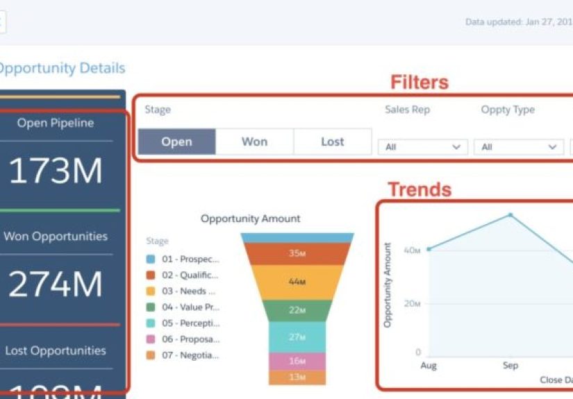
Imagine an enterprise workflow platform sold to a large operations team. The original sales promise was better efficiency, fewer manual errors, and faster approvals. A weak dashboard might show generic logins, ticket counts, and random charts. A strong dashboard would show approval turnaround time, automation usage, exception rates, process completion by team, estimated time saved, and which business units lag behind. It might also include an executive summary card that says, “Manual approvals reduced by 42% this quarter,” plus a trend line showing progress over time.
Now value is visible. Leadership sees business impact. Managers see operational friction. Customer success sees adoption and risk. That is what makes a dashboard feel indispensable.
Conclusion
The #1 thing that makes enterprise customers see value is not a clever slogan, a flashy demo, or a heroic account manager with forty-seven tabs open. It is a great dashboard. A great dashboard makes the product’s value obvious, measurable, and easy to communicate across the customer’s organization. It connects usage to outcomes, keeps teams aligned around the right KPIs, and gives executives a fast, trustworthy view of what is working and what needs attention.
In enterprise software, visibility is value. And when your dashboard becomes the customer’s favorite way to see progress, your product stops feeling like a cost center and starts looking like a smart decision.
Extra Experiences: What this looks like in the real world
In real enterprise environments, the emotional impact of a great dashboard is easy to underestimate. Teams rarely say, “Wow, this layout has changed my life.” What they say is, “Now I finally know what is going on.” That sentence is more important than it sounds. Clarity lowers friction. Clarity speeds decisions. Clarity reduces the amount of organizational theater required to explain performance.
Consider a customer success leader managing dozens of large accounts. Before a strong dashboard exists, every renewal prep meeting becomes a scavenger hunt. One metric lives in the CRM, another sits in product analytics, another is trapped in support software, and somebody always has a spreadsheet called final_final_v3 that nobody fully trusts. Once a well-built dashboard pulls adoption, health, sentiment, and outcome metrics into one view, the meeting changes completely. The leader can identify risk sooner, prioritize attention better, and walk into executive reviews with evidence instead of anxiety.
Or think about a product team rolling out a major enterprise feature. Launch day feels exciting, but excitement is not the same thing as adoption. A good dashboard quickly reveals which customers activated the feature, which teams are using it regularly, where onboarding stalls, and whether usage is tied to better retention or stronger business outcomes. That visibility helps teams improve the product faster. It also helps them avoid the classic mistake of declaring victory just because a feature shipped.
Sales and account teams benefit too. In expansion conversations, a dashboard can act like a silent closer. When a customer can see that one business unit is outperforming others because it adopted key workflows more deeply, the path to upsell becomes more obvious. The conversation shifts from abstract possibility to visible proof. Nobody has to invent a dramatic pitch. The numbers do the heavy lifting.
Executives love dashboards for a different reason: they reduce ambiguity. Enterprise leaders do not need a lecture every time they ask, “Are we getting value from this platform?” They need a clear answer. A thoughtful dashboard gives them that answer quickly. Even better, it gives them a common language to use with IT, operations, finance, and customer-facing teams. Alignment gets easier when everyone is looking at the same scorecard.
That is why the best dashboard experiences are not merely visual. They are organizational. They help customers build trust in the product, trust in the data, and trust in the decisions that follow. In big accounts, that trust is what turns a vendor into a long-term partner. And often, it starts with one great screen.