Table of Contents >> Show >> Hide
- Why black-and-white history can feel emotionally distant
- What artists really do when they colorize old photos
- Why colorized photos hit so hard
- Specific examples that show the power of colorization
- But wait: is colorization always a good idea?
- What the best colorized history gets right
- How colorization changes public memory
- Experience and reflection: what it feels like to see the past in color
History has a branding problem. For many people, the past feels far away not because it happened long ago, but because it looks long ago. Grainy faces, gray skies, charcoal uniforms, smoky streets, and serious expressions can make yesterday feel like a museum diorama with bad lighting. Then an artist colorizes an old black-and-white photo, and suddenly the wall between “then” and “now” gets a crack in it. A soldier looks young instead of symbolic. A suffragist looks stylish instead of frozen in civics class. A child on a city sidewalk no longer feels like a historical example. They feel like a person who could turn around and ask where the nearest coffee shop is.
That is the strange magic of photo colorization. It does not change the event itself, but it changes our relationship to it. And that difference matters. When viewers see the past in color, they often stop treating it like a legend and start recognizing it as lived reality. The effect can be emotional, educational, and occasionally unsettling. It can also be controversial. Because while colorization can make history feel more immediate, it also asks a big question: are we restoring the past, interpreting it, or quietly remixing it?
That tension is exactly why the best colorized historical photos are so powerful. At their best, they do more than add pigment. They restore attention. They wake up empathy. They invite curiosity. They make people linger. And in a digital world where attention disappears faster than free snacks in a newsroom, that is no small achievement.
Why black-and-white history can feel emotionally distant
Most of us were trained to associate black-and-white imagery with “the old days.” It is a visual shortcut. If it is monochrome, it must be history. If it is color, it must be modern. The problem is that this mental habit can flatten entire generations into abstractions. People begin to think of the past as a different species of human experience, as if nobody before 1970 ever wore a bright dress, blushed in embarrassment, decorated a room, or stepped into sunlight that looked warm instead of silver-gray.
But that idea is misleading. Long before digital artists began colorizing photographs, people were experimenting with hand-colored images, tinted prints, lantern slides, and early color processes. In other words, the desire to see life in color is not a modern gimmick. It is part of photography’s long history. Human beings have always wanted pictures to feel more lifelike, more immediate, and more emotionally legible.
Black-and-white images can absolutely be beautiful, serious, and artistically powerful. They often sharpen composition, contrast, and texture in ways color cannot. But when black-and-white becomes the default visual language of memory, it can also create distance. It whispers, “This belongs to another world.” Colorization replies, “Actually, no. These were ordinary people living through extraordinary times, and their world was not gray.”
What artists really do when they colorize old photos
A good artist does not simply dump a bucket of digital paint onto the past and call it a day. The strongest colorization work is part research project, part visual craftsmanship, and part historical interpretation. Artists study uniforms, medals, fabric, architecture, flags, cosmetics, skin tones, military records, weather patterns, and surviving objects from the same period. They compare archival references, museum collections, and documented palettes. Then they make educated decisions, filling in the gaps where certainty ends and inference begins.
That last part matters. Colorization is rarely perfect certainty. Even when an artist uses careful historical references, some choices remain approximate. A dress might be reconstructed from fashion records. A room tone might be inferred from period interiors. A sky may be based on likely conditions rather than a verified meteorological report from that exact hour. That does not make the work dishonest. But it does mean colorization should be presented transparently, as an informed visual interpretation rather than a magical time machine.
When done well, the result feels less like spectacle and more like translation. The artist is taking an image from one visual language and rendering it into another language modern viewers instinctively understand. The best colorizers do not try to overpower the photograph. They try to reveal it.
Why colorized photos hit so hard
1. They collapse the emotional distance between us and the subject
There is a reason viewers often say a colorized photo makes someone “look real” for the first time. It is not that the original image was fake. It is that color restores familiar cues our brains rely on every day. Skin tones, dust, brick, denim, copper, smoke, grass, lipstick, rust, and sunlight all help us recognize a scene as lived experience rather than historical evidence.
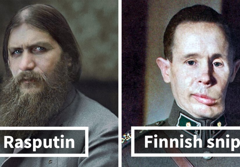
That is why colorized portraits of Abraham Lincoln, immigrants at Ellis Island, or workers in industrial America can feel so startling. These figures stop being icons and start being people. Their clothing looks chosen, not costume-like. Their fatigue looks bodily, not literary. Their youth becomes harder to ignore. Suddenly history is not just a topic. It is a room full of human beings.
2. They make major events feel less mythic and more immediate
Consider public history moments like suffrage marches, wartime scenes, the March on Washington, or early space exploration. In black and white, these moments can feel ceremonial or mythologized. In color, they often feel unfinished, unresolved, and alarmingly close. Crowds look contemporary. Signs feel current. Faces resemble the people we pass in grocery stores and airports.
That immediacy is one reason colorization resonates so strongly online. Viewers are not only impressed by the artistry. They are shocked by recognition. The past stops behaving like a chapter and starts acting like a mirror.
3. They pull new audiences into history
Let’s be honest: some people will happily spend an afternoon in an archive, gently whispering “fascinating” at cellulose nitrate negatives. Others need a stronger invitation. Colorized photos can provide that invitation. They spark clicks, classroom discussions, family conversations, and deeper research. A viewer who ignores the original may stop for the colorized version, then go back to learn the full story.
That does not cheapen history. It opens the door. If a colorized image gets someone interested in labor reform, women’s voting rights, wartime aviation, civil rights, or the early space race, that is not a failure of seriousness. That is public history doing its job.
Specific examples that show the power of colorization
Some of the strongest modern examples come from iconic American and global moments. Colorized photographs from World War I bring soldiers and civilians out of the fog of distance and back into ordinary human scale. The war no longer looks like a carved monument. It looks like mud, exhaustion, fabric, metal, and vulnerable skin. You remember that the people in those trenches were not born old and sepia-toned. They were young.
Colorized images connected to the civil rights era can be equally powerful. A newly vivid March on Washington photograph can make the scene feel less like a sacred postcard and more like a living demonstration full of heat, movement, clothing, color, and urgency. The effect is not just visual. It is moral. It reminds viewers that civil rights history is not ancient mythology stored on a high shelf. It is recent, personal, and still unfinished.
Then there are space-age images. Black-and-white photographs from the early NASA years already carry enormous historical weight, but color can make them feel unexpectedly modern. The equipment looks industrial rather than mythical. The astronauts look like workers doing dangerous jobs instead of marble heroes. Space history becomes less “retro” and more “human beings figuring things out while strapped to giant machines,” which is honestly a very fair summary.
Even portraits benefit. A colorized face can reveal warmth, fatigue, vulnerability, and personality that some viewers gloss over in monochrome. A historical subject’s eyes, hair, complexion, and clothing suddenly seem intimate rather than symbolic. That is not because color is superior to black and white. It is because color changes what we notice first.
But wait: is colorization always a good idea?
Not automatically. And this is where the conversation gets interesting.
Colorization can enrich historical understanding, but it can also oversimplify. A badly colorized image may look artificial, overly glossy, or suspiciously video-game-like. Worse, it can give audiences a false sense of certainty. Viewers may assume every shade in the final image is verified fact, when in reality some colors were reconstructed from context and some were chosen because the full record no longer exists.
There is also a long-running concern about altering original works, especially in film. Debates over colorizing black-and-white movies were intense enough in the United States that preservation concerns became part of larger cultural battles over artistic integrity. That legacy still shapes how historians and curators talk about restored imagery today. The key issue is not whether color is evil and grayscale is holy. It is whether the original artifact is being respected, preserved, and clearly identified.
The smartest approach is balance. Keep the original accessible. Label the colorized version clearly. Explain the method. Treat colorization as a companion to the archive, not a replacement for it. That way viewers get the best of both worlds: the authentic document and the interpretive rendering that helps them connect with it.
What the best colorized history gets right
It respects evidence
Strong colorization uses historical references instead of random guesswork. It is grounded in material culture, documented uniforms, known palettes, surviving artifacts, and the broader visual record of the period.
It respects mood
Good artists know that color should support the photograph, not smother it. The goal is not neon nostalgia. It is believable atmosphere. Dust should look like dust. Wool should look like wool. Winter should look cold, not like a holiday ad for expensive candles.
It respects the viewer
The most trustworthy work is honest about approximation. It tells viewers, in effect, “This is informed, careful, and deeply researched, but it is still an interpretation.” That honesty builds confidence rather than diminishing impact.
It respects the original image
The original black-and-white photograph should remain visible, valued, and preserved. A colorized version is most meaningful when it sends viewers back to the source rather than replacing it altogether.
How colorization changes public memory
Public memory is shaped by images as much as by textbooks. The pictures a culture repeats become the emotions it remembers. When a familiar historical photograph is colorized, it does more than gain visual novelty. It can shift collective memory. The event starts to feel closer, messier, less ceremonial, and more alive.
That can be especially important for stories that have been turned into clichés. A famous wartime image may have been seen so many times that viewers stop really seeing it. Color can disrupt that autopilot. It makes the eye slow down again. You notice a bruise of dirt, a lip color, a faded sign, a patched sleeve, an anxious hand. Suddenly the image has friction. It is no longer a symbol first and a human moment second.
And that is why artist-led colorization can make such a huge difference in how we see past events. It does not merely modernize old photographs. It reactivates them. It restores the uncomfortable truth that people in history were not wandering through a grayscale universe waiting for us to invent better screens. They lived in color, made choices in color, suffered in color, celebrated in color, and faced the future without knowing they would one day become “the past.”
Experience and reflection: what it feels like to see the past in color
The first time you really sit with a beautifully colorized historical photo, the feeling can be oddly personal. You expect to admire technique, but instead you end up meeting somebody. A face you thought you knew from textbooks suddenly looks like a neighbor, a cousin, a co-worker, or a stranger you might pass on a city sidewalk. The effect is not always dramatic in a cinematic way. Sometimes it is quieter than that. It feels like the past lowering its voice and saying, “I was never as far away as you imagined.”
That experience matters because history is often introduced to us in neat categories: wars, reforms, presidents, inventions, movements, disasters, victories. Those labels are useful, but they can also flatten emotion. A colorized image has a way of slipping past labels and going straight to recognition. You stop seeing “a factory worker in 1943” and start seeing grease on a sleeve, a tired jawline, a practical haircut, a hand that has repeated the same motion all day. The person becomes particular. Particular people are harder to ignore.
There is also something slightly disarming about how modern old photographs can feel once they are colorized. You look at a crowd from the early twentieth century and realize the clothing is different, but the posture is familiar. Someone is distracted. Someone looks skeptical. Someone seems bored. Someone is clearly the kind of person who would still arrive late and blame traffic. The details remind you that personality did not begin with social media and iced coffee. Human behavior has been gloriously recognizable for a very long time.
For many viewers, colorization also changes the way family history feels. Old photos of grandparents, great-grandparents, or distant relatives can move from “archive object” to “family presence” in a single glance. Hair color, skin tone, fabric patterns, and background details make relatives look less like folklore and more like people who had rooms, routines, preferences, and moods. That emotional shift can be surprisingly strong. It does not just answer what they looked like. It deepens the question of who they were.
Of course, the experience is not only warm or nostalgic. Sometimes colorization makes history more disturbing. An image of war, poverty, migration, or protest can feel much harder to keep at a safe academic distance when color enters the frame. Blood is not abstract. Dust is not symbolic. Exhaustion in the face reads as bodily and immediate. This can make some viewers uncomfortable, but that discomfort is not necessarily a flaw. In many cases, it is a sign that the image is doing what history should do: refusing to let us hide behind visual habits.
In the end, the most memorable colorized photos do not win us over because they are flashy. They stay with us because they change our pace. We pause longer. We notice more. We ask better questions. We become less satisfied with the simplified version of the past. And that may be the biggest difference of all. Color does not automatically tell us more facts, but it often makes us care enough to go looking for them. That is a powerful gift. An artist starts with an old black-and-white photograph, adds patience, research, and imagination, and somehow gives us back something we thought history had already spent: immediacy. Suddenly the past is not sealed off. It is visible, textured, and uncomfortably alive. Once you have seen that, it is very hard to go back to thinking of history as a distant black-and-white movie playing silently in another room.