Table of Contents >> Show >> Hide
- Why 8-Bit Watercolors Work So Well
- The Famous Artworks That Translate Best Into 8-Bit Watercolors
- The Starry Night: Built for Swirls, Saved by Restraint
- The Great Wave: A Master Class in Shape Design
- American Gothic: Comedy, Symmetry, and a Pitchfork That Does Not Need More Than Twelve Lines
- Monet’s Bridge and Water Lily Worlds: Less Outline, More Color Memory
- The Scream and Other Emotion-Forward Paintings
- My Process for Making 8-Bit Watercolors Based On Famous Artworks
- What These Paintings Taught Me About Art
- Mistakes I Made So You Do Not Have To
- Why I Keep Returning to This Series
- Extended Studio Notes: My Experiences Making These 8-Bit Watercolors
- Conclusion
Some artists chase realism. I apparently chase the glorious chaos of making world-famous masterpieces look like they escaped from an old game console and landed in a watercolor pan. That is the entire spirit behind My 8-Bit Watercolors Based On Famous Artworks: taking paintings people know, love, parody, and print on tote bags, then rebuilding them with chunky pixel logic and the soft unpredictability of watercolor.
At first, 8-bit watercolor art sounds like a contradiction. Pixel art is controlled, gridded, and brutally economical. Watercolor is transparent, fluid, and only occasionally interested in your plans. One is a tidy spreadsheet of tiny squares; the other is basically colored weather. But that tension is exactly what makes the format so satisfying. Pixel art forces me to decide what matters most in a composition. Watercolor prevents the result from becoming cold, mechanical, or visually stale. Together, they turn famous paintings into something playful, tactile, and weirdly emotional.
What I love most is that this process is not about copying a masterpiece stroke for stroke. It is about translation. When I remake a famous image in 8-bit watercolor style, I am asking a fun but serious question: if I had only a limited palette, a visible grid, and watercolor’s transparency, what would I keep? The answer usually reveals the bones of the original artwork better than a perfect imitation ever could.
Why 8-Bit Watercolors Work So Well
The secret is simplification. Pixel art has always depended on limited resolution, selective detail, and strong silhouette. If a shape cannot read quickly, it gets edited, reduced, or redesigned. Watercolor, on the other hand, thrives on luminous layers, softened transitions, and the white of the paper doing part of the work. When I combine the two, I get structure from the pixel grid and atmosphere from the paint. It is like hiring a strict architect and a dreamy poet to design the same room.
That balance matters when working from famous artworks. Great paintings are not memorable because every inch is equally important. They are memorable because of rhythm, color relationships, directional movement, contrast, and emotional focus. The pixel approach helps isolate those things. The watercolor approach keeps them alive. So instead of making a stiff retro replica, I end up with something that still breathes.
There is also a wonderful historical irony here. Many iconic artworks already rely on visual shorthand. Impressionist painters suggested form through color and broken brushwork. Japanese prints distilled wave, mountain, and sky into elegant shapes and controlled color blocks. Even highly finished works often depend on bold structure before detail. So while pixel art inspired by masterpieces feels modern, it often exposes how brilliantly economical the originals already were.
The Famous Artworks That Translate Best Into 8-Bit Watercolors
The Starry Night: Built for Swirls, Saved by Restraint
Vincent van Gogh’s The Starry Night is one of the best examples of a painting that almost begs to be reimagined in pixel form. Its power comes from movement, color contrast, and those unforgettable celestial spirals. In an 8-bit watercolor painting, I do not need every brushstroke. I need the dark village, the towering cypress, the rolling blue sky, and stars that feel electrically alive.
The trick is resisting the urge to over-render. If I add too many tiny value changes, the image starts looking muddy instead of iconic. So I reduce the sky into grouped bands of blues, build the moon and stars with warm yellow blocks, and let transparent washes soften the edges just enough to keep the painting from looking like it was printed by a toaster. The result still reads instantly, but it gains a handmade warmth that pure digital pixel art often lacks.
The Great Wave: A Master Class in Shape Design
Hokusai’s The Great Wave is basically a gift to anyone making watercolor art inspired by famous paintings. The composition is already bold, graphic, and beautifully organized. The wave itself is the star, Mount Fuji is the calm counterpoint, and the famous blue carries the whole mood. In pixel form, the claws of foam become tiny jagged blocks, which somehow makes them feel even sharper and more mischievous.
Watercolor adds another layer of magic. Flat digital color can make the image feel too clean, but a light wash under the pixel structure introduces variation, depth, and just enough atmosphere. I love painting the sea first in diluted blue, then placing darker pixel blocks on top. It gives the piece a visual hum, like the water is still moving even though the grid insists everything should sit down and behave.
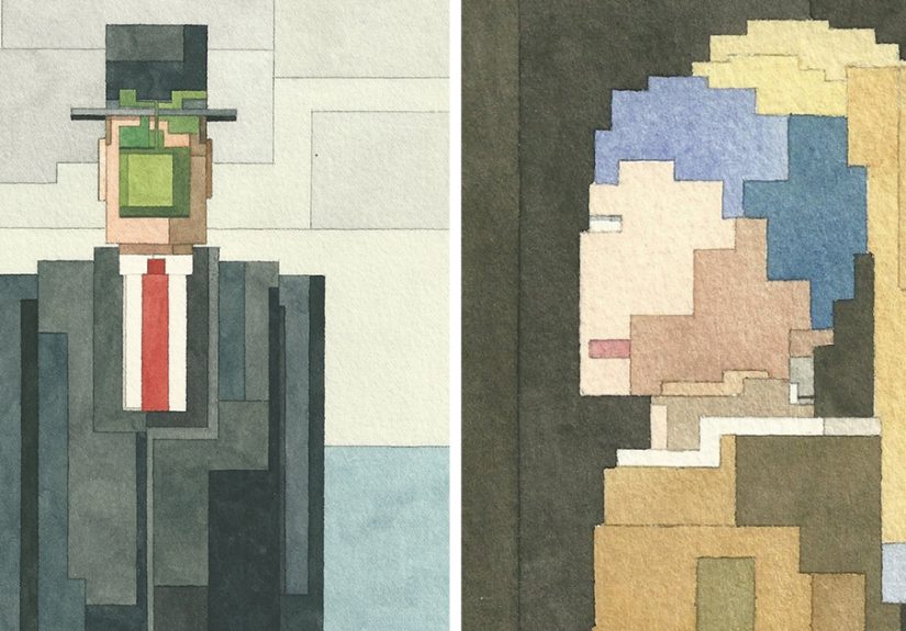
American Gothic: Comedy, Symmetry, and a Pitchfork That Does Not Need More Than Twelve Lines
Grant Wood’s American Gothic works beautifully in this style because the composition is so disciplined. The verticals are strong. The faces are iconic. The house is geometric. The pitchfork does almost half the branding on its own. This is where pixel watercolor portraits become especially fun, because the emotional tone lives in expression, posture, and spacing more than in fussy detail.
When I reinterpret this painting, I keep the stern faces slightly blocky and lean into the stiffness. It is part homage, part affectionate roast. The watercolor keeps the skin and clothing from becoming too severe, while the grid emphasizes the deliberate awkwardness that made the original unforgettable in the first place. If ever a painting could survive being translated by equal parts respect and mischief, this is the one.
Monet’s Bridge and Water Lily Worlds: Less Outline, More Color Memory
Claude Monet is a different challenge. His paintings are not driven by hard contour so much as color, light, and painterly atmosphere. That means I cannot rely on line alone. I have to think in patches. If I reduce one of Monet’s bridge scenes or water-lily compositions into an 8-bit art style, I focus on where warm and cool notes meet, where the bridge cuts across the surface, and where the eye needs a resting place.
This is where watercolor really earns its lunch. Soft layers help preserve the floating, shimmering quality that a strict pixel grid might otherwise flatten. I often begin with loose washes, then place pixel shapes only where structure is essential. It feels less like copying Monet and more like negotiating with him. He says, “Light is everything.” I say, “Sure, but I only have thirty-two blocks to explain it.”
The Scream and Other Emotion-Forward Paintings
Some artworks survive simplification because their emotional signal is immediate. Edvard Munch’s The Scream is one of them. The face, the twisting sky, and the charged color relationships carry such a strong mood that even a reduced version still lands. These are my favorite paintings to reinterpret when I want the piece to feel expressive rather than decorative. A few strategic color fields and a nervous silhouette can do more work than an army of tiny details ever could.
My Process for Making 8-Bit Watercolors Based On Famous Artworks
1. I Find the Skeleton First
Before I touch paint, I identify the structure that makes the original recognizable. Is it the silhouette? The color contrast? The angle of a figure? The placement of a horizon line? This is the part many people skip, and it is usually where good reinterpretations either live or quietly fall down a staircase.
If the artwork still reads when reduced to a handful of shapes, I know I have a strong starting point. If it only works when every detail is present, I either rethink the approach or choose a different painting. Not every masterpiece wants to be pixelated, and honestly, that is fair.
2. I Limit the Palette on Purpose
Nothing kills the retro effect faster than too many colors pretending they are not too many colors. So I intentionally narrow the palette. That does not mean the painting becomes dull. It means each color has a job. Blues create atmosphere. Yellows become focal points. Browns and blacks anchor the design. Watercolor glazing lets those few colors produce richer effects without turning the work into a rainbow traffic jam.
3. I Let Watercolor Do the Human Part
The grid introduces discipline, but the paint keeps the work from feeling lifeless. I use wet-on-dry passages when I want crisp pixel edges and wet-on-wet or lightly layered washes when I want the image to breathe. Sometimes a bloom, a softened corner, or a lifted highlight creates exactly the kind of visual surprise that makes the whole piece feel alive. In those moments, watercolor stops being just a medium and becomes a collaborator with a chaotic streak.
4. I Edit Again After the First Layer
One of the most useful lessons I have learned is that famous artwork reinterpretation is really an editing exercise. After the first pass, I step back and ask whether the image reads from a distance. If it does not, I simplify more. I sharpen the important shapes, mute the unnecessary ones, and protect contrast where the eye needs it. This is the part that turns a clever concept into a strong finished piece.
What These Paintings Taught Me About Art
Working on My 8-Bit Watercolors Based On Famous Artworks has made me appreciate how durable great composition really is. A masterpiece can survive changes in scale, medium, texture, and even visual language if the core design is strong enough. That is humbling. It means the paintings we remember are not just famous because history said so. They are famous because they continue to function under pressure.
It has also taught me that nostalgia works best when it is not lazy. The 8-bit look can easily become a gimmick. Watercolor can easily become a mood board. But when both are used with intention, they stop being cute stylistic tricks and become tools for interpretation. The result is not “old painting, but make it retro.” It becomes a conversation between eras: museum wall meets arcade memory, brush meets grid, tradition meets playful distortion.
Mistakes I Made So You Do Not Have To
I have absolutely overworked a sky that should have stayed simple. I have used too many pixel squares and accidentally recreated “4K anxiety” instead of retro charm. I have painted a face so carefully that it lost all personality. And yes, I have also watched a perfectly nice wash backrun into a masterpiece reinterpretation like it was trying to improve it through chaos.
But those mistakes helped. They taught me that strong 8-bit watercolor art depends on selection, not accumulation. You do not need more information. You need the right information. If the key shape, color tension, and emotional signal are present, the painting works. If they are not, no amount of decorative fuss will save it. Art can be deep, but it is also occasionally rude like that.
Why I Keep Returning to This Series
I keep returning to this idea because it makes art history feel active rather than distant. Reinterpreting a famous painting through pixel art and watercolor is a form of close looking. It slows me down. It makes me notice why a composition holds together, why a color sings, and why a shape becomes unforgettable. It also reminds me that reverence does not have to be solemn. Sometimes the best way to honor great art is to engage with it boldly, intelligently, and with a sense of humor.
And let us be honest: there is also something deeply satisfying about turning a sacred masterpiece into a blocky watercolor and realizing it still has swagger. That is when I know the idea worked.
Extended Studio Notes: My Experiences Making These 8-Bit Watercolors
The most surprising part of this project has been how physical it feels. Pixel art starts in the mind as something digital, orderly, and almost machine-like. But the moment watercolor hits paper, everything becomes sensory. I start noticing the drag of the brush on cold-press texture, the split-second when a wash settles into the fibers, and the tiny panic that arrives when two colors decide they would like to mingle more than I authorized. That tension has become part of the joy. Every piece begins with a plan and ends with a negotiation.
I remember one early attempt based on The Starry Night where I mapped out the sky so carefully that it looked less like van Gogh and more like a weather app having an existential crisis. The grid was too even, the blues were too polite, and the stars felt like decorative cereal. So I started over and let the first layer breathe more. I kept the pixel blocks, but I allowed subtle blooms and tonal shifts underneath. Suddenly the painting had pulse. That was the day I realized this series would only work if I stopped trying to make watercolor behave like software.
Another experience that changed the way I work came from painting The Great Wave. I thought the hardest part would be the wave itself, but it was actually the negative space around it. If the sky was too empty, the composition felt unfinished. If I textured it too much, the wave lost its authority. So I learned to trust restraint. I painted the background with a light wash, let it dry completely, and then built the pixel forms over it in deliberate stages. It felt less like illustrating and more like setting a trap for the viewer’s eye. The wave needed to arrive all at once.
American Gothic gave me the opposite problem: emotional precision. Those faces are iconic because they sit right on the border between stern, awkward, funny, and sincere. In pixel form, one misplaced square can turn “deadpan” into “confused tax accountant.” I spent more time adjusting eyebrows and mouth corners than I would ever like to publicly admit. But that taught me how much expression can live inside very small decisions. A block shifted by one unit can change the emotional temperature of the entire painting.
The Monet-inspired pieces were the ones that stretched me most. They taught me to stop thinking like a person outlining objects and start thinking like a person arranging light. I would lay down pale greens, violets, and blues first, then wait, sometimes impatiently, for the paper to dry. Only afterward would I place the stronger pixel structure. Those layers created a softness that pure flat color never could. It felt like I was borrowing watercolor’s memory of the scene first, then imposing the retro language second.
Over time, this series has also changed how I look at museums, books, and reproductions online. I no longer ask only whether I like a painting. I ask what survives translation. What remains if I remove half the detail? What color relationship is doing the heavy lifting? What shape carries the emotional headline? That habit has made me a better painter, but also a better viewer. It has turned admiration into investigation.
And maybe that is the real reason I keep making these works. They let me be serious about art without becoming stiff about it. They let me study masterpieces closely while still leaving room for play, surprise, and the occasional beautifully timed watercolor accident. In a world that often asks art to choose between tradition and experimentation, these paintings happily refuse. They keep both. They wink at the past, borrow from the digital present, and end up becoming something unmistakably their own.
Conclusion
My 8-Bit Watercolors Based On Famous Artworks is more than a stylistic mash-up. It is a way of testing what makes great art endure. By filtering masterpieces through pixel logic and watercolor transparency, I get to study composition, color, mood, and memory all at once. The process is funny, frustrating, technical, and unexpectedly moving. Best of all, it proves that even the most recognizable works in art history can still surprise us when they are translated with care, curiosity, and a little retro nerve.