Table of Contents >> Show >> Hide
- What Is Apple’s “Liquid Glass” Design?
- Why Liquid Glass Is a Big Deal for WWDC 2025
- Where the New Liquid Glass Look Shows Up
- What Apple Is Really Trying to Achieve
- First Reactions: Gorgeous, Bold, and a Little Controversial
- Why Liquid Glass Could Shape Apple’s Future
- Everyday Experience: What Liquid Glass May Feel Like in Real Use
- Final Thoughts
- SEO Tags
Apple did not stroll into WWDC 2025 carrying a tiny visual tweak and a polite shrug. It arrived with a full-on software makeover. The star of the show was a new design language called Liquid Glass, a glossy, translucent, shape-shifting interface style that immediately gave iPhones, iPads, Macs, Apple Watches, and Apple TVs a more unified look. If iOS 7 was Apple’s big flat-design revolution, Liquid Glass feels like the company opening the curtains, polishing the windows, and deciding software should sparkle again.
At first glance, Liquid Glass looks exactly like the sort of thing Apple loves to unveil on a giant screen with dramatic music and suspiciously perfect lighting. Buttons shimmer. Sidebars float. Toolbars seem less bolted onto the screen and more like they are hovering above your content. It is shiny, layered, and intentionally alive. But beneath the eye candy, Apple is also making a bigger point: this is about creating one visual language across the company’s entire ecosystem, while setting up a more modern interface that feels ready for the next era of devices.
So what exactly is Apple’s new Liquid Glass style, where does it show up, why does it matter, and why did some people immediately say, “Wow,” while others said, “Please hand me the contrast settings”? Let’s break it down.
What Is Apple’s “Liquid Glass” Design?
Liquid Glass is Apple’s new software material and interface style introduced at WWDC 2025. In plain English, it is a visual system built around translucent surfaces, soft reflections, dynamic motion, and UI elements that seem to bend light instead of merely sitting there like cardboard cutouts. Apple describes it as combining the optical qualities of glass with a fluid behavior that changes based on the content behind it and the context around it.
That means app controls, navigation bars, tab bars, sidebars, widgets, app icons, and even system layers like Control Center and the Lock Screen can look more dimensional and responsive. The design is meant to feel familiar enough that users do not get lost, but fresh enough that everything appears more expressive and more immersive. In Apple-speak, it is “delightful.” In normal-human speak, it looks like the interface had a spa day and came back moisturized.
The deeper idea is not just transparency for transparency’s sake. Liquid Glass is designed to keep the focus on content. Instead of thick, flat UI elements boxing in your screen, Apple wants controls to recede when they are not needed and expand when they are. That creates more visual depth without necessarily making the interface more cluttered. At least, that is the theory. We will get to the debate in a minute.
Why Liquid Glass Is a Big Deal for WWDC 2025
WWDC is usually where Apple shows developers what the company wants software to become over the next year. This time, Liquid Glass was not a side dish. It was the plate. Apple made it clear that the redesign is one of its broadest software visual changes in years, and it landed alongside a simplified naming convention that brought the company’s platforms into one family: iOS 26, iPadOS 26, watchOS 26, tvOS 26, visionOS 26, and macOS Tahoe 26.
That naming shift matters because it reinforces the same message as the design change: Apple wants its platforms to feel more cohesive. The company is no longer treating each operating system like a separate island with a different passport and accent. Instead, Liquid Glass acts like the common architectural language across the neighborhood. Your iPhone, Mac, Apple Watch, and Apple TV now look more like they belong to the same family, not like cousins who only meet at Thanksgiving.
There is also a strategic reason for this timing. Apple has spent the last few years leaning harder into spatial computing through visionOS. Liquid Glass carries some of that thinking into the rest of the lineup. Its transparency, depth, and motion cues feel closer to visionOS than to the flatter iPhone designs people have known since the post-iOS 7 era. In that sense, WWDC 2025 was not just a facelift. It was Apple nudging mainstream users toward a more dimensional software future.
Where the New Liquid Glass Look Shows Up
iPhone and iOS 26
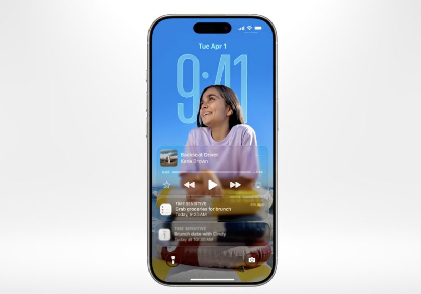
On iPhone, Liquid Glass is everywhere. The Lock Screen looks more alive, with the time adapting more fluidly to the wallpaper. Home Screen customization gets a boost with a striking clear app icon style. Navigation bars, controls, and toolbars take on a lighter, floating appearance. The Camera app has been simplified, which is a smart move because the best camera interface is the one that does not make you feel like you need a pilot’s license to take a photo.
Apple also updated core apps to fit the new design language. Photos, Safari, and other system apps now use controls that visually blend into content rather than blocking it off. That creates a more cinematic feel, especially on modern iPhones where screen space is precious and users increasingly expect the interface to stay out of the way.
iPad and iPadOS 26
On iPad, Liquid Glass has room to flex. Sidebars and tab bars feel more elegant, and floating elements look more natural on the larger display. Combined with iPadOS 26’s stronger productivity features and more desktop-like flexibility, the new design helps the iPad feel less like a giant phone and more like a polished hybrid device. The visual language is softer and more immersive, but it is also more structured, which matters on a platform where multitasking can get messy fast.
Mac and macOS Tahoe 26
Mac users get one of the most noticeable changes: a fully transparent menu bar that makes the display feel larger. The Dock, sidebars, and toolbars are refined with Liquid Glass treatments that create more depth without tossing out the basic macOS feel people know. Apple wisely did not turn the Mac into a giant iPhone. Instead, it used the new material to modernize the Mac’s chrome while preserving the density and flexibility desktop users expect.
This is one of the more impressive parts of the redesign. Liquid Glass is not applied identically everywhere. Apple is aiming for consistency, not cloning. The Mac still feels like a Mac. It just now looks like that Mac spent the weekend hanging out with a Vision Pro.
Apple Watch and watchOS 26
On Apple Watch, the design change can make a real difference because the screen is so small. Liquid Glass is used in Smart Stack widgets, notifications, Control Center, and in-app controls. The goal is to make the watch interface feel more vibrant and more layered while still keeping the focus on important information. When done right, this approach can make quick glances feel cleaner and more premium.
Apple TV and tvOS 26
Liquid Glass may be most at home on the TV. Apple says the new design keeps content front and center, and that makes sense. On a television, nobody wants giant menus stomping all over the movie. The refreshed Apple TV interface uses Liquid Glass to make controls feel lighter and more atmospheric while emphasizing poster art and what is currently playing. It is a subtle but sensible use of the redesign.
What Apple Is Really Trying to Achieve
The easiest way to misunderstand Liquid Glass is to treat it as mere decoration. Yes, it is decorative. Apple is never going to apologize for making software look expensive. But there is a functional aim too. Liquid Glass is supposed to establish hierarchy, create harmony between hardware and software, and keep UI elements responsive and easier to place across very different screen sizes.
Apple’s developers also get something meaningful out of it. The company says apps built with its native frameworks can adopt much of the new design automatically when recompiled with the latest tools. That lowers the friction for developers who want their apps to match Apple’s new system look. In other words, Liquid Glass is not just a keynote effect. It is a platform-wide design framework with new APIs and updated controls behind it.
That matters because the success of any Apple redesign depends on adoption. A beautiful system interface loses some of its magic if half your apps still look like they were designed during a different presidential administration. Apple is clearly betting that developers will move quickly, especially because the company is making the visual transition easier than a ground-up redesign would be.
First Reactions: Gorgeous, Bold, and a Little Controversial
The first reaction to Liquid Glass was simple: it looked stunning. Across official demos and early coverage, the new design gave Apple’s software a fresh identity that felt more premium, more dimensional, and more cohesive than the flatter aesthetics users had grown used to. For many viewers, it was the most memorable part of WWDC 2025.
But beautiful software can still create practical headaches. Almost immediately, designers and tech writers started questioning readability. Transparent UI can be elegant, but it can also be risky. When buttons, toolbars, and overlays allow too much background detail to show through, text can become harder to read and interfaces can feel busier than Apple probably intended. That concern showed up early in the response to Liquid Glass, especially around contrast and legibility.
That does not mean the redesign is a failure. In fact, it means Apple launched something ambitious enough to trigger real design debate. And historically, Apple often fine-tunes these kinds of big UI changes through beta cycles. Early reports after the WWDC reveal suggested that Apple had already started toning down some of the more aggressive transparency issues in later beta updates. That is not unusual. Big visual changes almost always get polished after real-world use starts exposing the awkward corners.
Why Liquid Glass Could Shape Apple’s Future
Liquid Glass feels important not only because it changes how Apple devices look today, but because it hints at where Apple wants computing to go next. The design borrows from the depth and spatial feel of visionOS, which suggests Apple is trying to normalize more layered, more dynamic interfaces across its product line. That can make future transitions between screens, devices, and possibly even new categories of hardware feel more natural.
It also gives Apple something it has always valued: a strong signature look. For years, flat design became so widespread that a lot of tech interfaces started to feel interchangeable. Liquid Glass gives Apple a more distinct visual identity again. Whether users end up loving every translucent flourish is another question, but nobody can accuse the company of playing it too safe.
And that is the most interesting part of this first look. Liquid Glass is not just a new coat of paint. It is Apple trying to reclaim the idea that interface design can still surprise people. In a tech industry obsessed with AI buzzwords, Apple chose to make millions of people talk about buttons, bars, icons, and reflections. That is either wonderfully old-school or a very slick magic trick. Possibly both.
Everyday Experience: What Liquid Glass May Feel Like in Real Use
What makes Liquid Glass interesting is not just how it looks in a WWDC keynote. It is how it may feel during ordinary moments, the kind that never make it into Apple’s cinematic promo videos. Think about unlocking your iPhone while half awake, checking a text in line for coffee, changing a song during a workout, or opening your MacBook to clear a backlog of tabs that have been quietly judging you for days. Those small interactions are where a redesign either becomes invisible in the best way or annoyingly noticeable in the worst one.
In the best-case scenario, Liquid Glass should make Apple devices feel lighter and more responsive. Controls that float above content can make the interface seem less heavy. A translucent tab bar can feel like it belongs to the screen instead of sitting on top of it like a plastic tray. On the iPhone, that could make apps feel more immersive, especially when photos, videos, maps, or web pages extend visually behind the interface. On the Mac, a transparent menu bar and refined toolbars may make the desktop feel roomier and less boxed in. On Apple Watch, where every pixel matters, the added depth could make simple glances feel more polished and more legible when handled carefully.
There is also an emotional side to this. Apple has always been unusually good at making software feel tactile even when you are touching nothing but glass. Liquid Glass leans hard into that tradition. The design is meant to feel fluid, almost physical, as controls respond to movement, light, and content. That can create a stronger sense that your device is reacting to you instead of merely displaying information. It is a small shift, but one that can make everyday actions feel a little less mechanical.
Of course, daily use is also where the complaints become real. A stylish interface is fun until bright wallpaper, busy content, and translucent overlays collide and make a button harder to see. Users who value clarity over drama may find parts of Liquid Glass a little too eager to show off. People sensitive to motion or visual noise could also react differently depending on how strong the effects feel in practice. Apple’s accessibility settings will matter here, and so will the company’s willingness to keep adjusting the balance between flair and function.
Still, there is a reason this redesign caught so much attention. Liquid Glass changes the mood of Apple software. It makes the ecosystem feel newly coordinated, more modern, and slightly more theatrical. For longtime Apple users, it may feel like the biggest shift since the move away from skeuomorphism years ago, except this time the company is not going flat. It is going layered, luminous, and a little bit showy. For new users, it may simply feel like Apple software has become more alive.
That is why the everyday experience matters more than the keynote applause. If Liquid Glass helps apps fade back when content matters and reappear cleanly when controls are needed, users will remember it as a smart redesign. If it keeps getting in the way, they will remember it as the year Apple made the interface look like a fancy cocktail menu. The likely outcome is somewhere in the middle: a bold new style that feels exciting, occasionally imperfect, and unmistakably Apple.
Final Thoughts
Apple’s Liquid Glass style is the defining visual story of WWDC 2025. It is elegant, ambitious, and clearly designed to unify Apple’s platforms around a more expressive, more dimensional interface language. It brings iPhone, iPad, Mac, Apple Watch, and Apple TV closer together visually while echoing ideas first explored in visionOS. That alone makes it one of the company’s most important software design moves in years.
But the first look also shows why the redesign will remain a conversation piece. Liquid Glass is lovely when it enhances focus, motion, and depth. It is less lovely when translucency starts wrestling with readability. That tension is exactly what makes this rollout so interesting. Apple is pushing its software aesthetic forward without pretending there will be no trade-offs.
For now, the clearest takeaway is this: Apple wanted WWDC 2025 to remind the world that software design still matters. With Liquid Glass, it absolutely did. Whether users end up calling it magical or mildly exhausting, they are definitely not calling it boring.